
You have the threads, the fabric, and the desire to create something meaningful. But how do you translate the words in your head into stitches that feel polished, personal, and truly intentional? It’s not about learning dozens of complex techniques, but about making subtle, expert choices that transform a simple word into a piece of art.
Whether you’re embellishing a well-loved denim jacket or creating a quiet reminder to hang on your wall, the way you form each letter matters. It’s in the density of a satin stitch, the fluid curve of a script, or the confident pop of a well-placed phrase. The right technique can add emotion, clarity, and a modern edge to your work.
Consider this your guide to stitching with purpose. Here, you’ll find 25 ways to elevate your typographic embroidery, focusing on methods that offer immediate, visible improvements. Let’s move beyond the basics and start creating text that not only looks beautiful but speaks with clarity and confidence.
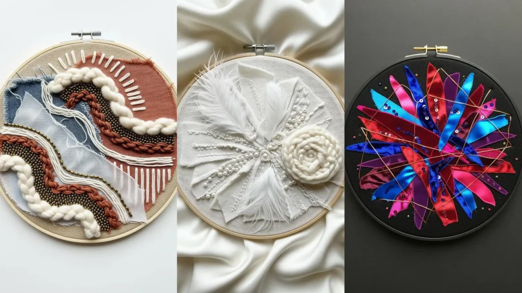
1. Balance Script and Motif with Negative Space
When combining text and illustration, let the composition breathe.
Use a single, continuous whipped backstitch for the script to create a fluid, calligraphic line.
For the delicate lavender stitch ideas, opt for tiny straight stitches and French knots with just one or two strands of floss.
This contrast in scale and density ensures the words remain the focal point, while the botanical element adds a soft, meaningful accent.
2. Build a Flawless Satin Stitch Foundation

To achieve that perfectly smooth, block-letter finish on denim, preparation is everything.
First, outline your letters with a split stitch using two strands of matching floss.
This creates a raised, stable edge that your satin stitches can press against, preventing them from slipping and creating gaps.
Fill the shape with six strands of floss, keeping your stitches parallel and close together for a dense, seamless finish that stands out against the denim’s texture.
3. Create Texture with a Brick Stitch Fill

For letters with a tactile, almost woven appearance, move beyond the satin stitch and use the brick stitch.
Work in rows of staggered straight stitches, much like a brick wall, to build up the letterform.
This technique is incredibly forgiving, as it eliminates the challenge of keeping long satin stitches perfectly parallel.
It also allows for subtle color blending; by switching threads between rows, you can create soft gradients without complex thread painting.
4. Layer Appliqué for a Bold Graphic Statement

When you want your message to have maximum impact on a large surface like a jacket, combine appliqué with embroidery.
Cut your letter shapes from felt or sturdy cotton fabric and secure them with a temporary fabric adhesive.
Then, frame each letter with a tight, clean satin stitch or a simple backstitch along the edge.
This technique creates a bold, dimensional effect that feels professional and intentional, making your vintage-inspired denim jacket embroidery motifs truly pop.
5. Use Parallel Bars for an Architectural Look
Transform simple block letters into a piece of modern art by filling them with parallel straight stitches instead of a solid satin stitch.
Use a water-soluble marker and a small ruler to draw precise guidelines inside your letters first.
Stitch each bar using metallic or high-sheen thread to catch the light, emphasizing the structure and the negative space within each letterform.
This approach turns simple text into an elegant, graphic design.
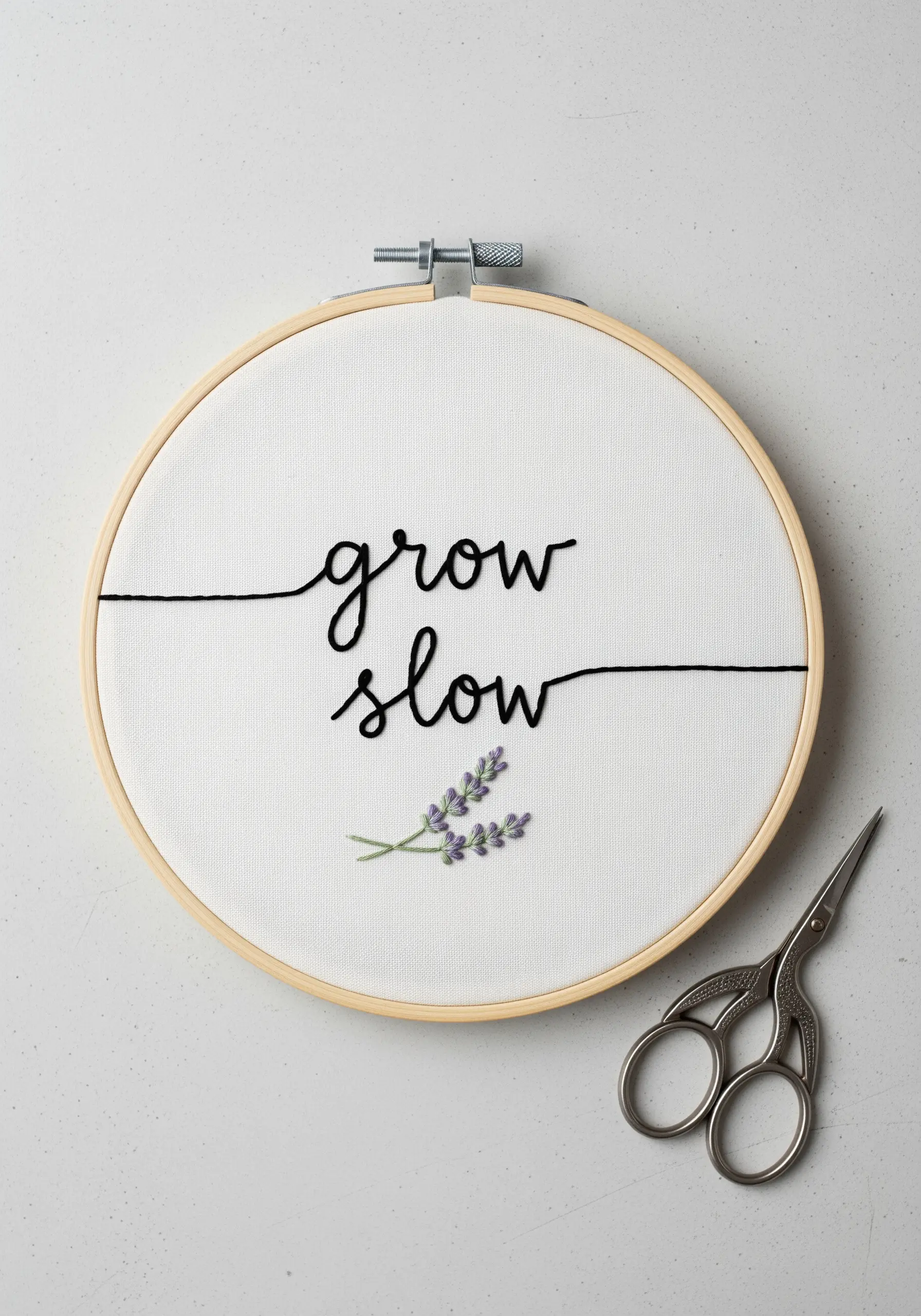
6. Master a Flowing Line with Chain Stitch
For cursive or script fonts, the chain stitch is your best friend.
Unlike backstitch, which can look segmented on curves, the interlocking loops of a chain stitch create a continuous, rope-like line.
This adds both texture and a sense of fluid motion to your words.
Focus on maintaining consistent loop size and tension to ensure every curve is graceful and uniform.
7. Integrate Text into Garment Details
Elevate a piece of clothing by treating its existing features—like a collar, cuff, or placket—as a canvas.
A small, vertically stitched word becomes an unexpected and personal detail.
Use a tear-away stabilizer on the inside of the garment to prevent the fabric from puckering, especially on heavy materials like denim.
Keep the scale small and the stitching clean; a simple backstitch using three strands is often all you need.
8. Add Dimension with Padded Satin Stitch

To make your letters literally stand off the fabric, use a padded satin stitch.
First, fill the area of your letter with a base of small, random straight stitches or seed stitches.
Then, cover this textured foundation with your final satin stitches, working in the opposite direction.
This underlying layer of thread provides lift, creating a raised, 3D effect that feels luxurious and tactile, especially when using a high-contrast color on neutral earth-toned embroidery projects.
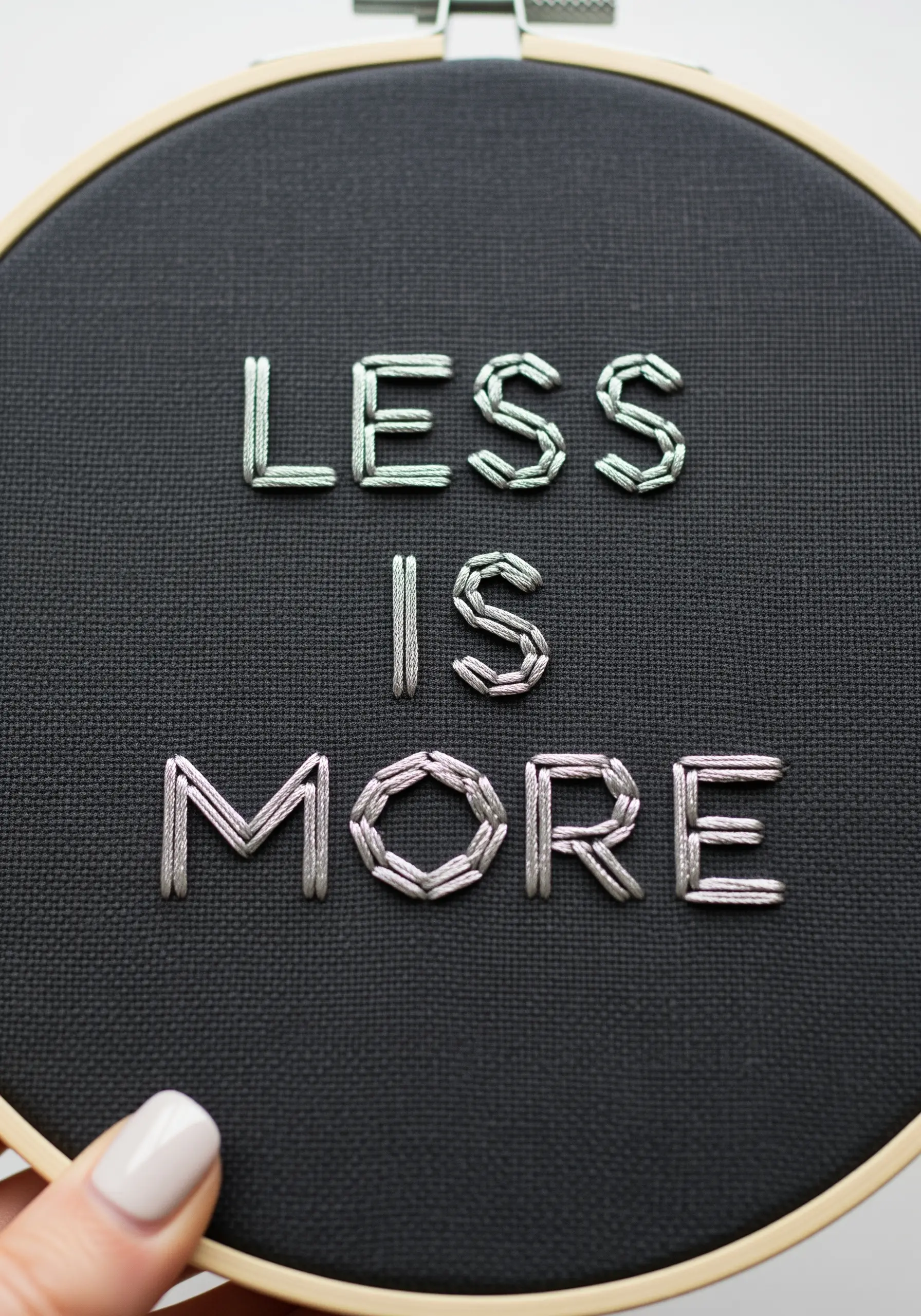
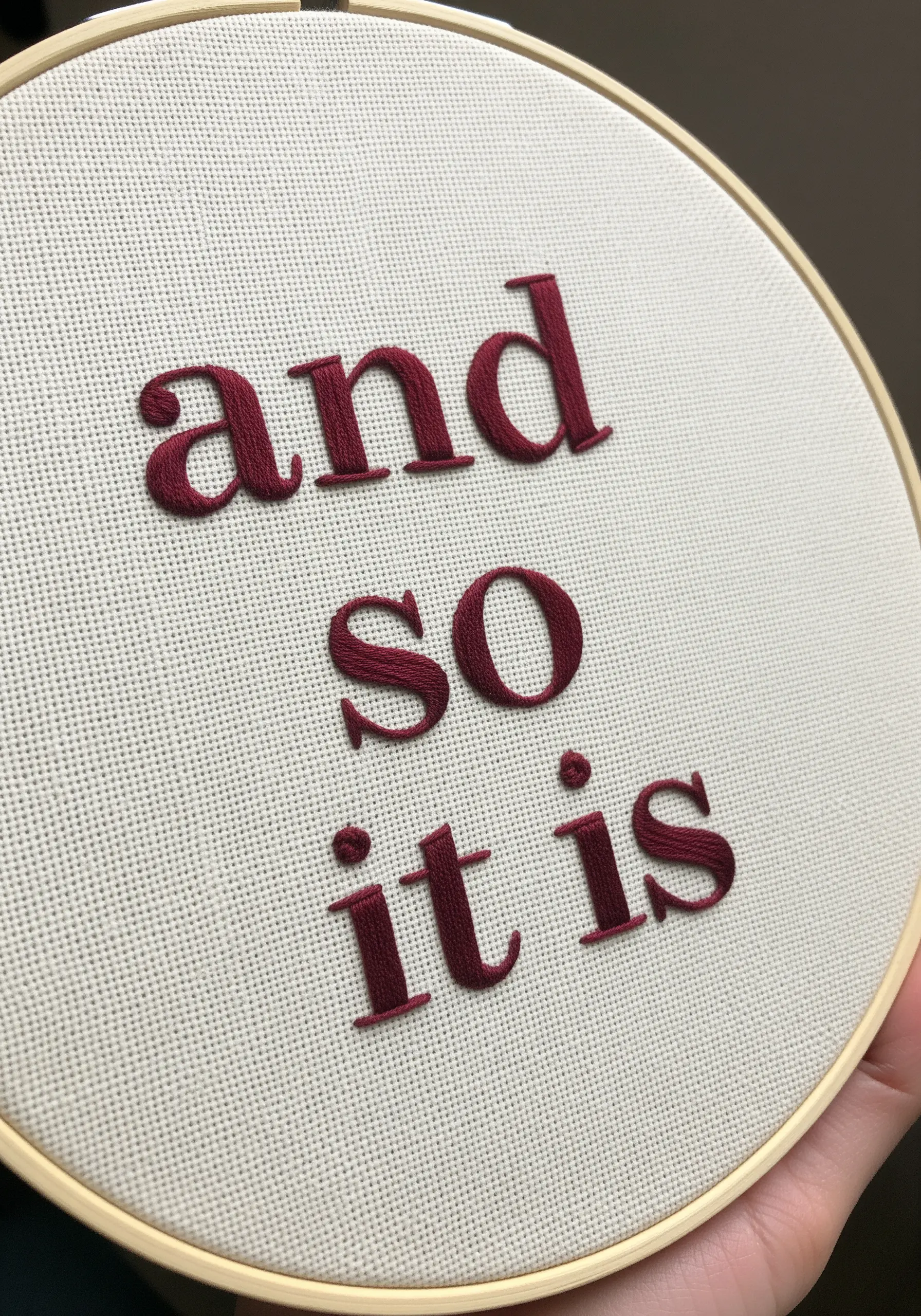
9. Achieve Clarity with a Precision Backstitch
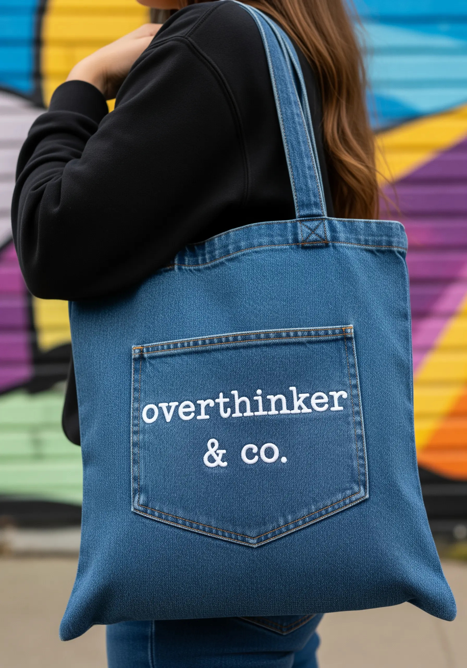
For clean, legible typography on functional items like a tote bag, a simple backstitch is your most reliable tool.
Choose a classic serif or sans-serif font and use two or three strands of floss—enough to be seen, but not so much that it becomes bulky.
Focus on making each stitch the exact same length, especially around curves, to create a sharp, almost printed look.
This is the foundation of all professional-looking modern tote bag embroidery designs.
10. Create Visual Harmony with Color Blocking

Turn a single word into a design statement by splitting the letters with color.
To achieve this crisp divide, draw a precise vertical or horizontal line through your text before you begin.
Stitch the first color half with satin stitches, ensuring your stitches end exactly on the line.
Then, complete the letter with the second color, meeting the first set of stitches perfectly in the middle. This technique adds a dynamic, graphic quality to the simplest of words.
11. Hide a Message on an Unexpected Surface

The most impactful embroidery isn’t always the most visible.
Stitch a tiny monogram, date, or playful symbol like ‘xo’ on the inside of a cuff, the hem of a shirt, or under a collar.
Use a simple stem stitch or backstitch with two strands of a contrasting thread.
This detail transforms a garment into a personal keepsake, a secret shared only with the wearer.
12. Mimic Knitting with the Cast-On Stitch
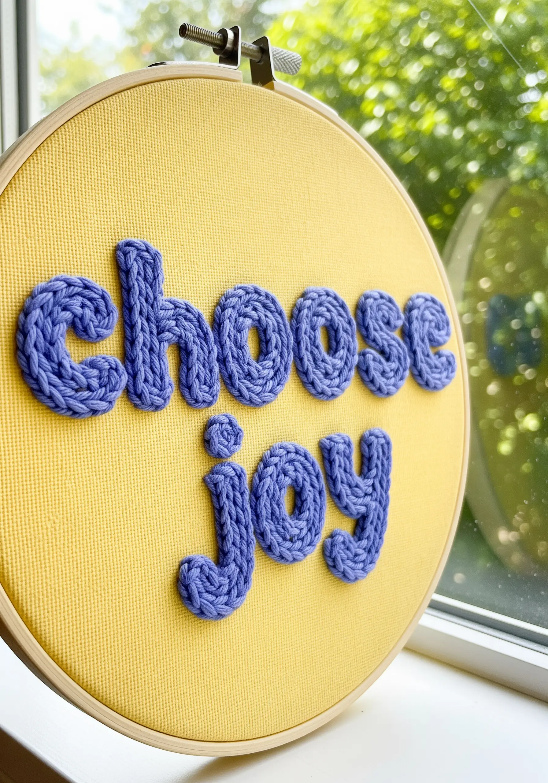
For typography that feels incredibly tactile and cozy, use the cast-on stitch.
This dimensional stitch creates a raised, braided line that looks just like a tiny knitted tube, making it perfect for chunky, playful lettering.
It works beautifully with thicker threads like pearl cotton or even fine yarn.
Use it to build up your letters section by section for a truly unique piece of mixed-fiber embroidery ideas.
13. Balance Filled Text with Delicate Line Art

Create a sophisticated composition by pairing a solid, filled font with light, airy botanical outlines.
Stitch your lettering with a dense satin stitch using three or four strands of floss for good coverage.
Then, for the surrounding leaf wreath, switch to a single strand of floss and use a delicate backstitch or stem stitch.
This variation in thread weight creates visual hierarchy, drawing the eye to the text while the wreath acts as a graceful frame.
14. Design a Cohesive Set with Color and Consistency
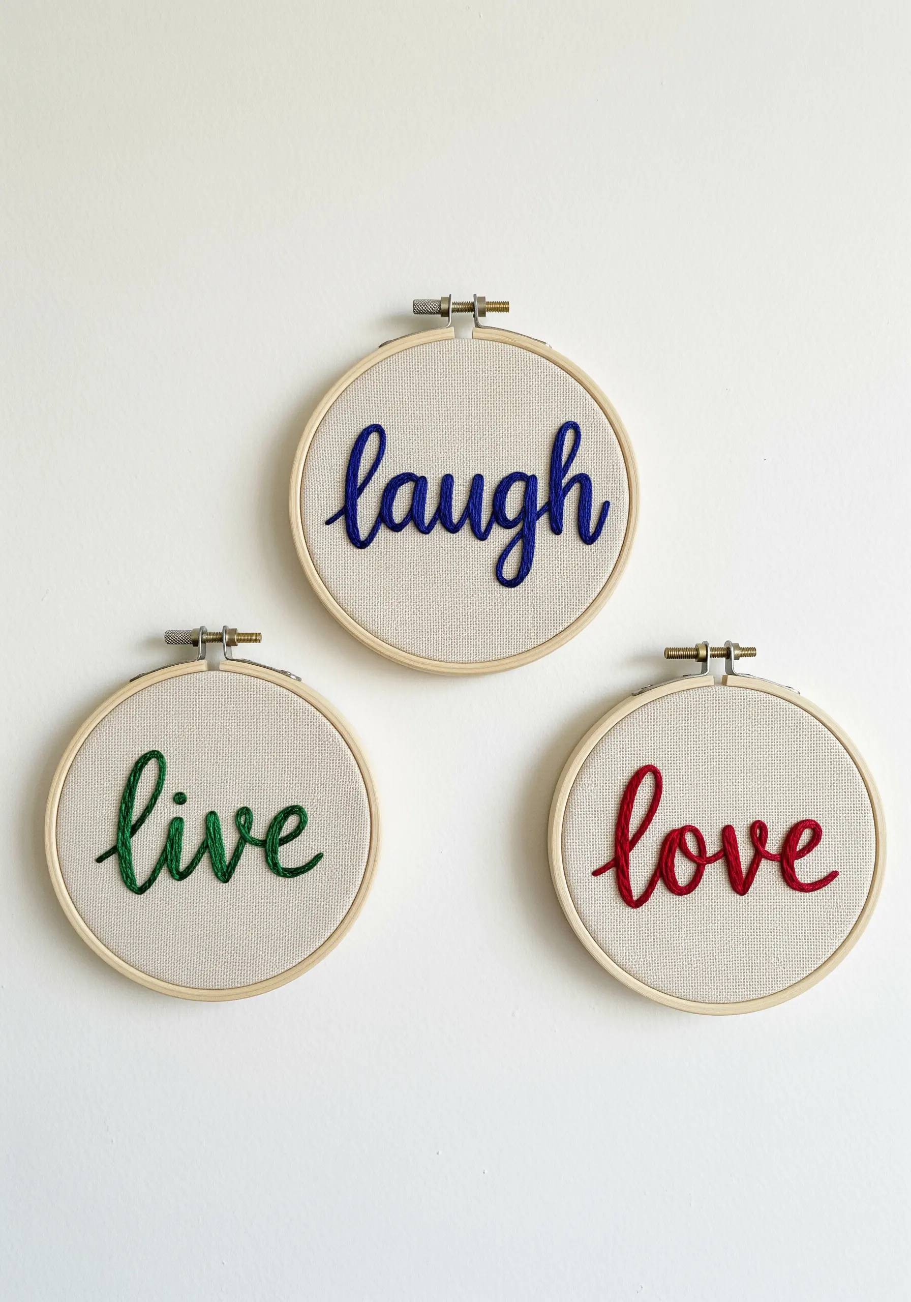
To create a trio of hoops that feel like a unified collection, consistency is key.
Use the exact same script font and the same stitch—like a whipped backstitch—for each word.
Then, introduce variety by choosing a distinct, complementary color for each piece.
This simple formula turns individual hoops into a coordinated set, perfect for creating dynamic and intentional wall hoop art ideas.
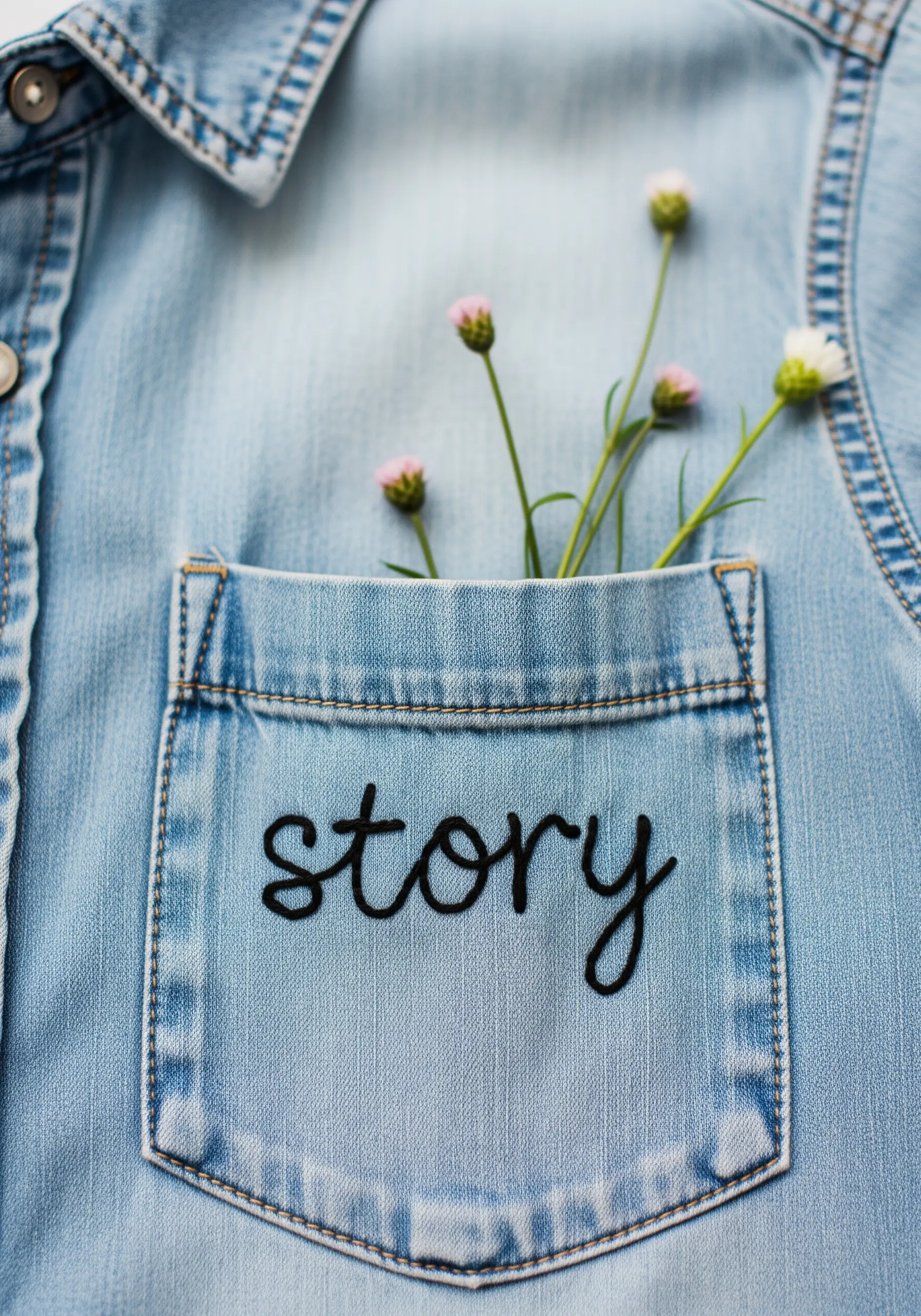
15. Embrace Understated Detail with a Single Thread
Sometimes, the most modern statement is also the most subtle.
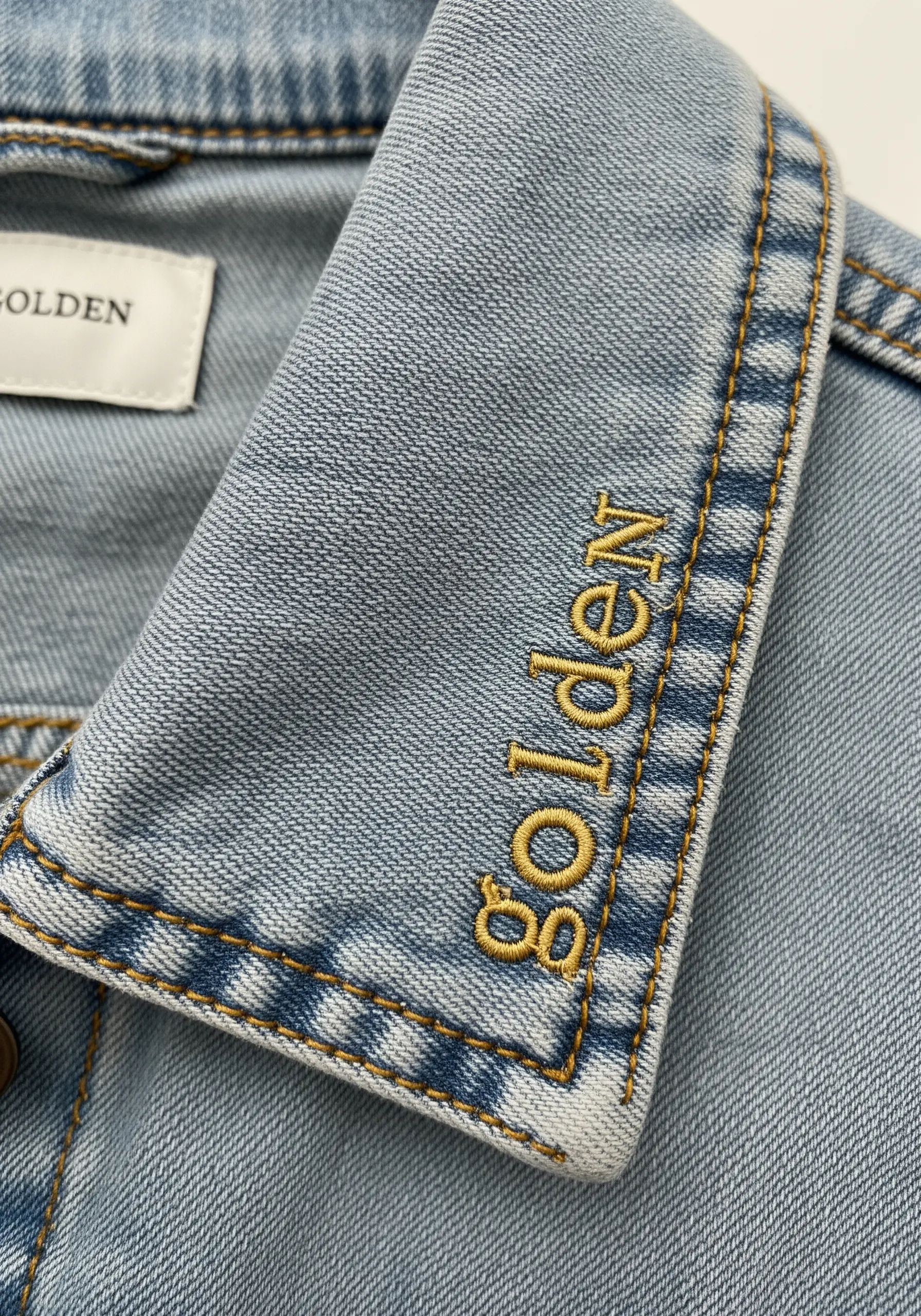
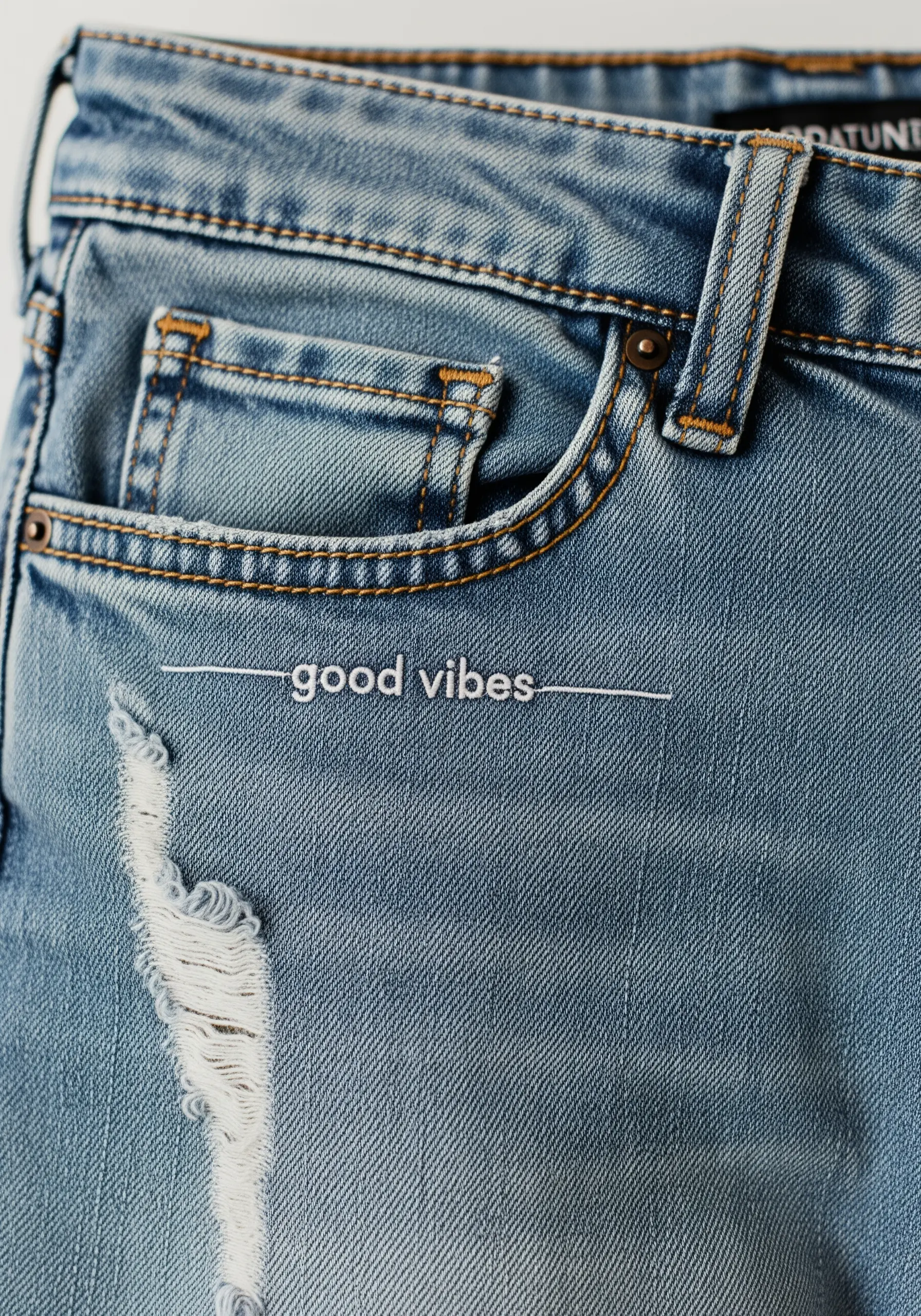
On a textured or distressed fabric like denim, a tiny phrase stitched with a single strand of floss creates an effortlessly cool, integrated look.
Use a simple backstitch and choose a font that is clean and minimal.
The thinness of the line feels intentional and refined, adding a touch of personality without overwhelming the garment.
16. Maximize Impact with High-Contrast Fabric
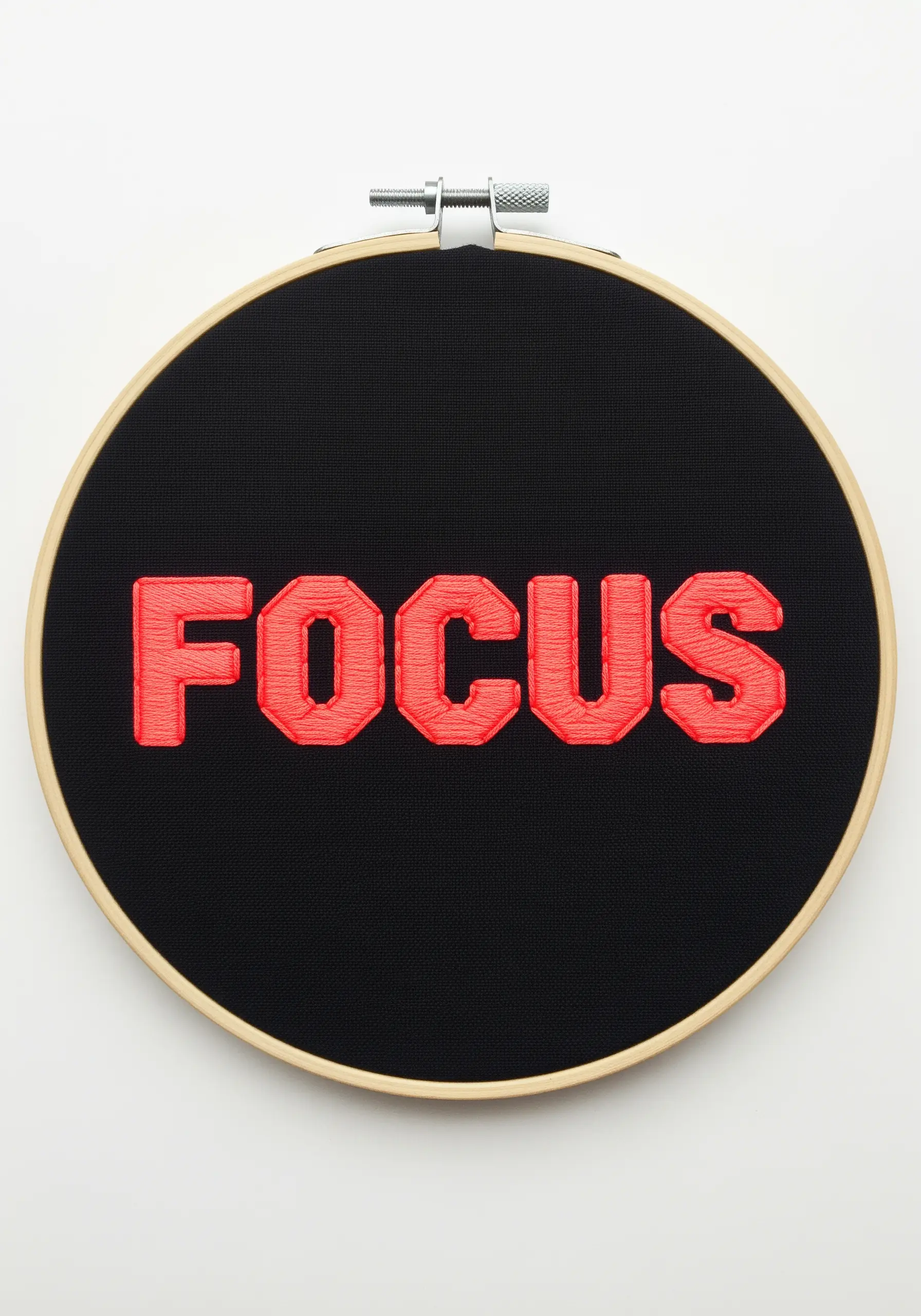
To make your lettering truly vibrate, choose a thread color that is the polar opposite of your fabric on the color wheel.
A bold red or neon on a deep black canvas creates an electric effect that commands attention.
To keep the edges razor-sharp, outline the letters with a split stitch before filling with satin stitch.
This prevents the dark fabric from showing through and keeps the silhouette of each letter crisp and powerful.
17. Convey Elegance with a Fine Stem Stitch
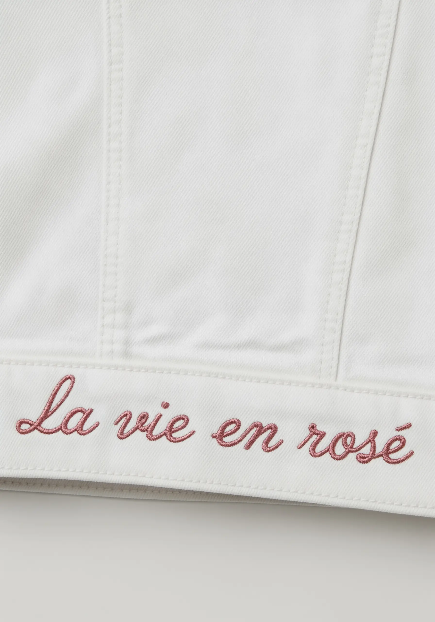
For delicate script that needs to feel both refined and handwritten, the stem stitch is the perfect choice.
Using just two strands of floss, work in small, consistent stitches to build a smooth, twisting line that beautifully follows the curves of a cursive font.
This technique is ideal for adding a sophisticated phrase to the hem of a jacket or a crisp linen napkin, creating a look that feels both personal and high-end.
18. Frame Your Words within a Simple Shape

Give your quote a conceptual home by stitching it inside a relevant outline.
Use a simple backstitch to create a clean, graphic shape—like a house, a coffee cup, or a book.
Then, carefully center your text inside, using the same stitch and thread weight to create a cohesive design.
This technique turns a simple quote into a complete illustration, making it one of the most impactful embroidered quote wall hangings you can create.
19. Add a Graphic Shadow for Depth and Pop
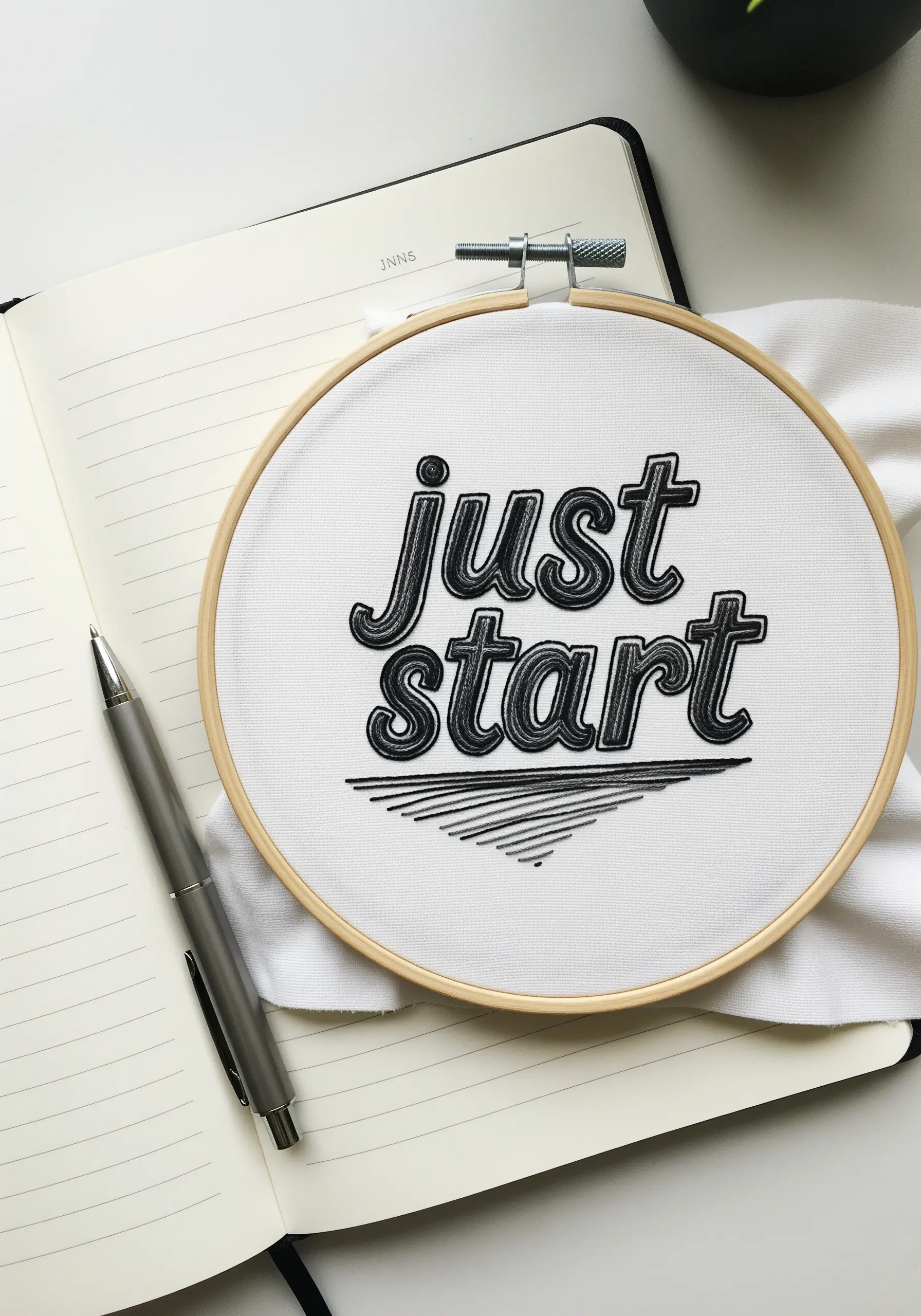
Instantly give your letters a three-dimensional, graphic feel by adding a simple drop shadow.
First, stitch your main word using a bold fill like satin stitch.
Then, using a darker thread (like black or gray), add short, diagonal straight stitches or a clean backstitch line to one side of each letter.
This simple addition creates an illusion of depth that makes your typography pop right off the fabric.
20. Stabilize Curved Surfaces for Clean Results

Embroidering on a curved, structured item like a baseball cap requires extra support to prevent distortion.
Cut a piece of heavy-duty, iron-on stabilizer that is larger than your design and apply it firmly to the inside of the cap.
This creates a flat, taut surface to stitch on, allowing you to produce clean satin stitches and sharp outlines without the fabric puckering or stretching.
A small 4-inch hoop can help isolate the area and maintain tension.
21. Perfect Your Serifs for a Refined Finish

Stitching a clean serif font is a true test of precision, and the secret lies in the details.
Before you fill the letter with a padded satin stitch, use a single strand of floss to create a tiny backstitch outline around the entire letter, especially the small serifs.
This creates a crisp boundary to guide your fill stitches and ensures those tiny typographic details don’t get lost, resulting in an exceptionally polished and professional look.
22. Harness the Power of Variegated Thread

Create magical, shifting color effects with minimal effort by using a variegated or space-dyed thread.
To achieve a smooth, gradual transition of color along your letters, make sure your satin stitches are all oriented in the same direction.
The thread will do the rest, creating a beautiful, organic gradient.
Add a few French knots or star stitches in a metallic thread to complement the colors and add a touch of sparkle.
23. Plan a Deliberate Color Gradient

Create a stunning sunset effect by planning a color gradient that flows across the entire phrase.
Select three to five shades in the same family (e.g., light yellow, golden yellow, orange) and assign each color to a specific word or line.
Use a padded satin stitch to give the letters a bold, dimensional quality that makes the color shift even more noticeable.
This thoughtful use of color transforms simple text into a vibrant piece of art.
24. Sharpen Edges with a Final Outline
For the absolute crispest lettering, especially with serif fonts, add a final finishing touch after your satin stitch is complete.
Take a single strand of the same color floss and use a split stitch to trace the entire outside edge of each letter.
This micro-outline tightens and defines the shape, correcting any minor imperfections in the satin stitch and giving your typography a razor-sharp, almost digital precision.
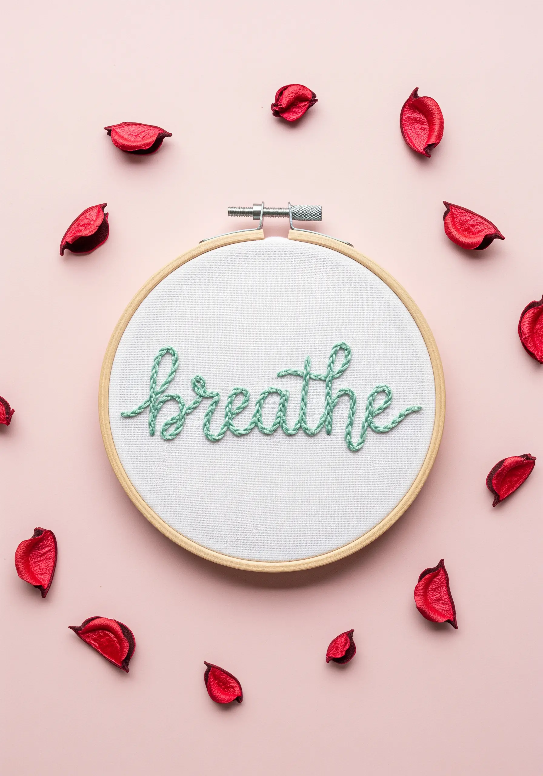
25. Achieve a Smooth Script with Whipped Backstitch
If you find stem stitch tricky or want a smoother, more cord-like line for your script, turn to the whipped backstitch.
First, lay down a foundation of simple backstitches along your design line.
Then, take a second thread and ‘whip’ it around each backstitch without piercing the fabric.
This technique covers the segmented look of the backstitch, creating a raised, continuous line that is perfect for elegant cursive on any fabric, especially textured denim.