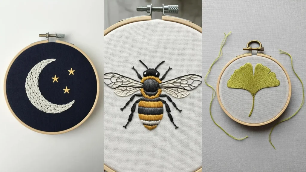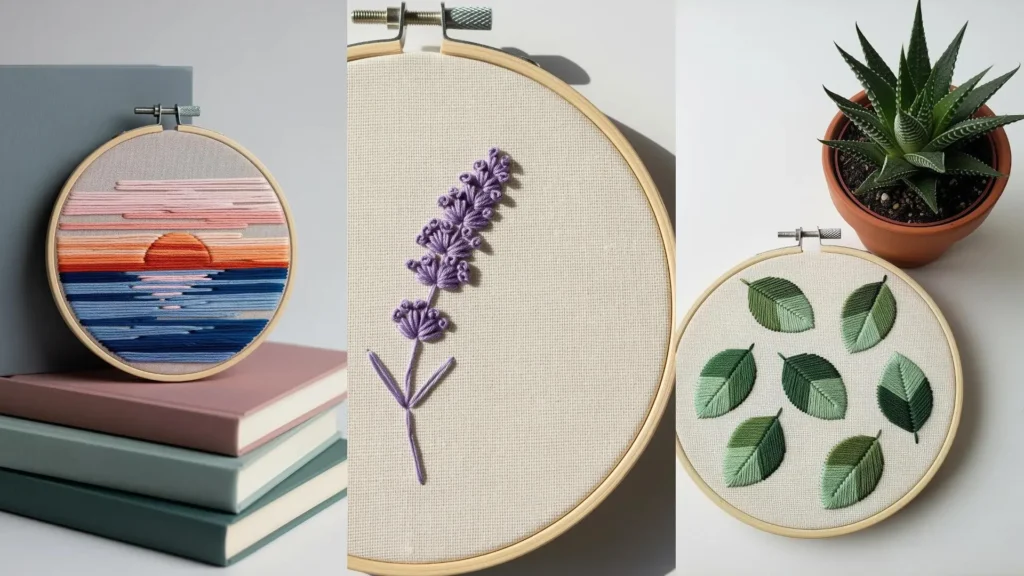
A small embroidery hoop on your desk is more than just decoration; it’s a quiet anchor in a busy day. It’s a space you’ve carved out for yourself, a tangible reminder of focus, creativity, or calm. But turning a simple word into a piece of art that feels personal and polished requires more than just stitches—it requires intention.
The secret isn’t in complex patterns, but in the thoughtful details. It’s in choosing a stitch that echoes the word’s meaning, like a smooth whipped backstitch for ‘flow’. It’s in the padded satin stitch that gives ‘start’ a bold, unmissable presence. It’s in the single strand of thread that renders a tiny icon with perfect clarity.
These compact embroidery quote frames are your opportunity to practice precision and play with purpose. Each one is a small study in composition, texture, and color. Let them inspire you to create something that not only looks beautiful but feels meaningful every time you glance at it.
1. Ground Your Typography with Botanical Details
Combine your lettering with a simple botanical element to create visual balance and softness.
For the lavender, use detached chain stitches for the buds and a simple stem stitch for the stems, which adds an organic contrast to the structured text.
This visual anchor prevents a single word from feeling lost in the hoop.
Consider using two strands of floss for the flower and one for the stem to create a delicate, tapered look that feels more natural.
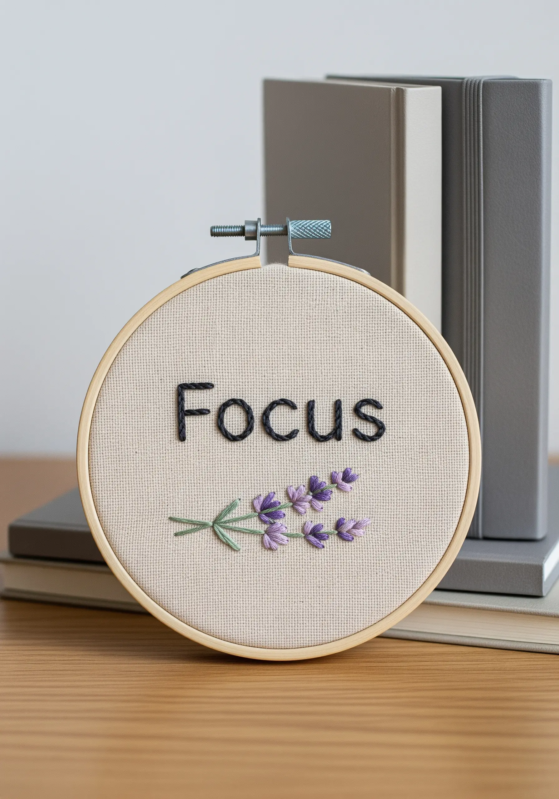
2. Create Emphasis with Padded Satin Stitch
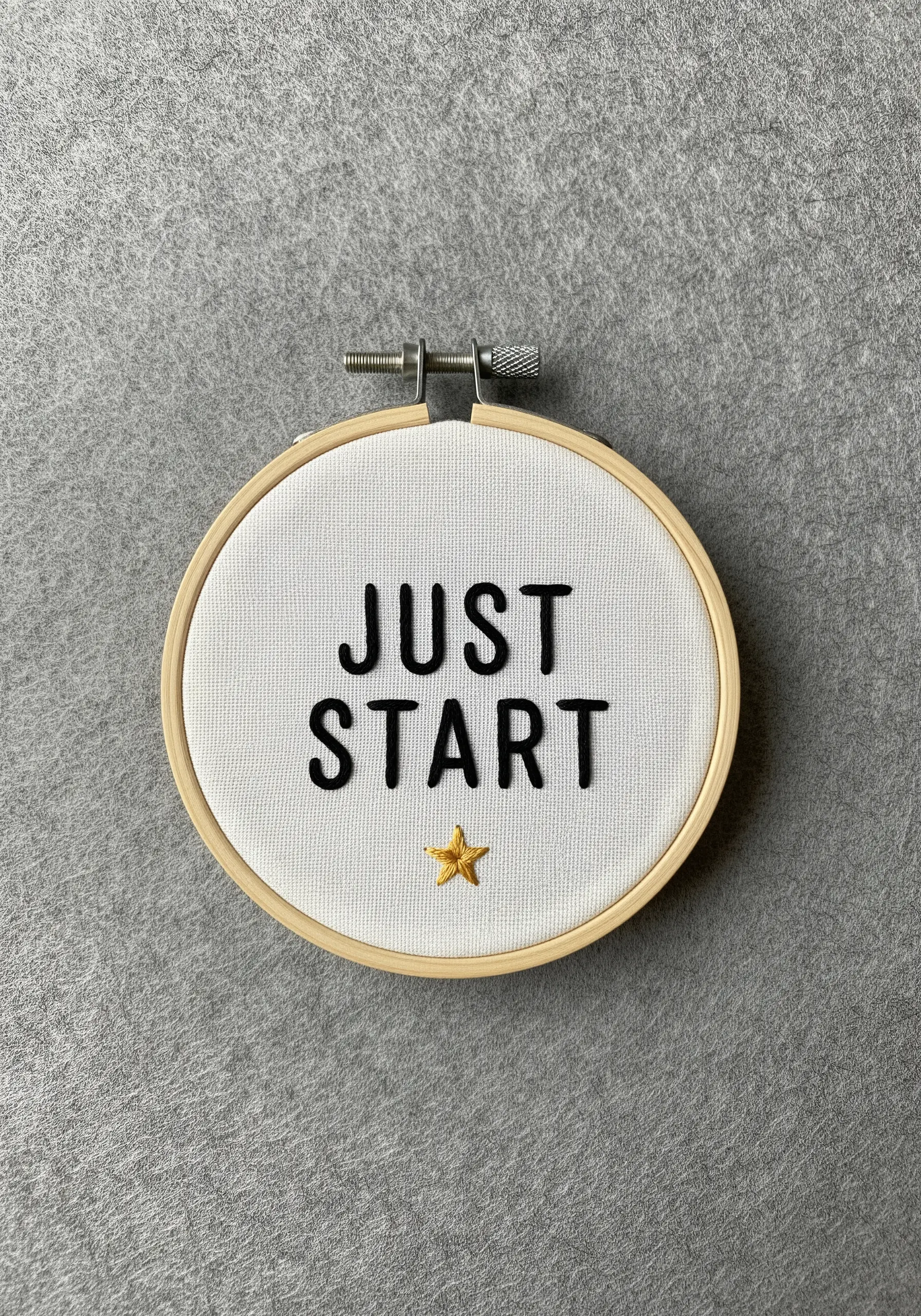
To make your letters pop with a three-dimensional effect, use a padded satin stitch.
First, outline each letter with a split stitch, then fill the inside with small, horizontal seed stitches before covering everything with your final vertical satin stitch.
This raised effect adds shadow and makes the text highly readable from across the room.
A single gold star, stitched with metallic thread, offers a tiny, motivating focal point that catches the light.
3. Match Stitch Style to Your Quote’s Meaning
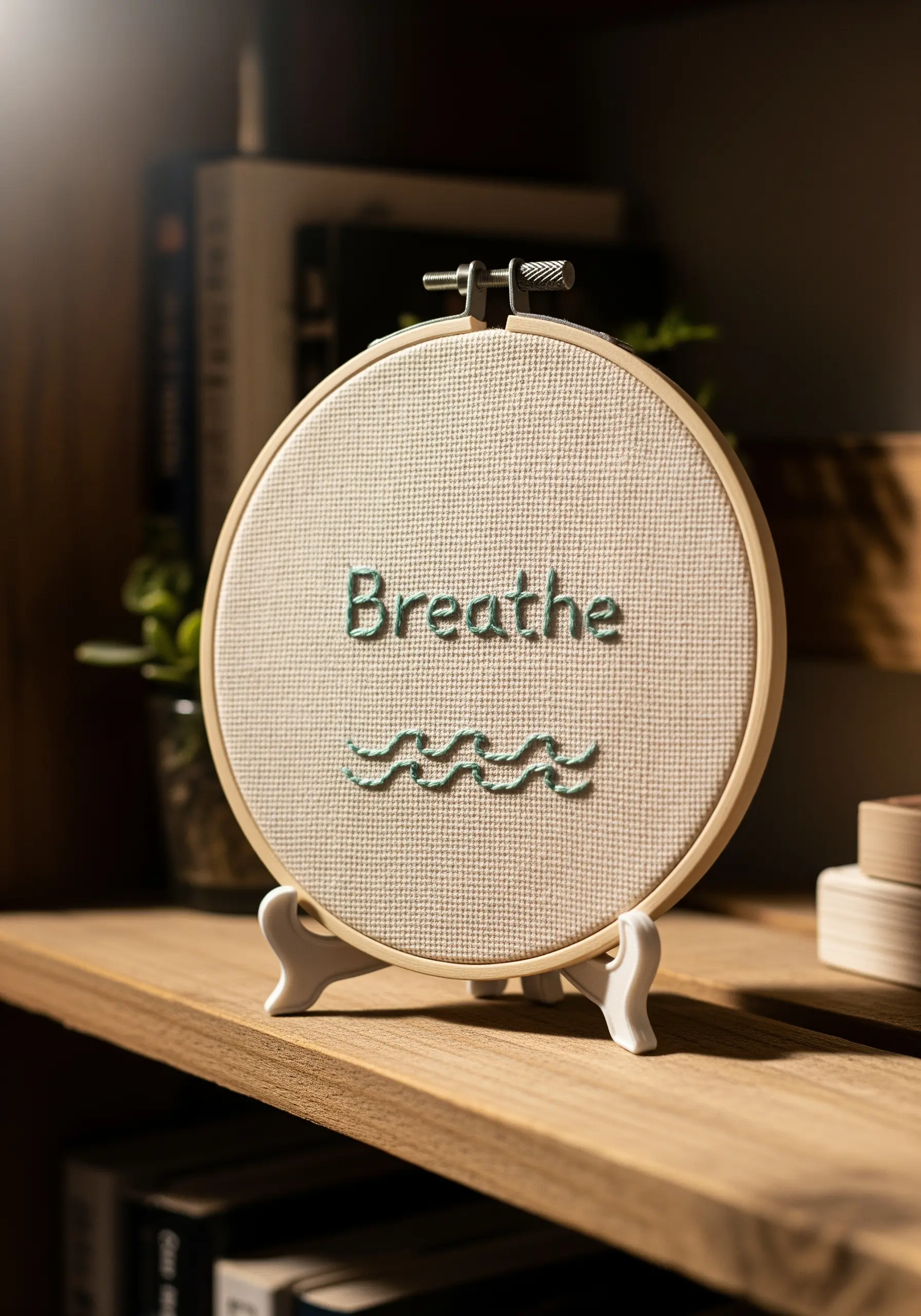
Let the texture of your stitches echo the word’s sentiment for a more cohesive piece of art.
For a word like “Breathe,” use a whipped backstitch for the letters to create a smooth, flowing line that feels effortless.
The waves below, formed with an interlaced backstitch, visually represent the gentle rhythm of breath.
This thematic consistency turns a simple word into a more thoughtful and meditative design.
4. Use Directional Satin Stitch for Dynamic Lettering
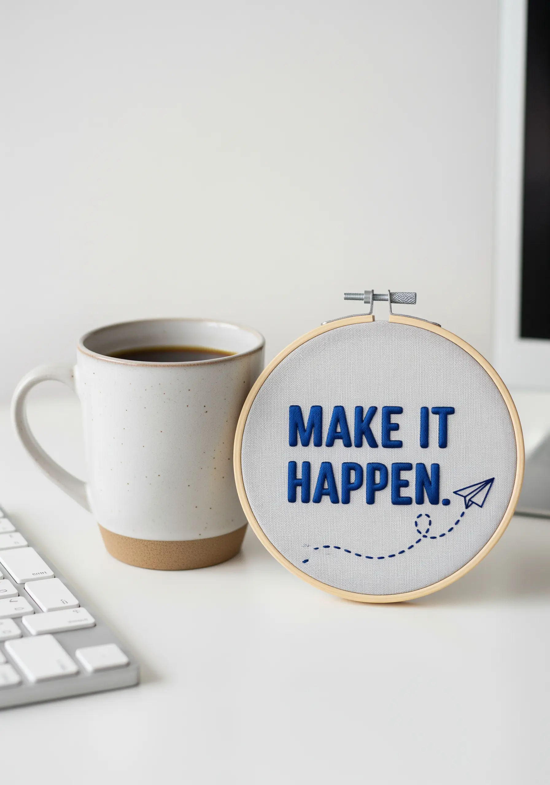
When filling bold, blocky letters, the direction of your satin stitch has a significant impact on the final look.
For a clean, graphic appearance, keep all your stitches perfectly vertical within each letter.
This discipline creates a uniform sheen and enhances the text’s strong, architectural quality.
The dashed line of the paper airplane, made with simple running stitches, adds a sense of movement and narrative that contrasts beautifully with the static text.
5. Integrate Icons into Your Lettering
Turn a simple word into a clever visual concept by adding or replacing a letter with a small icon.
Here, the lightbulb icon seamlessly extends from the tail of the ‘e’ in a continuous line.
Use a whipped backstitch or stem stitch for the cursive lettering to achieve smooth, graceful curves.
Outline the icon with a single strand of thread to keep its lines crisp and distinct, ensuring the idea is communicated clearly.
6. Master Single-Strand Outlines for Fine Details
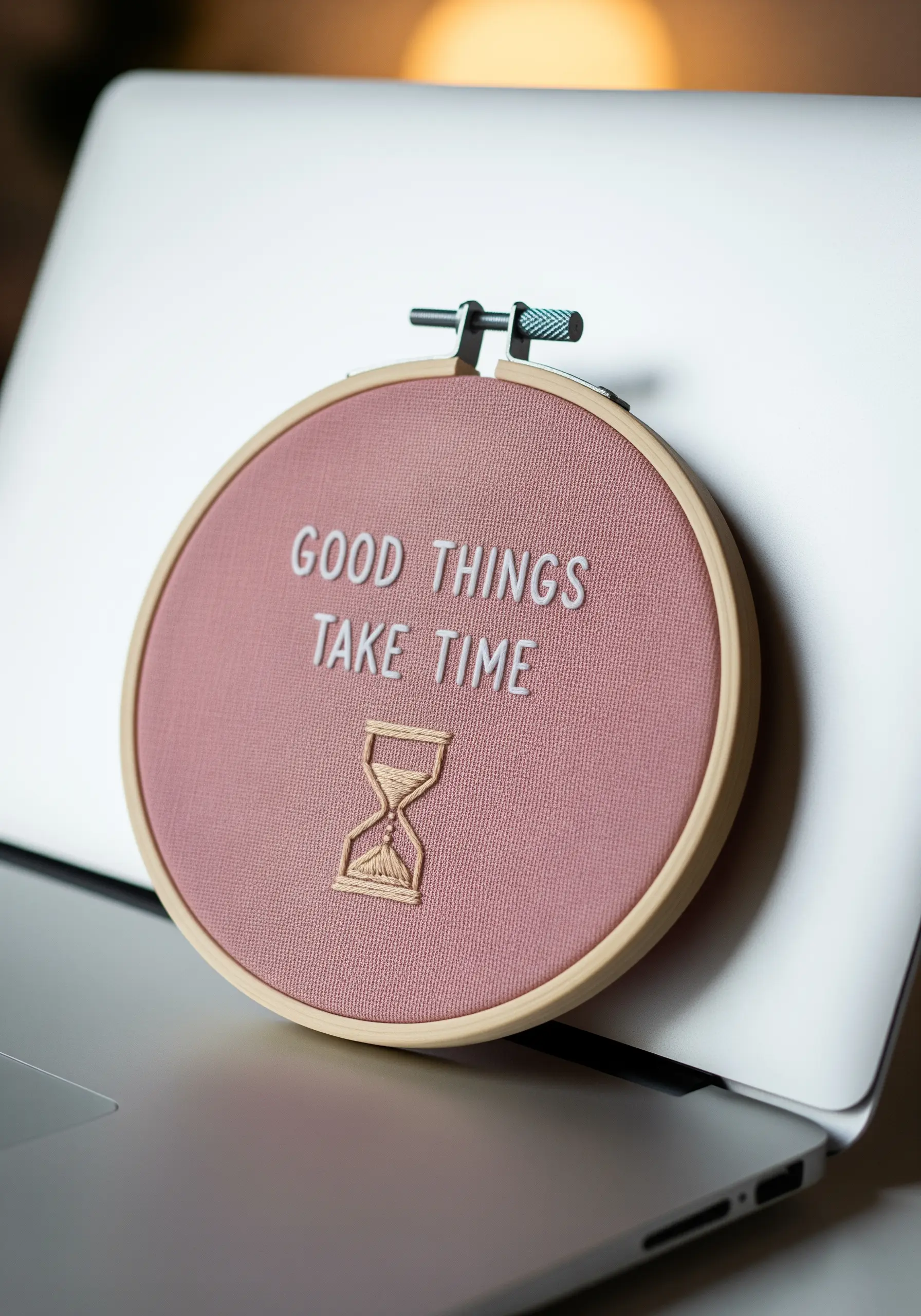
For intricate icons like an hourglass, resist the urge to use thick thread, which can obscure details.
Instead, work with a single strand of embroidery floss to achieve sharp, delicate lines that look refined and precise.
A simple backstitch is all you need for this technique.
This ensures your detailed motifs look elegant, not clumsy, and perfectly complement the clean lettering in your framed embroidery artworks.
7. Create Texture on Dark Fabric with Contrasting Threads
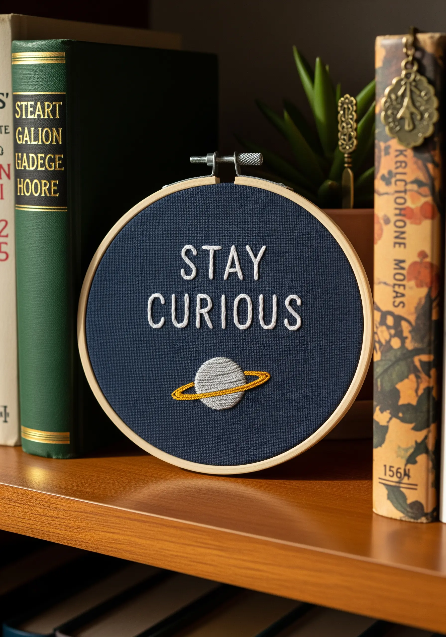
Make your design pop against a dark background by choosing contrasting colors and textures.
The crisp white of the lettering provides high visibility, while the densely filled planet becomes the focal point.
Fill the sphere with a light gray satin stitch, then wrap it with a bold gold ring using a whipped backstitch.
This contrast makes the celestial motif the undeniable star of the piece, drawing the eye immediately.
8. Use Fishbone Stitch for Natural-Looking Leaves
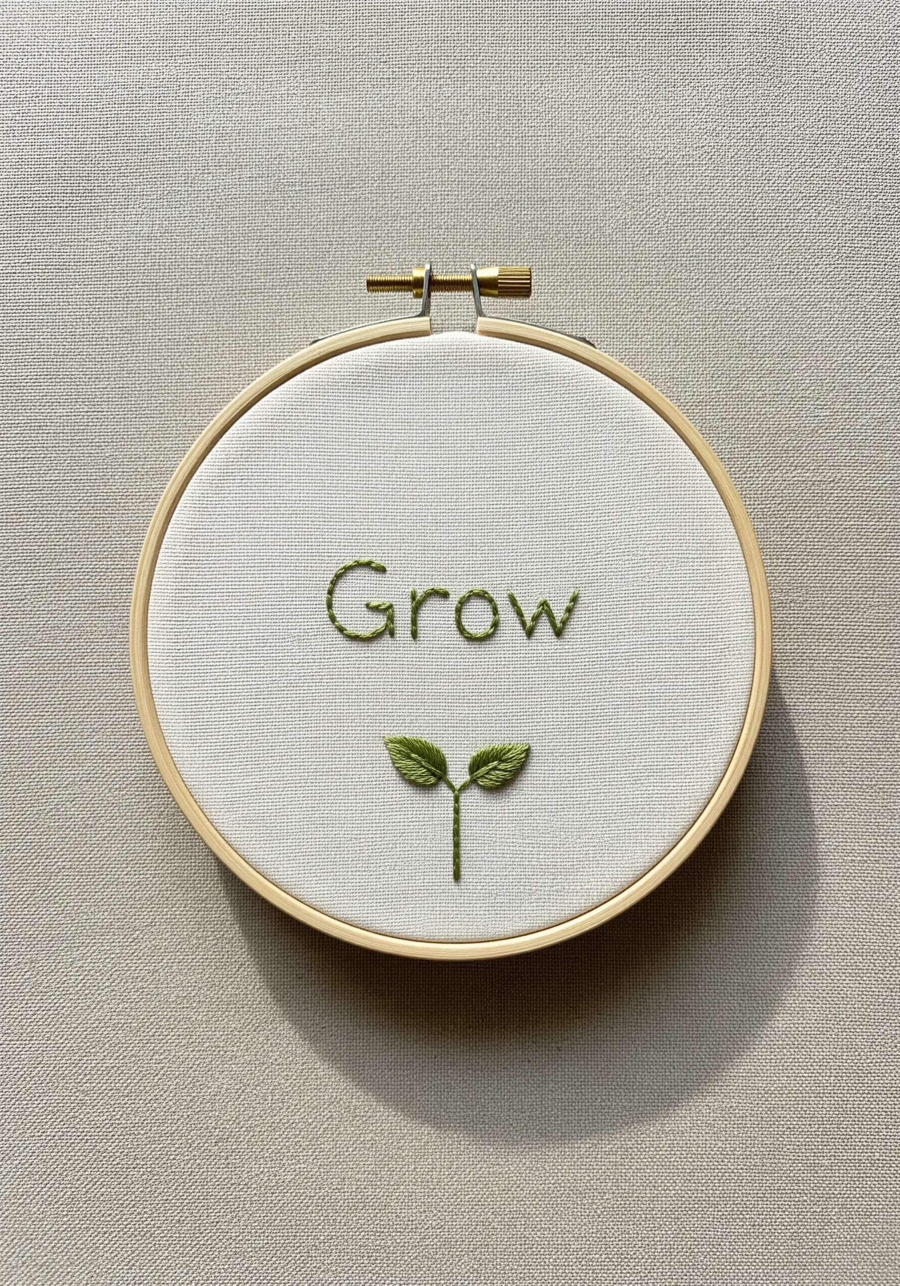
To give your botanical elements a natural, lifelike appearance, the fishbone stitch is your best choice for leaves.
This single stitch creates a central vein and angled sides in one fluid motion, perfectly mimicking the structure of a real leaf.
It provides texture and dimension that a simple satin stitch cannot replicate.
This is one of the most effective leaf embroidery stitches for adding realism to your work.
9. Achieve Graphic Impact with Minimalist Line Art

You don’t need dense, time-consuming stitching to create a powerful design.
A simple backstitch or stem stitch outline is perfect for creating graphic, illustrative motifs like these mountains.
Varying your stitch length adds a subtle, organic texture that suggests a rocky, uneven terrain.
This minimalist line art approach pairs beautifully with bold, filled lettering for a balanced and modern composition.
10. Soften Lettering with a Low-Contrast Palette

For a gentle, subtle message, choose a thread color that is only a few shades away from your fabric color.
This low-contrast approach creates a soft, almost ethereal look that feels calm and encouraging rather than demanding.
A tiny, brighter accent, like the simple sun icon stitched in a warm yellow, adds a touch of optimism without overwhelming the serene mood of the piece.
11. Create Delicate Texture with Fly Stitch Fronds
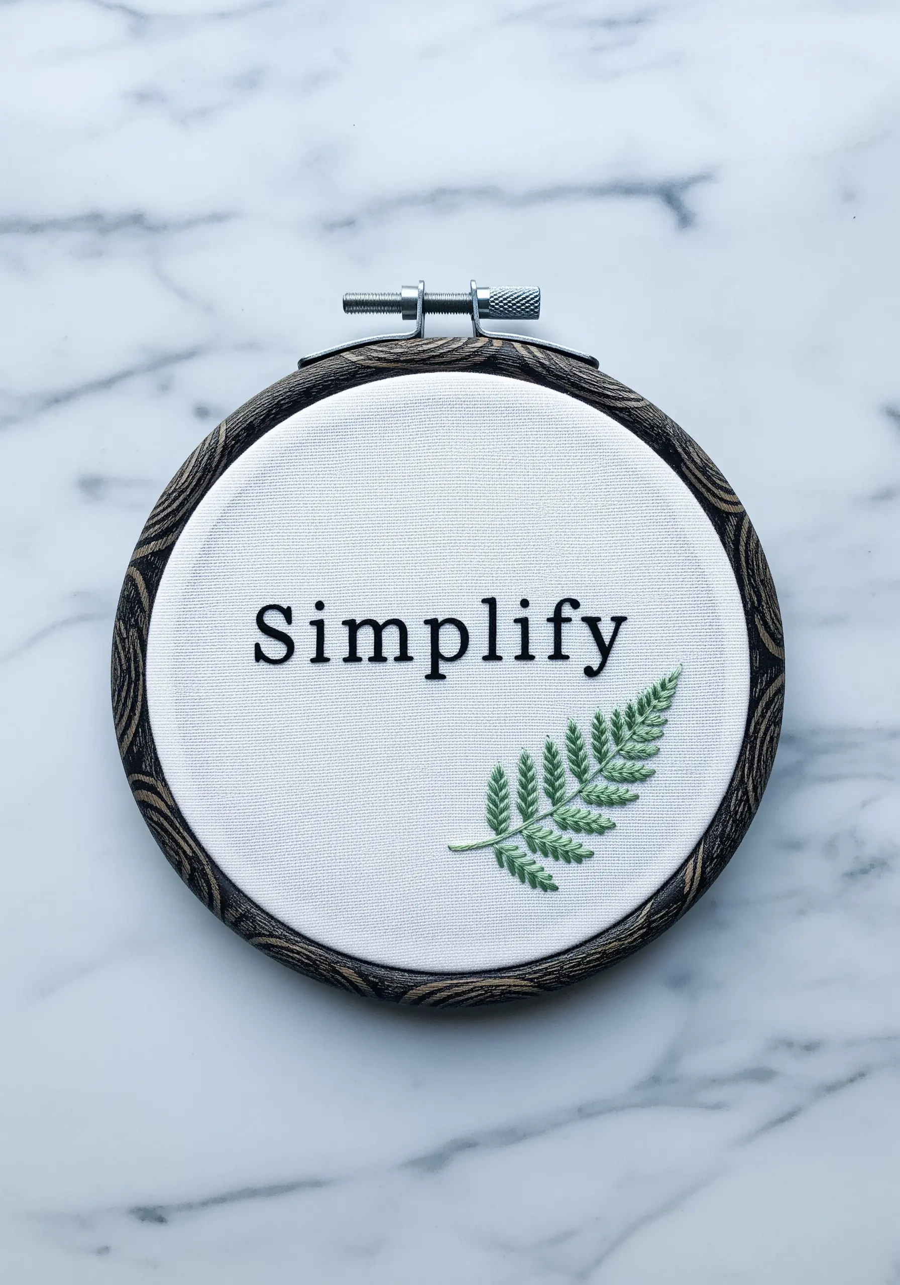
For complex botanical shapes like a fern, the fly stitch is an elegant and efficient solution.
Arrange individual fly stitches along a central stem stitch line to form the delicate fronds.
This technique is much faster than satin stitching each tiny leaf and results in a more realistic, airy texture.
It’s the perfect way to add lush, detailed foliage without overwhelming your design.
12. Introduce Mixed Media for a Playful Touch
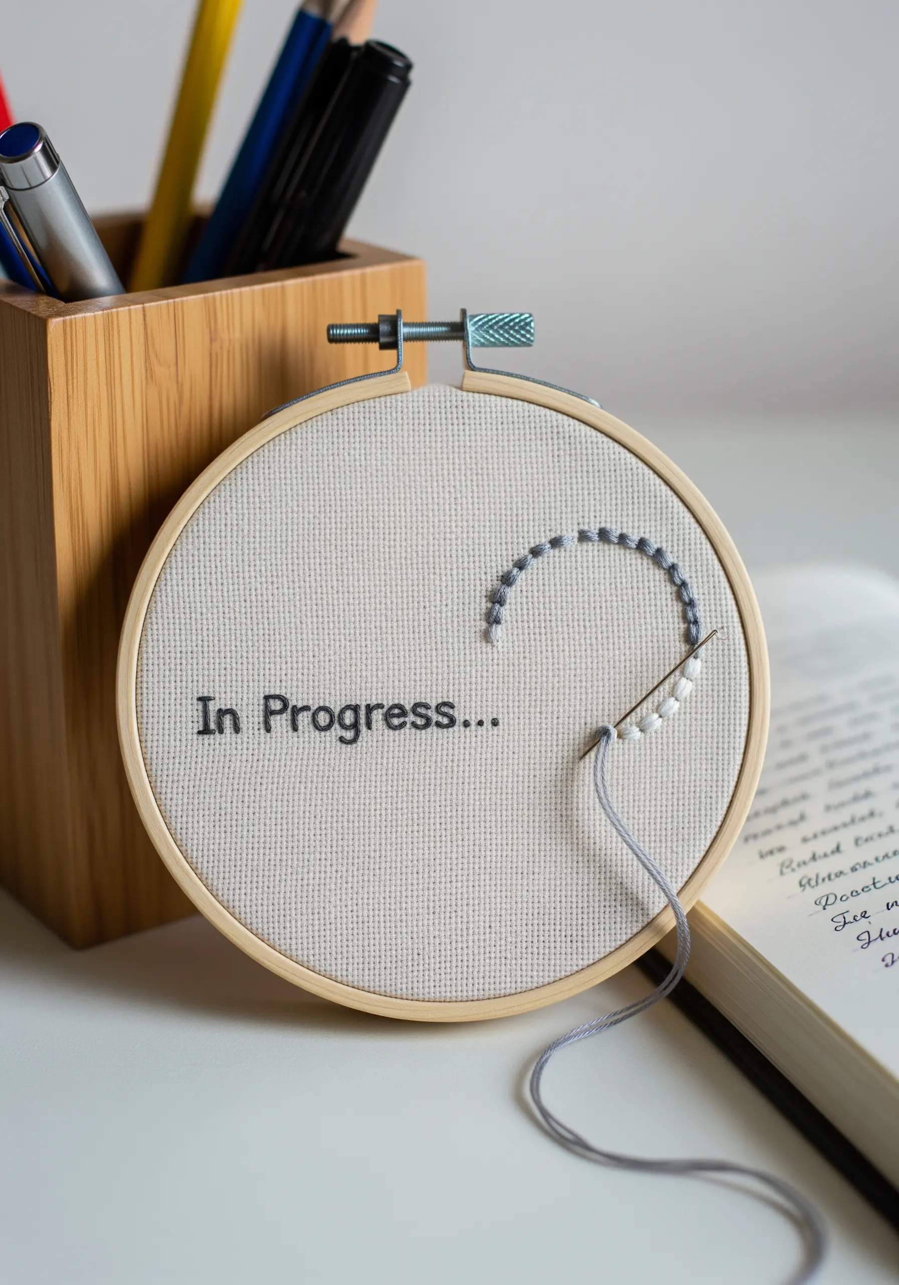
Elevate a simple concept by incorporating unexpected materials like beads.
A trail of beads stitched along a curved line playfully visualizes the idea of progress, adding a tactile dimension to the piece.
To secure beads, use a single strand of matching thread and pass through each bead twice for stability.
This mixed-media element adds texture, shine, and a touch of wit to your hoop art.
13. Use Negative Space to Guide the Eye
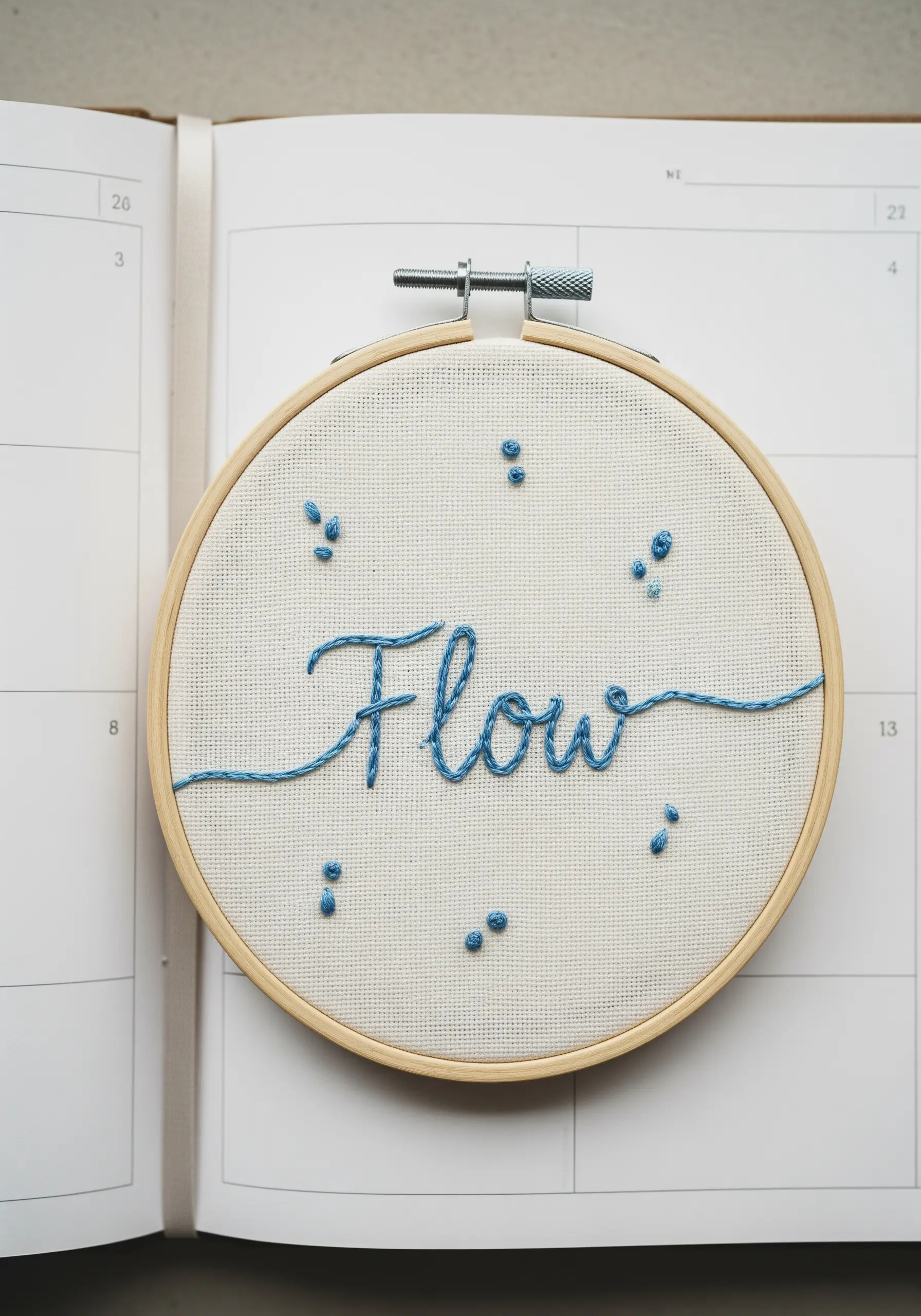
The unstitched areas in your design are just as important as the stitched ones.
In this piece, the cursive word “Flow” is balanced by small, scattered clusters of French knots.
The negative space between the elements creates a sense of movement and breathability, preventing the composition from feeling static.
Arrange the knots organically to enhance the feeling of natural, unrestricted flow.
14. Reinvent Punctuation with Tiny Stitched Motifs
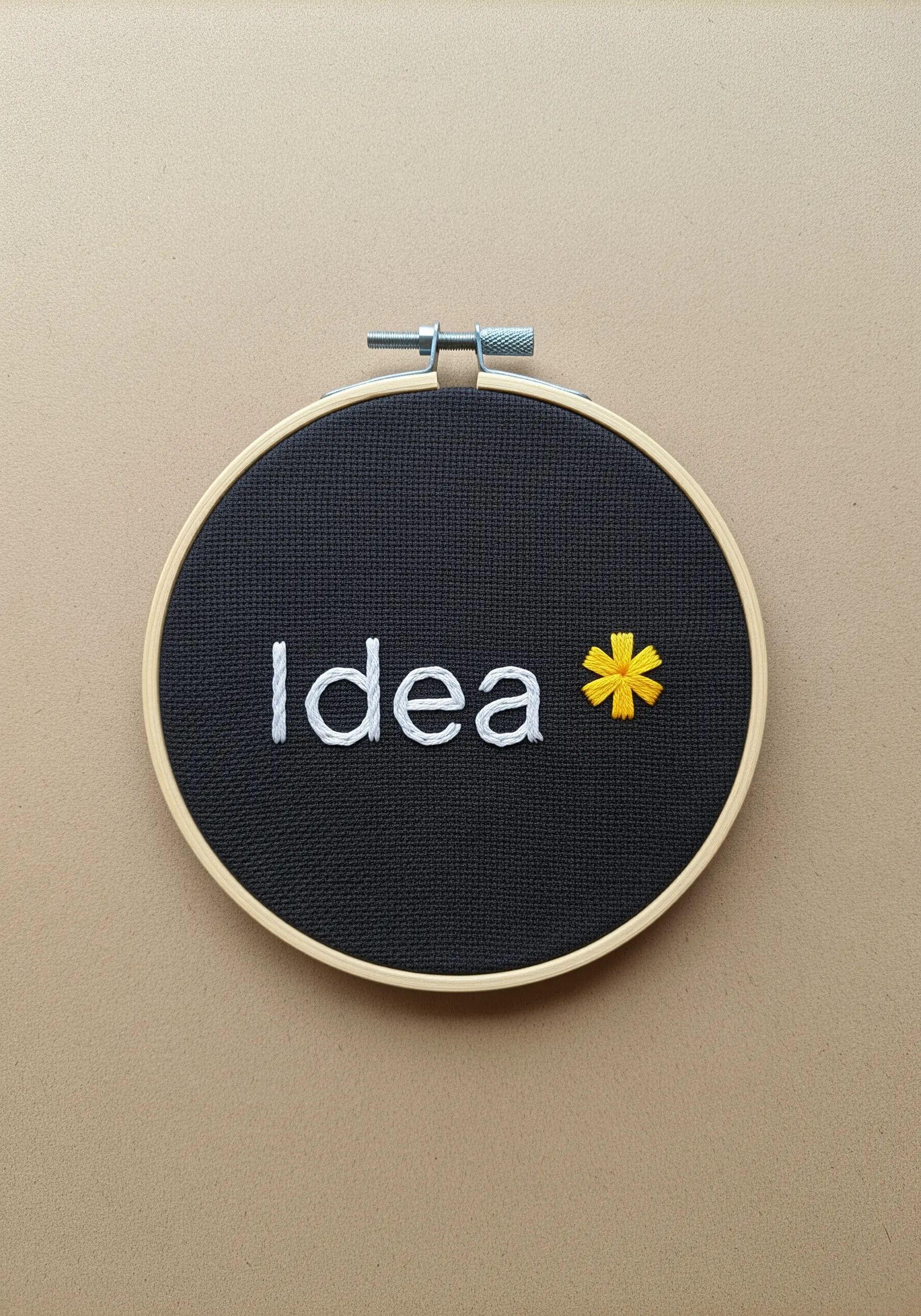
Add a clever twist to your text by replacing standard punctuation with a tiny, meaningful icon.
Here, a simple asterisk is transformed into a bright daisy using detached chain stitches for petals and a single French knot for the center.
This small detail turns a plain word into a charming statement and showcases your creative approach to design.
15. Create Depth with Overlapping Stitches
To give the illusion of dandelion seeds floating on a breeze, use a combination of straight stitches and detached chain stitches.
By slightly overlapping the ‘seeds’ and stitching them at different angles and densities, you create a convincing sense of depth and movement.
Place some stitches closer to the word and others further away to enhance the feeling of dispersal and release.
16. Harness the Power of Punctuation and Placement
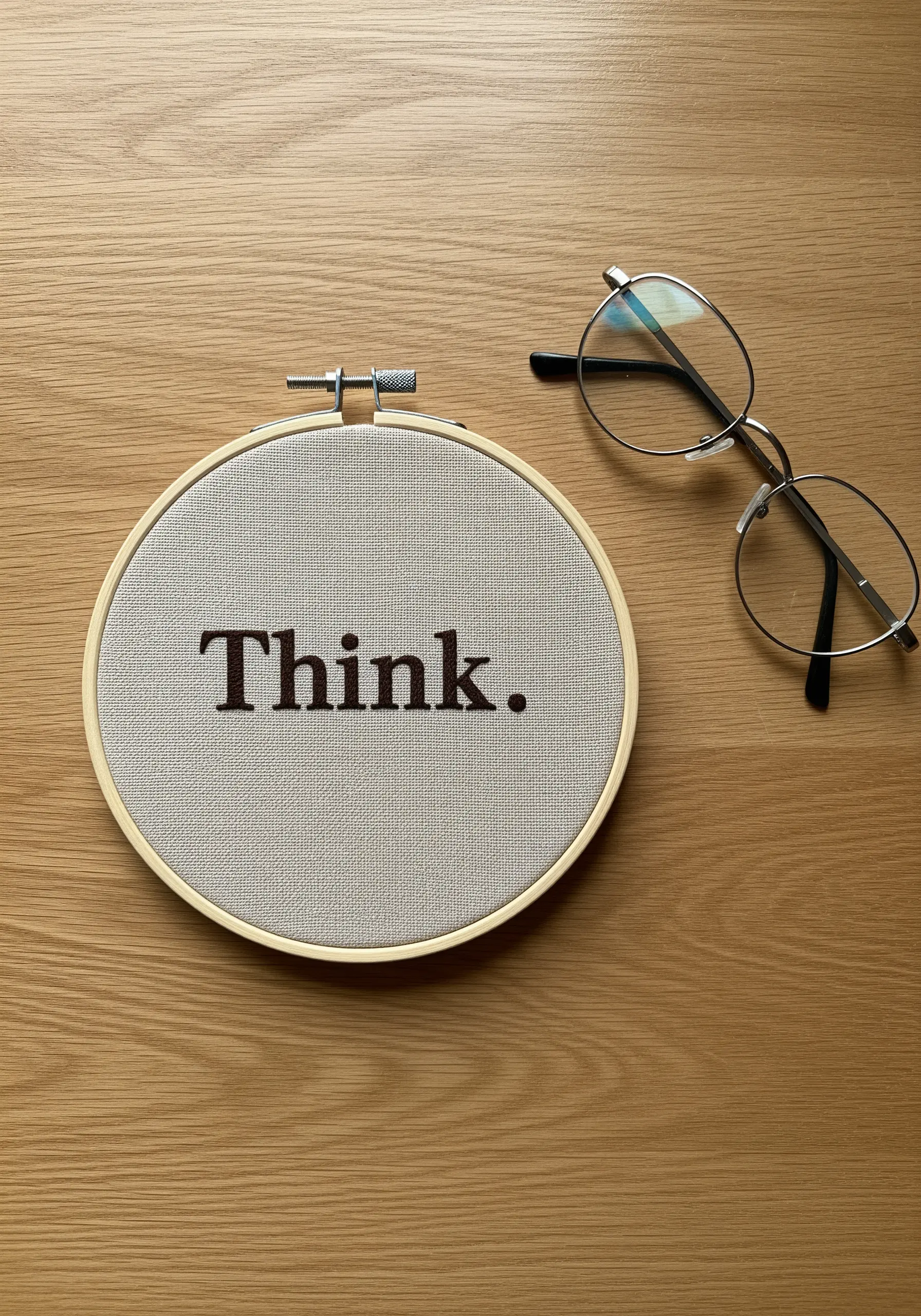
A single word can have immense impact through careful styling and precise placement.
The choice of a classic serif font gives “Think” a sense of authority and timelessness.
Adding a full stop grounds the word, turning it from a mere suggestion into a quiet, confident command.
Centering it perfectly within the hoop creates a balanced, meditative focal point for your desk.
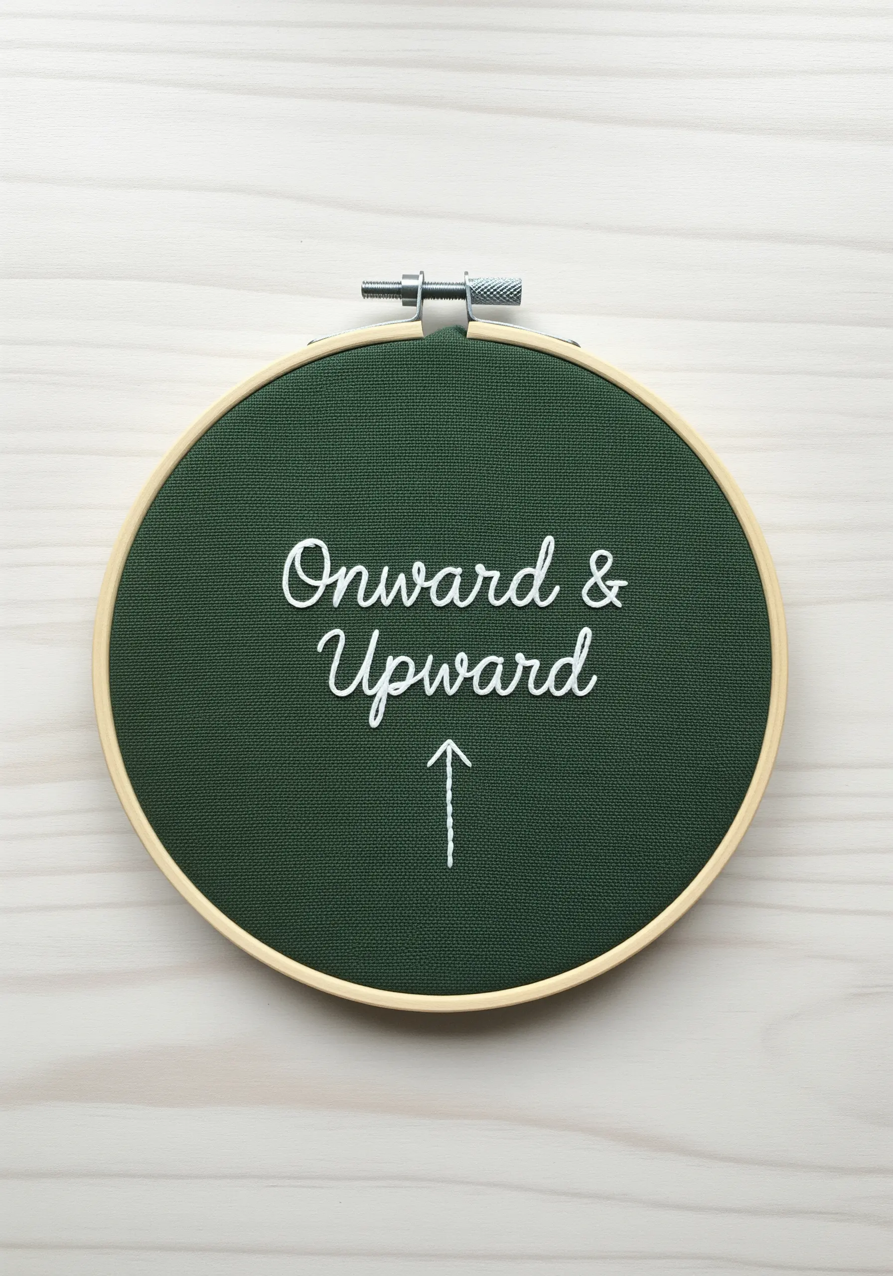
17. Balance Elegant Script with Clean Symbols
When pairing text with a symbol, ensure they complement rather than compete with each other.
The elegant, flowing script of “Onward & Upward,” stitched with a smooth whipped backstitch, is beautifully balanced by a simple arrow.
Stitching the arrow with a clean backstitch ensures its simplicity doesn’t detract from the decorative text, resulting in a cohesive and easily readable design.
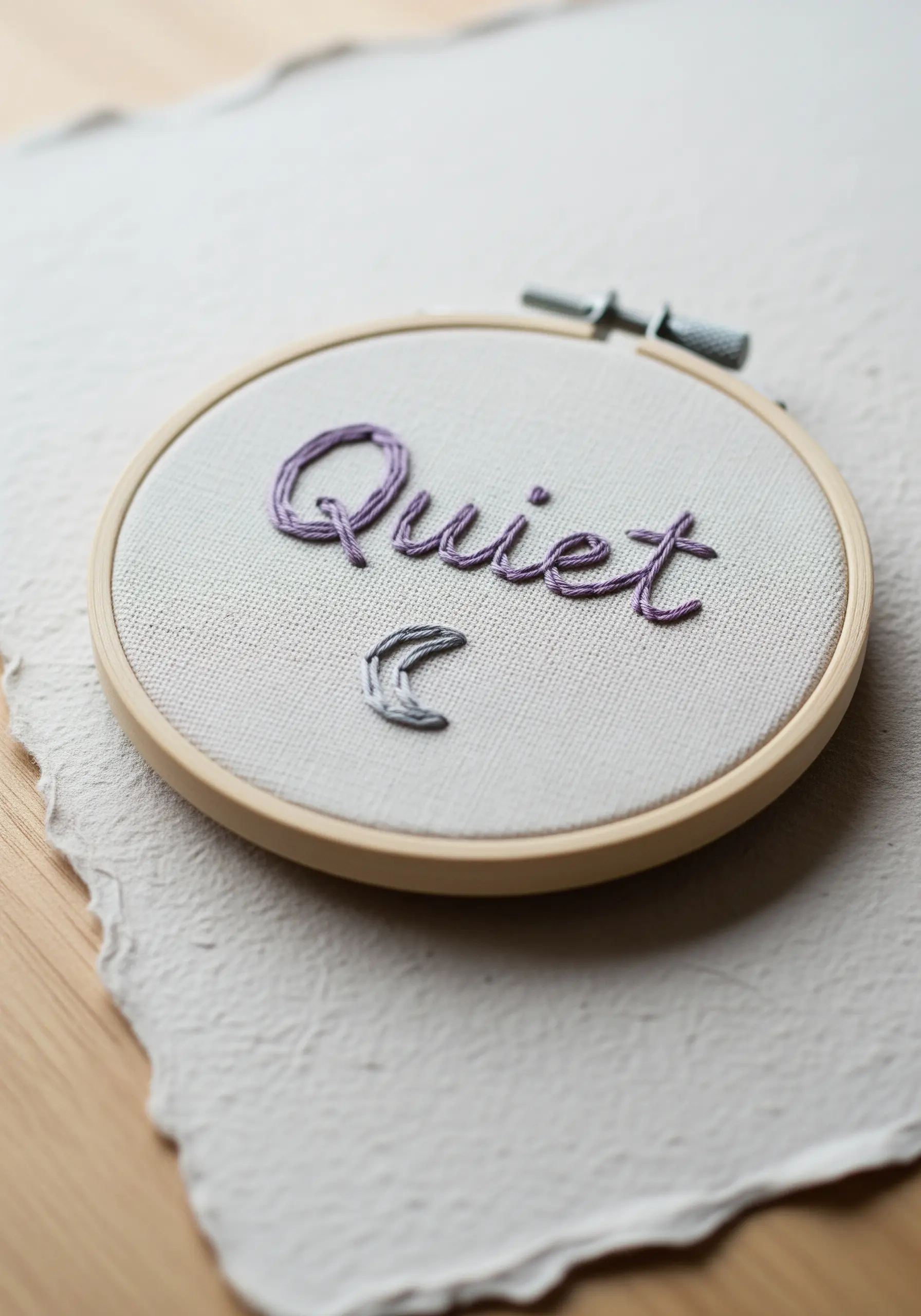
18. Use Variegated Thread for Subtle Color Shifts
For a touch of visual interest without the effort of changing colors, use a single variegated thread.
The gentle, unplanned shifts in tone within the purple floss add depth and a soft, watercolor-like effect to the lettering.
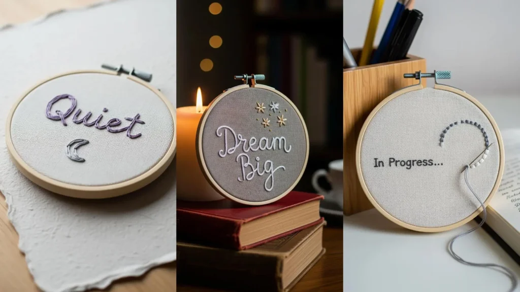
This is an excellent way to achieve a multi-tonal look with minimal effort, perfectly suited for a word that evokes a sense of calm like “Quiet.”
19. Frame Your Text with an Illustrative Border
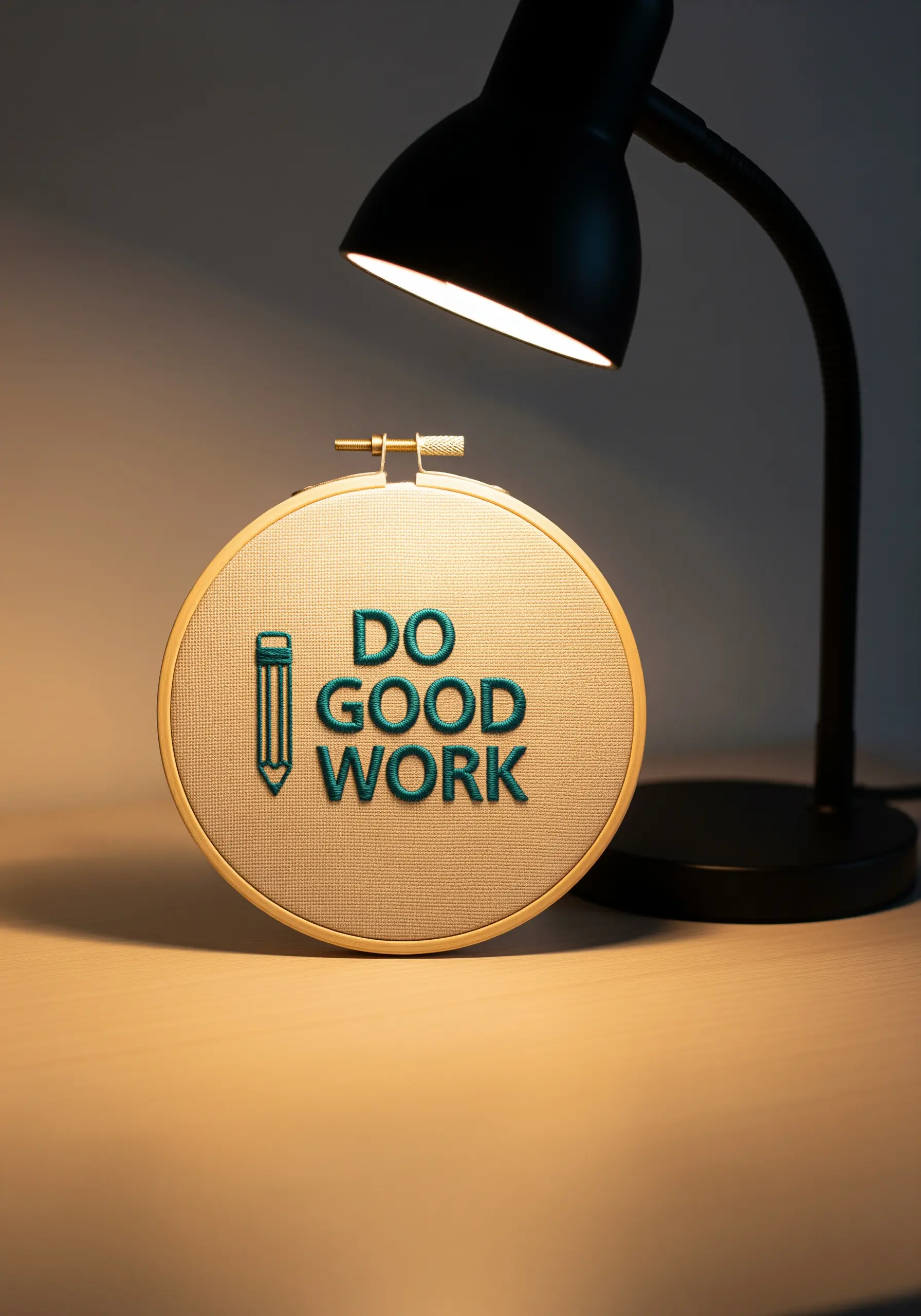
Give your quote context and visual structure by incorporating it into a simple line-art icon.
The pencil outline not only frames the text but also reinforces the “work” theme, turning the piece into a cohesive concept.
Use a split stitch for the outline to create a solid, stable line that contains the padded satin stitch of the letters, ensuring a clean and professional finish.
20. Achieve Elegance with Tone-on-Tone Stitching
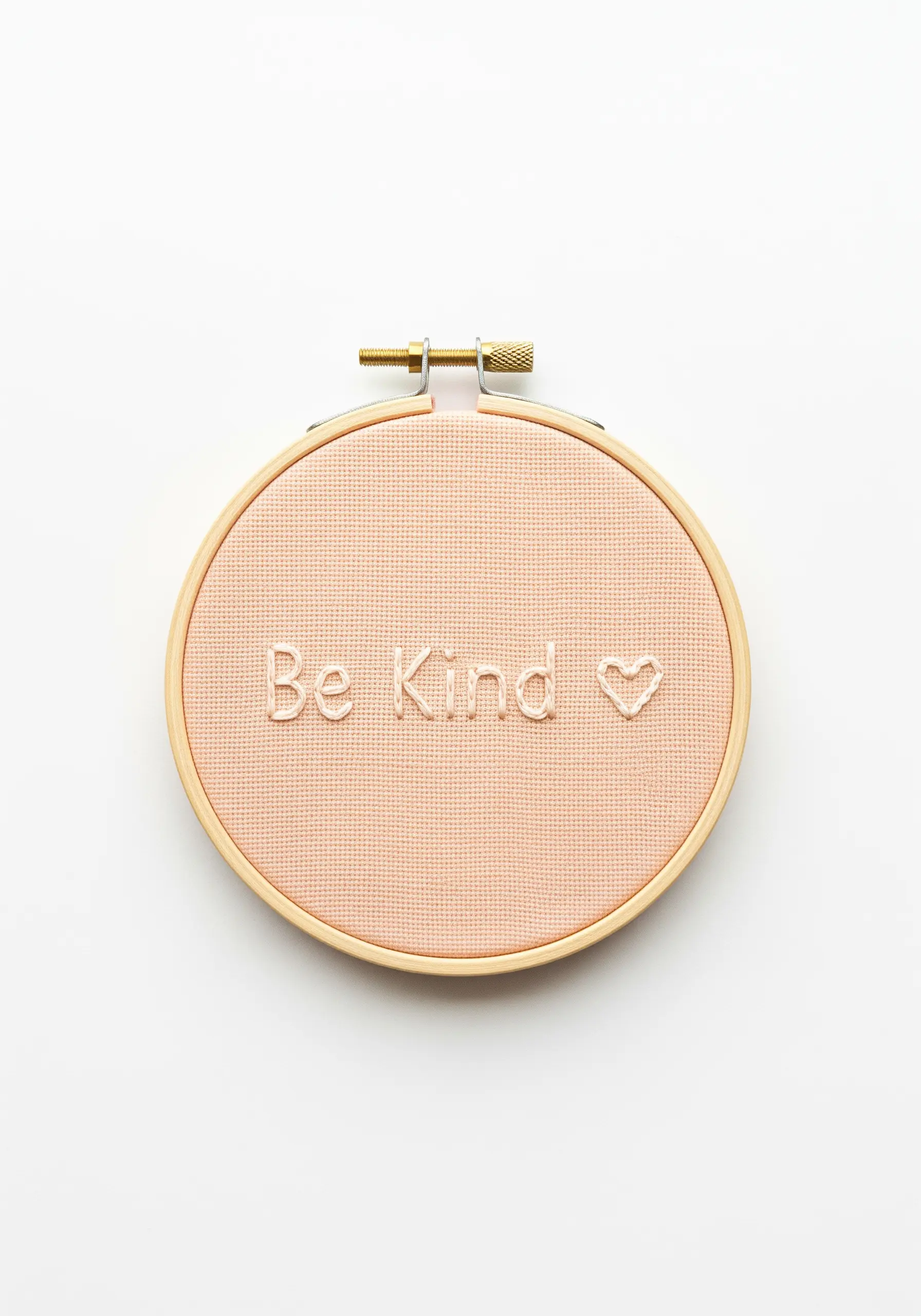
For an understated and sophisticated look, try a tone-on-tone color scheme.
Use a thread that is the same hue as your fabric but a few shades lighter, creating a beautifully subtle texture that reveals itself in the light.
The simplicity of a backstitch outline for the heart and letters is all you need for this high-end, minimalist effect.
21. Add Visual Energy with Dynamic Accents

Infuse your word with a sense of action by adding a sharp, graphic element.
The energetic lightning bolt at the end of “Hustle” visually transforms the word from a noun into a verb, a statement of intent.
Use a dense satin stitch for the bolt to give it the same visual weight and presence as the letters, creating a unified and powerful design.
22. Use Color Blocking for Typographic Emphasis
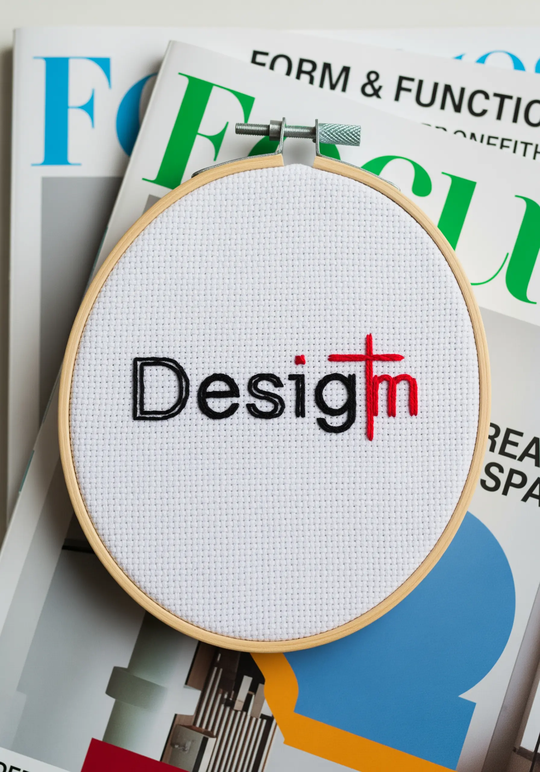
Draw attention to a specific part of a word or concept by using strategic color blocking.
Changing the thread color for one or two letters, as seen with the red cross in “Design,” creates an immediate focal point.
This simple technique adds a layer of conceptual depth, inviting the viewer to pause and consider the word’s meaning in a new way.
23. Visualize Concepts with Abstract Symbols
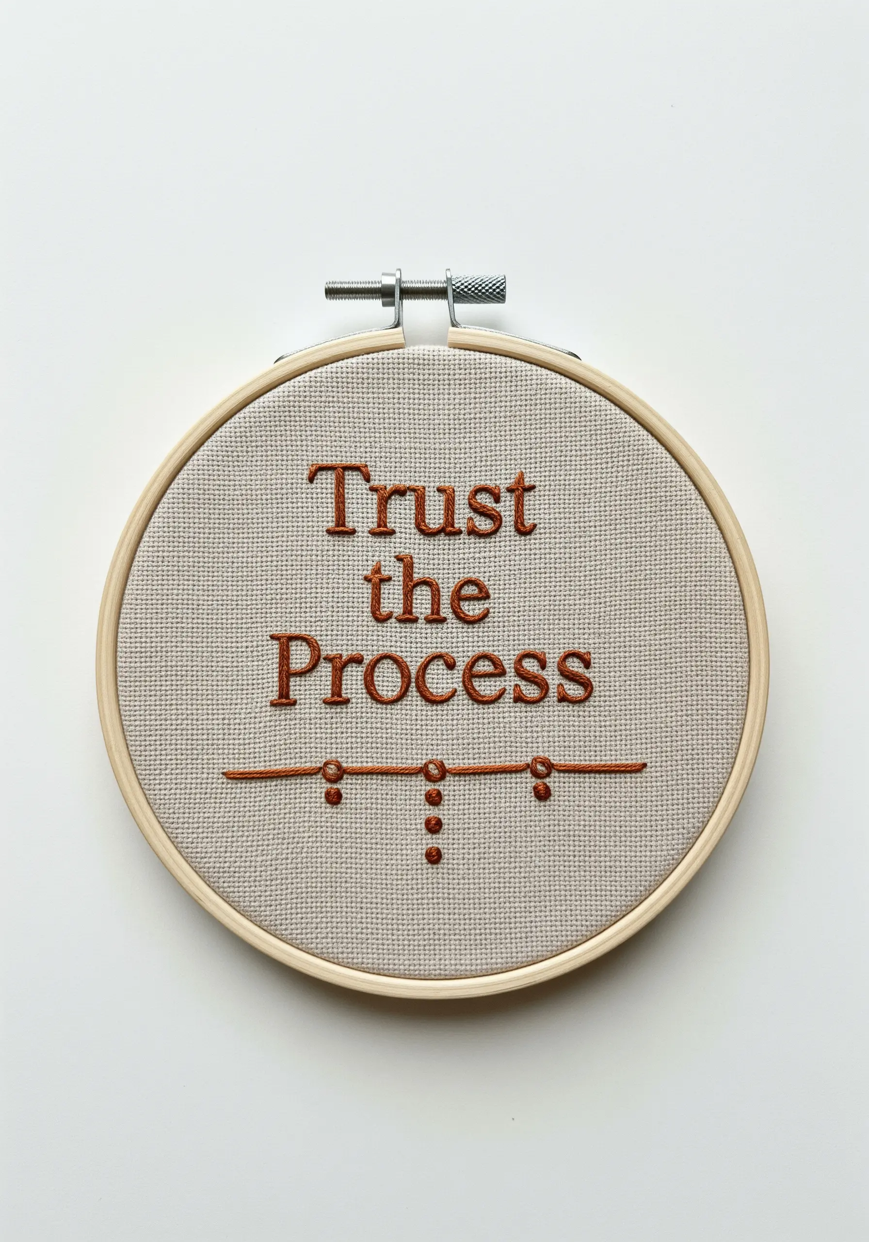
Represent an idea like “process” visually without resorting to a literal or cliché image.
The simple line punctuated by evolving clusters of French knots—from one to three and back to one—is a beautiful abstract representation of a journey’s phases.
This thoughtful use of simple stitches adds a deeper narrative layer to your quote, making it more personal and meaningful.
24. Anchor Delicate Script with a Single Motif
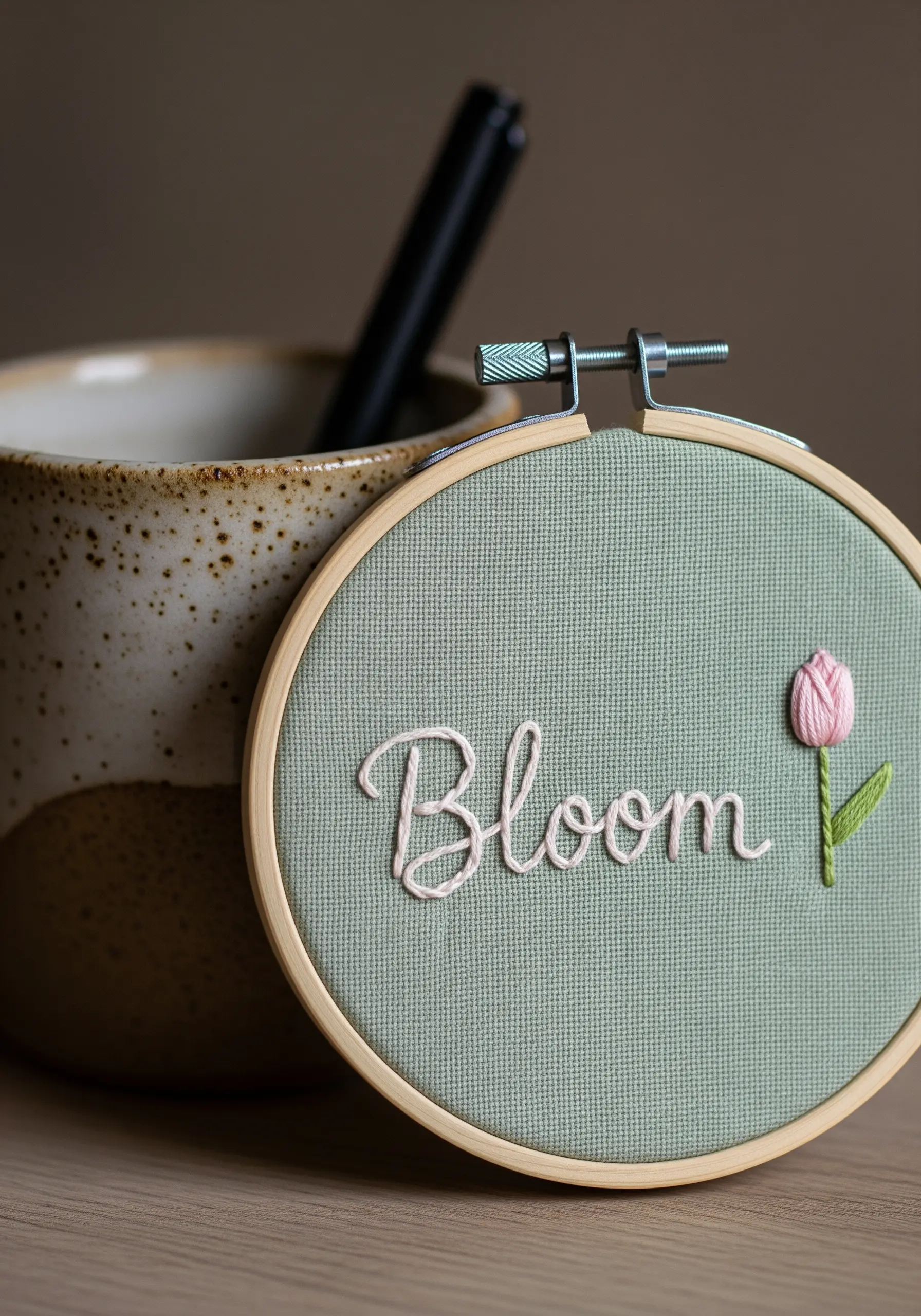
When you have fine, flowing cursive lettering, a single, well-placed motif provides the perfect visual anchor.
The small tulip, created with a satin-stitched bud and a simple stem stitch, balances the composition without overwhelming the elegant script.
This creates a harmonious design that feels complete and intentional, preventing the text from appearing to float aimlessly.
25. Add a Touch of Magic with Metallic Threads
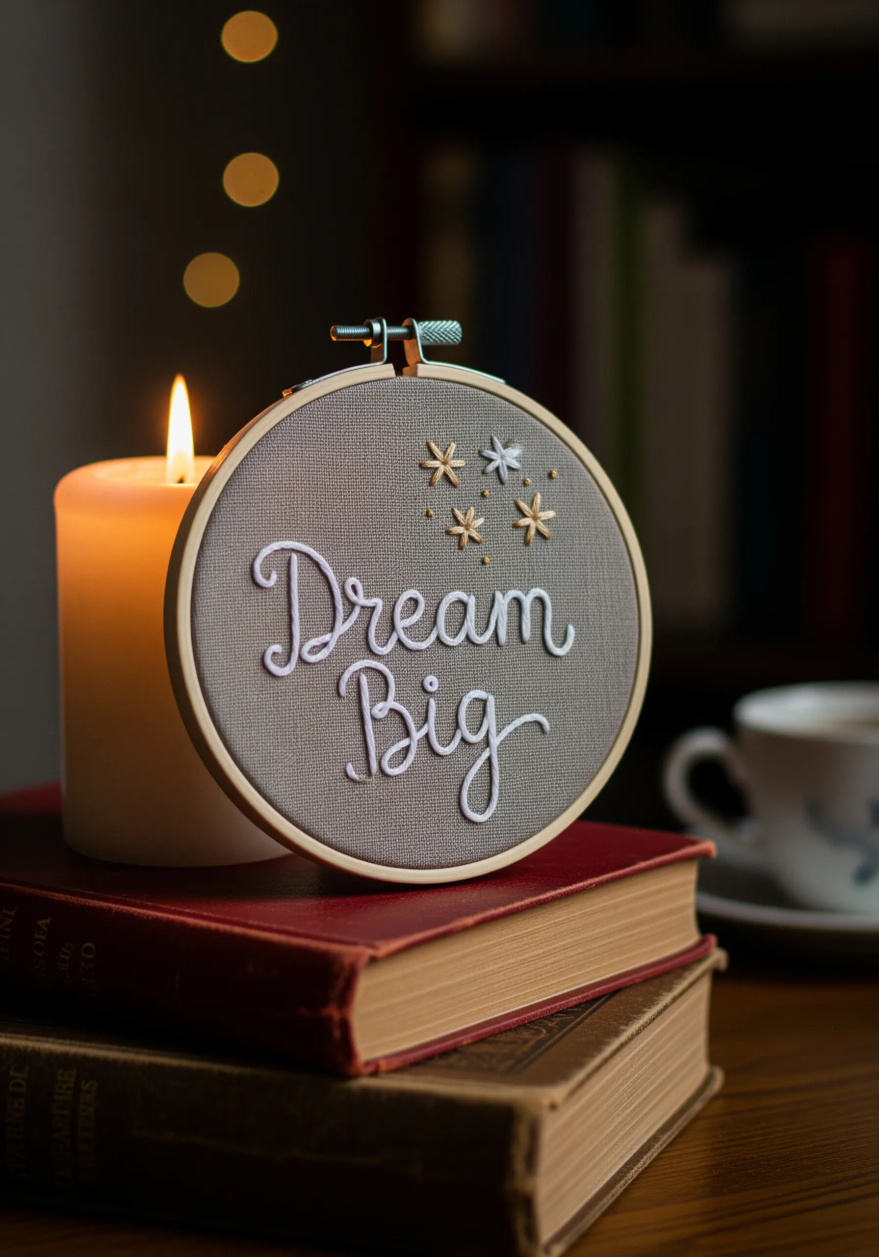
Elevate a simple design by incorporating metallic thread for key details.
The shimmering gold and silver of the stars create a striking contrast against the matte white lettering and the texture of the gray fabric.
To make stitching with metallic floss easier, use shorter lengths of thread and a thread conditioner like beeswax to prevent frustrating tangles and fraying.
26. Choose a Font That Reinforces Your Message
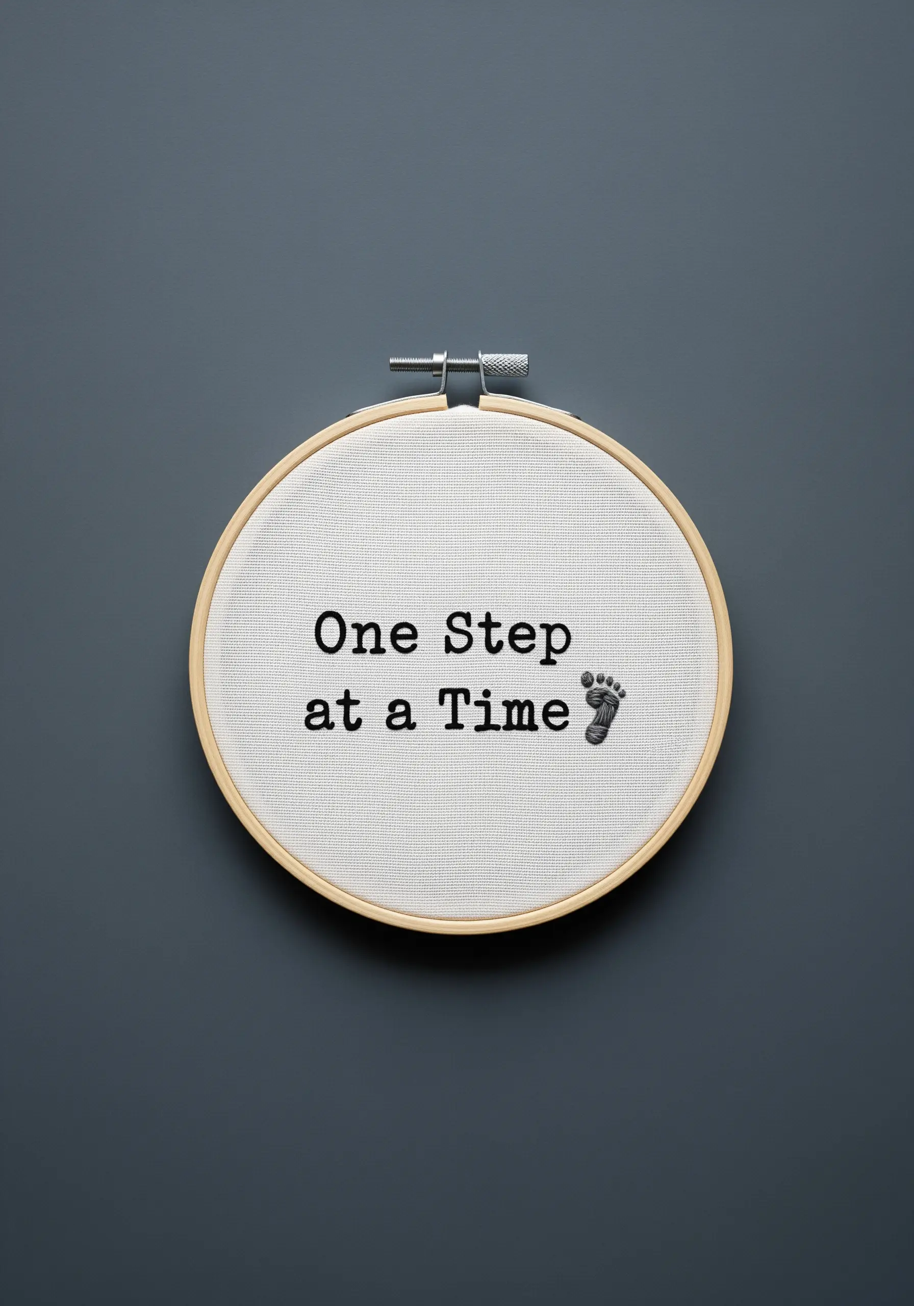
The font you choose is a key design element that communicates a specific mood.
A typewriter-style font evokes a sense of deliberation, patience, and tangible progress—perfect for the phrase “One Step at a Time.”
Paired with a simple footprint icon, the typography itself helps to tell the story.
Use a basic backstitch to replicate the clean, monospaced lines of the font with precision.
27. Tell a Story with a Single Continuous Line
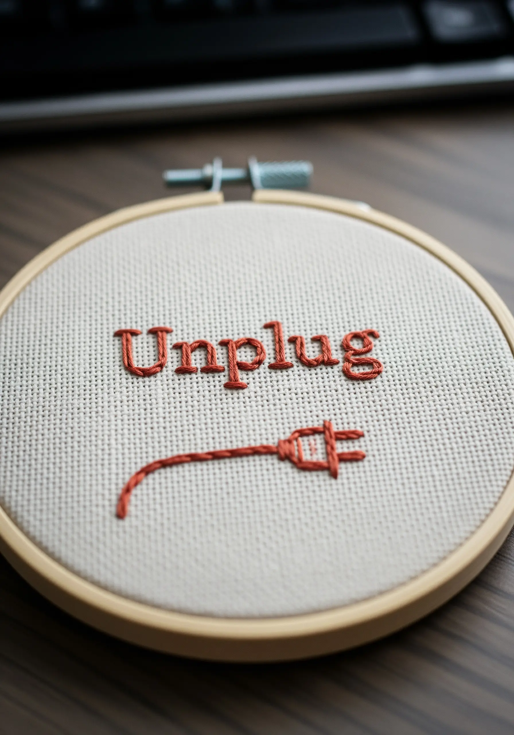
Use a single, unbroken line of stem stitch to create both your icon and its connecting ‘cord.’
This technique creates a fluid, cohesive look that cleverly ties the word to its visual representation.
The simplicity of the line drawing puts the focus squarely on the message, making it instantly understandable and graphically appealing.
It’s a smart way to create a dynamic design with minimal stitching.
28. Maximize Impact with Bold, Minimalist Typography

Sometimes, the most powerful statement you can make is the simplest one.
A single, bold word stitched in a high-contrast color like black on white creates an undeniable focal point.
Use a dense, padded satin stitch to give the word “Now” a strong physical presence that feels solid and intentional.
The complete lack of any other embellishment ensures the message is direct, clear, and urgent.