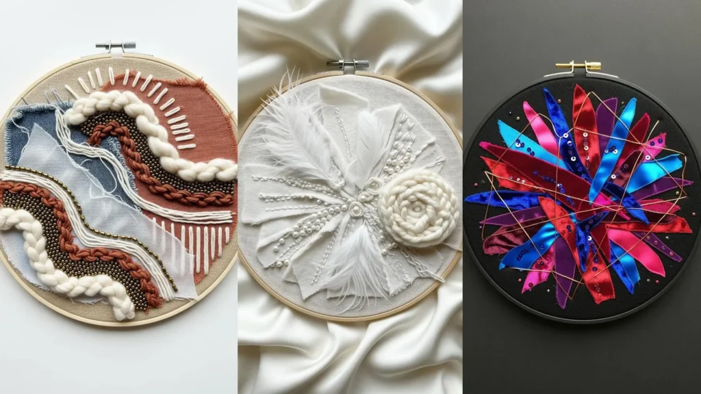

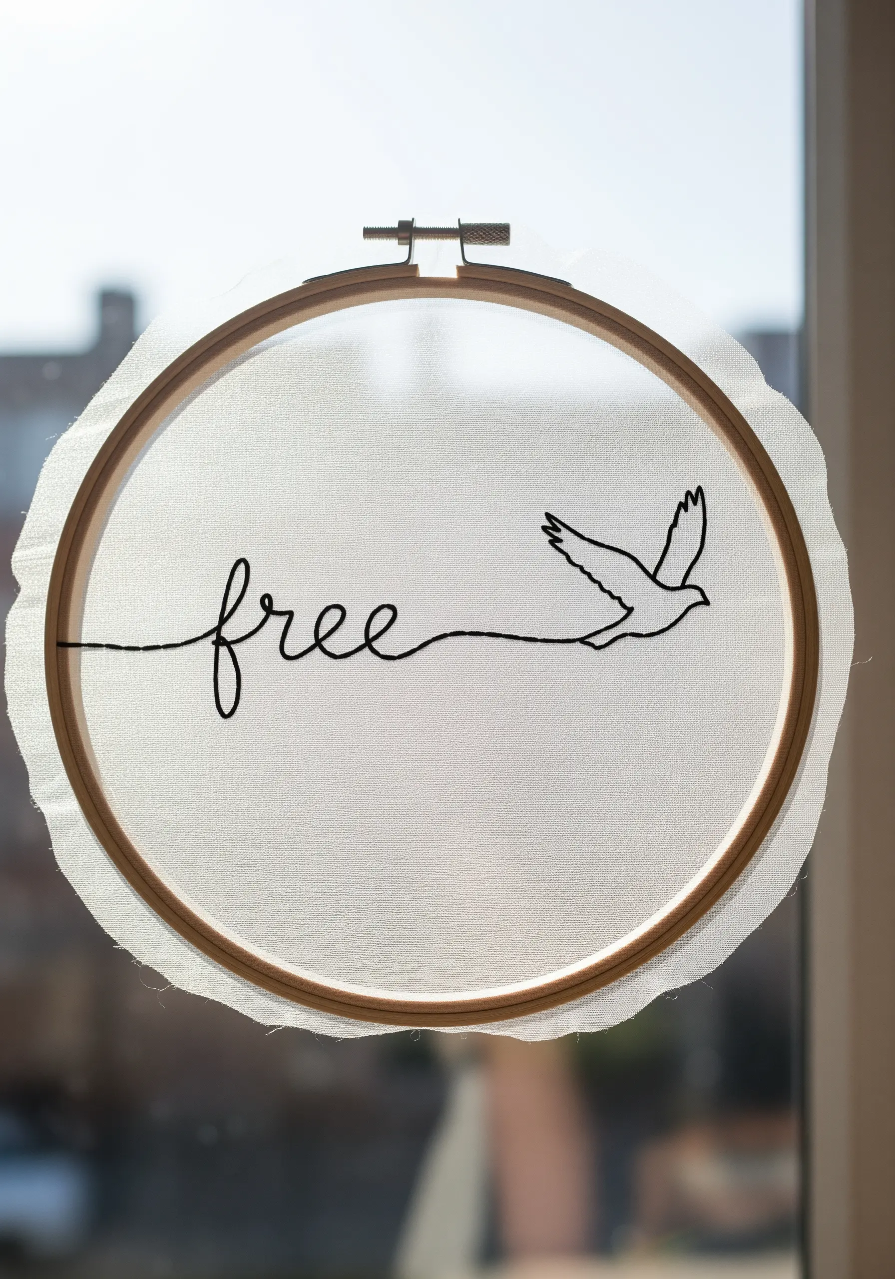
Sometimes the most profound statements are made with the fewest words. In embroidery, this is where the simple power of line art truly shines. It allows you to move beyond decorative stitching and towards creating something deeply personal, a quiet anchor for yourself or a meaningful gift for someone you care about.
Think of your thread as a pen, and the fabric as a page. A single word, when paired with a thoughtful symbol, transforms into a personal mantra, a gentle reminder, or a cherished memory. This isn’t about complexity or technical perfection; it’s about intention. It’s about the quiet moments spent pulling thread, embedding a feeling into the cloth with each stitch.
These ideas are designed to be both simple and significant. You’ll see how a small adjustment in stitch direction, a subtle color choice, or a clever placement can elevate your work from a craft project to a piece of personal art. Let this be your permission to start simply, stitch thoughtfully, and create something that feels like a true reflection of the heart.
1. The Art of the Continuous Line
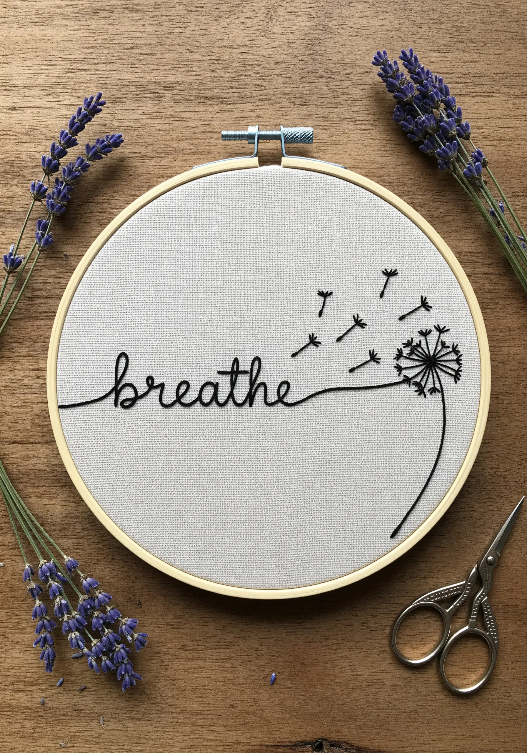
Create the illusion of a single, unbroken pen stroke by using a whipped backstitch for your cursive lettering.
First, lay down a standard backstitch, then whip the thread around each stitch without piercing the fabric, smoothing the line into a fluid curve.
For the delicate dandelion seeds, use single, detached straight stitches to give them a weightless, floating quality against the tight weave of the linen.
This contrast between a solid line and scattered elements creates visual rhythm and a sense of calm release.
2. High-Impact Satin Stitch on Denim
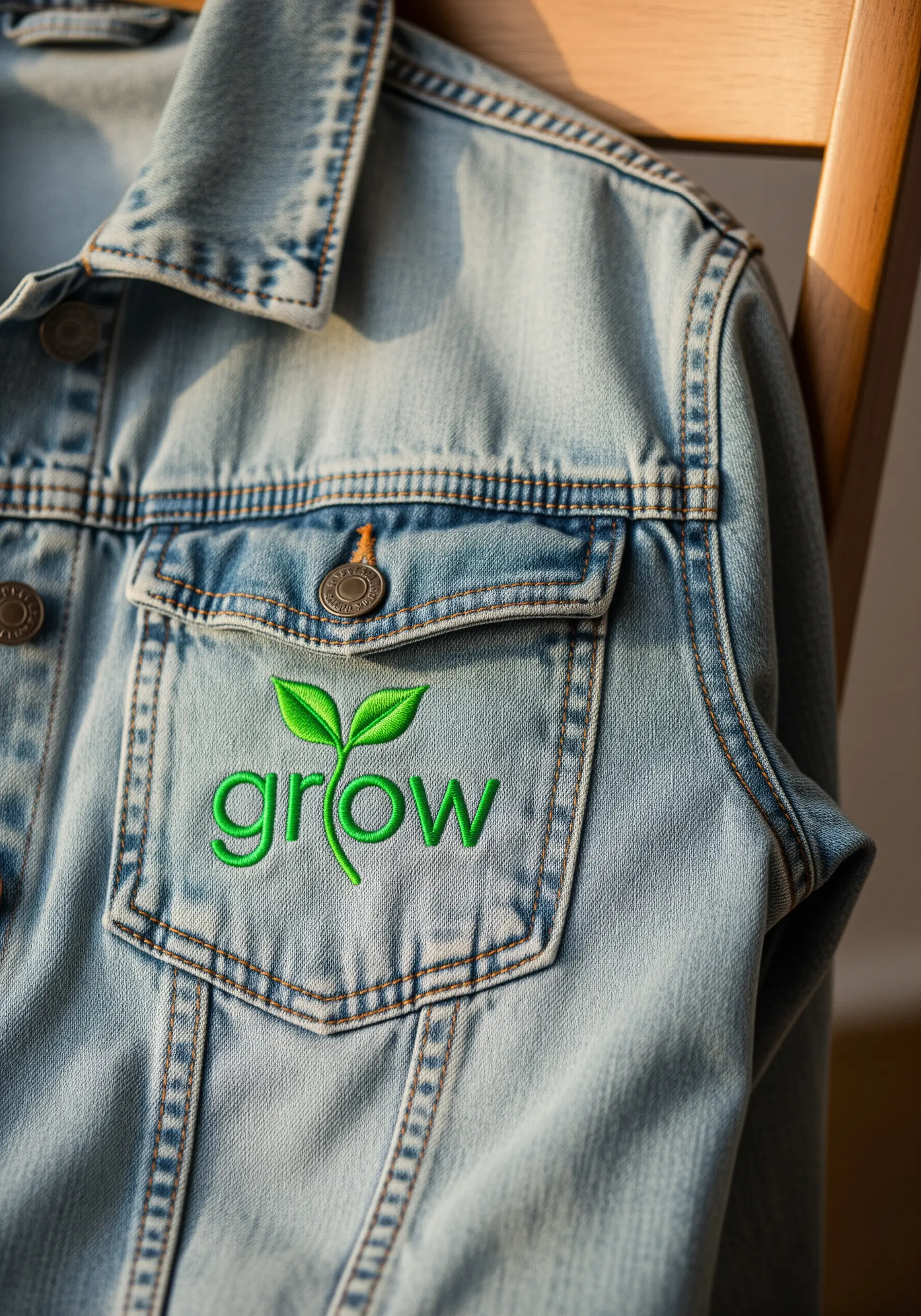
To make your embroidery pop on a textured surface like denim, use a padded satin stitch for the letters.
First, create a foundation of small running stitches within the shape of each letter, then cover it with your satin stitch.
This simple step raises the final stitches, catching the light and creating a clean, dimensional effect that won’t get lost in the fabric’s weave.
For the leaves, use a fishbone stitch to create a subtle, realistic center vein, adding a touch of organic detail to the graphic text.
Always use a cut-away stabilizer on the back of denim to prevent puckering and support the weight of the dense stitching.
3. Achieving Graphic Precision
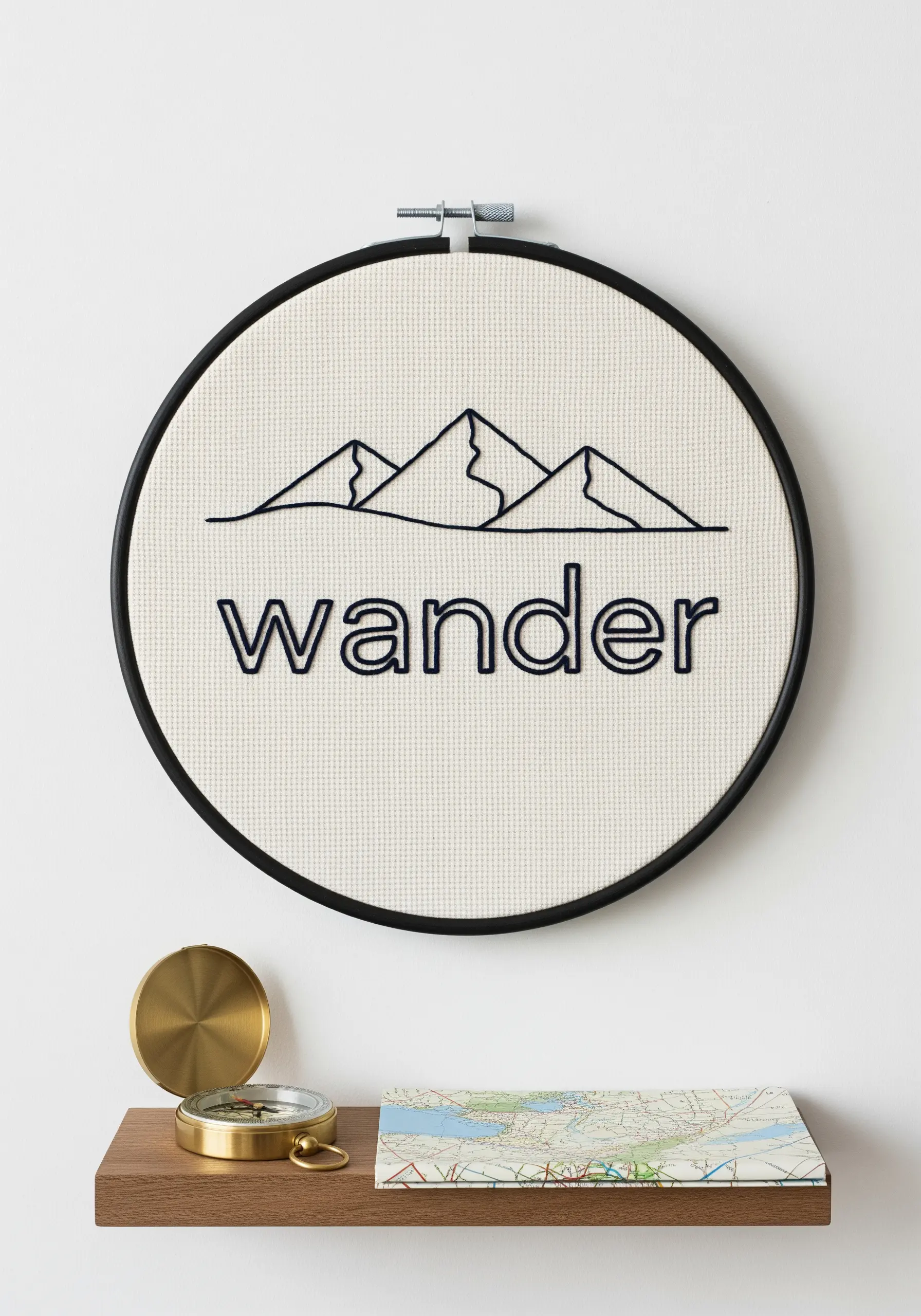
For crisp, geometric designs like these mountain peaks, outline the entire shape with a split stitch before filling.
This technique creates a firm, slightly raised edge that acts as a boundary, allowing you to tuck your fill stitches neatly inside for perfectly sharp lines.
Use a thick, bold backstitch or a two-strand stem stitch for the ‘wander’ text to match the weight of the mountain outline.
Stitching on an Aida or evenweave fabric provides a natural grid, helping you keep your lines straight and your angles precise.
4. The Power of a Single Metallic Accent

Elevate an ultra-minimal design by introducing a single, unexpected element of metallic thread.
Stitch the word with a single strand of black floss using a delicate backstitch for a whisper-thin line.
For the star, switch to a gold metallic floss and use five straight stitches originating from a central point to form the shape.
This tiny touch of shine draws the eye and adds a layer of significance without cluttering the composition, proving that restraint is a powerful design tool.
Place it on a soft, textured background like this knit fabric to enhance the cozy, hopeful feeling.
5. Mastering Directional Satin Stitch
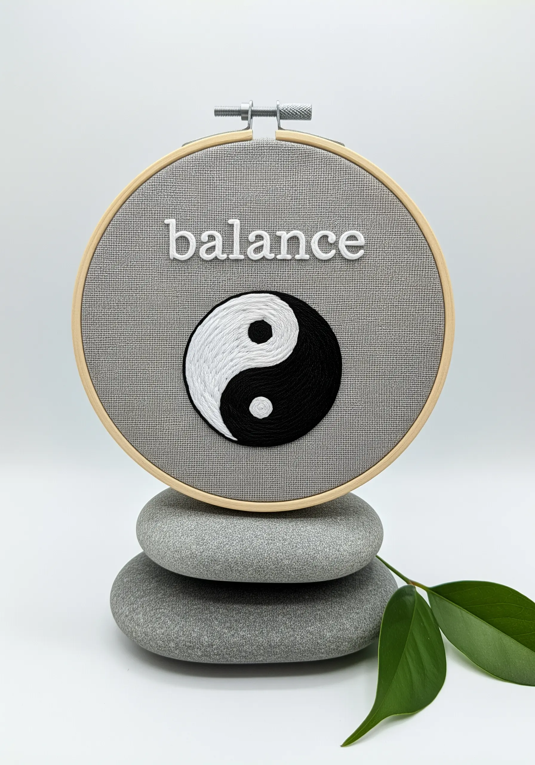
The key to a perfect yin-yang symbol is controlling the direction of your satin stitches to create that seamless, flowing curve.
Instead of stitching straight across, angle your stitches to follow the ‘S’ curve that divides the two halves.
This ensures there are no gaps and that the light reflects off the threads in a smooth, continuous way, emphasizing the sense of movement.
To achieve the dense, raised texture, use at least four strands of floss and keep your stitches packed tightly together, creating a surface that feels almost sculpted.
6. Stitching on Paper and Book Covers
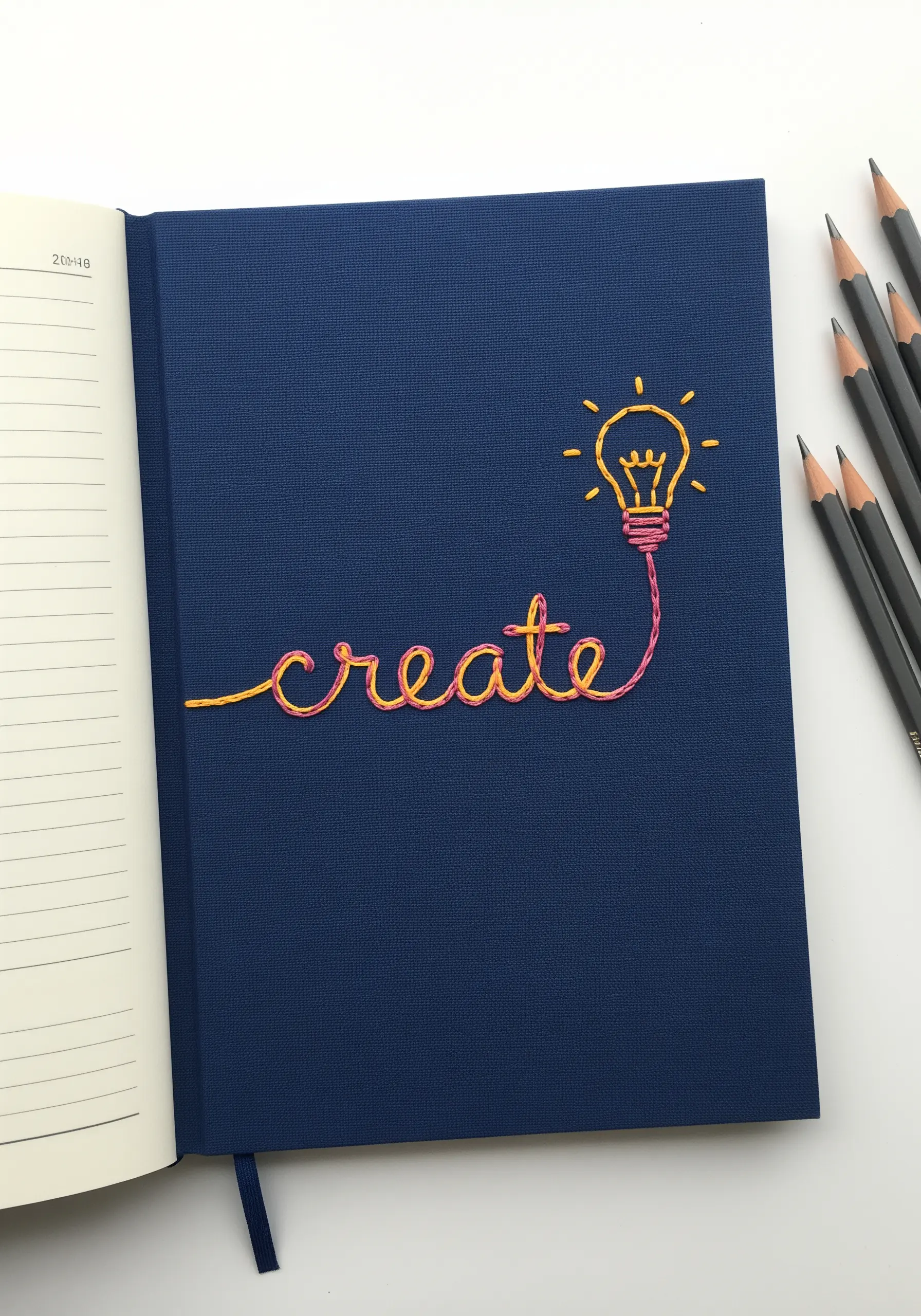
Embroidering on a journal cover requires a different approach than fabric; you need to pre-pierce your holes to avoid tearing the paper.
Use a sharp, thick needle or an awl to gently punch holes along your design outline before you begin stitching.
To achieve the beautiful color gradient in the word ‘create,’ thread your needle with one strand of pink and one strand of yellow floss together.
As you stitch, the colors will twist and blend naturally, creating a variegated effect that feels energetic and inventive.
7. Organic Lettering with Botanical Flourishes

Integrate your word and symbol by allowing the lettering to flow directly into a botanical element, as if it’s growing from the text.
Use a stem stitch for the word ‘thrive’ to give the cursive a rope-like, dimensional quality that mimics a real vine.
For the leaves, a simple satin stitch or fishbone stitch adds a soft, natural texture.
Choosing a muted, sage green thread on a natural cream fabric enhances the design’s earthy, grounded feel, making the final piece feel both gentle and resilient.
8. High-Contrast Embroidery on Dark Apparel
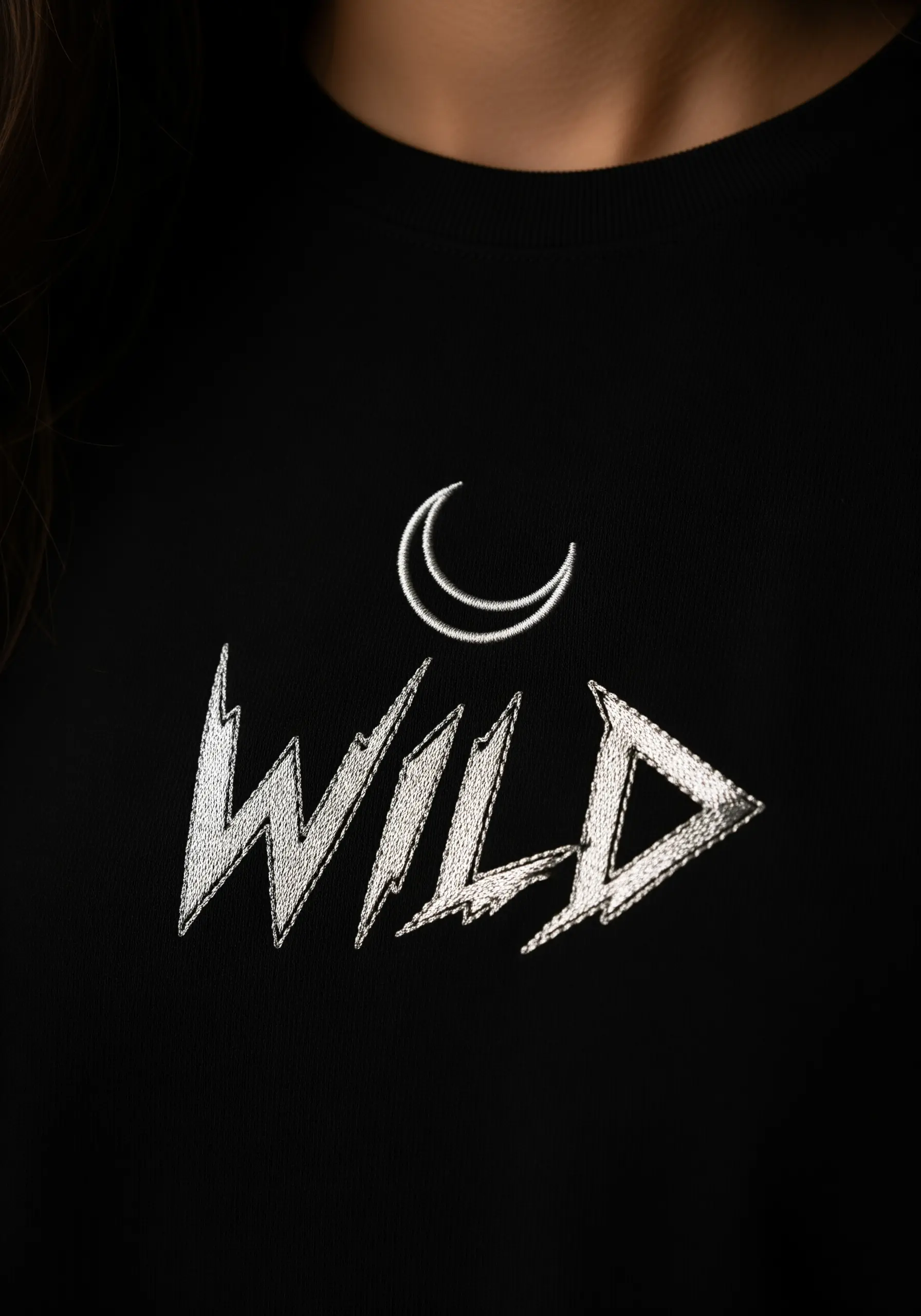
Make your design leap off a dark t-shirt by using a bright white or silver thread and focusing on texture.
Outline the sharp, aggressive font of ‘wild’ with a single backstitch line to create a crisp boundary.
Fill the letters with a dense satin stitch, angling your stitches to create facets that catch the light, almost like chiseled stone.
The crescent moon, stitched with just a few clean satin stitches, provides a soft, celestial contrast to the sharp energy of the text, creating a balanced and striking composition for your denim jacket.
9. Creating 3D Texture with Couching

To achieve this bold, cord-like effect for lettering and waves, use the couching stitch technique.
Lay down a thick piece of yarn or multiple strands of embroidery floss (6-12 strands) along your design line.
Then, using a second, thinner thread, make small, discreet tacking stitches over the thick cord to anchor it to the fabric.
By using two shades of blue and layering the couched lines, you create a sense of depth and movement that mimics rolling waves, perfect for boho-inspired textile wall art.
10. The Elegance of Single-Strand Line Art
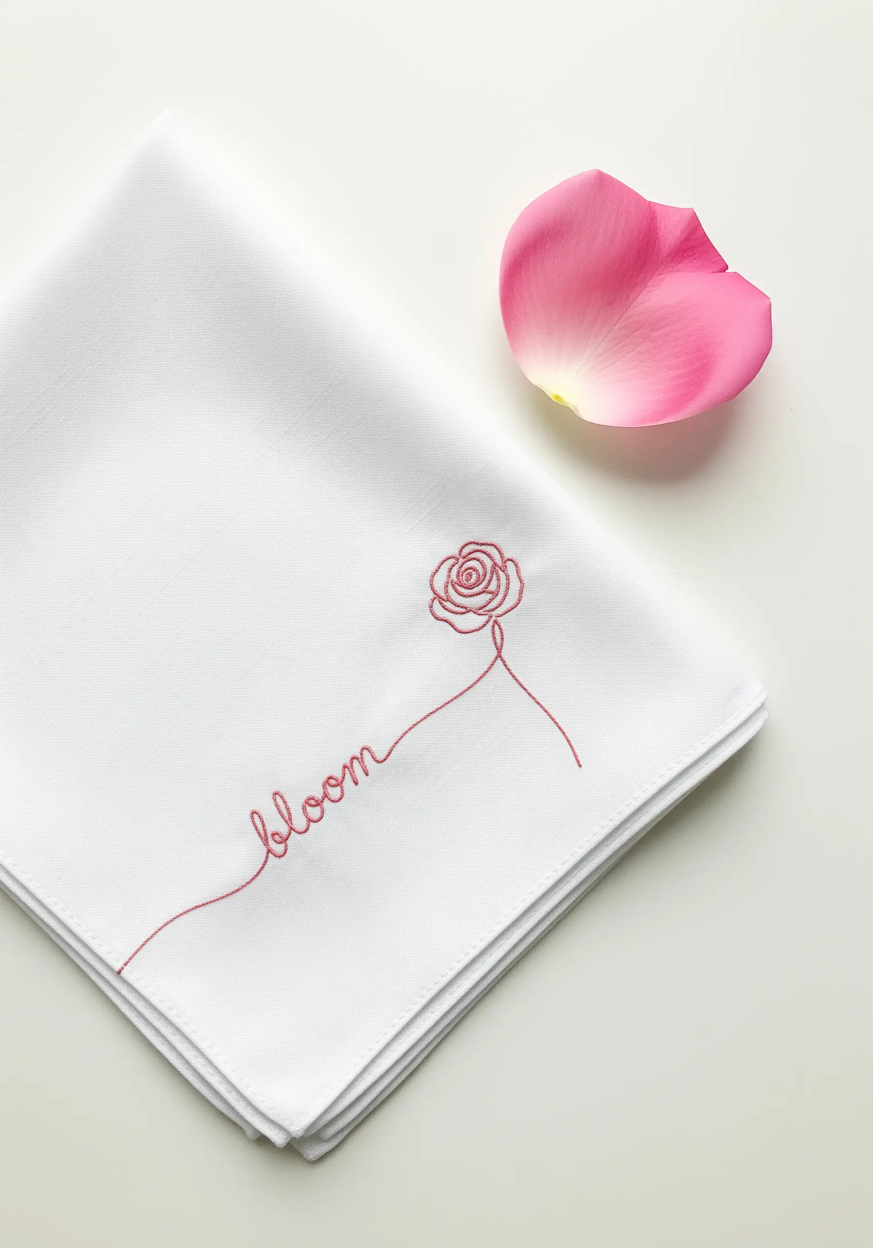
On fine, delicate fabrics like a linen handkerchief, less is truly more. Use a single strand of floss to achieve a line that is as fine as an ink drawing.
A tiny backstitch or stem stitch will give you control over the continuous line that forms both the word and the rose.
The key to this design’s success is the negative space; by keeping the lines thin and the composition minimal, you create a sense of breathability and grace.
This approach transforms a simple object into a piece of personal, understated luxury, making it one of those tiny embroidery designs inspired by everyday life.
11. Collegiate-Style Lettering with Padded Satin Stitch

Create that classic, bold varsity letter effect by outlining your text with a contrasting color.
First, fill the letters with a dense, horizontal satin stitch in your main color (orange).
Then, using a darker color (white or grey), outline the entire shape with a tight backstitch or split stitch. This outline contains the shape and gives it that clean, appliqué-like finish.
The sun element, made with simple straight stitches, adds a playful touch that balances the heavy lettering.
12. Functional Embroidery for Bookmarks

When embroidering a functional item like a bookmark, choose stitches that are flat and durable.
A simple, clean backstitch is perfect for the vertical ‘explore’ lettering, ensuring it remains legible and won’t snag.
For the compass rose, use precise straight stitches. The tight weave of a canvas or linen-blend fabric is ideal as it prevents the stitches from shifting with use.
Consider adding a felt backing to your finished bookmark to protect the stitches and give the piece a more substantial, professional feel.
13. Integrating Text and Icon Seamlessly
Make your design feel cohesive by merging your word and symbol into a single, continuous line.
Here, the letter ‘o’ is replaced by a house shape, which is stitched without breaking the flow of the thread from the ‘h’ to the ‘m’.
A whipped backstitch is the perfect choice for this, as it creates a solid, smooth line that can navigate the sharp corners of the house and the gentle curves of the letters with ease.
This technique turns a word into a story, creating handmade embroidery ideas that will transform ordinary gifts.
14. Tone-on-Tone Texture for Bed Linens
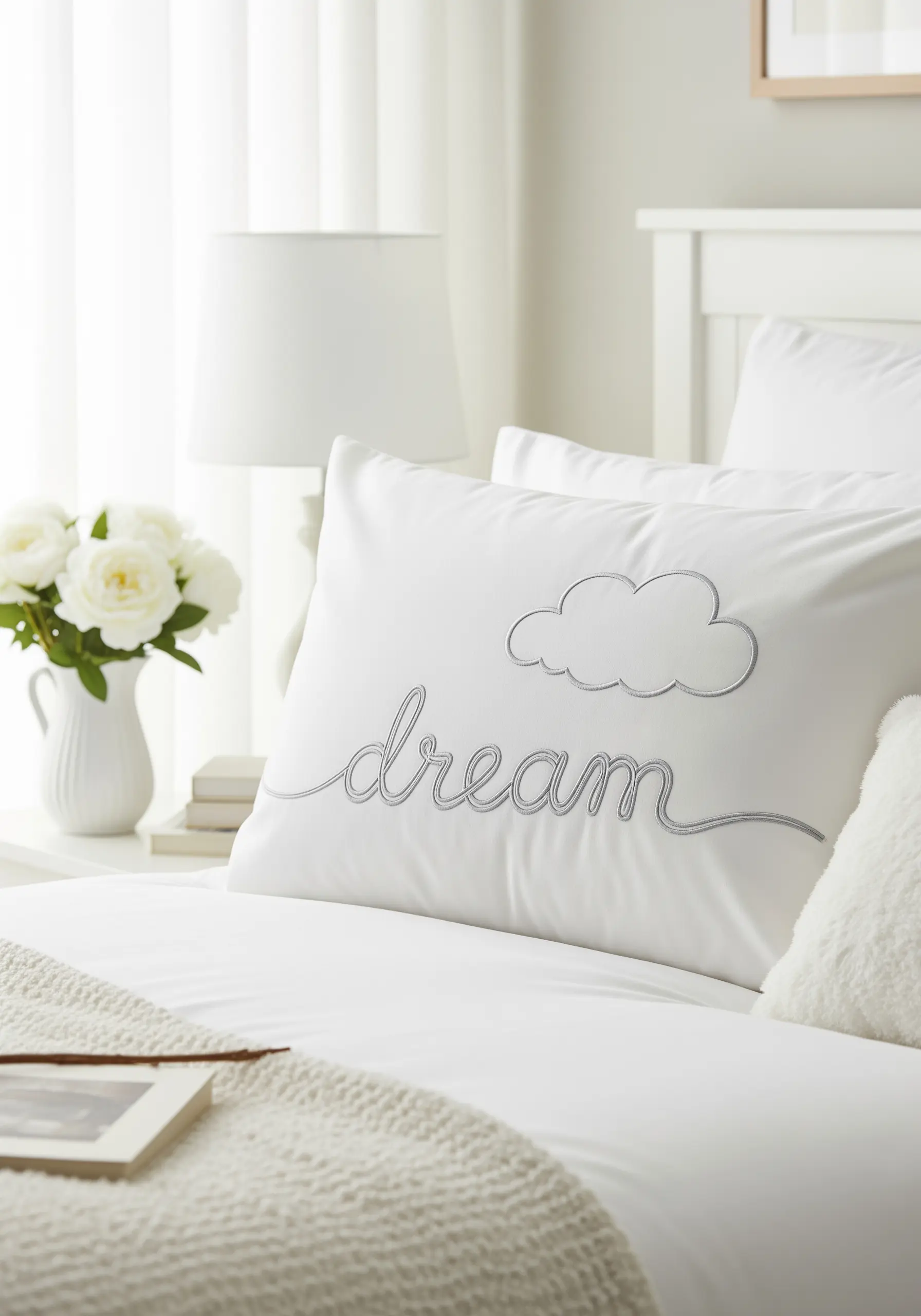
For an elegant, calming effect on a pillowcase, choose a thread color that is just a shade or two darker than the fabric.
This tone-on-tone approach emphasizes texture over color, creating a subtle design that feels sophisticated and serene.
Use a raised stem stitch or chain stitch for the word ‘dream’ to give it a soft, rope-like texture that you can feel.
Outline the cloud with a simple backstitch to keep it light and airy, perfectly suiting the theme and making for embroidered pillow covers that promote softness.
15. Understated Placement on Cuffs and Collars
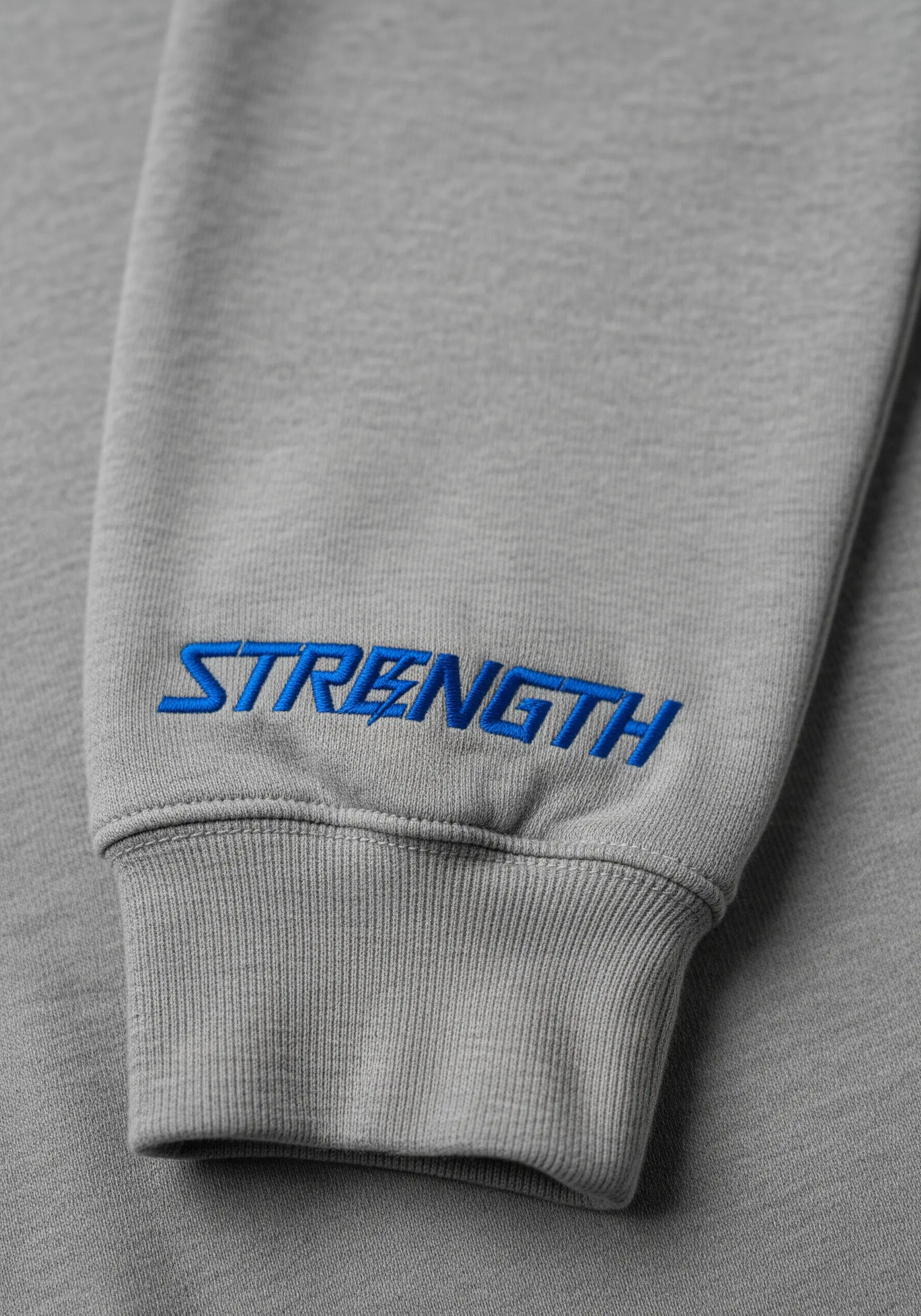
Place a meaningful word on an unexpected location, like the cuff of a sweatshirt, for a private, personal reminder.
Because this area is subject to wear, use a durable satin stitch and choose a high-quality thread.
The small lightning bolt detail inside the ‘E’ adds a flash of energy. To make it stand out, stitch it in a vibrant, contrasting color after the main word is complete.
This is one of those tiny secret embroidery ideas to hide inside cuffs for personal meaning.
16. Creating Movement with Varied Stitches
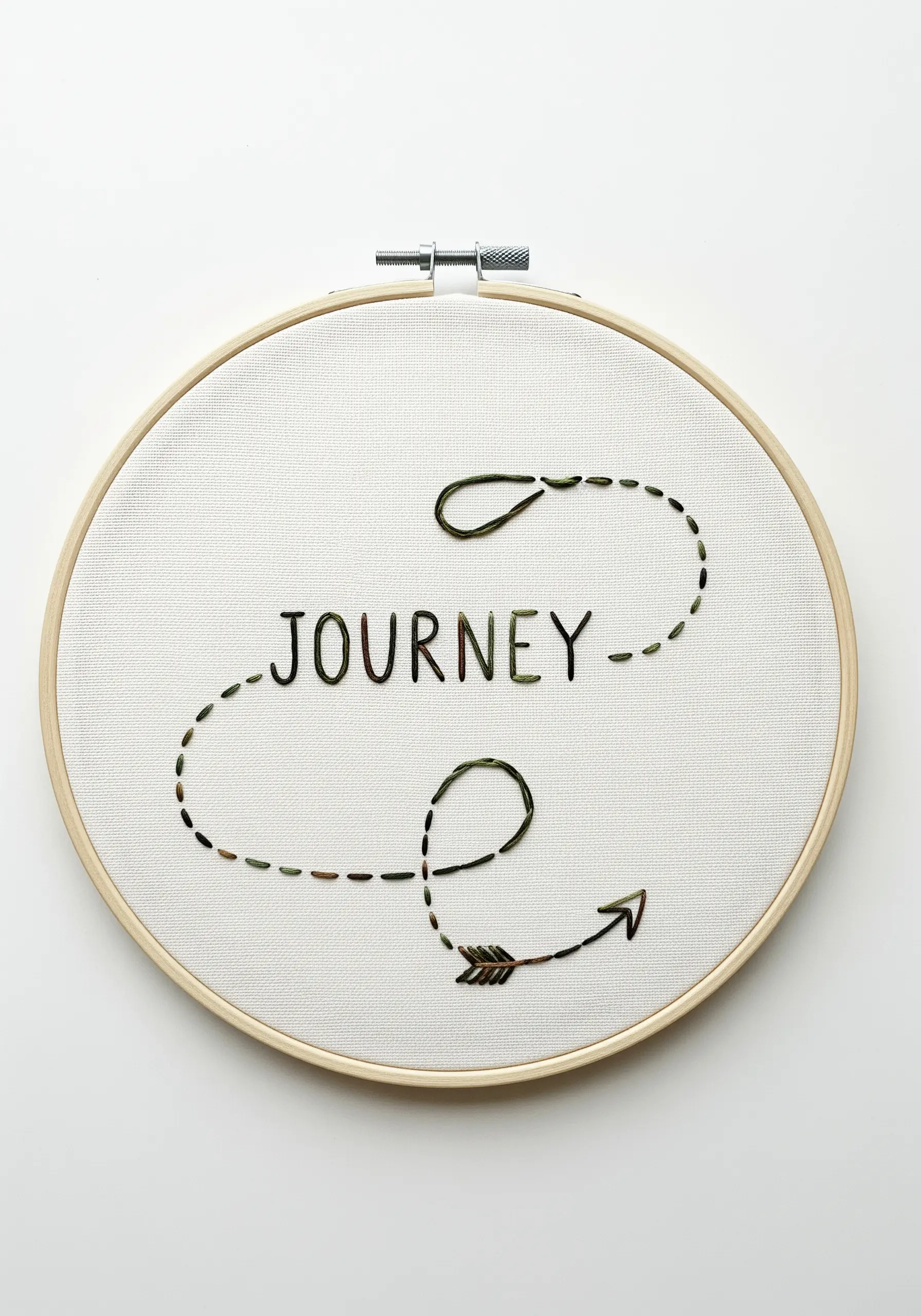
Tell a story of progress and direction by combining different stitch textures and styles within one piece.
Fill the letters of ‘journey’ with short, vertical satin stitches (or seed stitches) using a variegated thread. This gives the word a grounded, textured feel.
For the path line, use a simple running stitch with deliberately varied spacing. This creates a sense of movement and spontaneity, as if charting a course.
The combination of solid letters and a broken line creates a beautiful visual narrative of a path unfolding.
17. The Art of Minimalist Framing

When your embroidery is minimal, the framing becomes part of the art. A simple, modern black frame anchors the delicate stitching.
Use a fine, single-strand backstitch for the word ‘patience’ and the hourglass outline to maintain a light, graphic quality.
For the sand inside the hourglass, use tiny French knots or seed stitches, which add a point of concentrated texture that draws the eye.
This balance of clean lines and subtle texture creates minimal DIY embroidery projects you’ll actually want to hang.
18. Crafting Embroidered Gift Tags
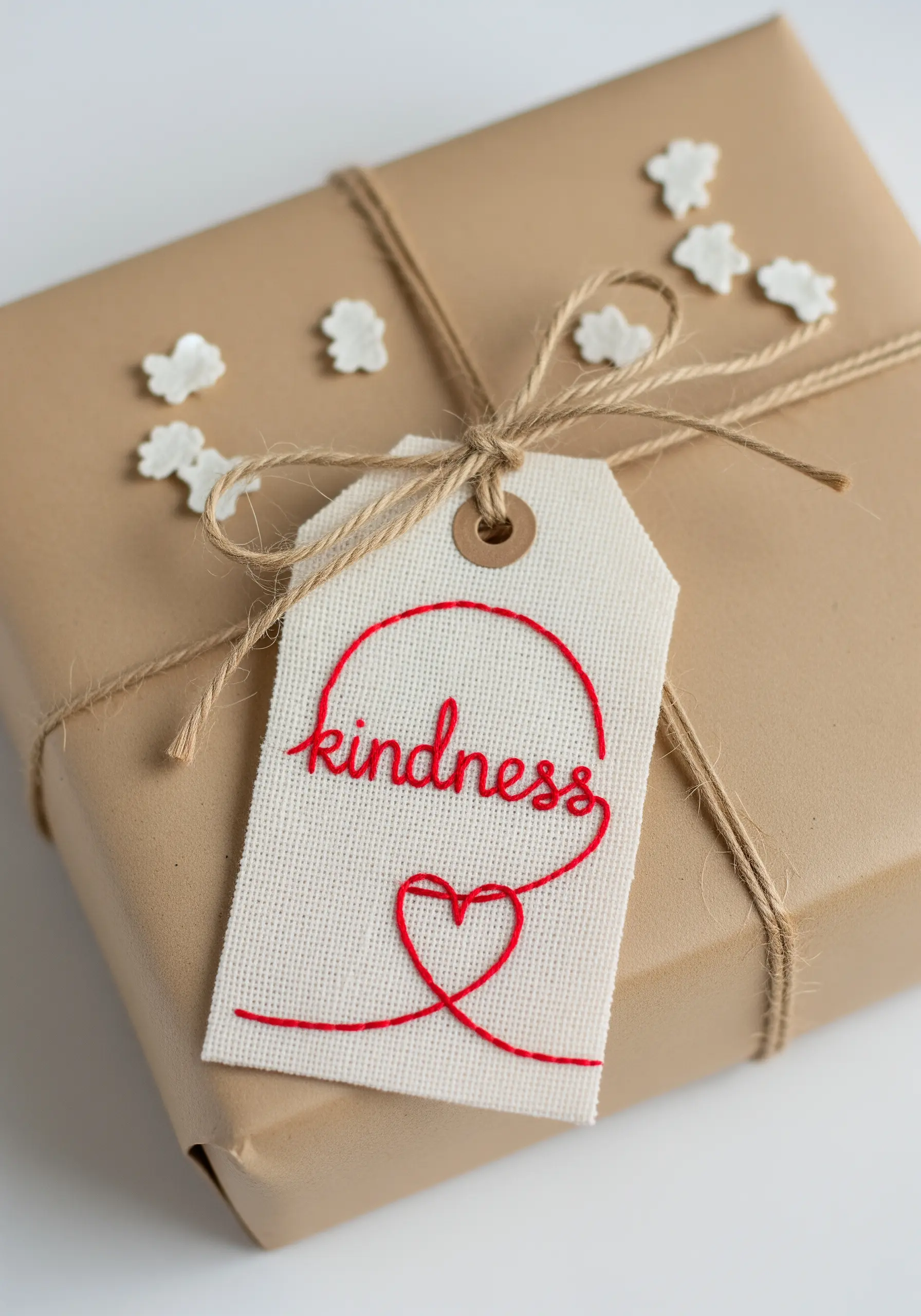
Transform a simple gift tag into a keepsake by adding a touch of embroidery.
Stitch directly onto heavy cardstock or, for a softer look, use a small piece of canvas with punched holes for the twine.
Use a stem stitch for the cursive lettering, as it handles tight curves beautifully.
The thread that forms the heart can be tacked down with a few tiny, almost invisible stitches in the same color, maintaining the illusion of a single, playful loop.
This is one of those DIY fabric crafts that double as unique handmade gifts.
19. Achieving a Crystalline Effect with Metallics

When working with metallic floss, which can be prone to tangling, use shorter lengths of thread and a needle with a larger eye.
To create the shimmering facets of the crystal, use a light silver thread and lay down precise straight stitches.
Add tiny, bright white stitches at the vertices where light would hit, creating a sparkling effect.
The word ‘clarity’ can be stitched with a padded satin stitch to give it a raised, almost embossed quality against the dusty rose fabric.
20. Blending Threads for a Watercolor Effect
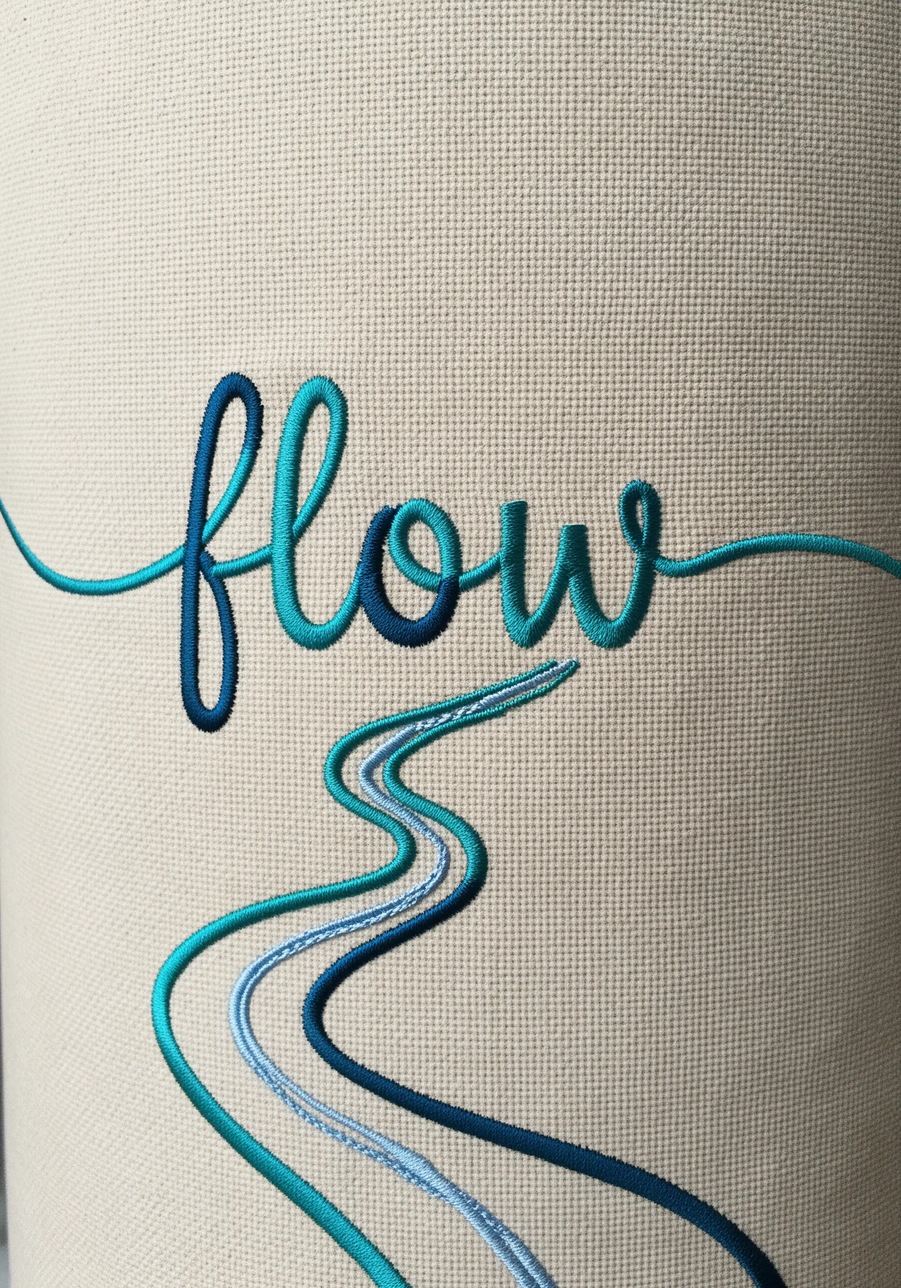
Create a fluid, color-shifting look by blending multiple shades of thread within your lettering.
Instead of finishing one color and starting the next, use the long-and-short stitch to seamlessly transition from dark teal to light aqua.
This technique, often used for realistic florals, works beautifully for words like ‘flow’ or ‘dream,’ giving them an ethereal, liquid quality.
Carry the same blending technique into the river lines below to create a cohesive design that embodies the word itself.
These thread color blending tricks create stunning visual depth.
21. Designing for Curved Surfaces

Embroidering on a baseball cap requires careful planning due to the stiff, curved surface.
Use a strong adhesive stabilizer on the inside and a smaller 4-inch hoop to isolate the stitching area.
Keep the design clean and bold. A simple backstitch for the lion outline and a dense satin stitch for the word ‘courage’ will ensure the design is clear and impactful.
The high contrast between the golden-yellow thread and the deep green cap makes the design legible from a distance.
22. Embroidering on Plush Velvet

To prevent your stitches from sinking into the rich pile of velvet, use a water-soluble topper stabilizer.
Place it on top of the fabric before you begin stitching; it provides a smooth surface and dissolves away with a damp cloth afterward.
Combine metallic threads for the word ‘magic’ with tiny French knots or seed stitches for the stars.
Using both silver and gold threads adds dimension and enhances the celestial, sparkling theme against the deep navy velvet, creating a truly luxurious finish.
23. Creating Ethereal Designs on Sheer Fabric
Stitching on a sheer or semi-sheer fabric like organza creates a beautiful, floating effect, especially when held against a window.
You must use a stabilizer to prevent puckering; a wash-away or heat-away stabilizer is ideal as it will disappear completely, leaving only the threads.
A simple, continuous backstitch line is perfect for this, as the focus is on the silhouette and the way light passes through the fabric.
This technique turns your embroidery hoop into a delicate, light-catching suncatcher.
24. Framing with a Raw Fabric Edge
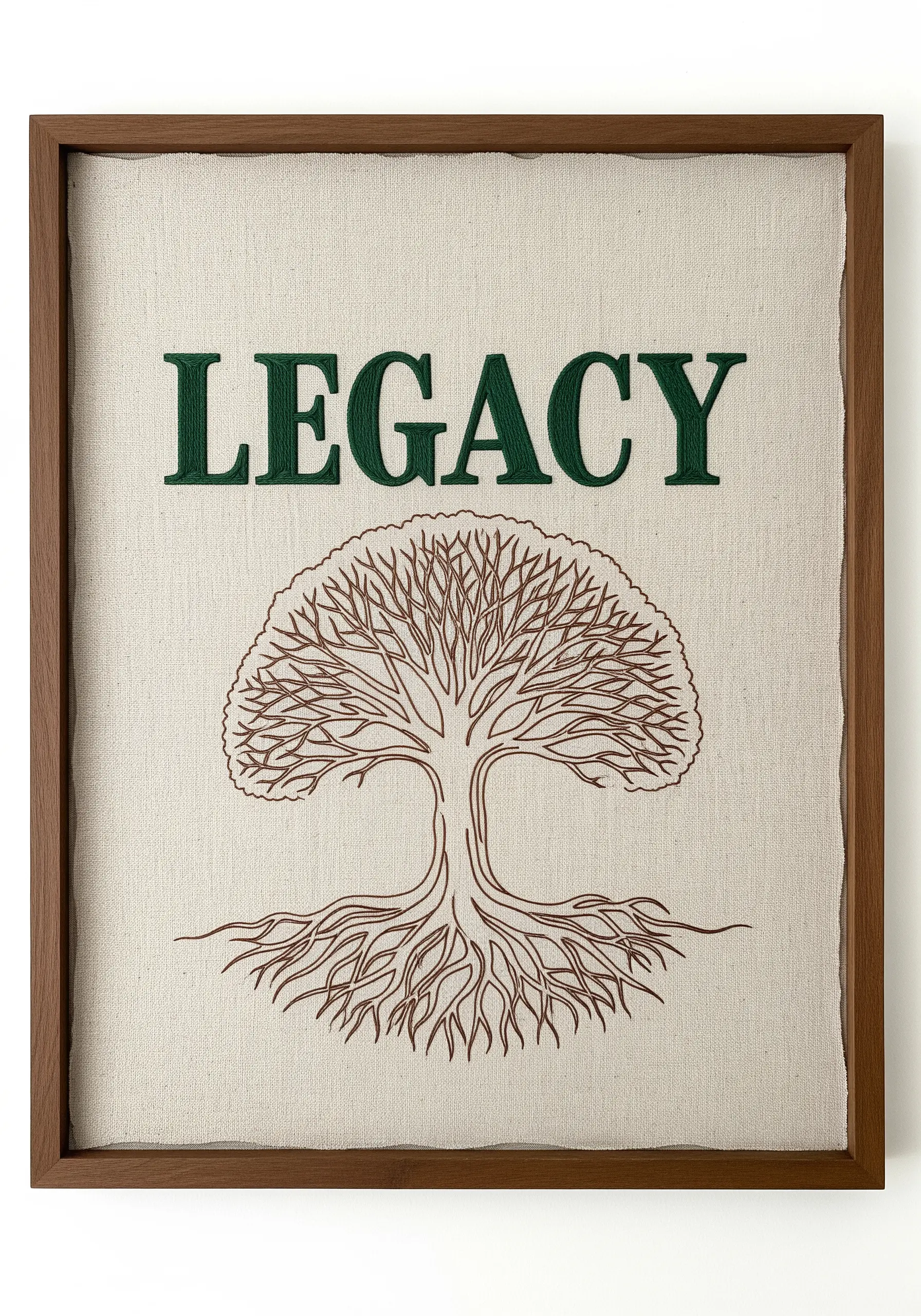
For a rustic, organic feel, leave the edges of your fabric raw and ‘float’ the piece within a deep shadowbox frame.
This intentional imperfection adds texture and character. The intricate branches and roots of the tree can be created with a dense network of single straight stitches or a fine stem stitch.
In contrast, use a clean, sharp satin stitch for the serif font of ‘legacy’ to create a sense of permanence and strength.
This contrast between the wildness of the tree and the formality of the text enhances the overall narrative.
25. Contrasting Textures with Whipped Stitch
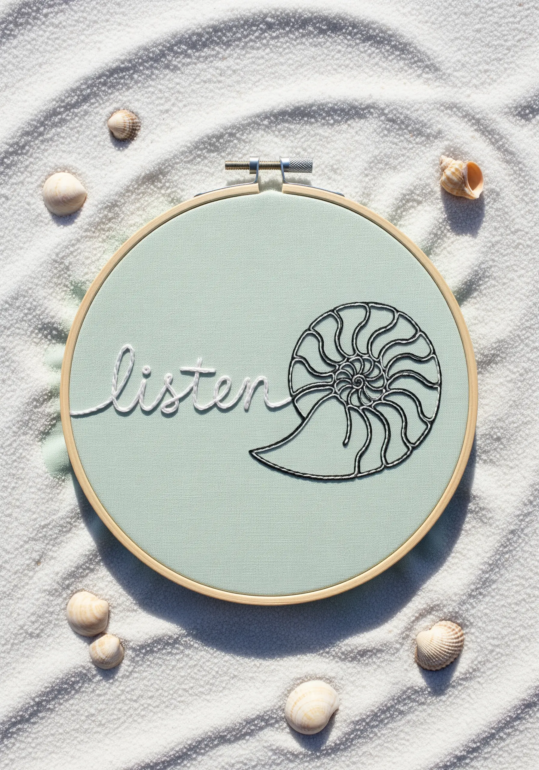
Create a design that invites touch by contrasting a smooth, solid outline with delicate lettering.
For the nautilus shell, first lay down a backstitch outline, then whip it with a contrasting thread (like silver or grey) to create a raised, cord-like effect that stands out.
In contrast, stitch the word ‘listen’ using a simple, fine stem stitch in white. This makes the word appear softer and quieter than the bold shell.
This play on textures guides the viewer’s eye and reinforces the theme of the piece.
26. Harmonizing Embroidery with Fabric Patterns
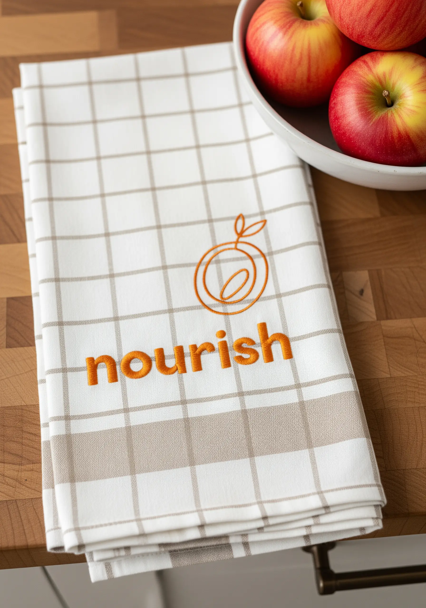
When embroidering on patterned fabric, select a thread color that complements the existing design rather than competing with it.
Here, the warm orange thread picks up on the neutral tones in the plaid kitchen towel, creating a harmonious look.
Keep the design simple and open. The clean line art of the fruit and the clear, readable font for ‘nourish’ ensure the embroidery is visible without overwhelming the pattern.
This thoughtful color choice makes the embroidery feel integrated and intentional.
27. Using Straight Stitches for a Radiant Effect
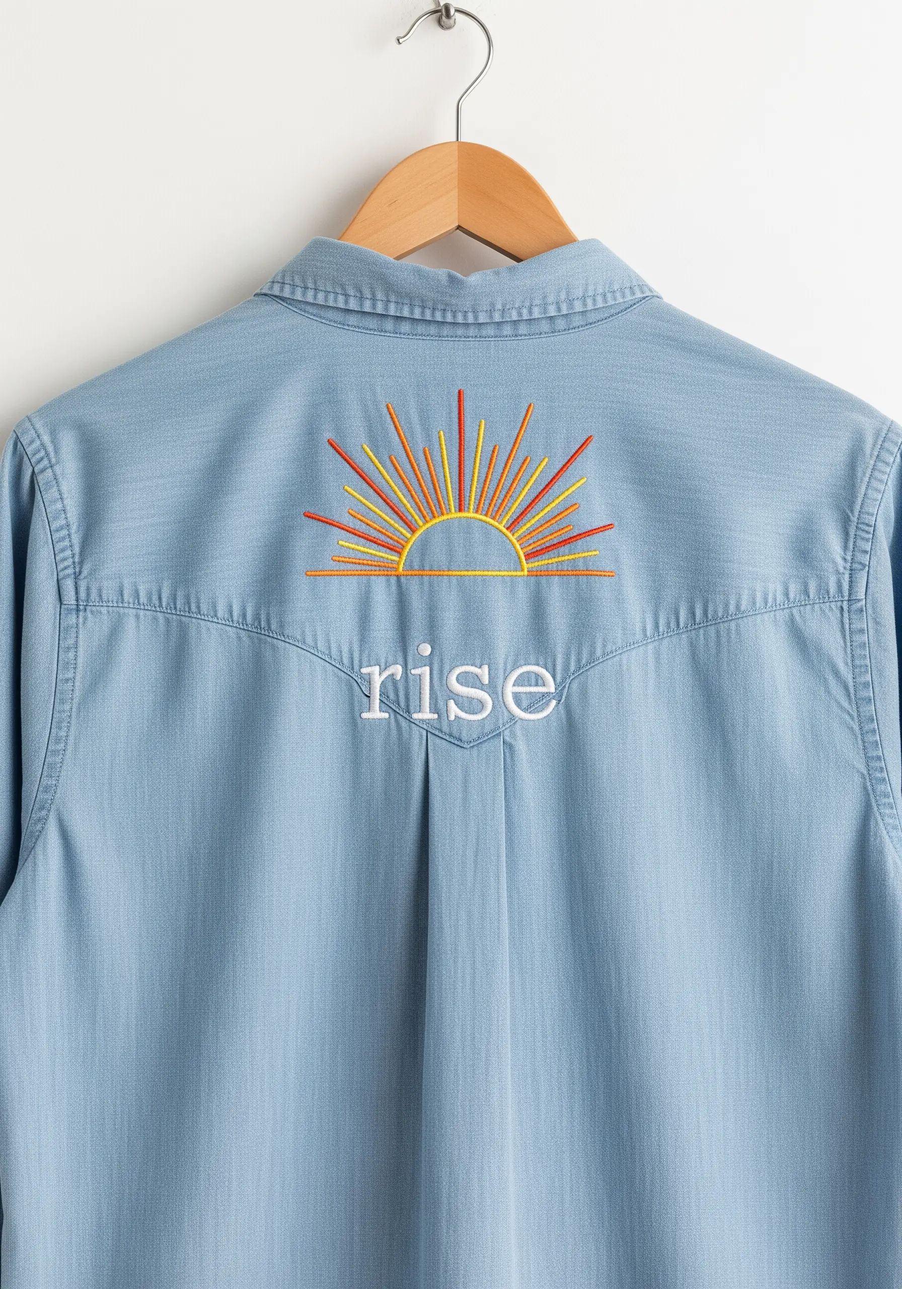
You don’t need complex stitches to create a dynamic impact. This sunrise is made entirely of simple straight stitches.
The magic comes from the color choices and varied lengths. Use a gradient of warm colors—from deep red and orange to bright yellow—to mimic the glow of the sun.
Vary the length of each ray to create a sense of energy and movement. A simple backstitch for the word ‘rise’ provides a calm anchor to the vibrant burst of color above.
This is a perfect large-scale design for the back of a shirt or jacket.
28. Clever Symbol Substitution in Lettering
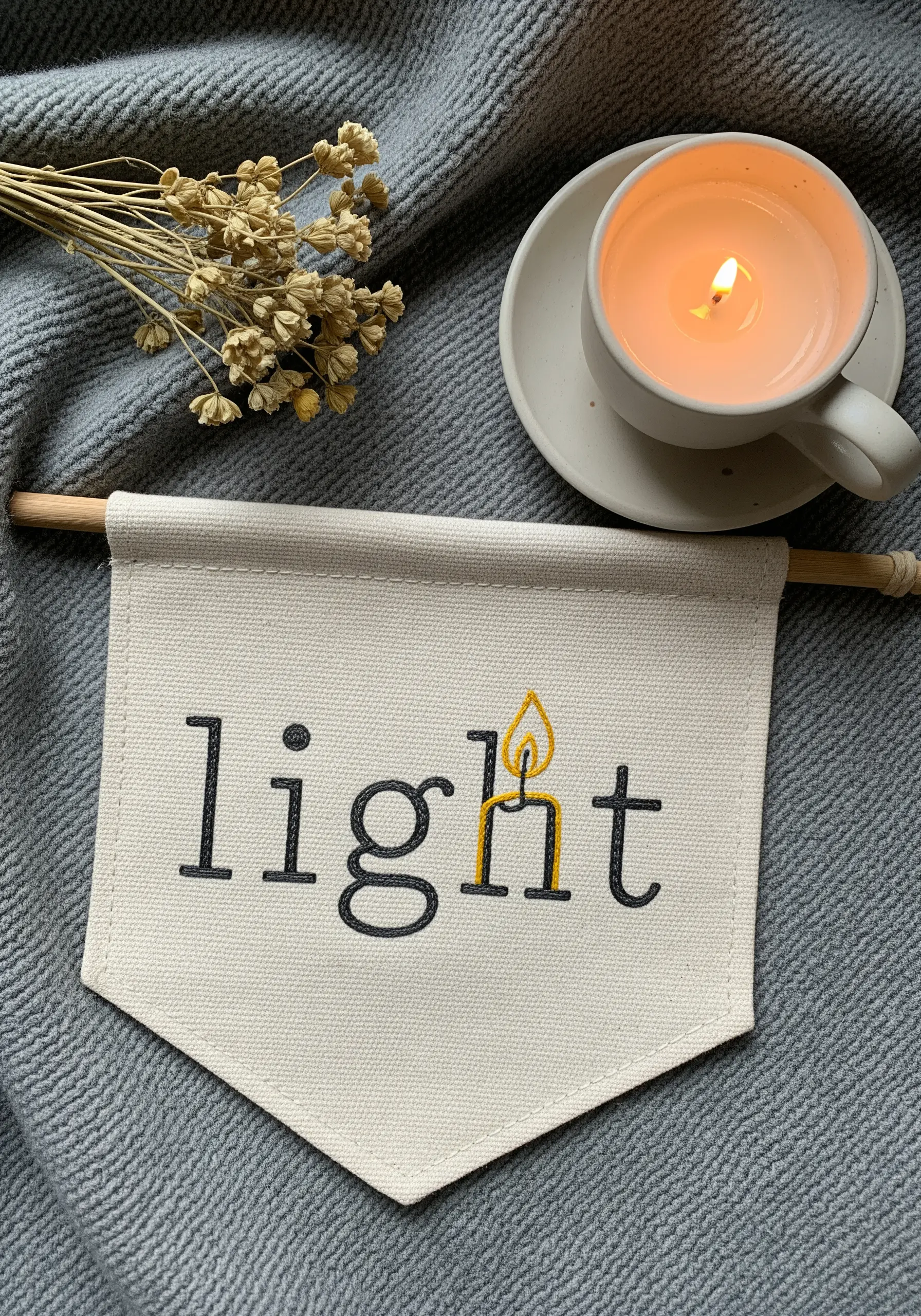
Elevate a simple word by creatively substituting part of a letter with a meaningful icon.
Here, the dot of the letter ‘i’ in ‘light’ is replaced by a candle flame. The flame is created with just a few satin stitches in yellow and orange, giving it warmth and dimension.
Stitch the rest of the word in a simple, dark backstitch to make the colorful flame the undeniable focal point.
This small but clever adjustment transforms a word into a powerful visual concept, perfect for calm, cozy handmade crafts.
29. Storytelling Across Two Hoops

Use a diptych—two hoops displayed together—to tell a story of connection, separation, or transformation.
The clean, graphic style of the hands and lettering is achieved with a consistent backstitch using three strands of red floss for high visibility.
The power of this piece lies in the simple change between the two hoops: the single broken line that severs the connection.
This narrative approach to embroidery opens up possibilities for expressing more complex emotions and ideas.
30. Integrating Illustration into Typography
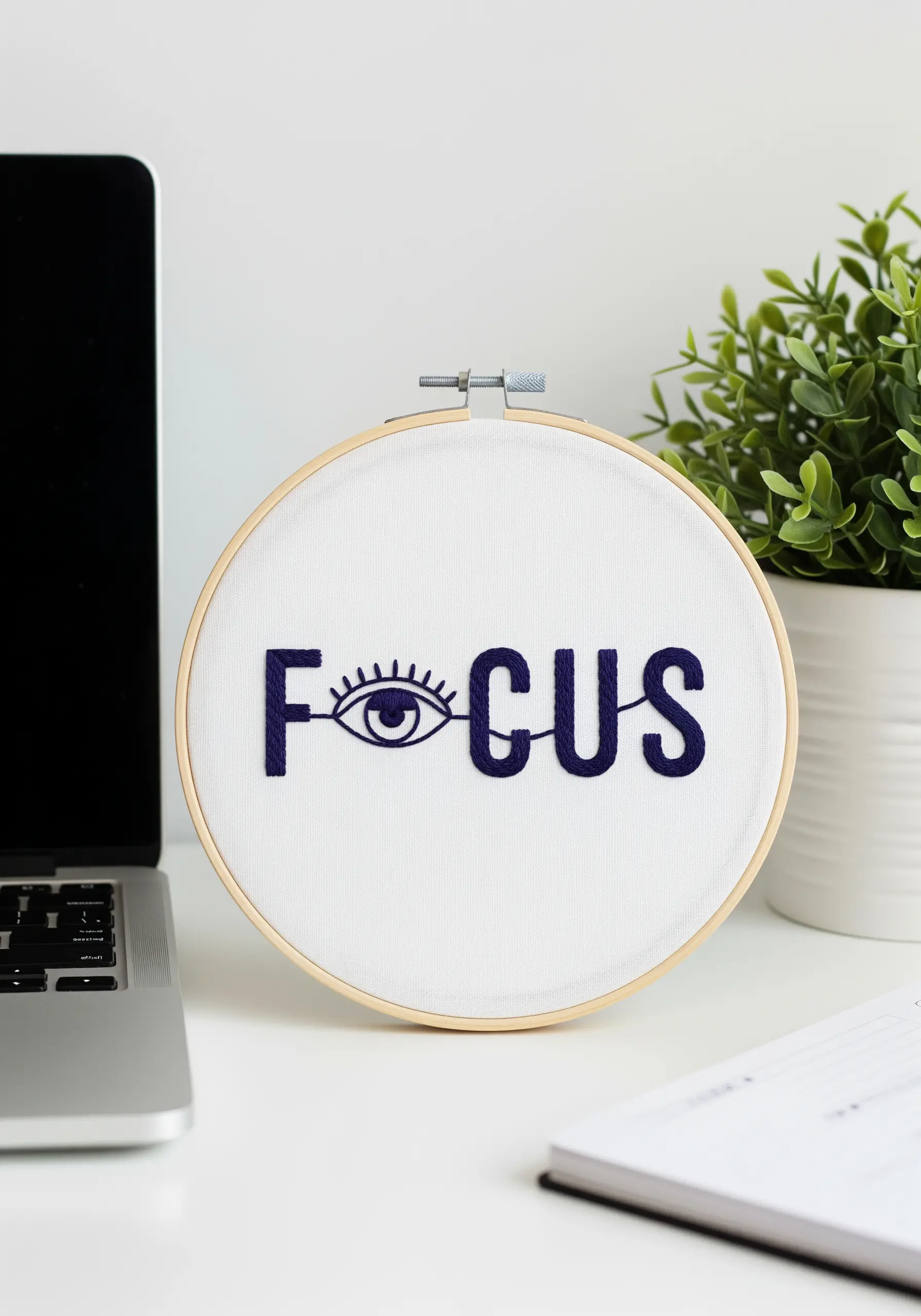
Turn your lettering into a piece of illustration by building a symbol directly into a letterform.
The ‘o’ in ‘focus’ becomes an eye, creating an immediate and intuitive link between the word and its meaning.
Use a dense, smooth satin stitch to fill the bold letters, ensuring they have a solid, graphic presence.
For the fine details of the eye and lashes, switch to a single strand of floss and use a tiny backstitch for precision. This is a great design for subtle embroidery touches that make your desk look Pinterest-ready.