Sometimes the simplest words carry the most weight. But how do you translate that feeling into thread? If you’ve ever felt that your embroidered lettering could be more expressive, more intentional, you are in the right place.
Elevating your typography isn’t about mastering hundreds of complex stitches. It’s about making thoughtful choices—pairing a fluid stitch with a cursive font, using texture to give a word physical presence, or letting negative space speak louder than thread. It’s about seeing letters not just as shapes to be filled, but as tiny canvases for artistry.
Here, you’ll find techniques that transform simple quotes into compelling works of art. Think of this not just as a collection of ideas, but as a new vocabulary for your needle. Once you understand these approaches, you can apply them to any word, quote, or sign that holds meaning for you, stitching your voice into every piece you create.
1. Botanical Lettering with Variegated Thread
Create an organic, flowing feel by using a single variegated green floss for your letters.
This technique allows the thread to do the color-blending work for you, creating subtle, natural shifts in tone without needing to switch threads.
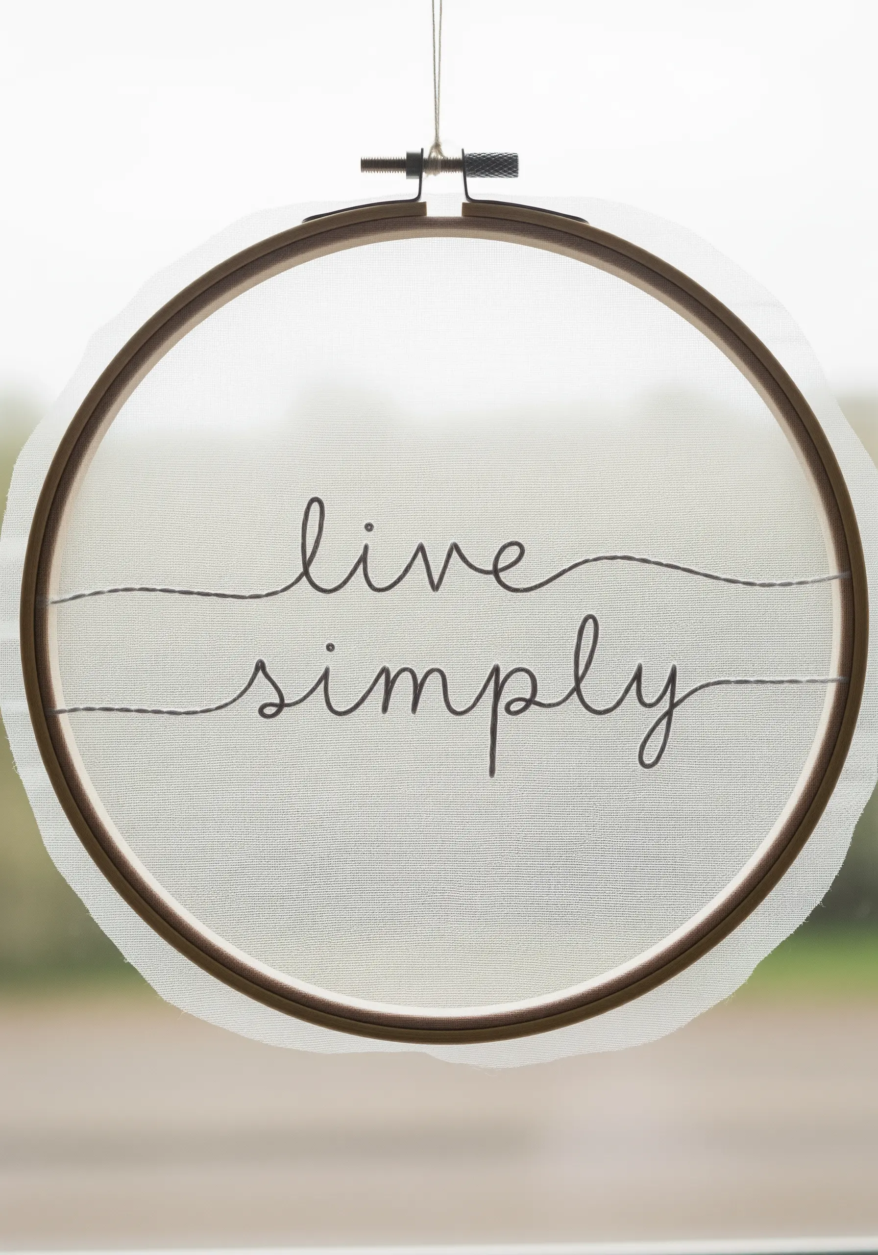
Use a whipped backstitch for the cursive letters to give them a smooth, rounded finish that looks like a vine.
For the leaves, scatter simple detached chain stitches (lazy daisies) and straight stitches, letting them gently overlap the letters to integrate the text and botanical elements seamlessly.
2. High-Contrast 3D Lettering on Canvas
Achieve this bold, graphic look by first outlining each letter section with a tight backstitch.
This outline acts as a raised barrier, giving you a sharp edge to pack your satin stitches against for a perfectly clean fill.
Create the 3D shadow effect by filling the side planes with a slightly darker thread, angling your stitches in a different direction from the main letter face.
Stitching on a black canvas is key, as the high-contrast background makes the colors pop dramatically, enhancing the illusion of depth.
3. Retro Gradients with Dimensional Knots
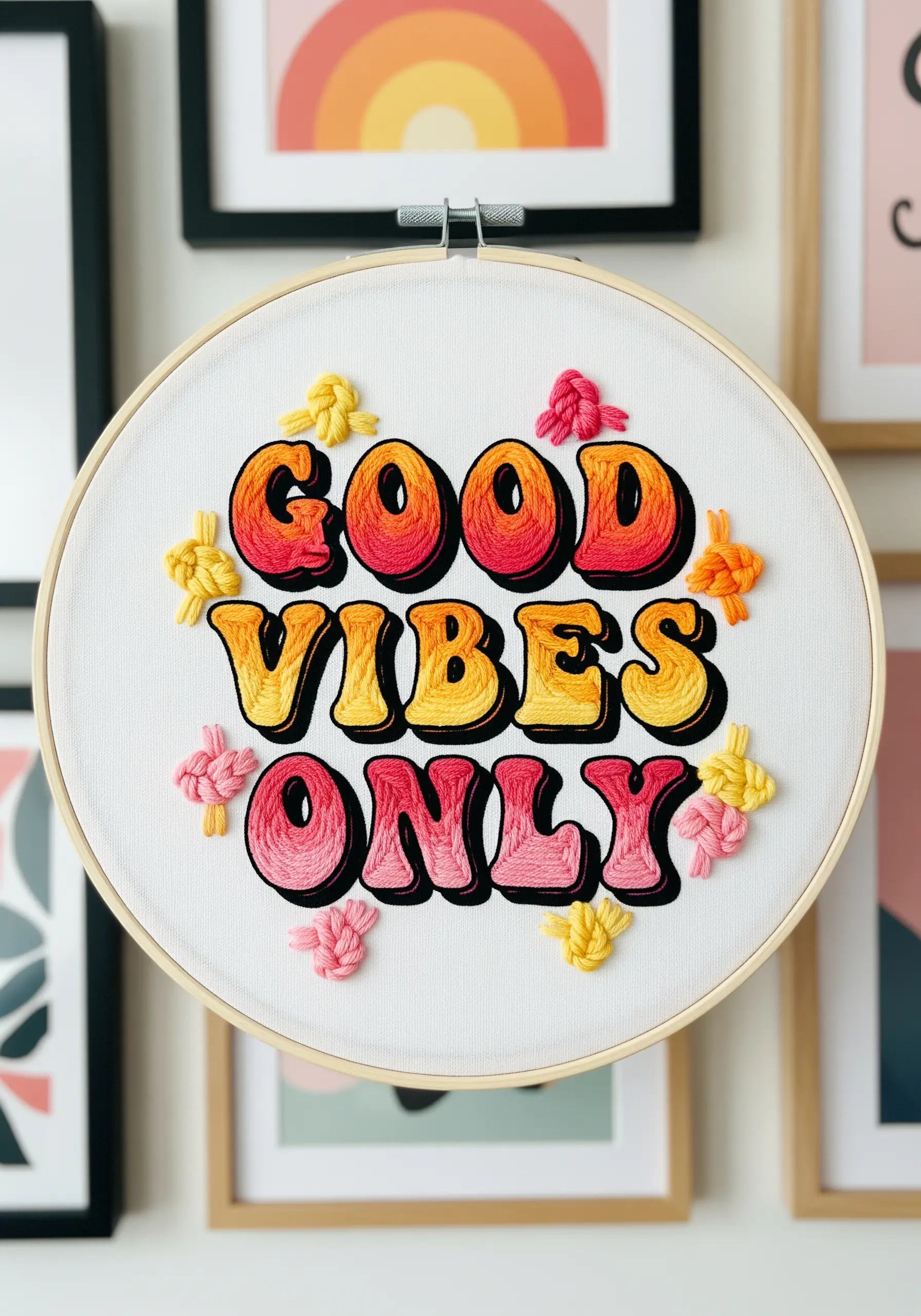
Capture that 70s-inspired vibe with a smooth gradient fill using the long-and-short stitch.
Blend three to four shades within each letter, from a deep red-orange to a bright yellow, to create a seamless transition that mimics a sunset.
A crisp, black backstitch outline defines the bubble letters and makes the gradient stand out with graphic clarity.
Add clusters of French or colonial knots in coordinating colors to introduce a playful, tactile dimension that balances the smooth fill.
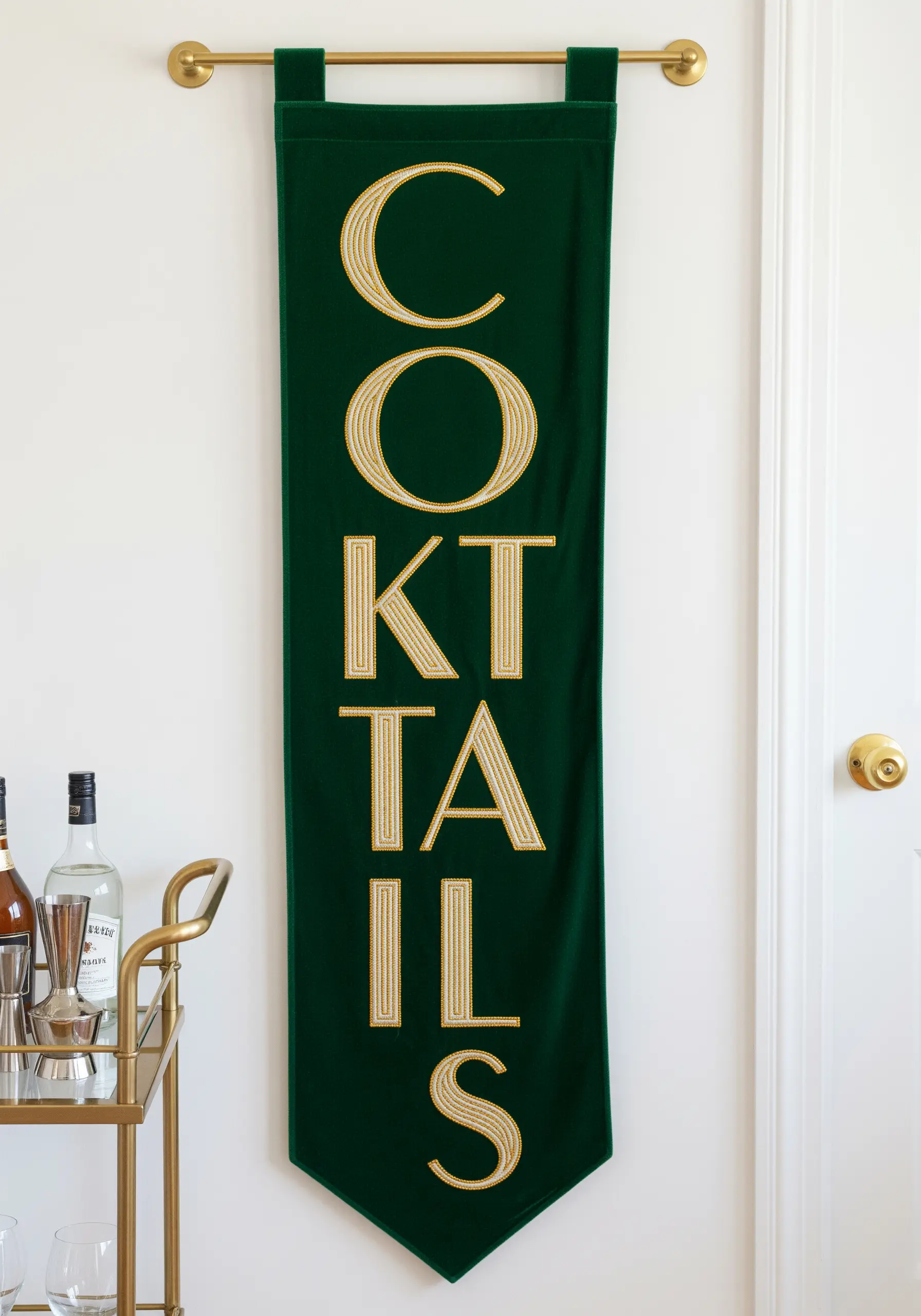
4. Graphic Texture with Vertical Straight Stitches
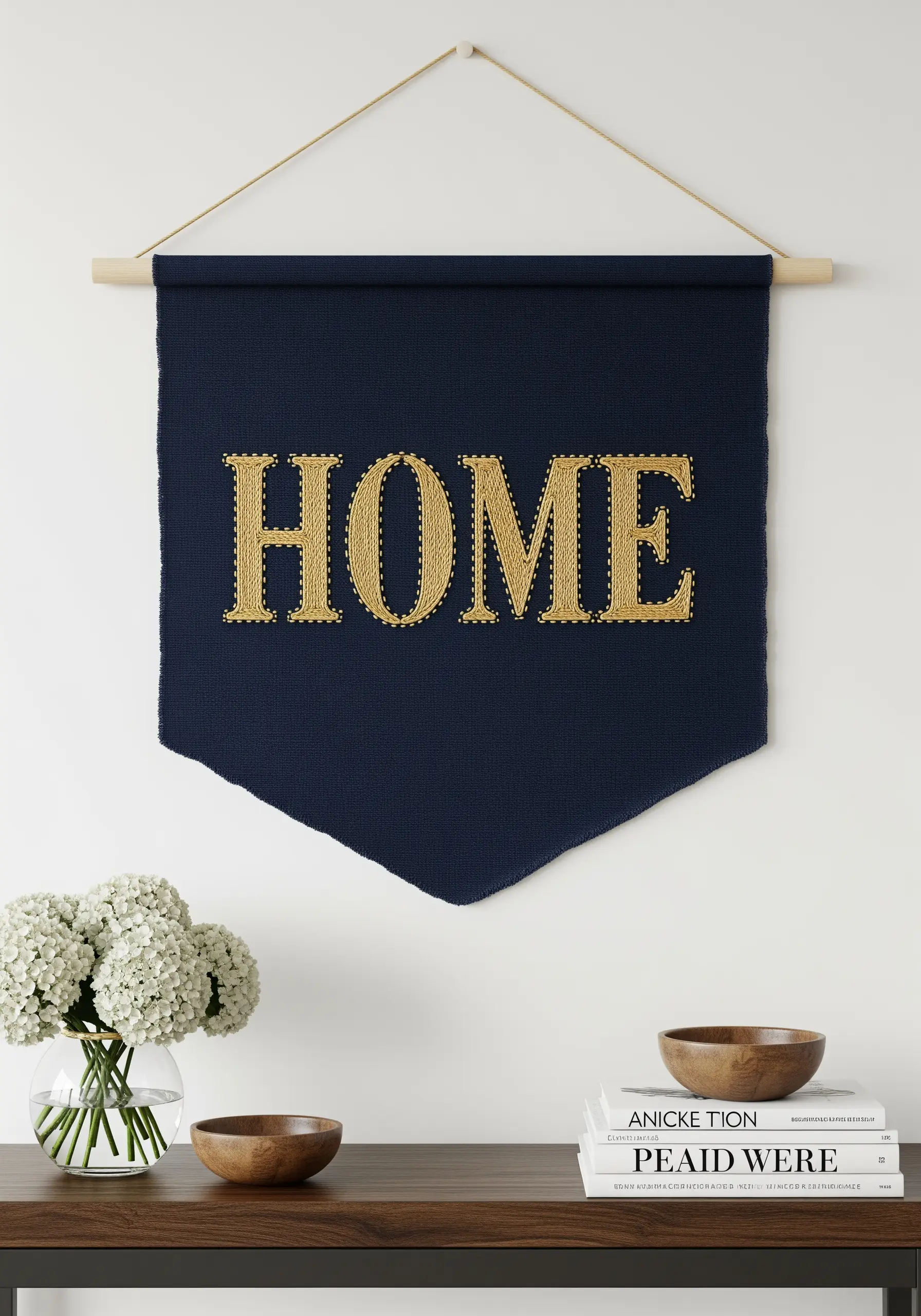
For this sophisticated look, create a texture that mimics string art by filling your letters with precise vertical straight stitches.
Instead of a dense satin stitch, this technique uses negative space between the threads to create a lighter, more graphic feel.
The key is keeping your stitches perfectly parallel and evenly spaced for a clean, intentional finish.
Using a high-sheen gold thread against a dark, matte fabric like this navy felt banner enhances the luxe contrast and makes the lettering shine.
5. A Sampler of Stitches within a Single Word
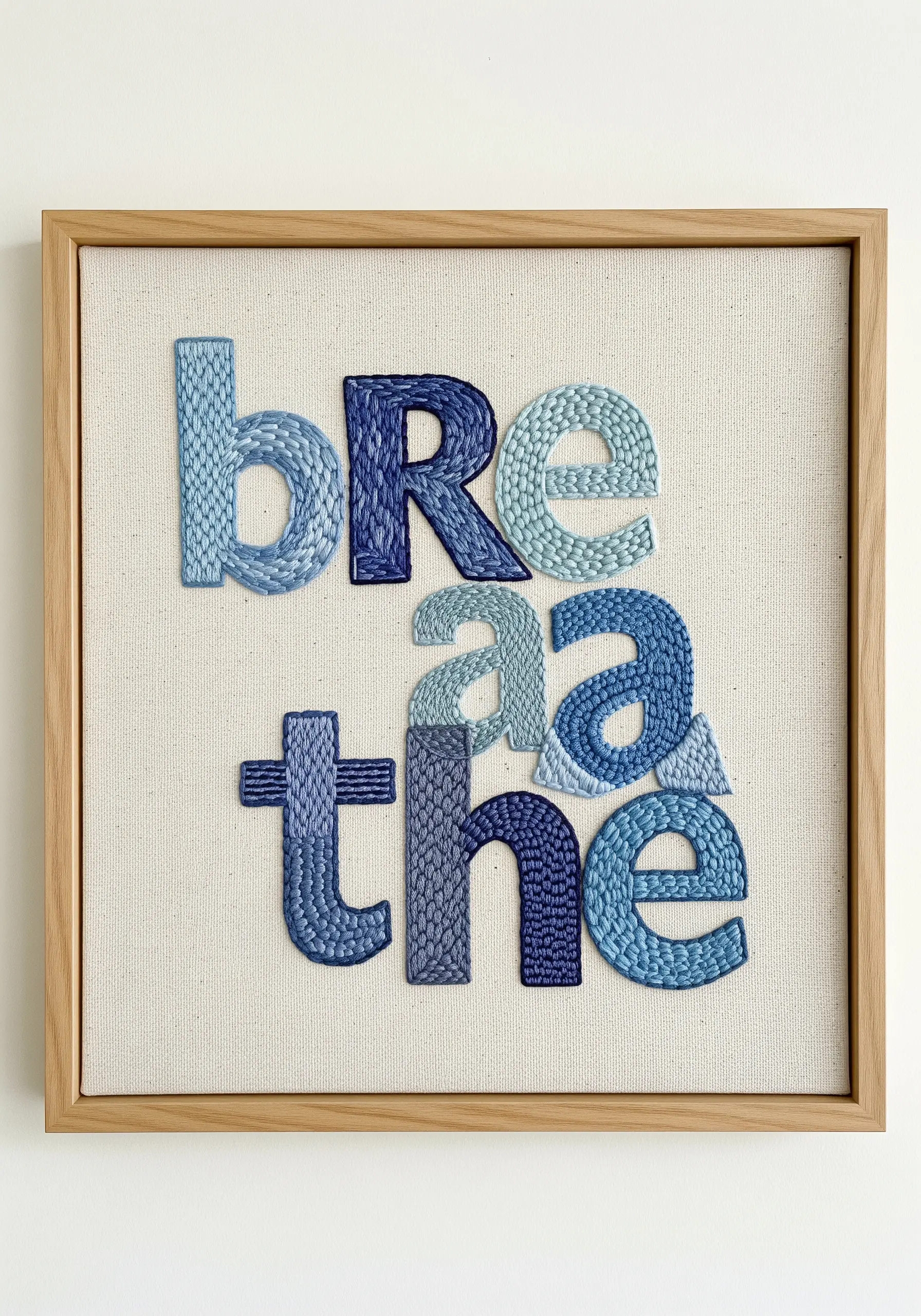
Transform a simple word into a textural study by assigning a different fill stitch to each letter.
This is an excellent way to practice and showcase your stitch vocabulary, combining techniques like basket weave, French knots, chain stitch, and woven picot.
To ensure the design feels cohesive rather than chaotic, work within a strict monochrome color palette, using various shades of a single hue.
The harmony in color allows the rich variety of textures to become the main focus.
6. Negative Space Lettering with a Textured Frame
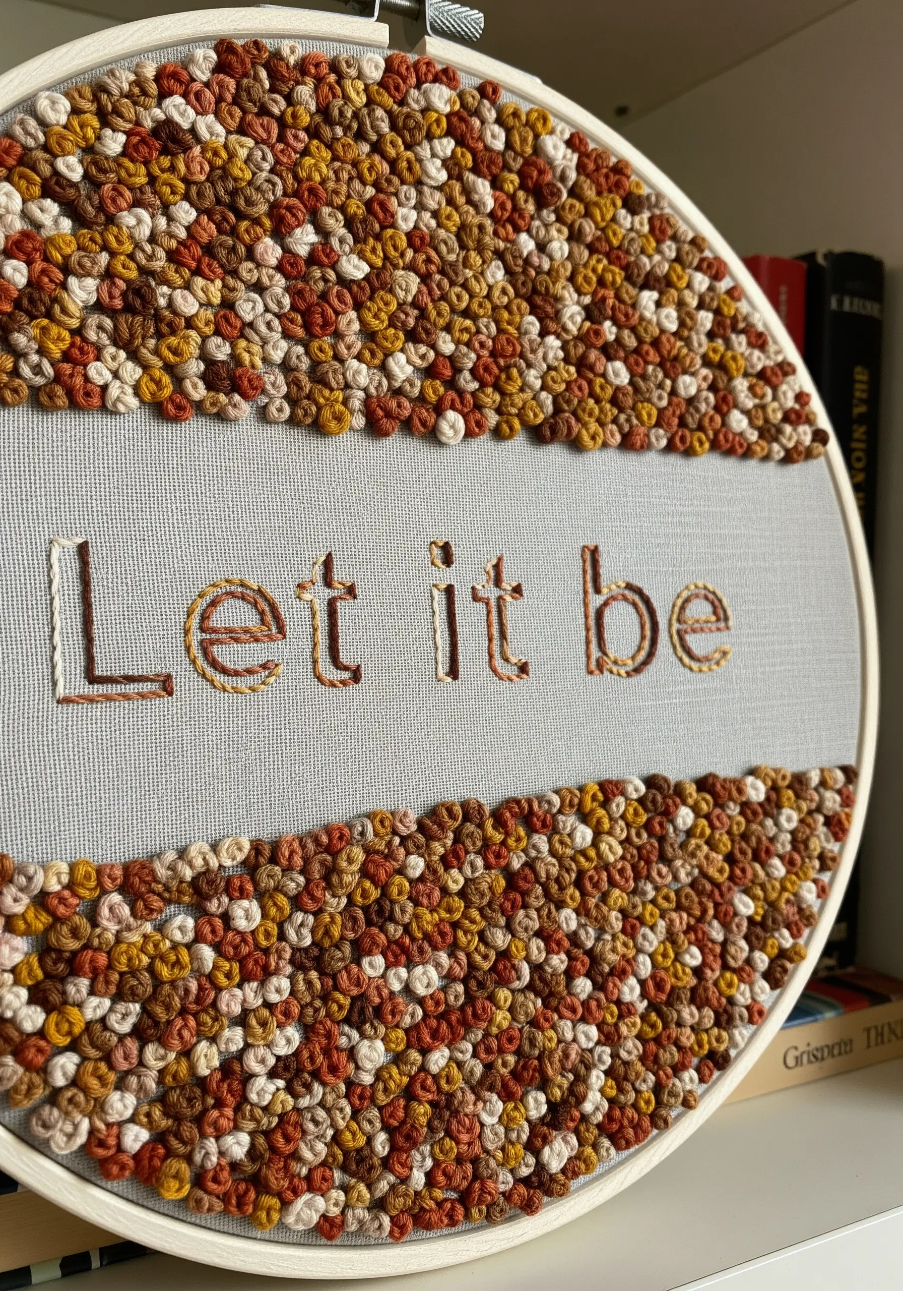
Define your message through the absence of stitches in this clever reversal of traditional embroidery.
Keep the letters themselves minimal—a delicate, single-strand backstitch is all you need.
The main effort goes into creating a dense, tactile frame of French knots in an earthy, variegated palette.
This use of Negative space lettering creates a powerful contrast between the quiet text and the rich, complex texture surrounding it.
7. Neon Glow Effect with Strategic Color

To create this retro-futuristic glow, the technique relies on high-contrast color choices and sharp, clean lines.
Use fluorescent thread for the main letter faces, filling them with a dense satin stitch for solid color.
Create the 3D effect with angled satin stitches in a secondary bright color, mimicking a light source from one side.
A black fabric background is essential; it absorbs light and makes the neon threads appear to vibrate and glow.
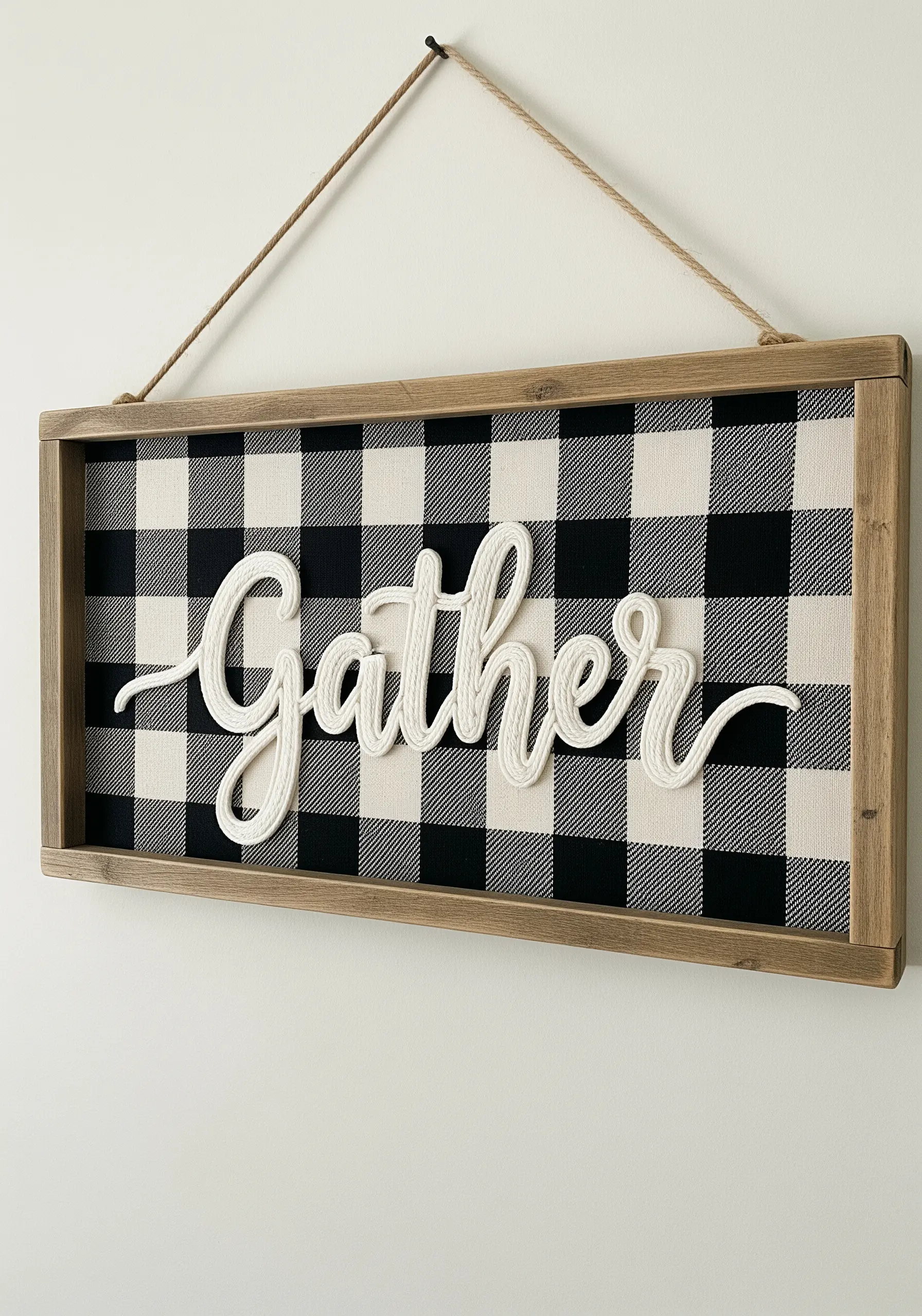
8. Crisp Appliqué on a Patterned Background
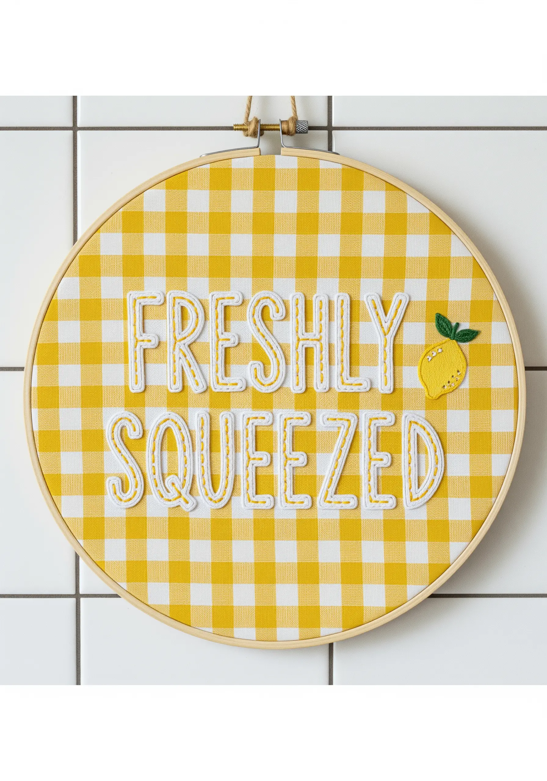
For perfectly uniform letters that stand out, use appliqué instead of direct stitching.
Cut your letters from stiff white felt and tack them down with a neat whipstitch around the edges using a matching thread.
Add a decorative backstitch just inside the border of each letter to create a clean, graphic outline and secure the felt.
This method is ideal for busy patterned fabrics like gingham, where embroidered fills might otherwise get lost in the visual noise.
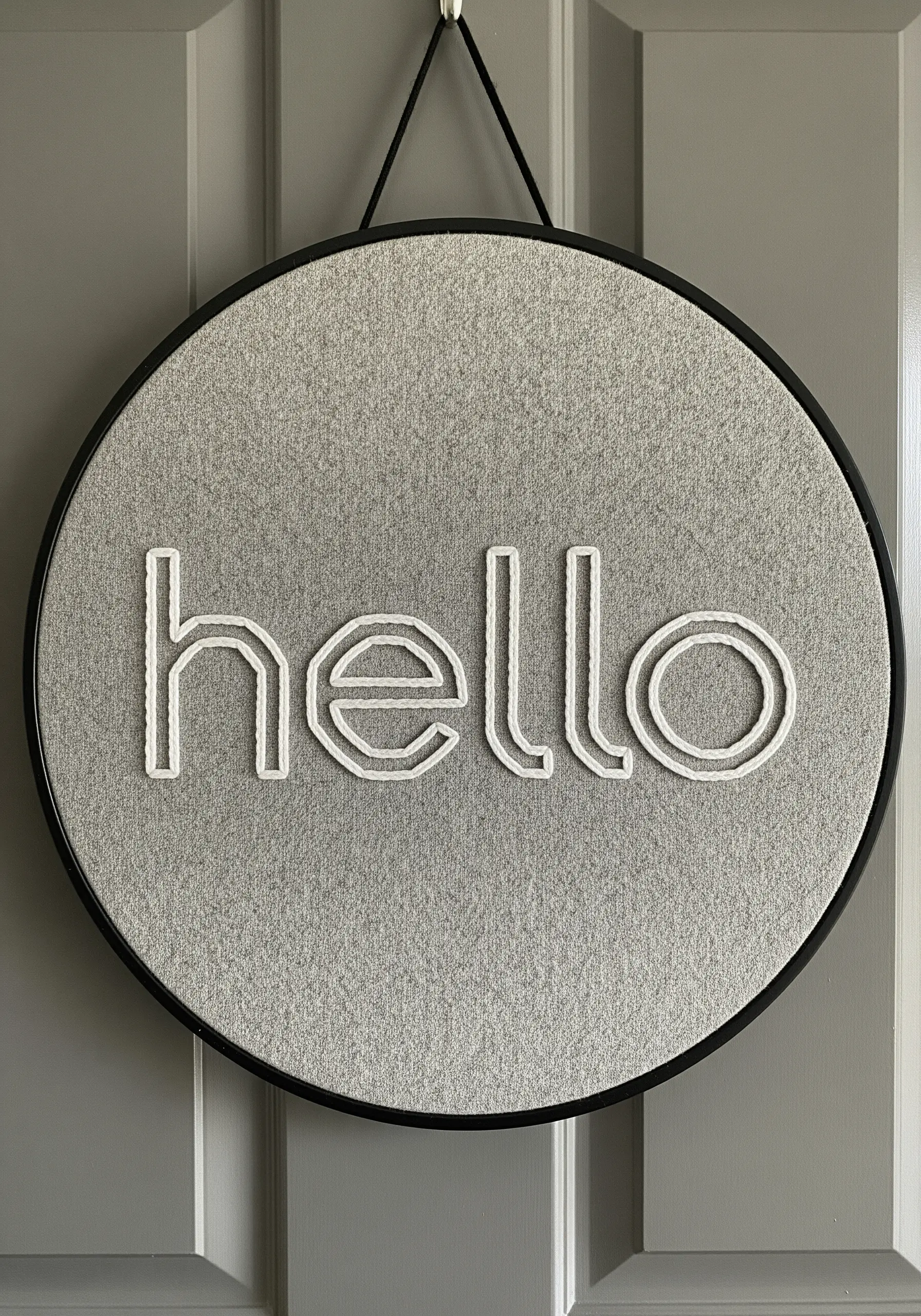
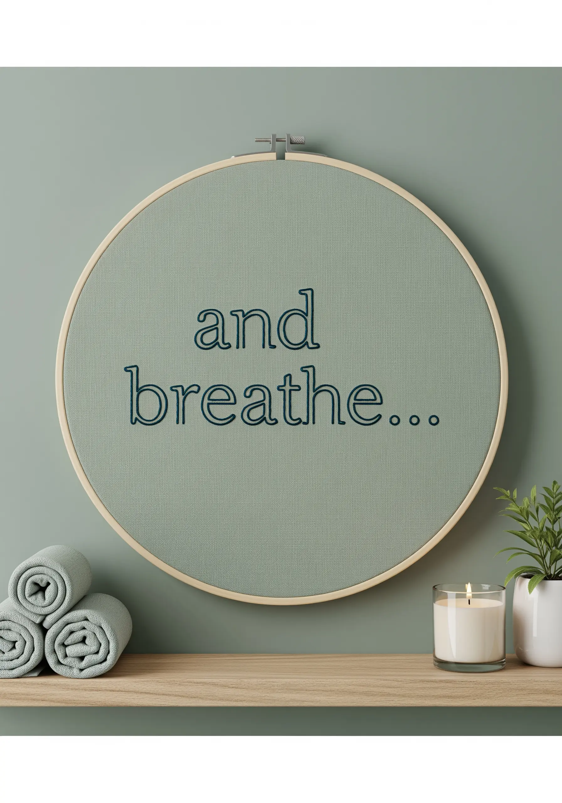
9. The Power of Minimalist Micro-Lettering
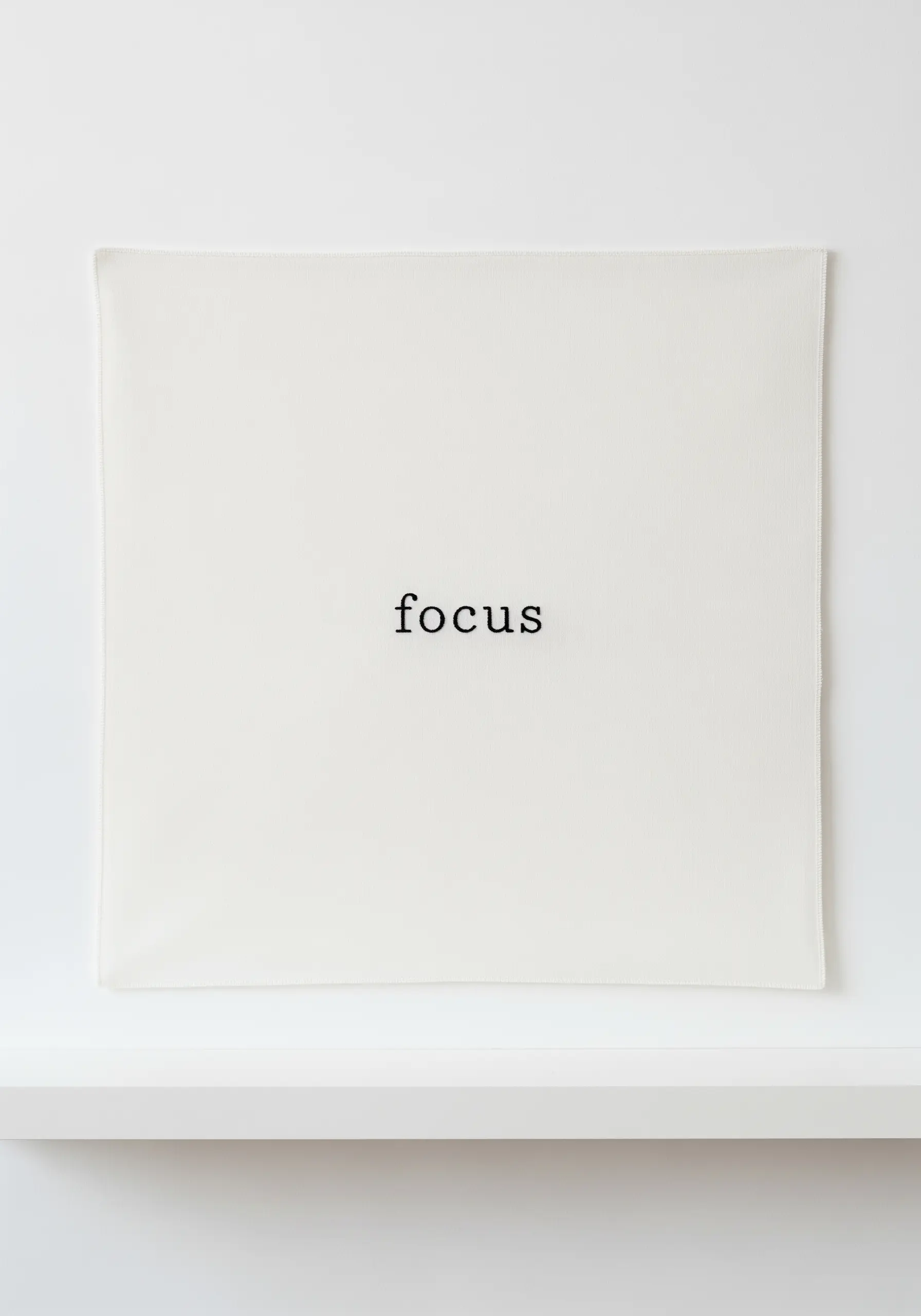
This design’s impact comes from its deliberate restraint and masterful use of negative space.
To achieve this crisp, delicate look, use only a single strand of black six-strand floss.
A tiny, precise backstitch is perfect for creating clean lines that mimic a classic typewriter font, making this a prime example of minimalist typography.
By placing a small word in the center of a large, empty canvas, you force the viewer’s eye to it, amplifying its meaning.
10. Dimensional Lettering with Chunky Yarn
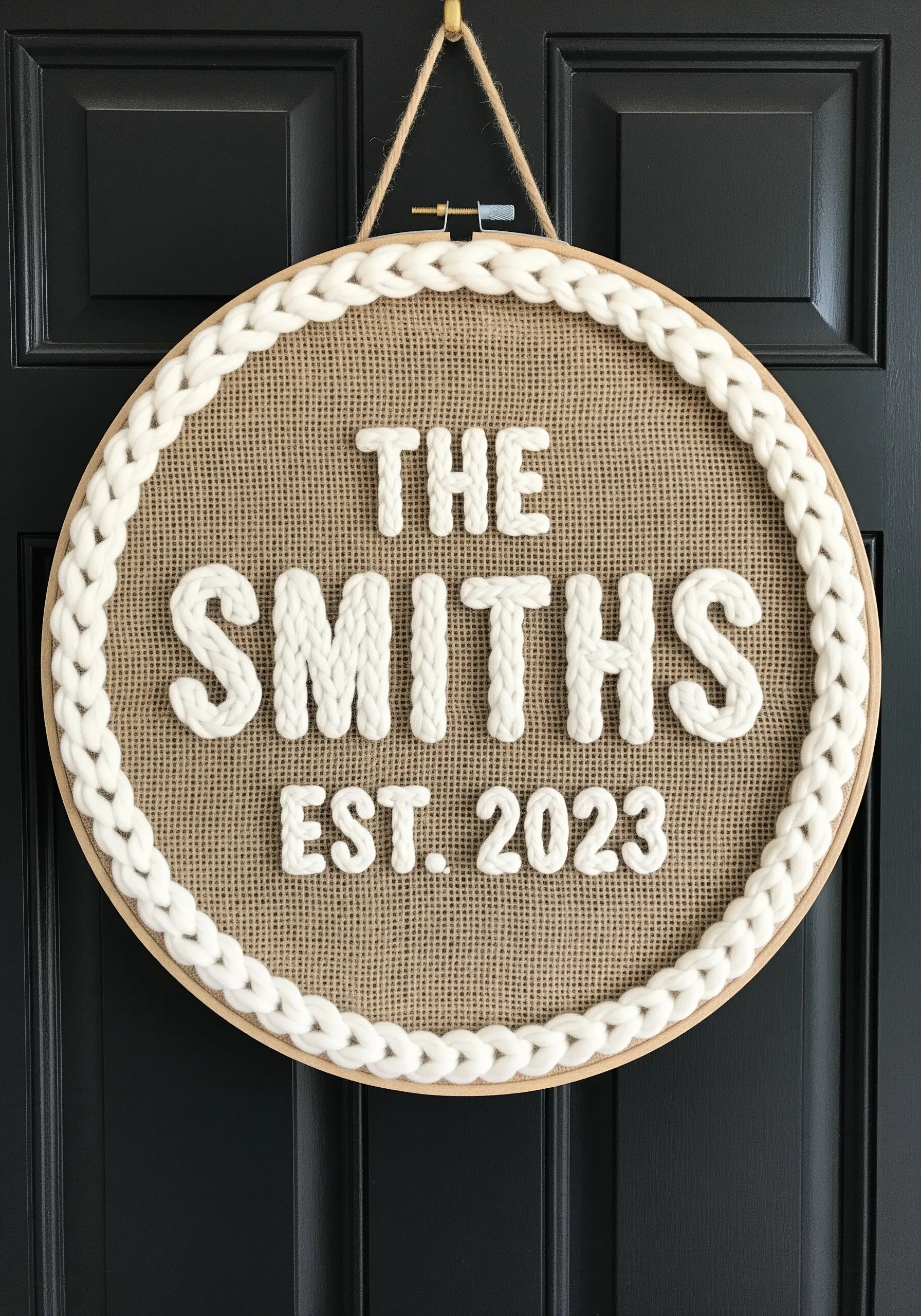
Create high-impact, textured letters by couching chunky yarn onto your fabric.
Lay the yarn down along your drawn letter shapes and use a standard six-strand floss in a matching color to tack it in place with small, evenly spaced stitches.
The contrast between the soft, thick yarn and the rustic burlap fabric creates a cozy, modern farmhouse aesthetic.
This is also a wonderfully fast way to create large-scale signage with significant dimension.
11. Mixed-Media Lettering on a Watercolor Wash
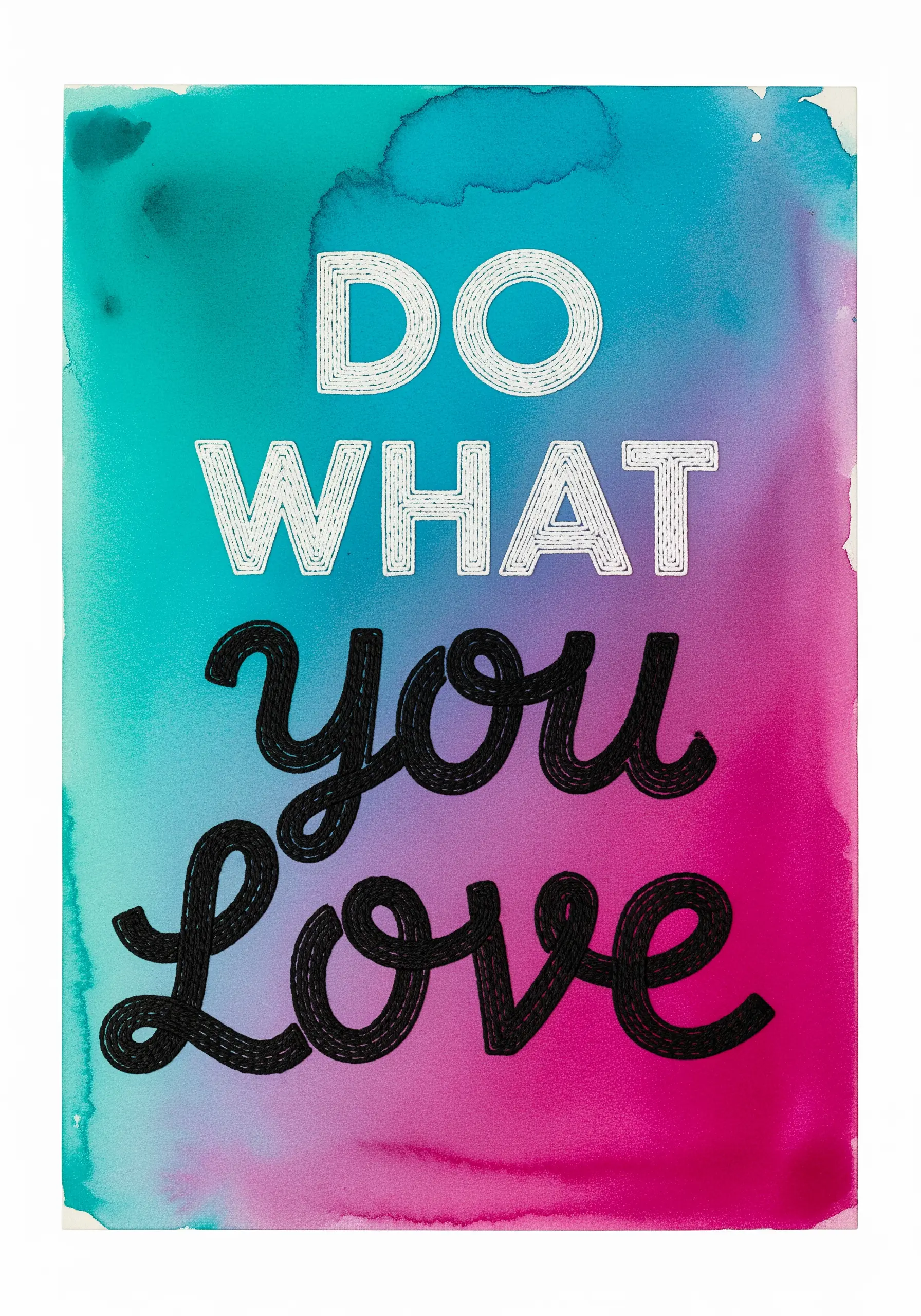
Elevate your embroidery by Combining Embroidery with a Watercolor Wash background.
Before stitching, apply watercolor paint directly to your fabric and let it dry completely.
The organic, blended colors create a vibrant and artistic canvas for your thread work.
Contrast the fluid background by using distinct thread weights and stitches for your text—a delicate backstitch for the print and a bolder chain stitch for the script—to make the words stand out.
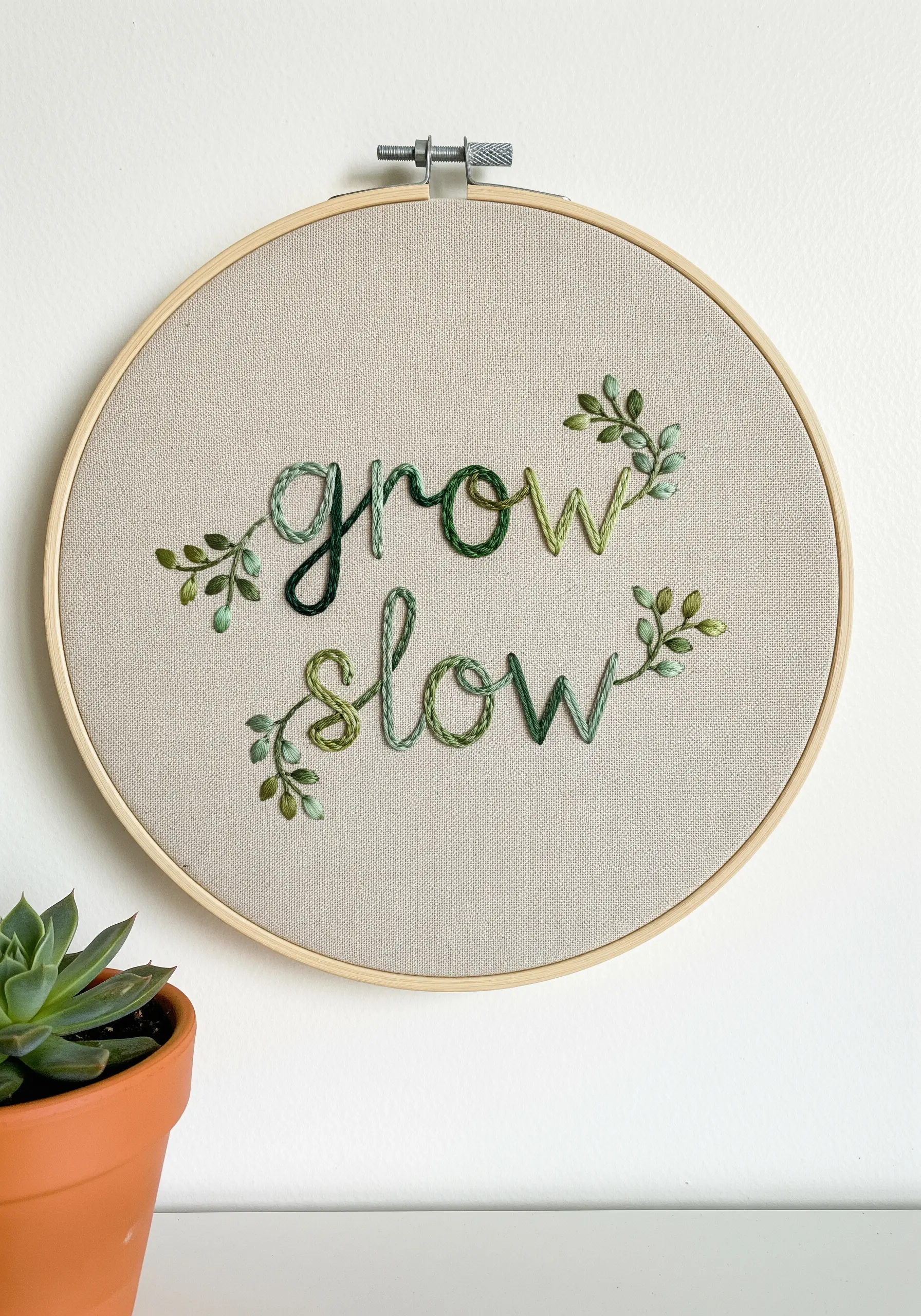
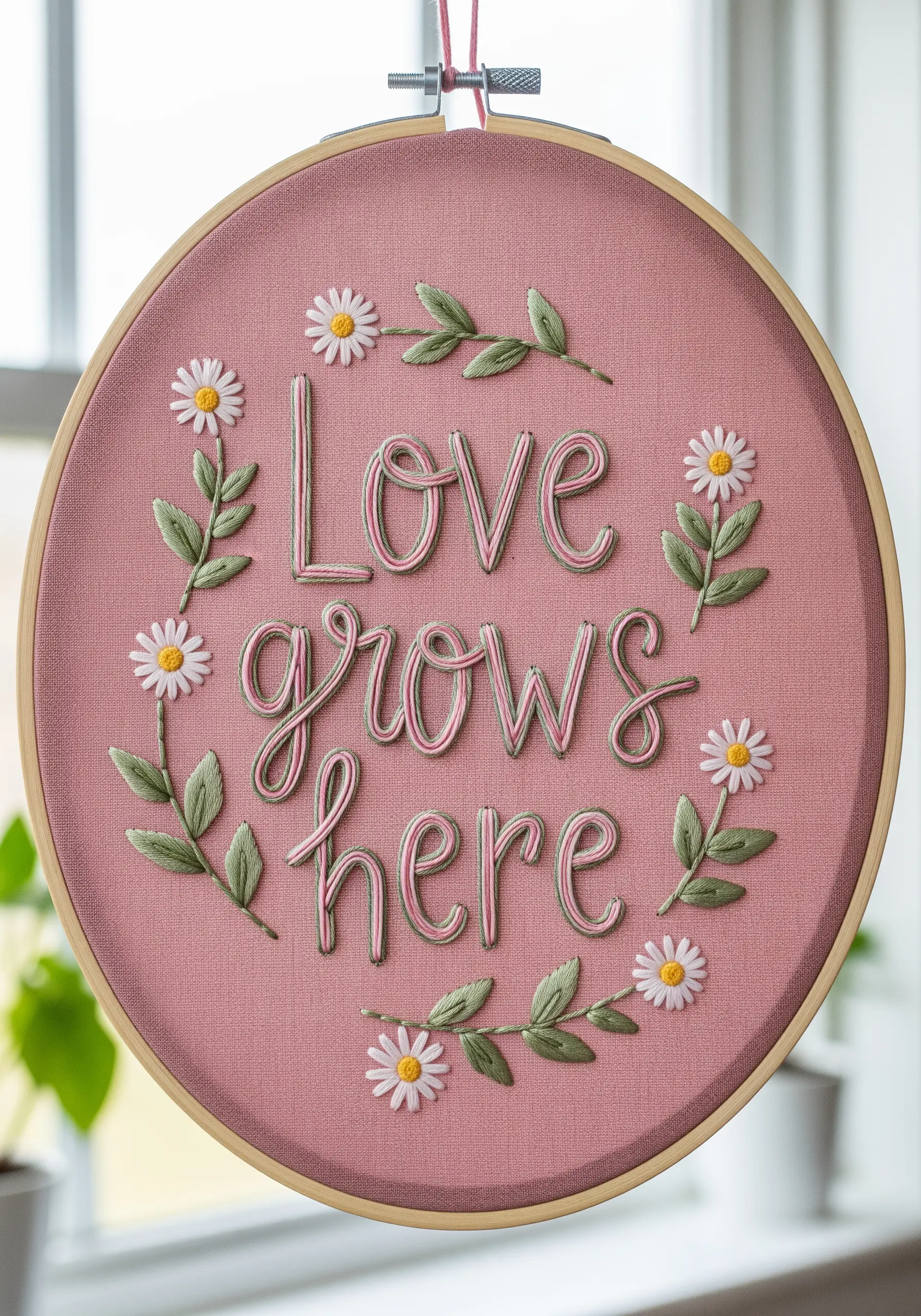
12. Botanical Fill: Letters Made of Tiny Florals
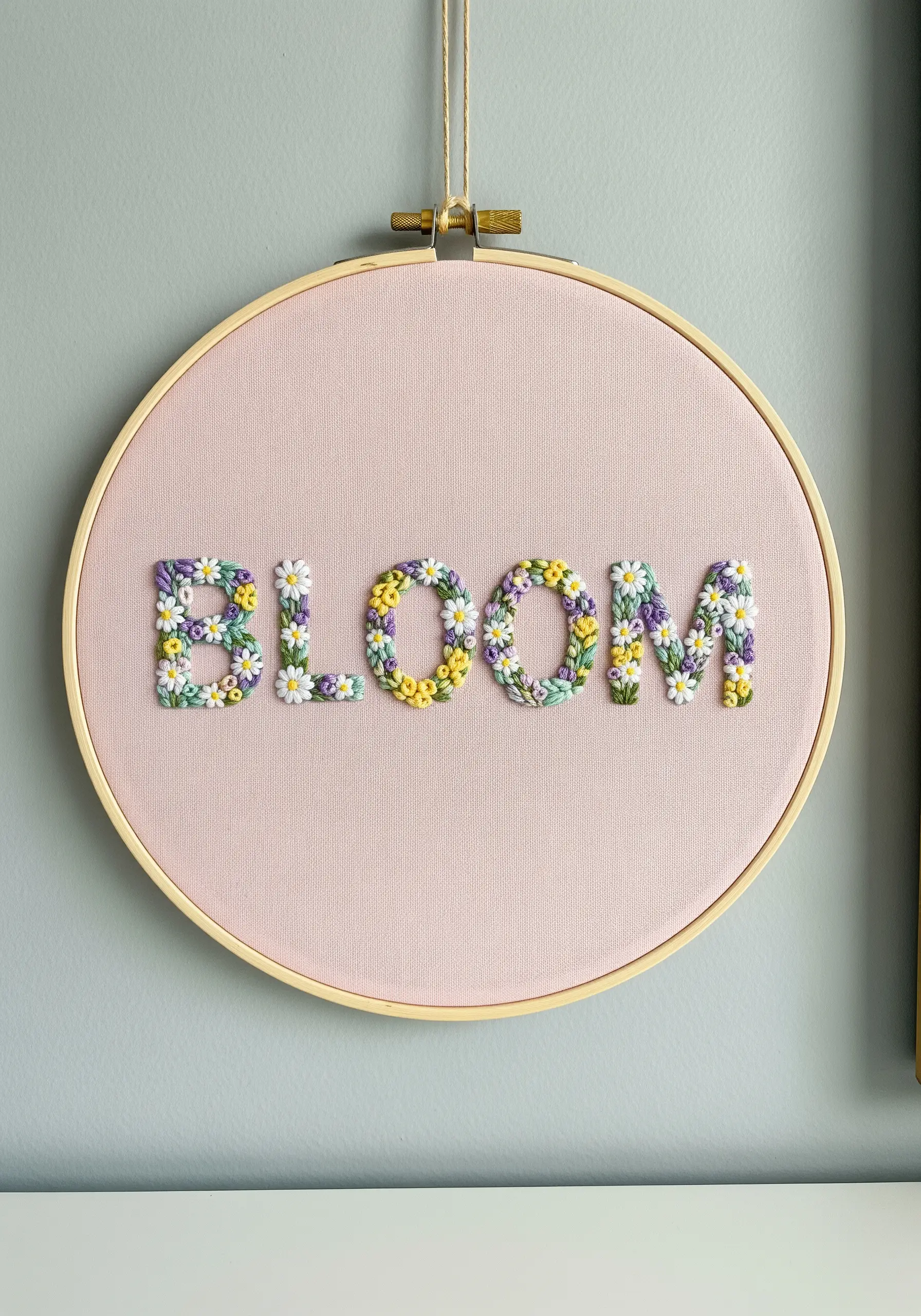
Instead of a traditional fill, grow your letters from a meadow of tiny floral stitches.
Lightly outline your letters, then fill the shapes with a dense collection of lazy daisy stitches for petals, French knots for flower centers, and small straight stitches for leaves.
Use a varied, harmonious color palette to give the impression of a wildflower field captured within the letterforms.
This technique transforms simple text into a miniature botanical garden, connecting the word to its meaning.
13. Art Deco Glamour on Plush Velvet
For a touch of vintage sophistication, stitch your lettering on a rich, deep-pile fabric like velvet.
The texture of the velvet creates a beautiful contrast with the sheen of metallic or silk thread.
To prevent your stitches from sinking, use a water-soluble stabilizer on top while you work; it provides support and then washes away.
A combination of satin stitch for wide strokes and backstitch for thin serifs brings the Art Deco font to life.
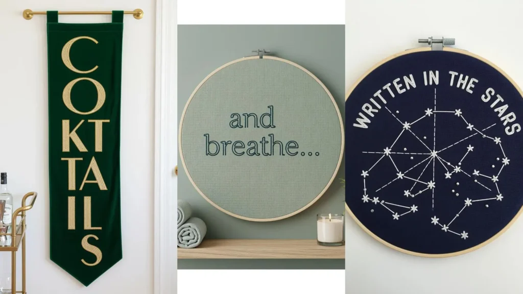
14. Celestial Typography with Star Stitch Details
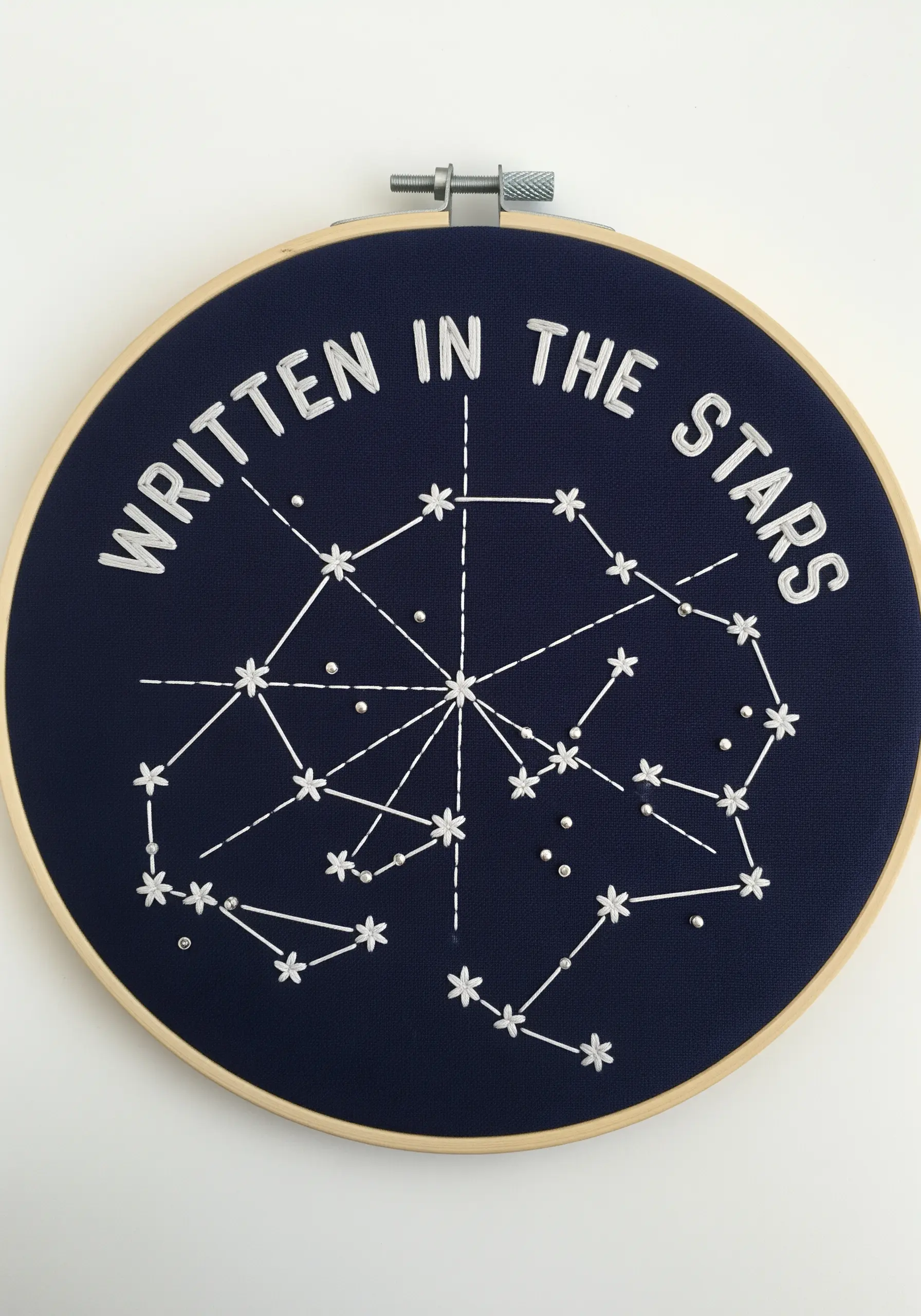
Create a celestial map by combining clean lettering with simple star stitches and French knots.
For the text, use a crisp backstitch with two or three strands of white floss to make it pop against the navy fabric.
Form the constellations by connecting star stitches or tiny seed beads with a single strand of thread.
The combination of typography and iconography tells a cohesive story, proving how minimal stitching can create a powerful visual narrative.
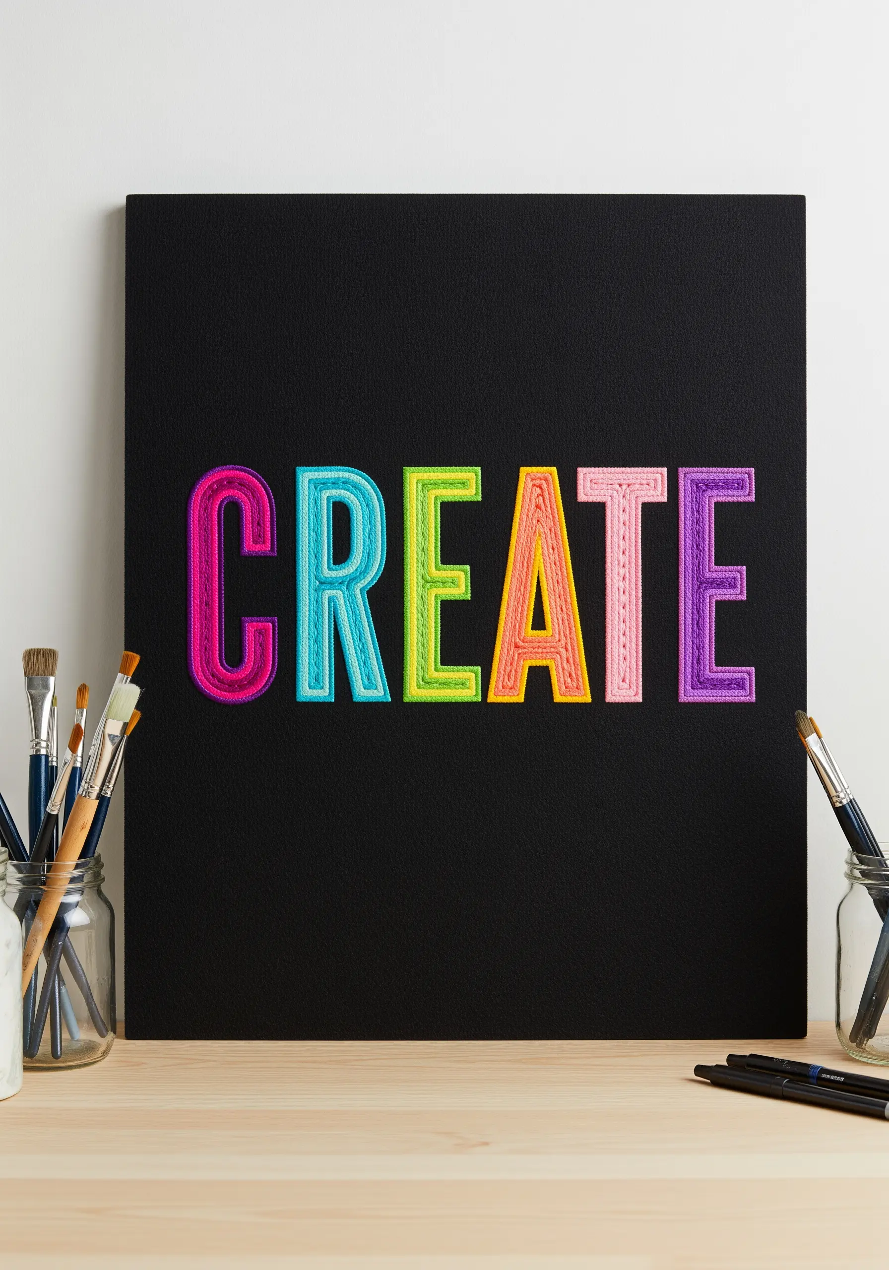
15. Bold Color Blocking with Satin Stitch
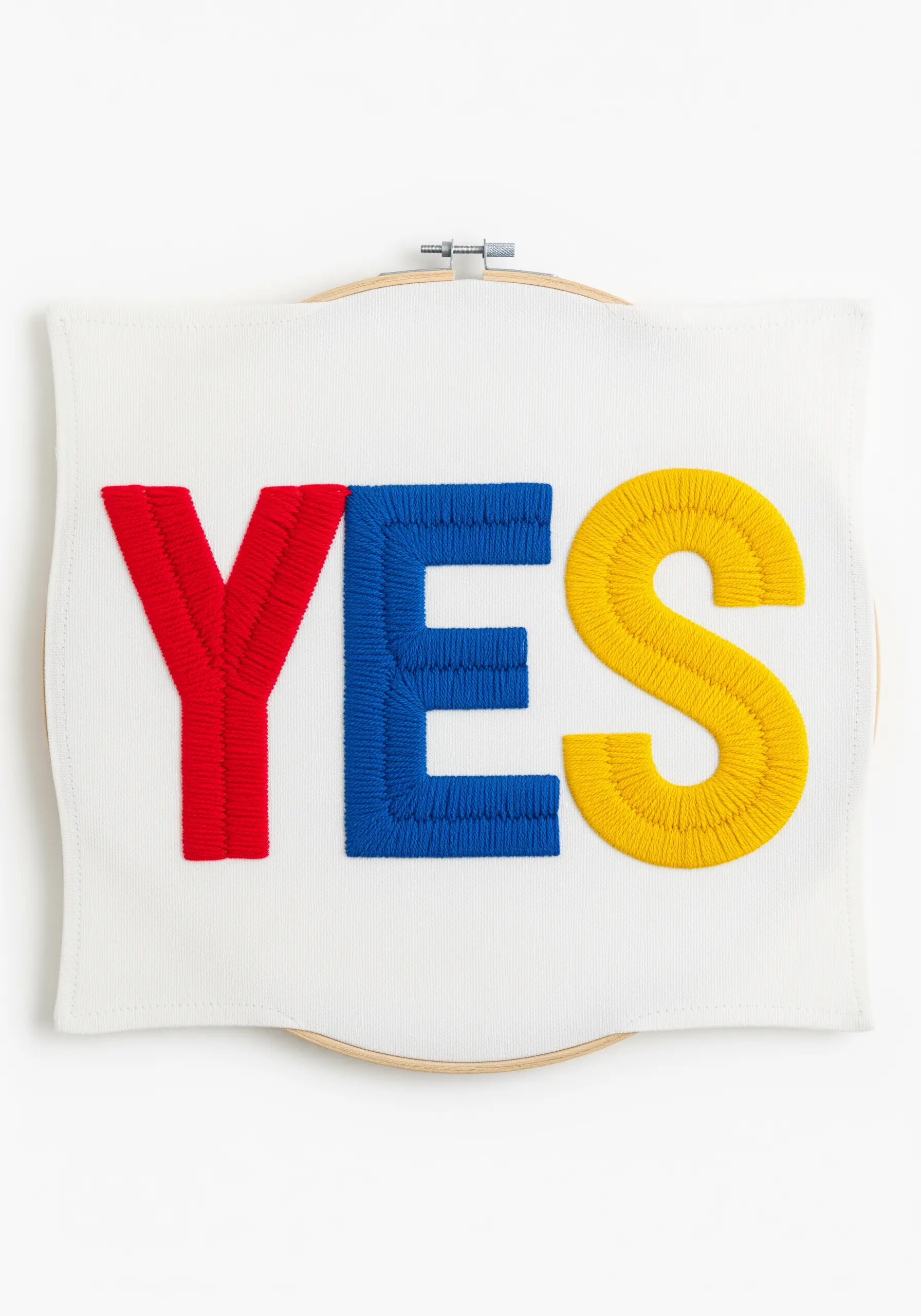
Make a powerful statement with primary colors and perfectly executed satin stitch in this example of Bold Color Blocking.
The success of this design depends entirely on the quality of your fill stitches.
To get those flawless blocks of color, first outline each letter with a split stitch. This raised edge acts as a dam, allowing you to pack your satin stitches tightly against it for a crisp, clean line where the colors meet.
Use all six strands of floss for a chunky, high-coverage finish.
16. Ethereal Lettering on Sheer Fabric
Stitching on a sheer fabric like organza creates a beautiful, floating effect that feels weightless.
The key to success is neatness, as the back of your work will be visible.
Plan your stitch path to minimize traveling threads and use tiny knots that can be hidden under stitches.
For extra stability, sandwich the organza between two layers of water-soluble stabilizer while you stitch; it provides support and then dissolves away, leaving only your delicate lettering.
17. Layered Lettering Over Abstract Stitches
This design creates a dreamy, atmospheric quality by layering precise lettering over a chaotic background.
First, create the base with loose, expressive straight stitches, blending threads to mimic brushstrokes in a form of abstract thread painting.
Next, stitch your word on top using a clean, solid white whipped backstitch to ensure it stands out.
The contrast between the freeform background and the controlled lettering creates a stunning visual tension and depth.
18. Plush, Fluffy Lettering with Turkey Work
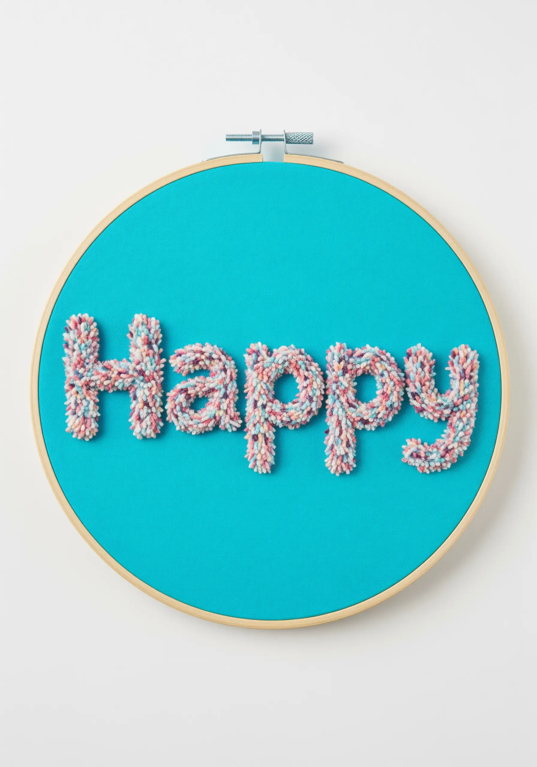
To create this wonderfully soft, carpet-like texture, you will use the turkey work stitch.
This stitch involves making loops on the surface of your fabric, which you then snip open and fluff up with your needle to create a plush pile.
Using a variegated yarn adds instant depth and visual interest to the fluffy texture.
This technique is perfect for playful words and adds a fun, three-dimensional element to your work.
19. Architectural Lettering with a Padded Foundation
Achieve this subtle, raised, 3D effect with a technique called padded satin stitch.
First, create a foundation within your letter outlines using layers of straight stitches or felt cutouts to build up height.
Then, work your final, smooth satin stitches over this padding at a perpendicular angle.
The extra height makes the letters pop from the fabric, creating a beautiful, minimalist play of light and shadow on the raised surface.
20. Typographic Spiral with Precision Stitching
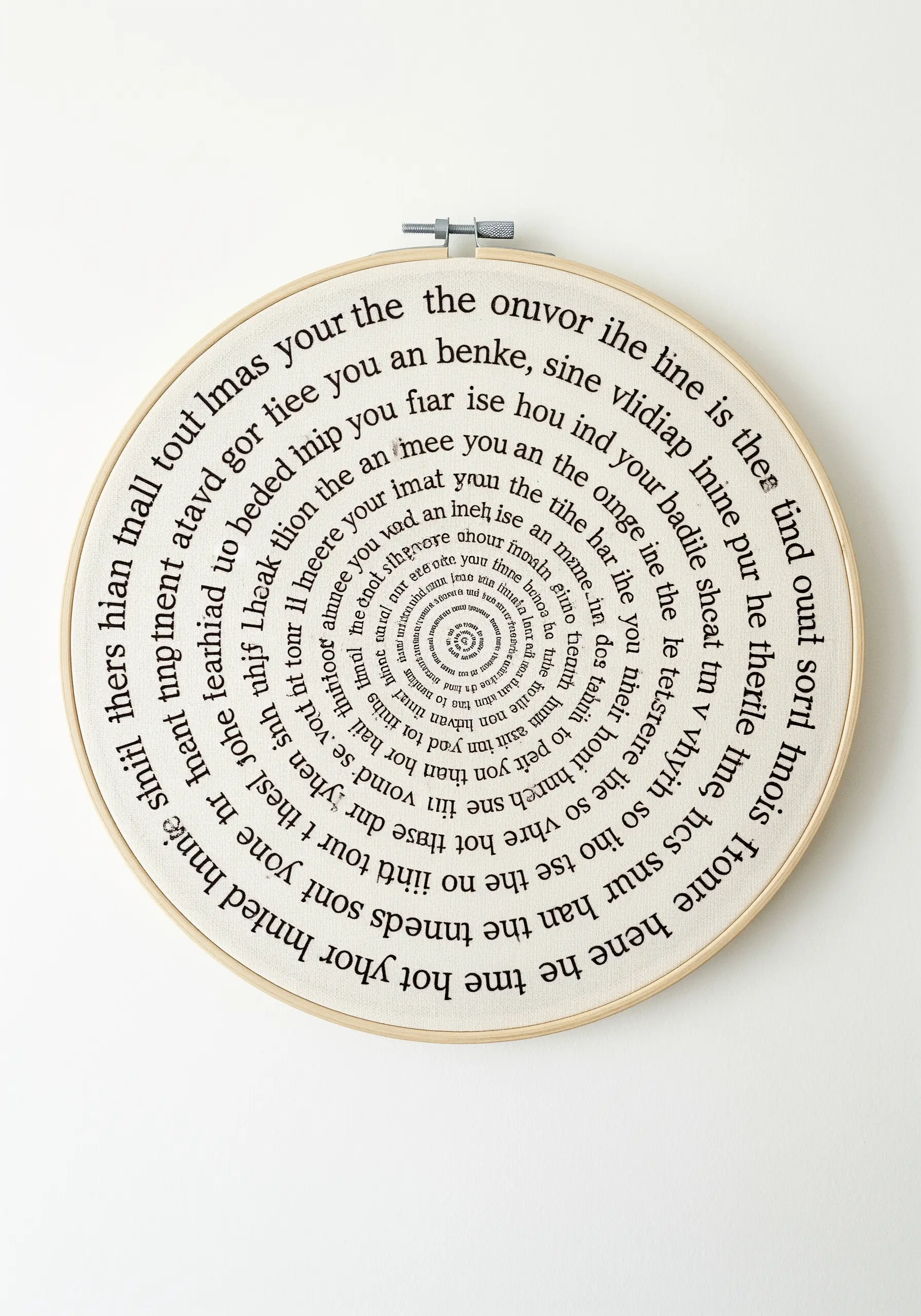
This mesmerizing design is a masterclass in precision and planning.
The key to a successful spiral is a perfectly drawn guide; use a compass to create an accurate spiral guideline on your fabric with a water-soluble pen.
Then, using a tiny backstitch with a single strand of floss, carefully trace the text along the line.
Maintaining consistent stitch length and spacing is crucial for readability as the spiral tightens, drawing the viewer’s eye inward.
21. Integrating Typography into an Embroidered Landscape
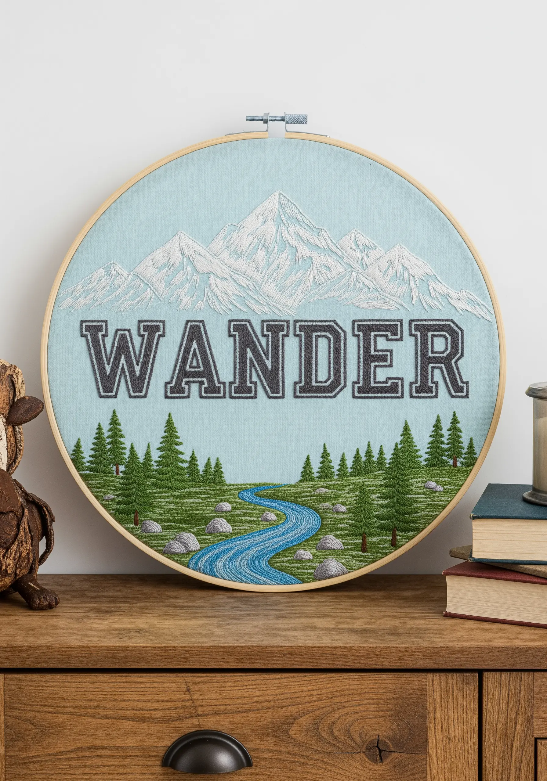
Make your text a core feature of the scene by integrating it directly into the composition.
Position the word as a central element and use a bold, solid fill stitch to give it weight and presence.
Frame the typography with classic landscape elements stitched in complementary styles: long-and-short stitch for snowy mountains, French knots for rocky ground, and straight stitches for pine trees.
This approach transforms a simple quote into a cohesive and immersive Embroidered Landscape.
22. An Alphabet Sampler of Typographic Styles
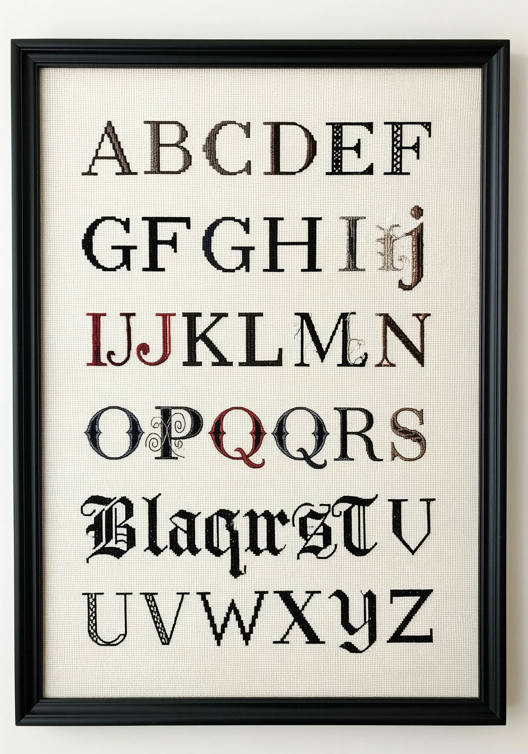
Challenge yourself to create a sampler that is a study in font and texture, not just letters.
Render each letter in a different typographic style, from classic serifs to ornate gothic scripts and modern pixelated forms.
Use cross-stitch on Aida cloth for blocky letters and switch to finer stitches like backstitch on evenweave for detailed scripts.
By mixing fonts and thread colors, you create a dynamic reference piece that showcases both history and skill.
23. Monochrome Texture with a Stitch Dictionary
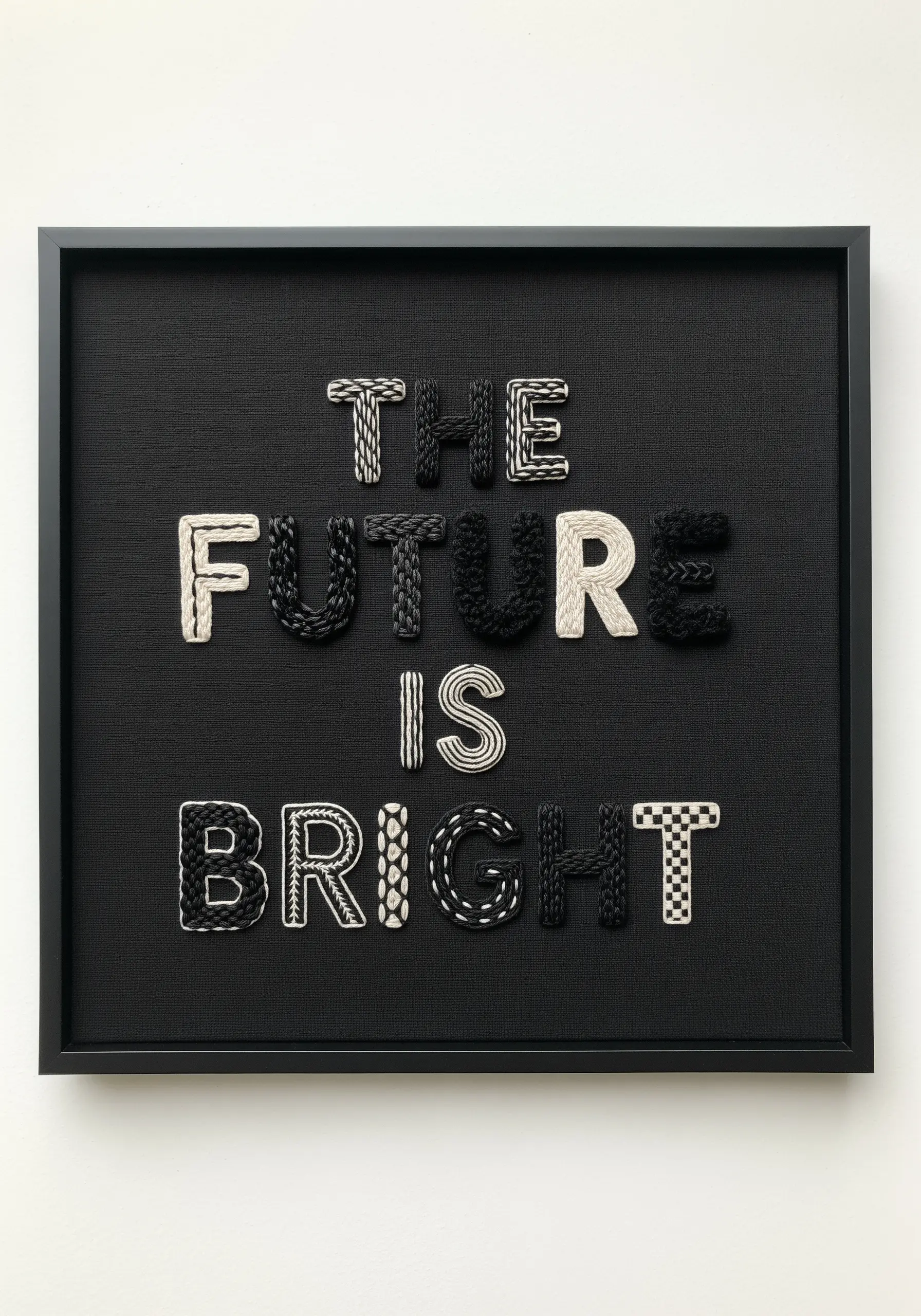
Explore the power of texture by filling each letter with a different black-and-white stitch pattern.
This project proves you don’t need color to create a high-impact design; the variety comes from the stitches themselves.
Combine classic stitches like weaving, basket stitch, chain stitch, and checkerboard fills to create visual interest.
The contrast between the stark monochrome palette and the rich variety of patterns turns a simple quote into a tactile work of art.
24. Retro Arcade Lettering with Cross-Stitch
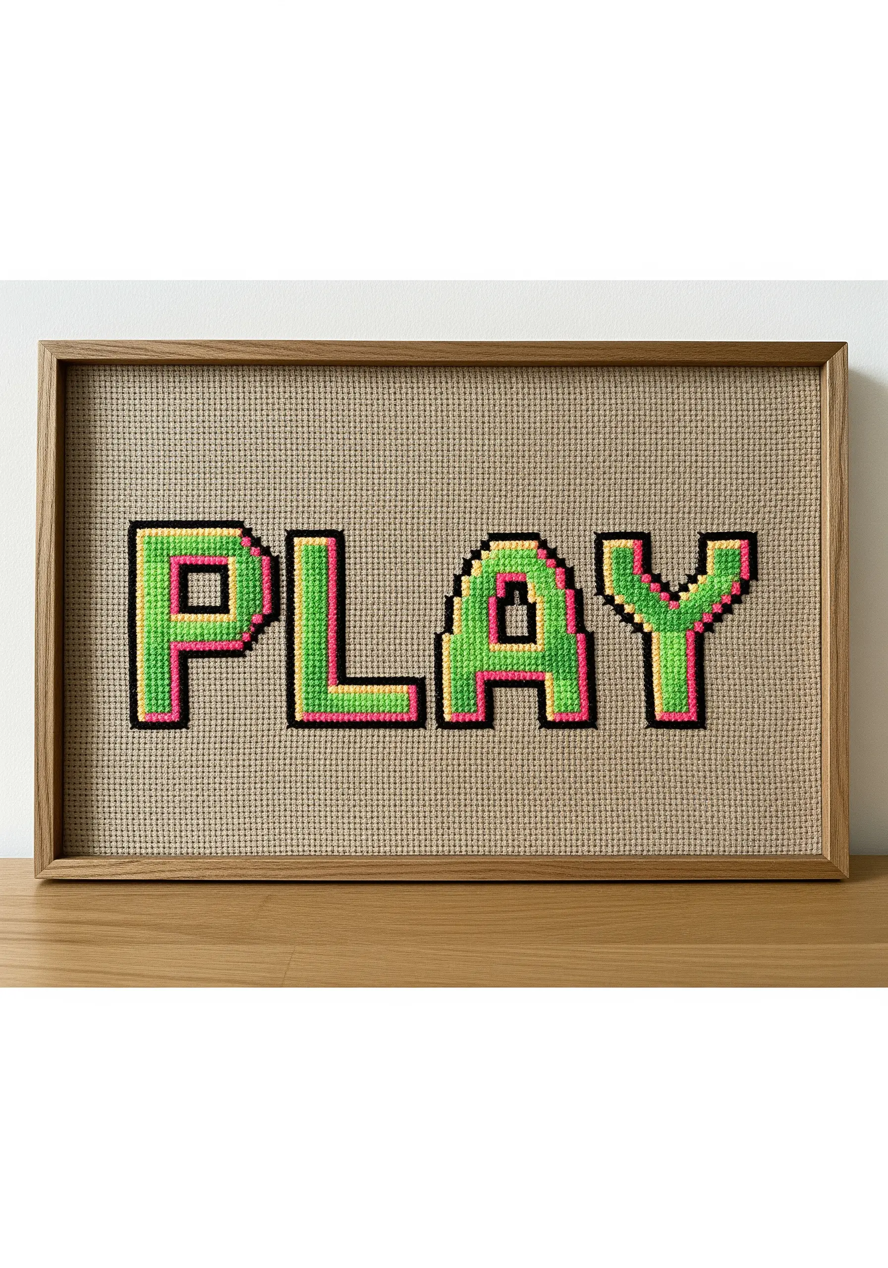
Recreate the nostalgic look of 8-bit video games by using cross-stitch on Aida or evenweave fabric.
The inherent grid of the fabric is perfect for building pixelated letterforms with crisp edges.
Use bright, neon colors for the main fill and a sharp black outline to define the shape, just like old-school graphics.
This fun, graphic approach to typography is also incredibly beginner-friendly and satisfyingly quick to complete.
25. 3D Cursive with Wrapped Wire Forms
For a truly three-dimensional effect, build your letters off the fabric before attaching them.
Carefully bend a sturdy wire into your desired cursive word, creating a structural base.
Tightly wrap this wire form with yarn or thick thread, then stitch the finished word onto your fabric background.
This technique creates a piece that is part sculpture, part embroidery, with a shadow-casting presence that traditional stitching can’t replicate.
26. Beveled Block Letters with Thread Blending
Achieve this chiseled, metallic look by blending different shades within each letter to create the illusion of light and shadow.
Use a long-and-short stitch to create smooth gradients that mimic a beveled edge.
Place the darkest shade along one side, a mid-tone in the center, and the lightest shade on the opposite side.
A sharp backstitch outline contains the colors and enhances the illusion of depth, making the letters look solid and dimensional.
27. Ornate Monograms with Intricate Fill Stitches
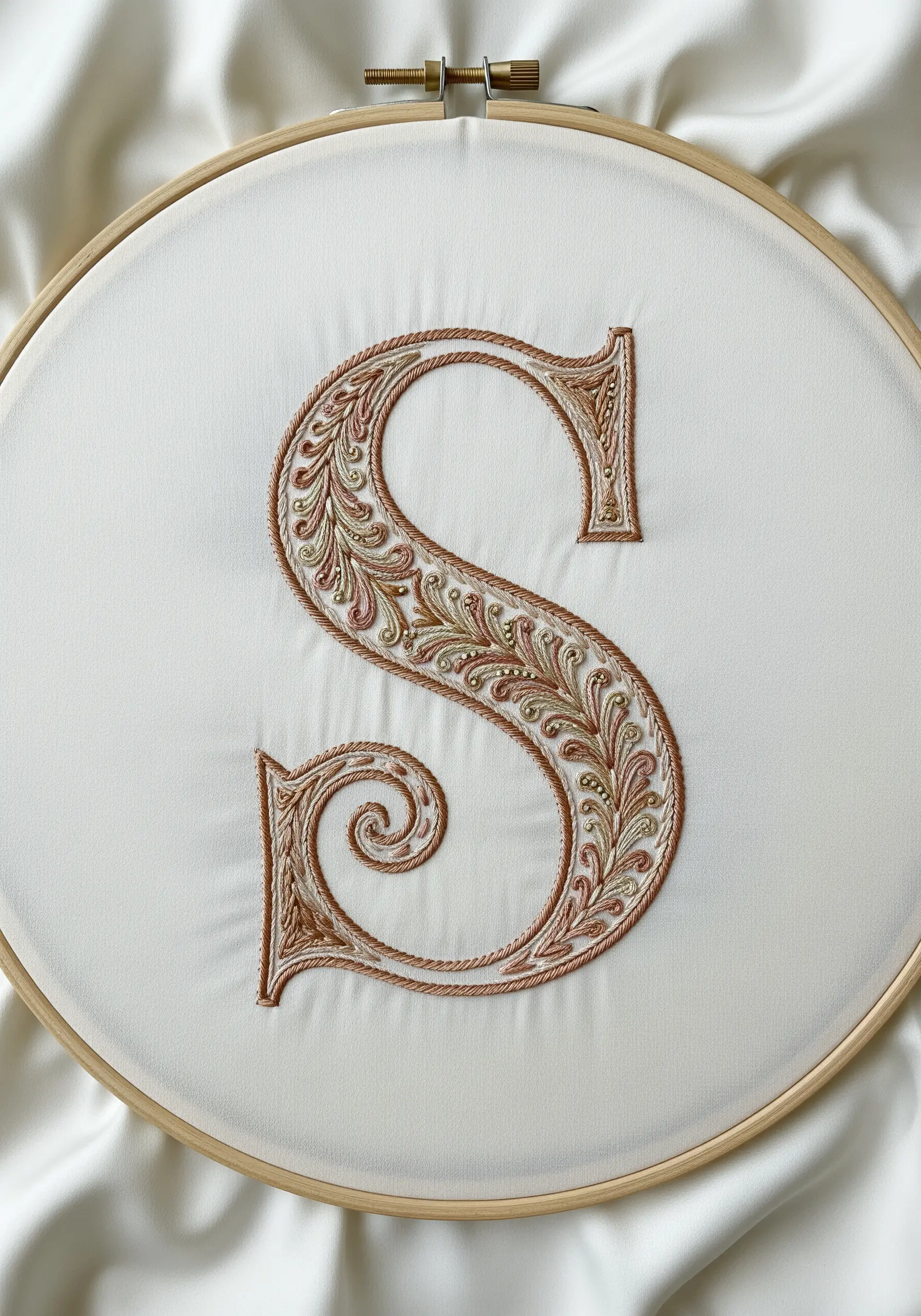
Transform a simple initial into an heirloom-quality piece by filling it with a dense tapestry of delicate stitches.
Outline the letter with a heavier stem stitch, then fill the interior with a thoughtful pattern of French knots, seed stitches, and tiny leaf stitches.
Incorporate metallic threads to add a touch of luxury and light-catching detail.
This approach to Ornate Monograms turns a single letter into a rich, textural work of art.
28. Minimalist Outline Lettering for Serene Decor
Sometimes the most powerful statement is the most understated.
For this calming design, you will only stitch the outline of the letters, leaving the interior completely empty.
Choose an elegant, thin font and trace it with a delicate backstitch or stem stitch using just two or three strands of floss.
The impact comes from the clean lines and the vast amount of negative space, which gives the message room to breathe.
29. Two-Tone Whipped Backstitch Lettering
Create a charming, candy-stripe effect on your letters by using a whipped backstitch with two different colors.
First, complete a standard backstitch in your base color.
Then, take a second, contrasting color and ‘whip’ it around each backstitch without piercing the fabric.
This adds a second color and a smooth, rope-like dimension to your lines, resulting in a decorative text that looks far more complex than it is to execute.
30. Op-Art Lettering with Concentric Outlines
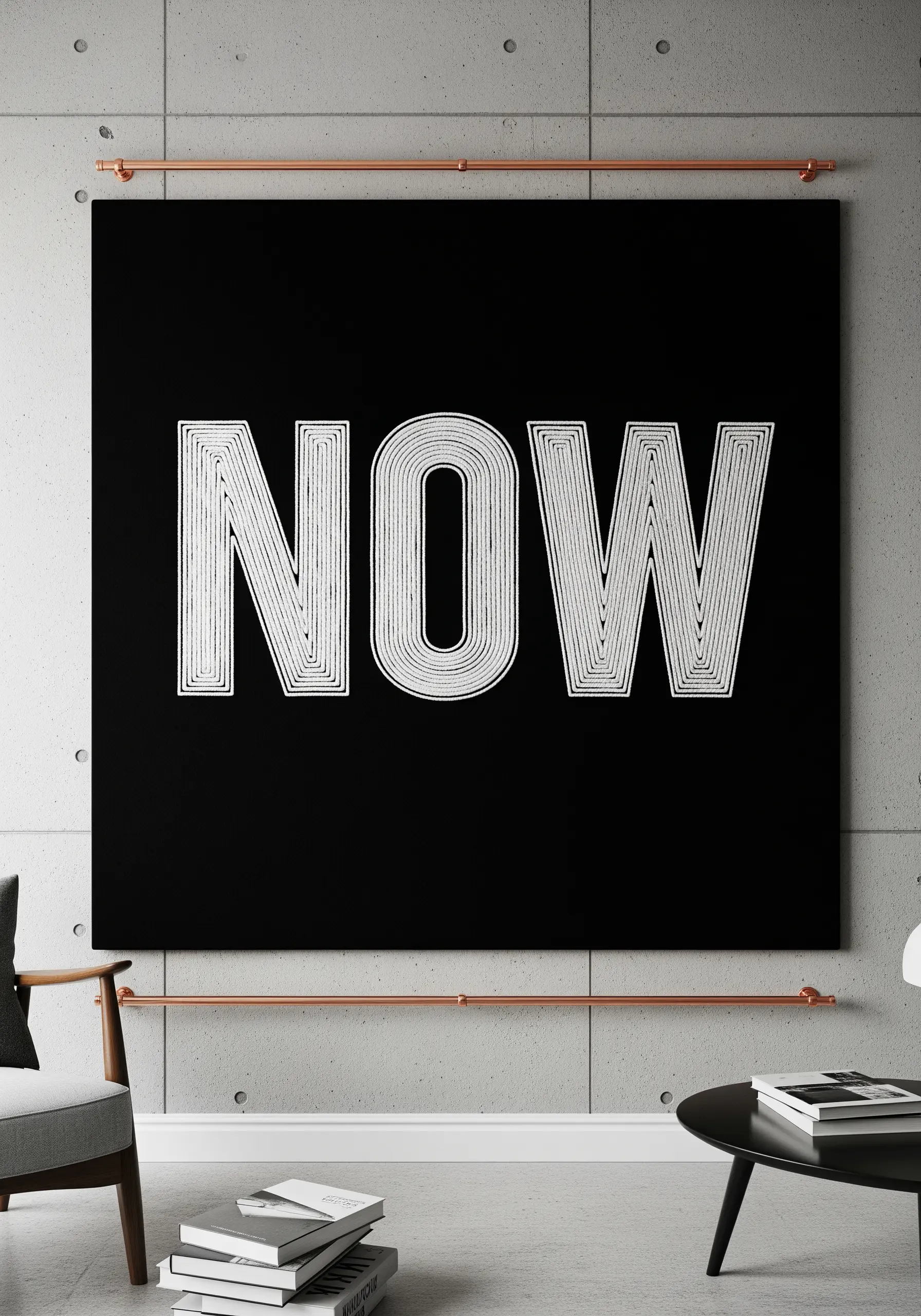
This striking design uses the power of repetition to create an optical illusion.
Instead of filling the letters, you will stitch a series of concentric outlines using a simple backstitch.
Start with the innermost outline and work your way out, keeping the spacing between each line as consistent as possible to create a vibrating effect.
Using high-contrast white thread on black fabric maximizes the graphic, modern, and hypnotic impact.
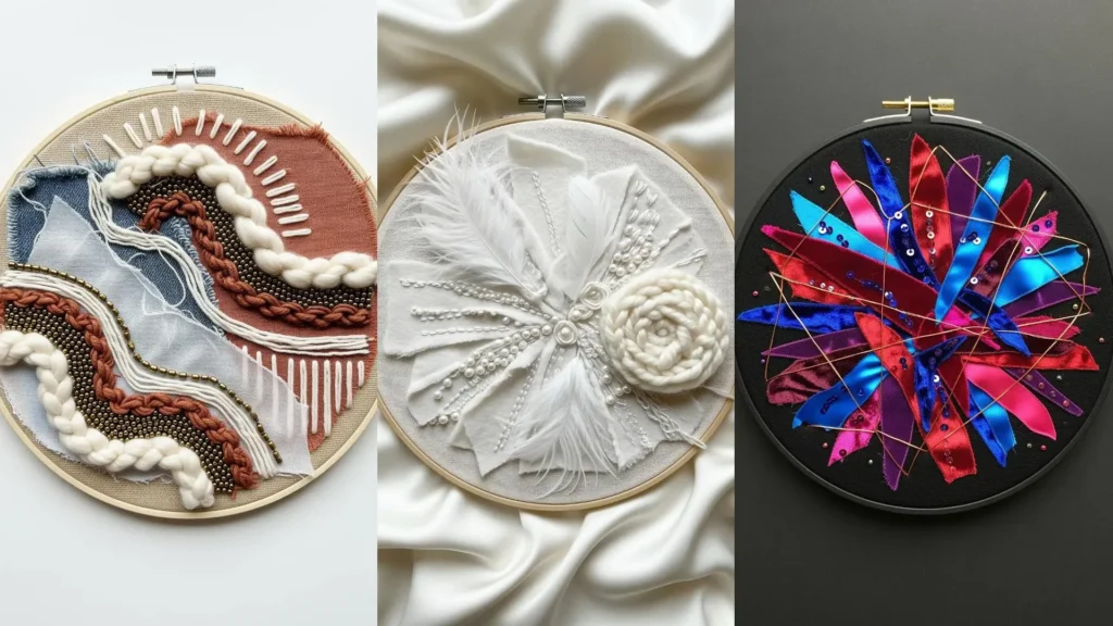
31. Embellished Script with Beads and Sequins
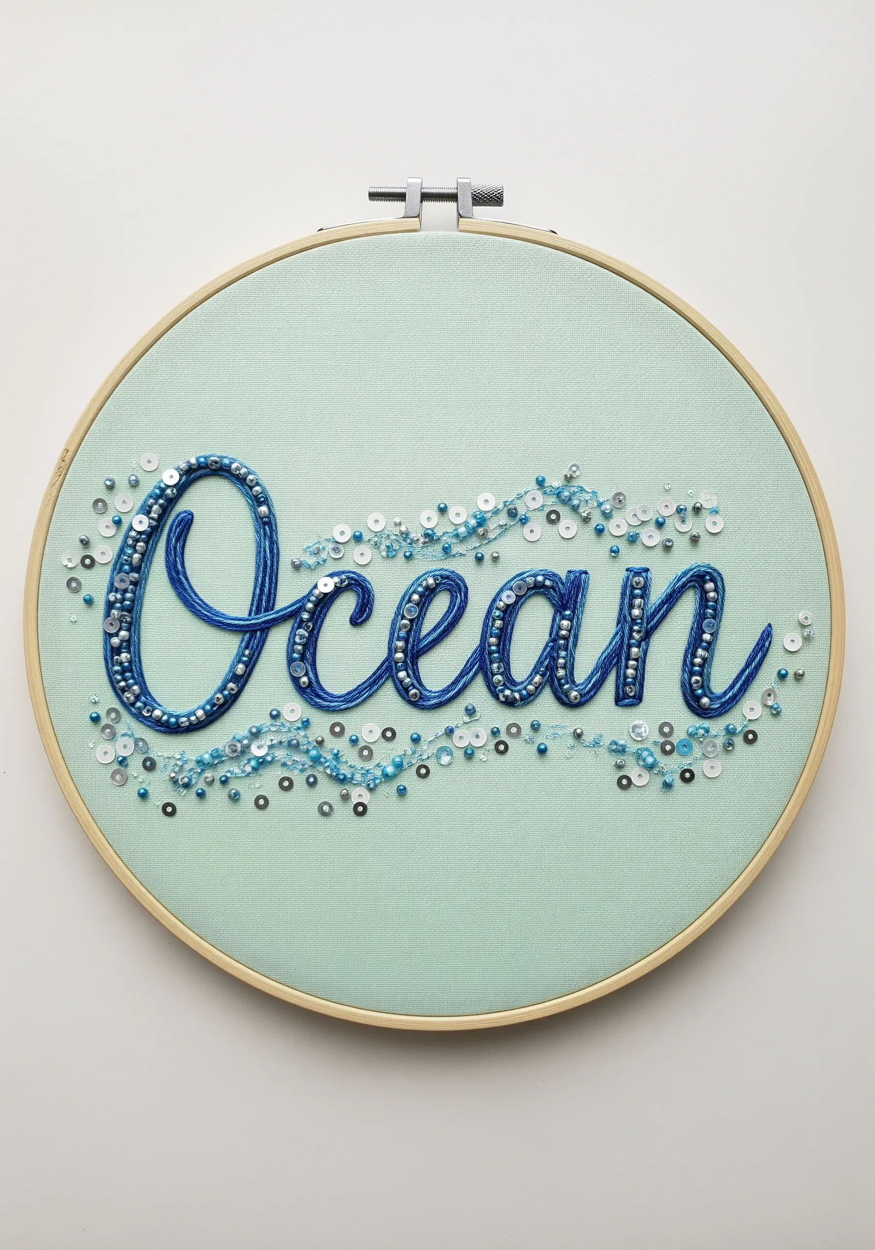
Add a layer of sparkle and shimmering texture by incorporating beads and sequins into your lettering.
First, stitch your word using a foundational chain stitch to provide a solid base.
Then, go back over the letters and the surrounding area, sewing on a curated mix of seed beads, bugle beads, and sequins.
Cluster them densely on the script and scatter them outwards to create a sense of movement, like light reflecting on water.