Your canvas tote bag is more than just a practical accessory; it’s a blank slate waiting for your creative touch. Too often, we hesitate, worried that our stitching won’t look polished or that our ideas aren’t original enough. But what if you could transform that simple bag into a piece of wearable art that feels entirely, authentically you?
The secret isn’t in mastering dozens of complex stitches. It’s in the small, intentional choices: how you form a letter, how you blend two shades of thread to give a vegetable dimension, or how you use texture to make a word feel like a cloud. It’s about understanding why a simple backstitch outline can make your whole design look sharper and more professional.
Here, you’ll find more than just ideas; you’ll find the techniques behind them. Each concept is designed to give you a visible, tangible improvement in your work. Let this be your guide to creating a tote bag that not only carries your groceries but also tells a story with confidence and style.
1. Create Depth with Shaded Satin Stitch
To prevent your satin-stitched vegetables from looking flat, use two or three shades of the same color.
For the carrots, start with a medium orange, then add a lighter orange for highlights and a darker one for shadows along the edge.
This technique, known as thread painting or long-and-short stitch, adds dimension without complicating the design.
Use a crisp split stitch for the leafy tops to contrast the smooth texture of the vegetables.
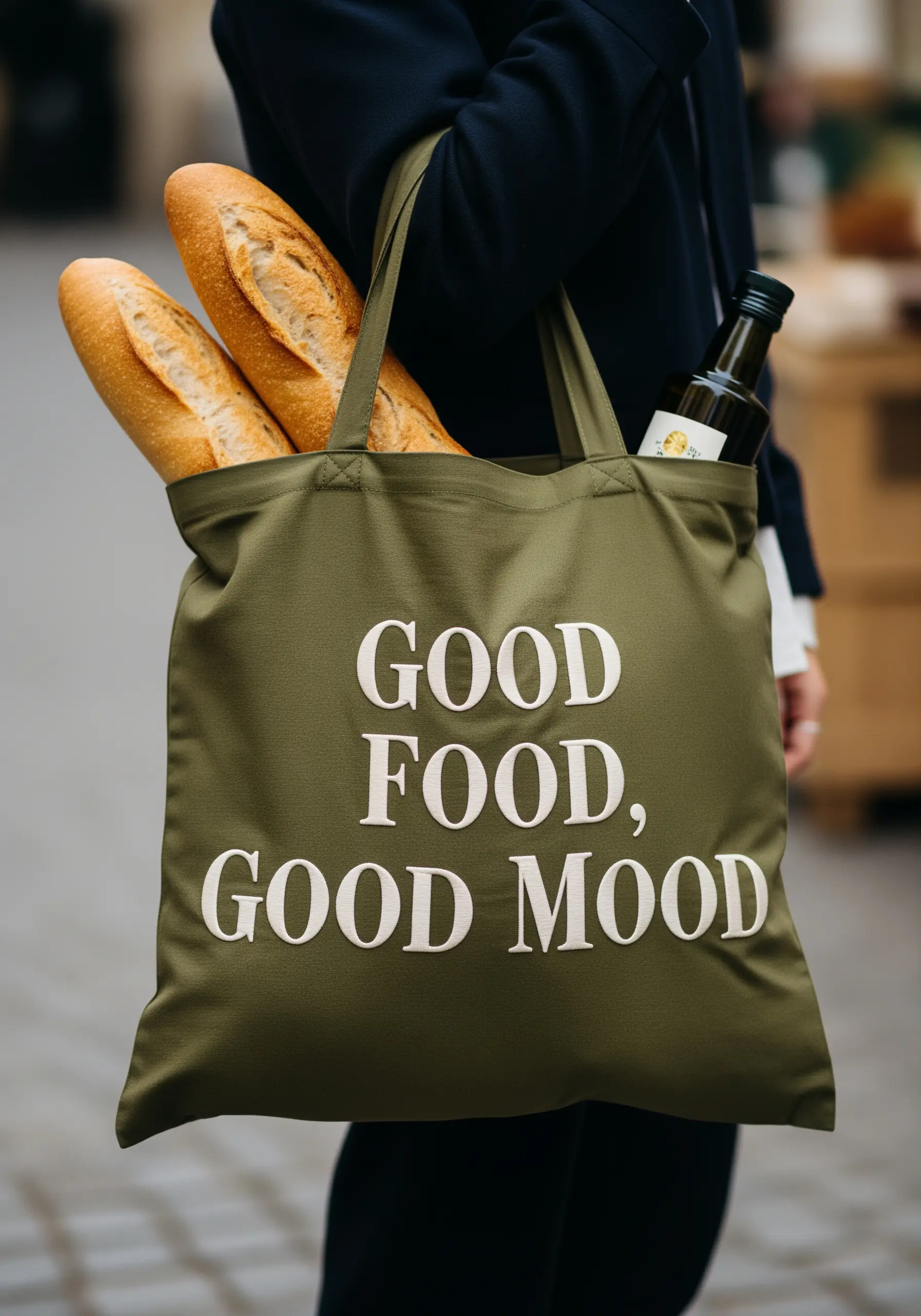
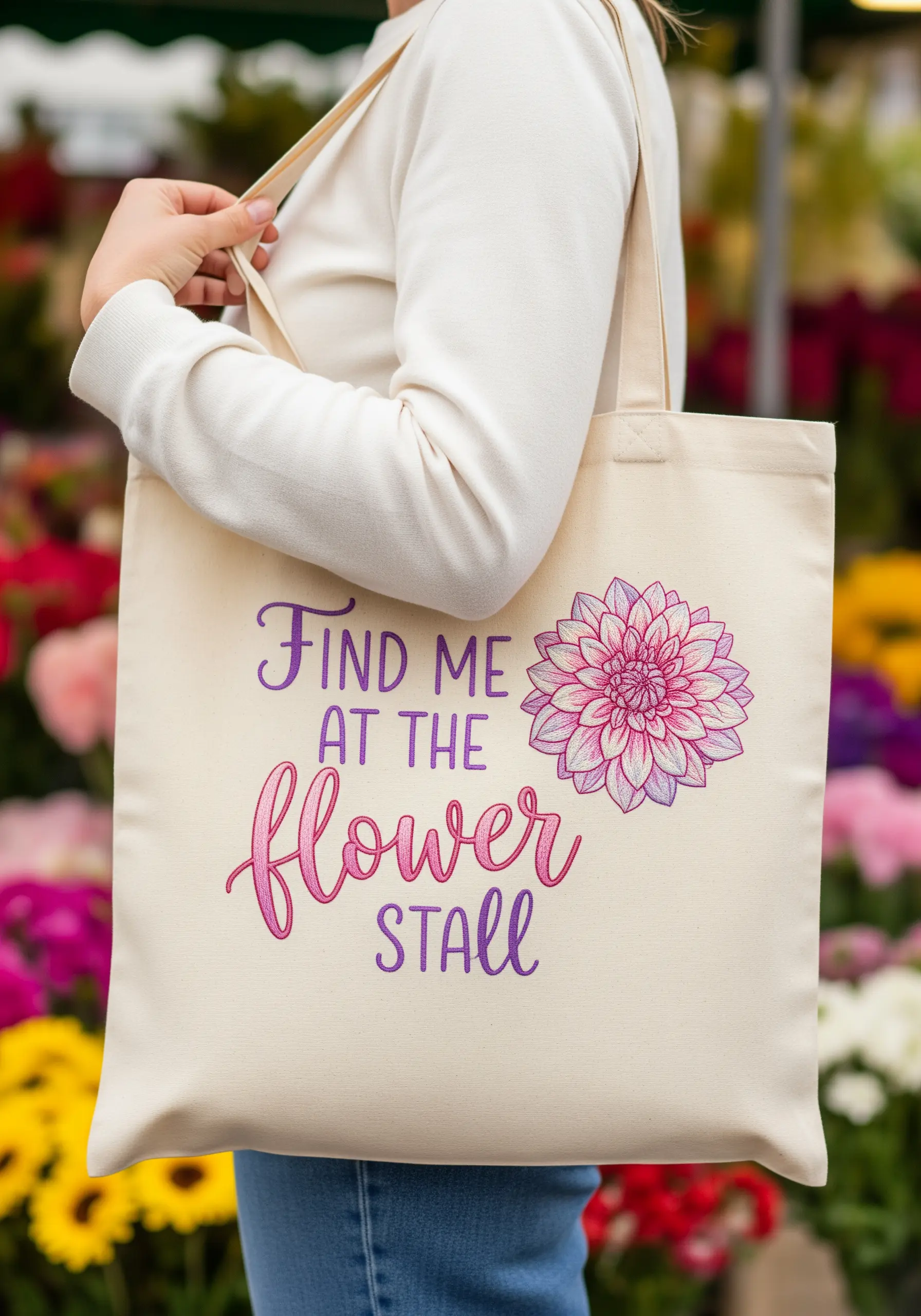
2. Master Clean Outlines for Graphic Lettering
For playful, multi-colored text, the key to a professional finish is a sharp outline.
Before filling each letter with satin stitch, trace its perimeter using a single-strand backstitch or split stitch in the same color as the fill.
This creates a slightly raised edge that guides your fill stitches and keeps the final shape perfectly crisp.
This technique works especially well on canvas, preventing the fabric’s weave from distorting the letterforms.
3. Achieve Precision with Minimalist Line Art
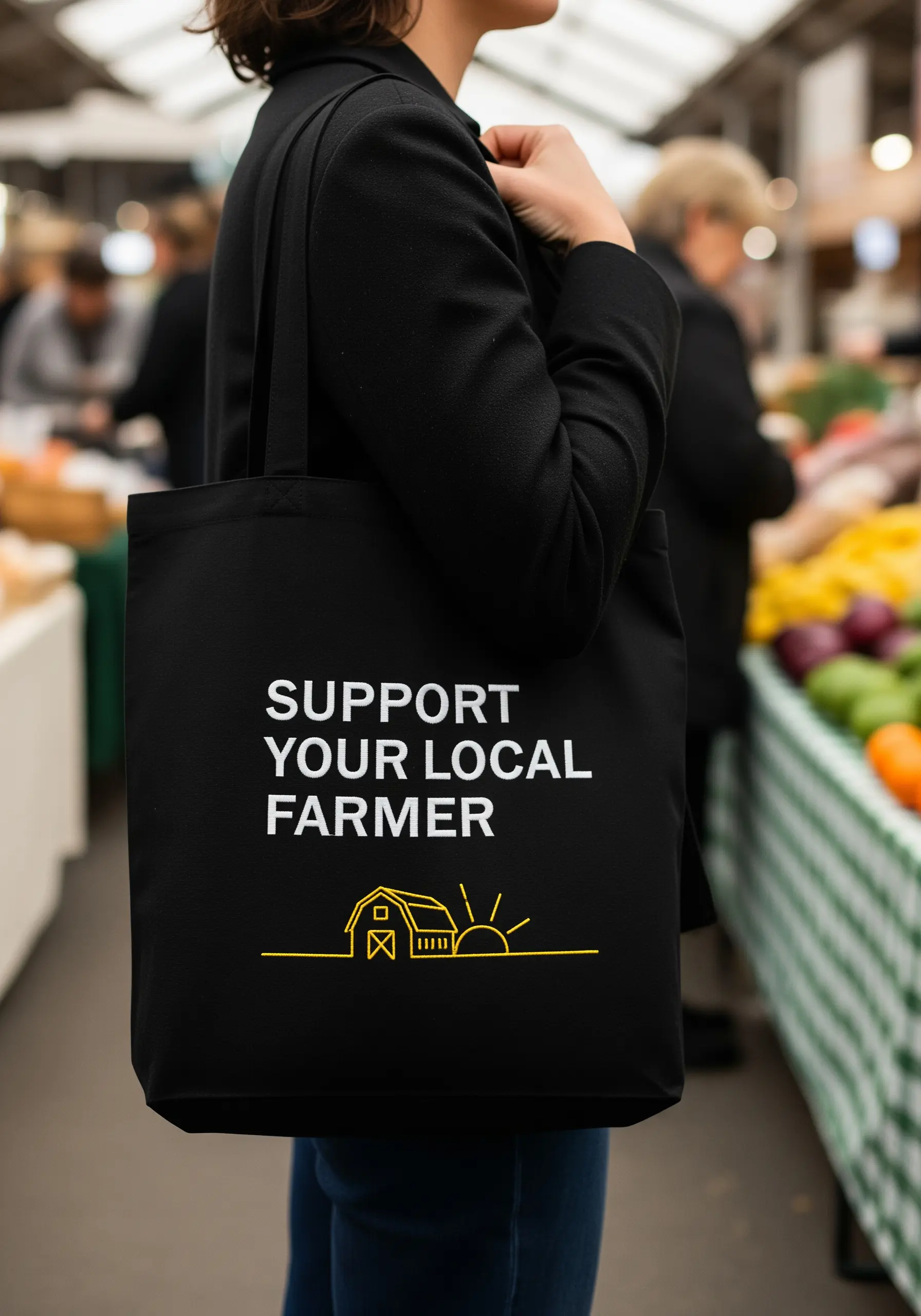
When a design is this minimal, stitch consistency is everything.
Use a single, continuous line of backstitch or stem stitch with two strands of floss to achieve this clean, graphic look.
To keep your lines perfectly straight and your curves smooth, maintain consistent stitch length—around 2-3mm is ideal for tote bag canvas.
Using a high-contrast thread color, like this sharp yellow on black, makes the minimalist design feel intentional and bold.
4. Use Whipped Backstitch for Elegant Script
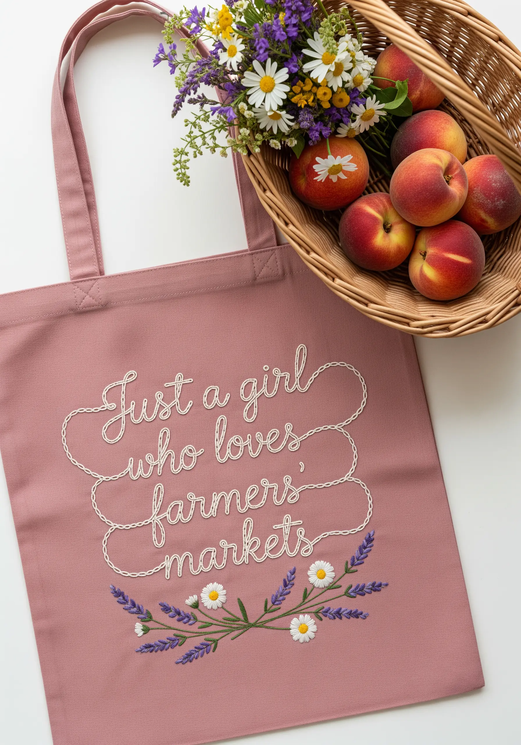
Standard backstitch can sometimes appear disjointed in flowing script. Elevate your lettering by using a whipped backstitch instead.
First, complete the entire phrase with a basic backstitch.
Then, using a second thread (it can be the same or a contrasting color), whip the needle under each backstitch without piercing the fabric.
This wraps the stitches, creating a smooth, rope-like line that looks elegant and reads clearly.
Pair it with simple detached chain stitches for the daisies and tiny French knots for their centers.
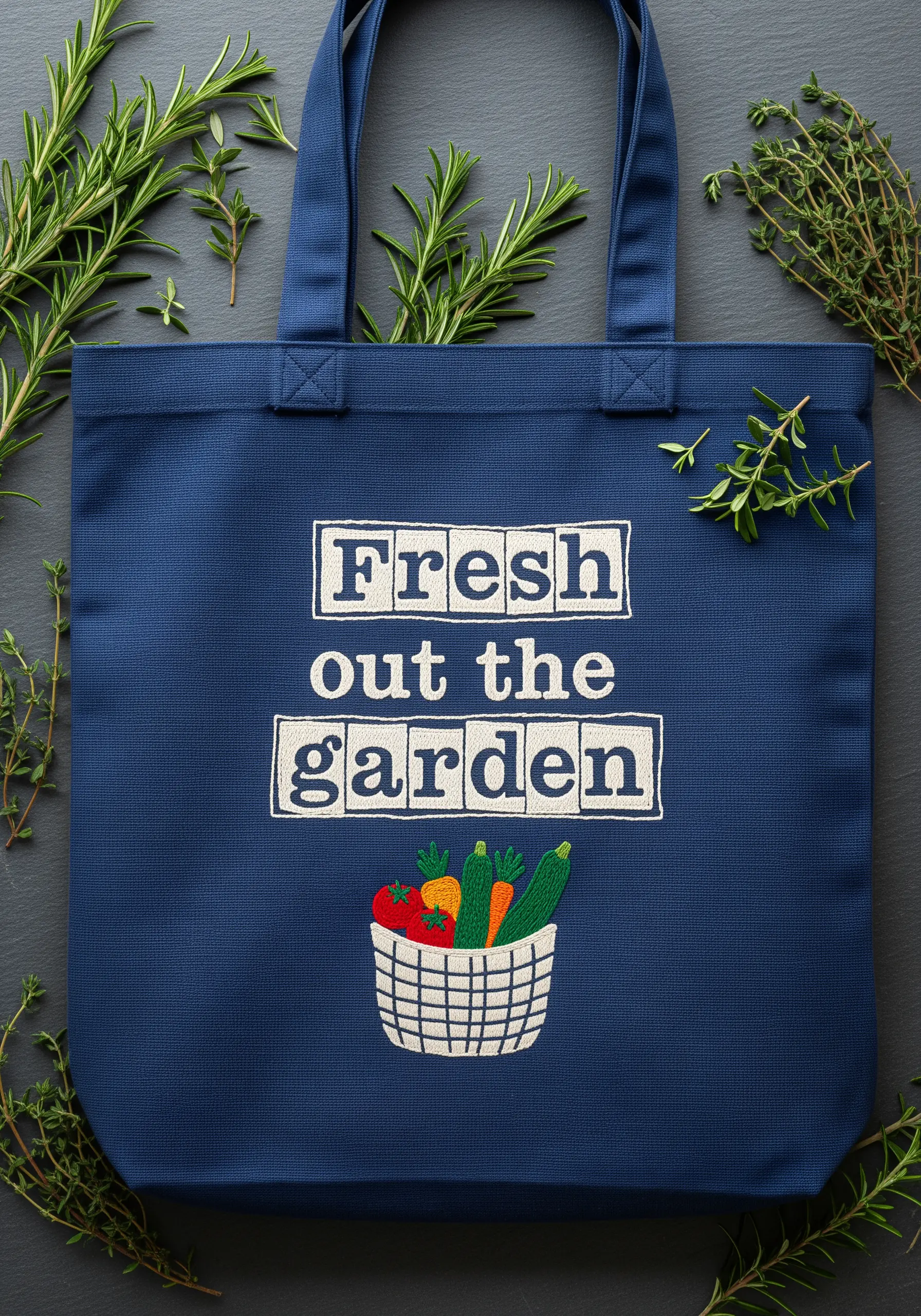
5. Build Appliqué-Style Letters on Denim
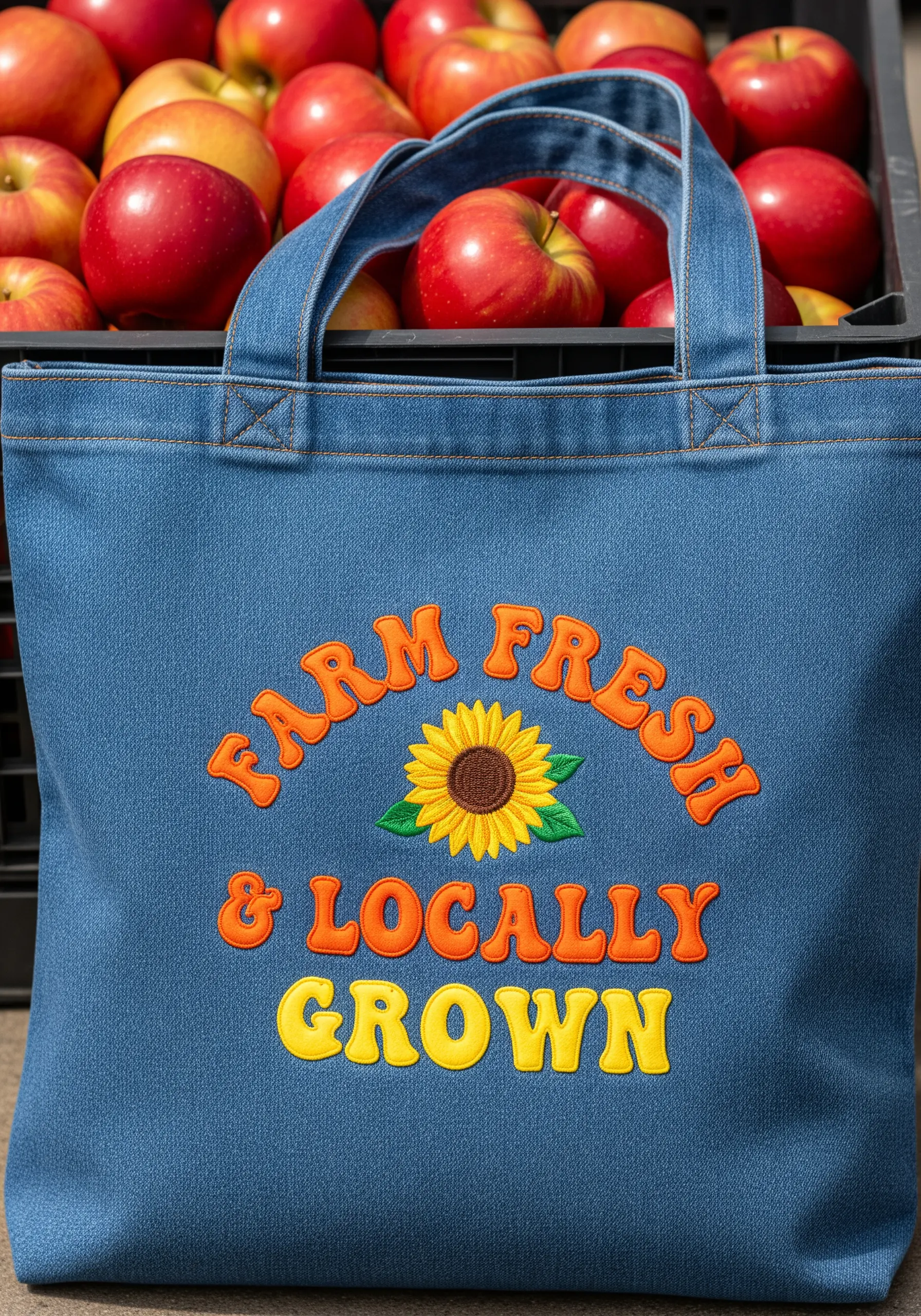
To get this bold, patch-like effect on a heavy fabric like denim, focus on stitch density.
Outline each letter with a split stitch to create a firm boundary.
Fill the shape with satin stitches packed closely together, ensuring no fabric shows through.
Use at least four of the six floss strands to achieve this high-coverage, slightly raised texture that makes the lettering pop.
This technique gives your letters the professional look of a machine-embroidered patch, but with handmade charm.
6. Let Negative Space Amplify Simple Designs
With a whimsical, minimalist design, composition is key.
Resist the urge to make the motif larger or add more elements. The ample negative space around the lettering and illustration makes the design feel light and modern.
Place the design slightly off-center to give it a more dynamic, less static feel.
Use a simple backstitch for the text and a clean satin stitch for the small illustrations, letting the simplicity of the stitches speak for itself.
7. Create Luxurious Raised Text with Padded Satin Stitch
To make lettering stand out with elegant dimension, use a padded satin stitch.
First, fill the shape of each letter with a base of small, horizontal seed stitches.
Then, cover this padding with your final vertical satin stitches.
The underlying layer of thread physically raises the satin stitch, creating a subtle 3D effect that catches the light beautifully.
This technique transforms simple text into a high-end, tactile statement, especially effective with white thread on a dark fabric.
8. Mimic Natural Textures with Varied Stitches
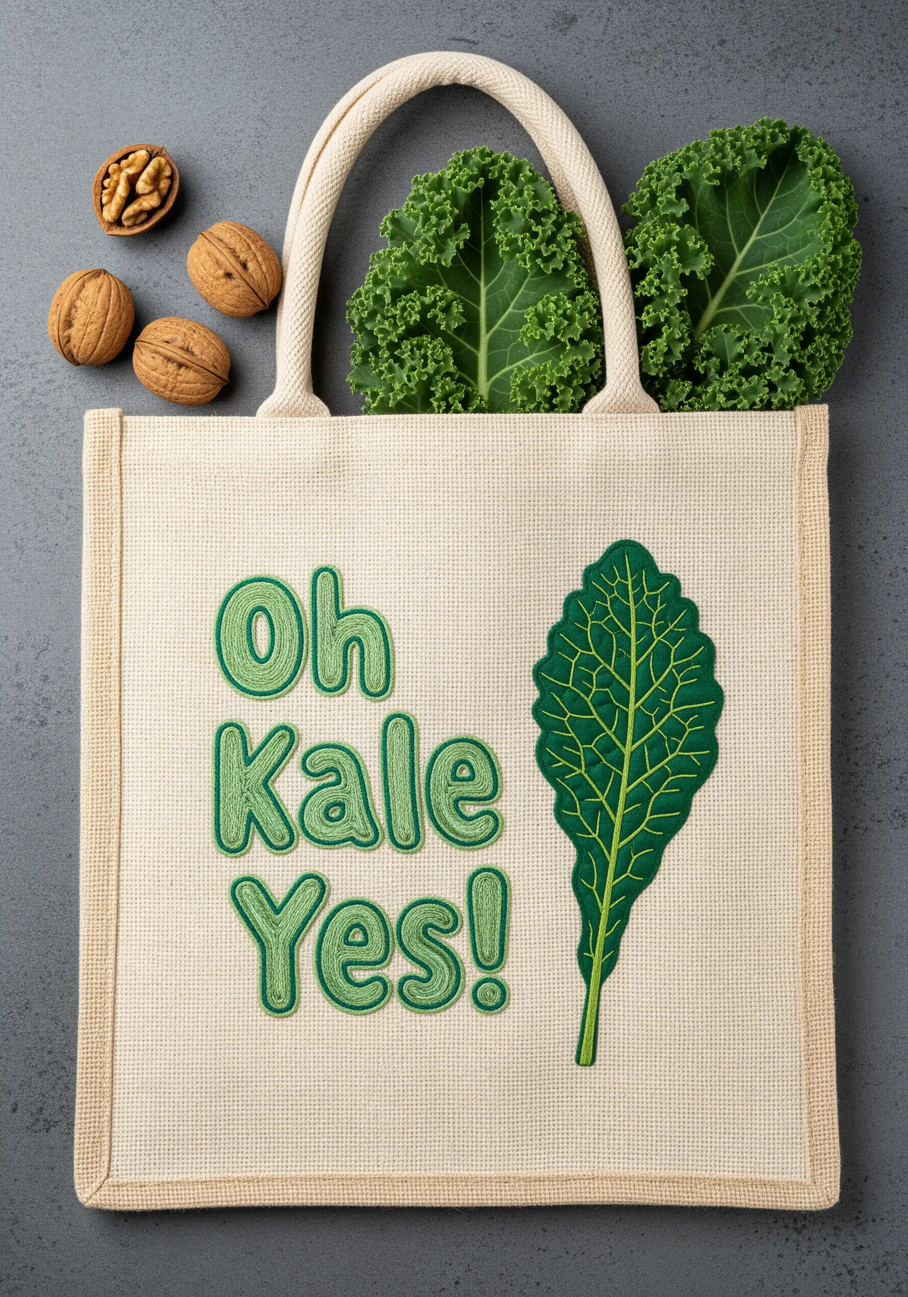
A single stitch type wouldn’t do justice to the complex texture of a kale leaf. Combine several to create a realistic effect.
Use split stitch or stem stitch for the central veins to give them definition.
Fill the leafy sections with a mix of French knots, bullion knots, and seed stitches in varying shades of green.
This combination creates an uneven, bumpy surface that perfectly mimics the curly, robust texture of the real leaf, turning a simple shape into a tactile work of art.
9. Balance Whimsical Elements for a Cohesive Design
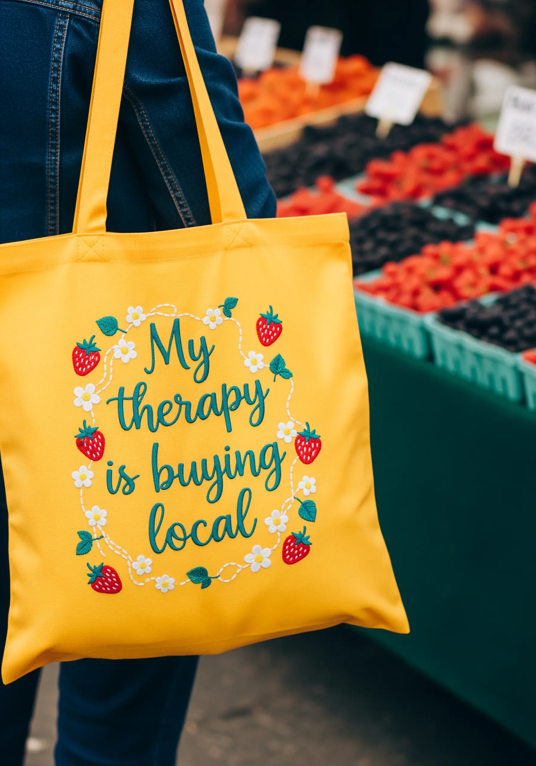
When combining text and motifs, create a visual path for the eye to follow.
The circular arrangement of the strawberries and flowers acts as a frame, drawing attention inward to the lettering.
Keep your stitches simple and consistent: a smooth whipped backstitch for the text, satin stitch for the strawberry bodies, and seed stitches for the seeds.
This ensures the overall design feels playful and charming, not cluttered or chaotic.
10. Achieve Sharp Serifs on Sans-Serif Fonts
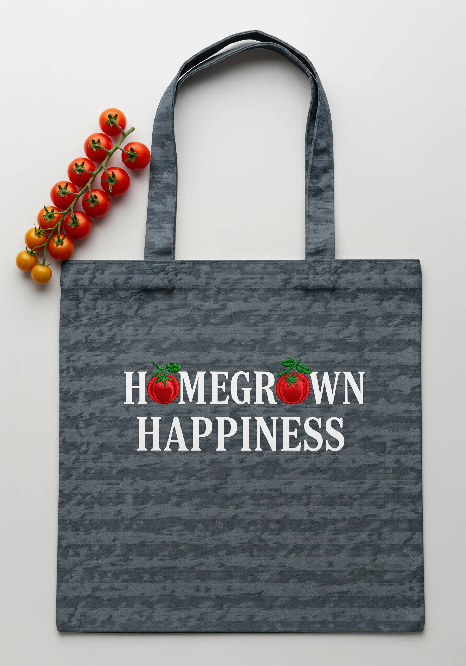
Stitching serif fonts requires precision, especially on the tiny feet of the letters.
Instead of trying to shape the serifs with a bulky satin stitch, define them with single, straight stitches placed at the end of each main stem.
Fill the main body of the letters with vertical satin stitches, and then add these small, horizontal stitches to create the serifs.
This technique keeps them sharp and intentional, ensuring your classic font is perfectly legible.
11. Use Directional Stitches to Create Form
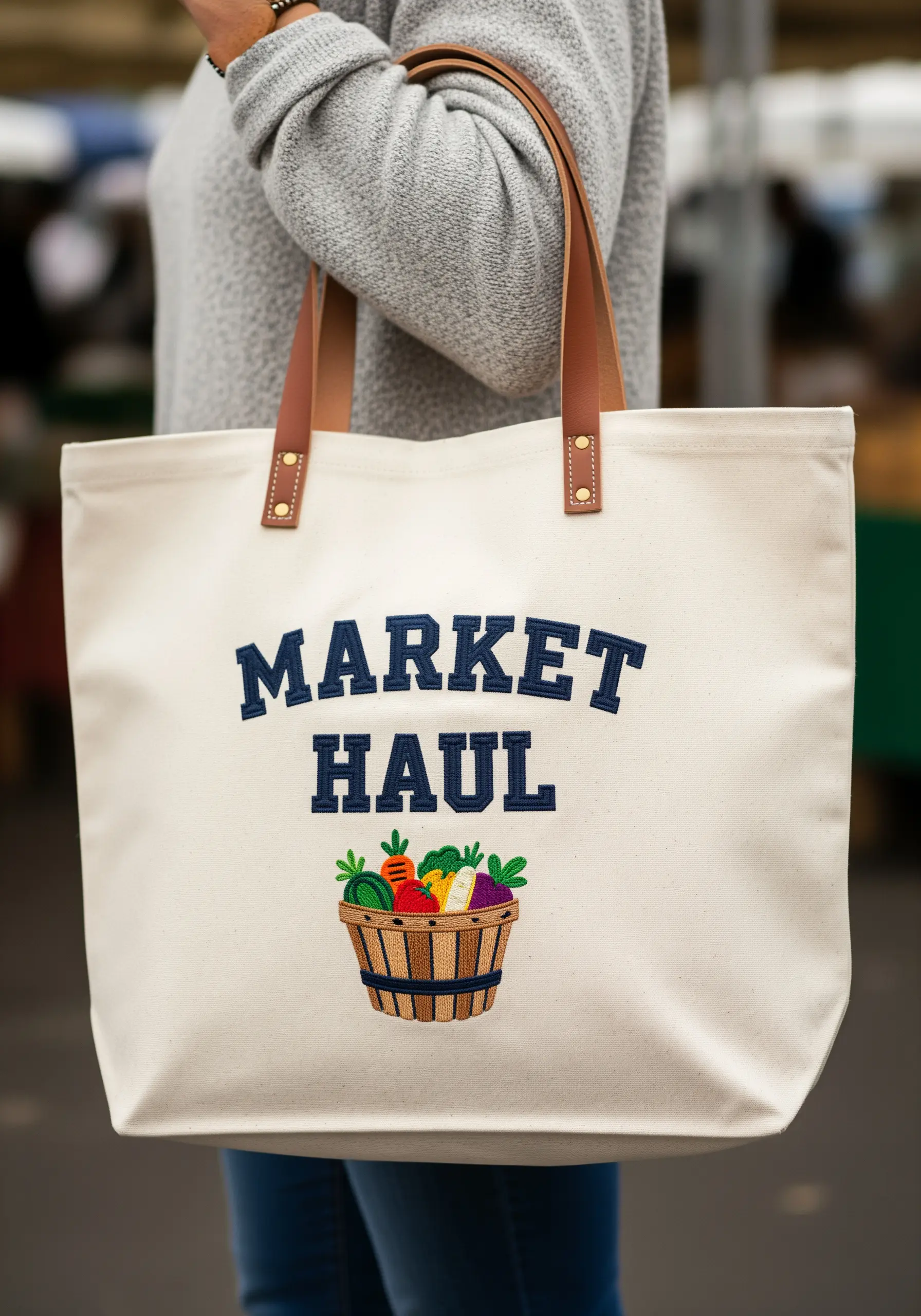
To make the woven basket appear rounded and realistic, adjust the direction of your satin stitches.
For the vertical slats of the basket, use vertical satin stitches.
For the horizontal woven bands, switch to horizontal satin stitches.
This simple change in direction creates the illusion of light and shadow, giving the flat object a three-dimensional form.
Fill the vegetables with small, tight stitches to contrast with the basket’s texture.
12. Capture Delicate Details with Thread Painting
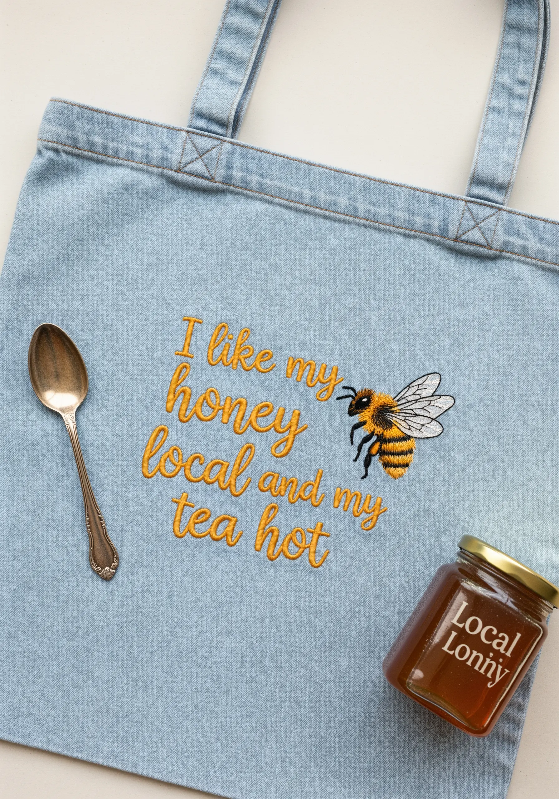
For a realistic bee, use single strands of floss and the long-and-short stitch technique.
Blend shades of yellow, gold, and black to create the fuzzy texture of the bee’s body. Use short, feathered stitches that overlap slightly to create a soft, natural gradient.
For the delicate wings, use a light grey or off-white thread to outline the shape with a split stitch, then fill with spaced-out straight stitches to suggest transparency.
This attention to detail transforms a simple insect into a stunning, lifelike motif.
13. Couch Thick Yarn for Bold, Graphic Text
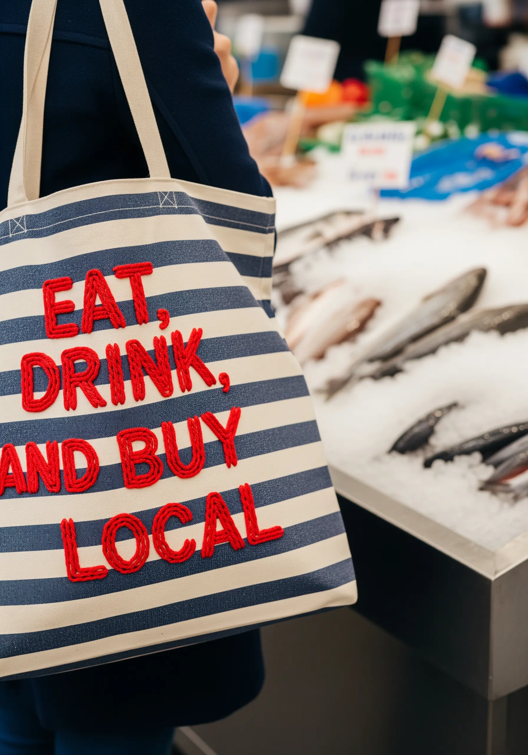
For lettering that makes a serious textural statement, abandon floss and use yarn instead.
Lay down a thick piece of yarn along the path of your letter, then use a single strand of matching embroidery floss to tack it down with small, evenly spaced couching stitches.
This technique is fast, efficient, and creates incredibly bold, raised lettering that you can feel as well as see.
It’s the perfect method for making a simple phrase on a striped bag pop with graphic intensity.
14. Blend Petal Colors with Long-and-Short Stitch
To give your embroidered flowers a soft, painted look, use long-and-short stitch.
Fill each petal with staggered rows of straight stitches in varying lengths, using two to three shades of pink and white.
Slightly overlap each row of stitches to blend the colors seamlessly, creating a natural gradient from the dark base to the light edge of the petal.
This technique avoids the hard lines of satin stitch, resulting in a much more realistic and delicate floral motif.
15. Replicate Handwriting with a Simple Stem Stitch
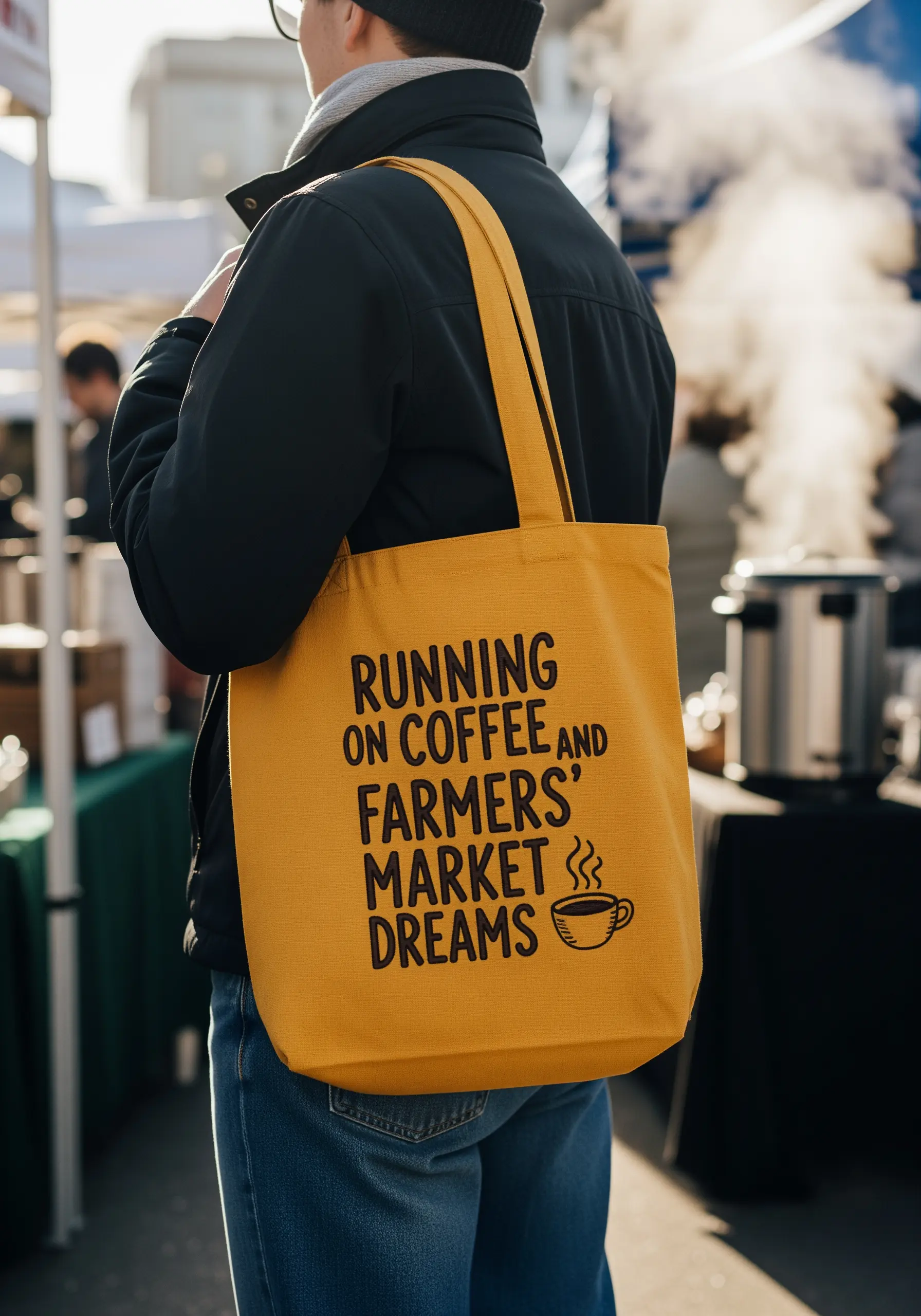
To capture the casual, free-flowing energy of a handwritten font, choose your stitch wisely.
A stem stitch, worked with two or three strands of floss, is the ideal choice. It creates a slightly raised, rope-like texture that follows curves beautifully without breaking the line.
Unlike a backstitch, which can look segmented on curves, the stem stitch creates a continuous, fluid line that perfectly mimics the look of pen on paper.
For the tiny coffee cup, a simple backstitch outline is all you need to complete the doodle-like aesthetic.
16. Maximize Contrast for High-Impact Line Work
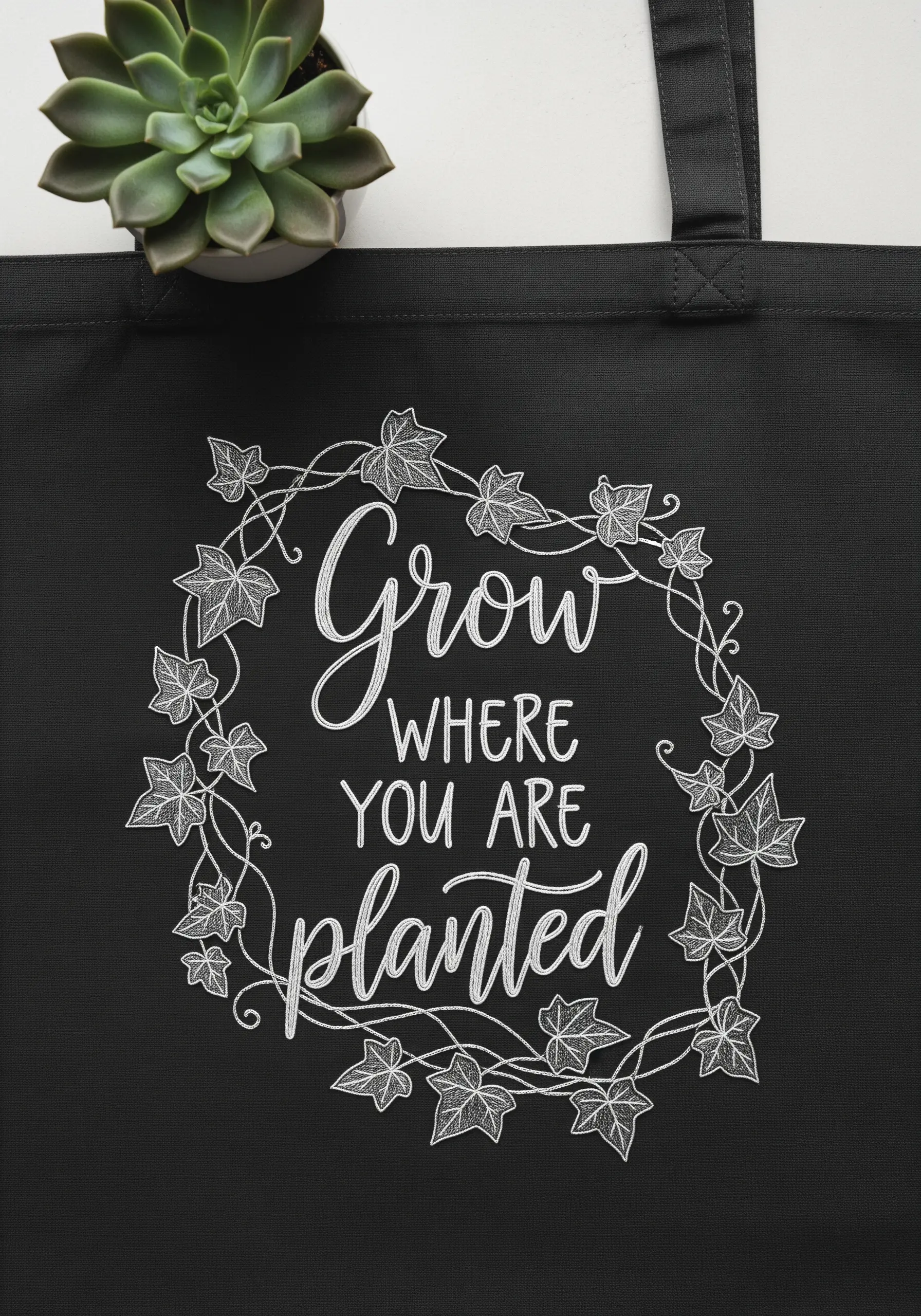
When working with white thread on black fabric, every stitch is visible, so precision is paramount.
Use a water-soluble stabilizer to transfer your pattern perfectly, ensuring your lines are flawless from the start.
Stitch the delicate ivy vines with a two-strand split stitch to create a fine, continuous line.
For the filled-in leaves, use a satin stitch, making sure your stitches lie flat and even to create a solid white shape against the dramatic black background.
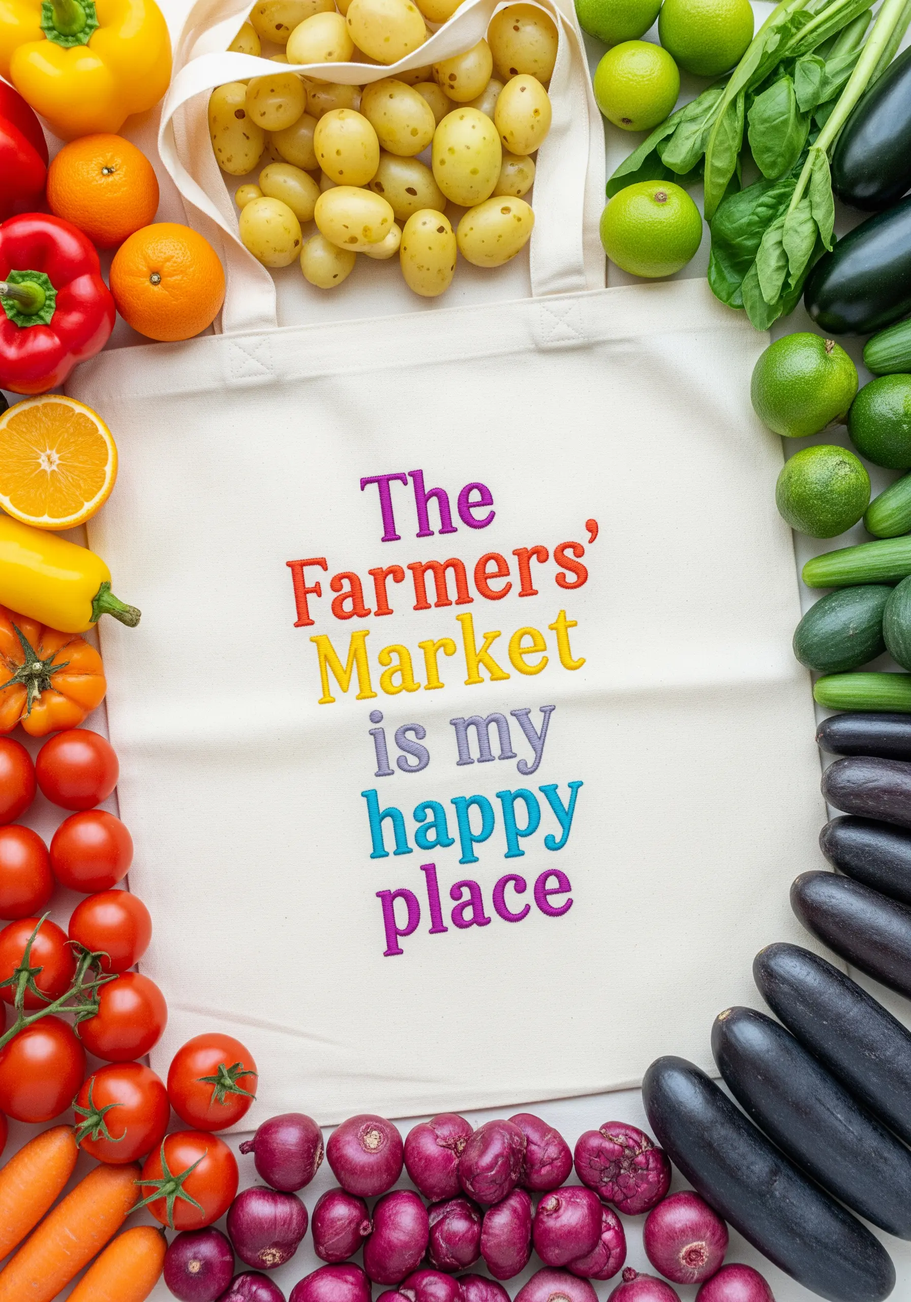
17. Create Playful Rhythm with Color-Blocked Text
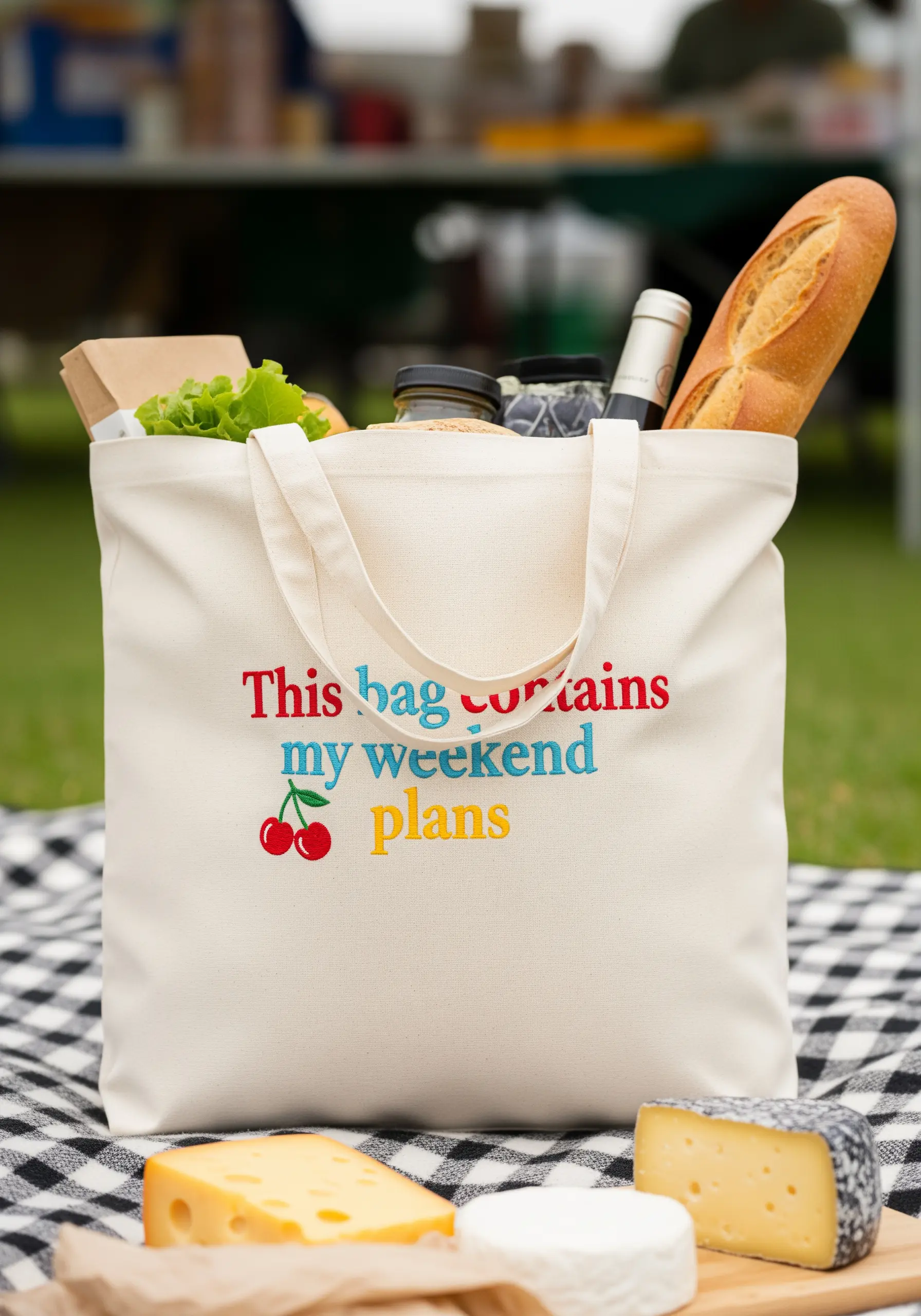
Add energy to a simple quote by assigning a different color to each word or line.
To ensure the design feels cohesive, choose a palette of colors that share the same level of saturation, like these bright primary and secondary shades.
Use a simple, clean backstitch for the letters to keep the focus on the color play.
This technique is a fantastic way to use up leftover thread from other projects while creating a vibrant, eye-catching design.
18. Embrace Understated Power with Tonal Stitching
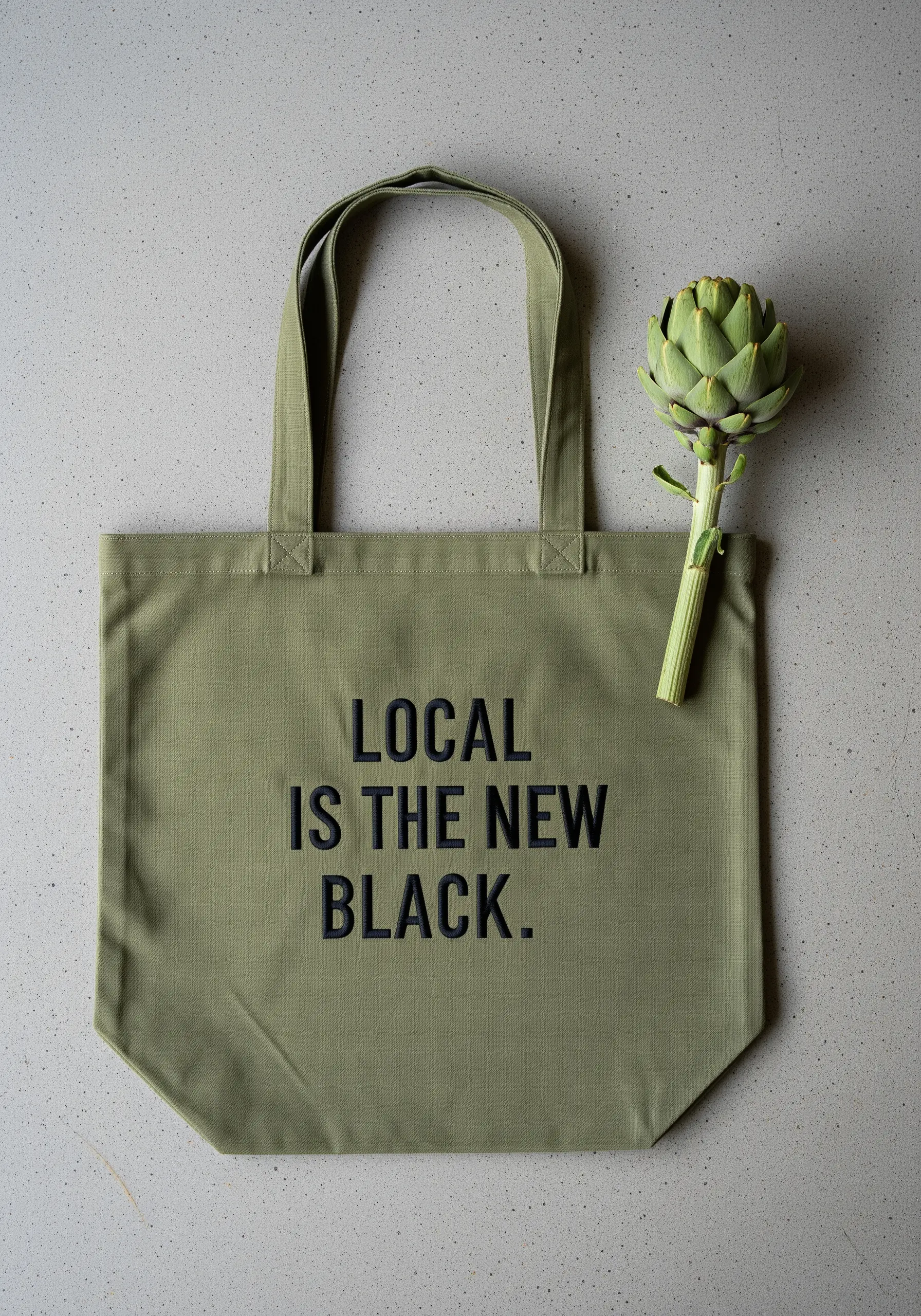
Embroidering with a color that is very close to your fabric color creates a subtle, sophisticated effect.
Here, black thread on olive green canvas produces a design that is visible but not overpowering.
For this technique to work, stitch definition is crucial. Use a clean, sharp backstitch or stem stitch with at least three strands of floss so the letters have enough weight to be read easily.
The result is a modern, minimalist tote that feels effortlessly chic.
19. Capture Charm with Continuous Line Illustrations
To create a simple, sketch-like illustration, choose a stitch that flows without interruption.
A stem stitch or split stitch works perfectly for this, as it allows you to navigate tight curves and sharp corners while maintaining a single, unbroken line.
Use three strands of floss to give the line enough presence on the canvas fabric.
Pairing this type of modern line art with a classic, clean font creates a design that feels both timeless and contemporary.
20. Add Graphic Punch with Embroidered Dots
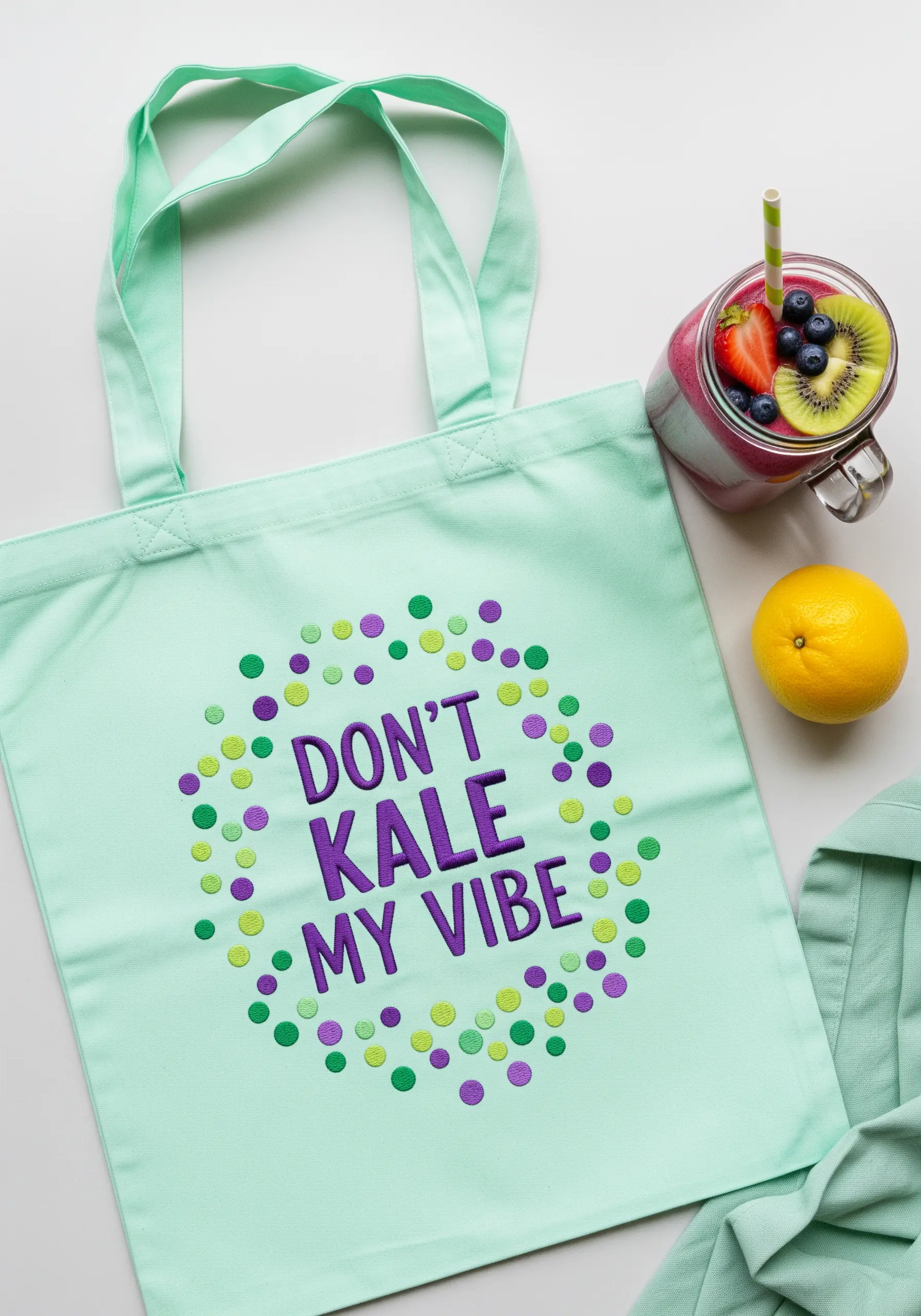
Create a fun, confetti-like border using simple stitched dots in a curated color palette.
For small, delicate dots, a single French knot is perfect. For larger, more solid circles, use a small, circular satin stitch, often called a dot stitch.
To achieve the effect, trace circles of varying sizes and fill them in, radiating your stitches from the center outwards.
Varying the size and color of the dots adds visual interest and a playful, celebratory feel to the lettering.
21. Use Stitch Direction to Sculpt Succulents
To capture the architectural shape of a succulent, you must use stitch direction to your advantage.
For each individual leaf of the plant, align your satin stitches to follow its natural growth direction, radiating from the base to the tip.
Use a slightly different shade of green for adjacent leaves to define their shapes and create the illusion of overlapping planes.
This simple trick turns a flat outline into a structured, dimensional plant.
22. Blend Autumnal Hues for a Warm Glow
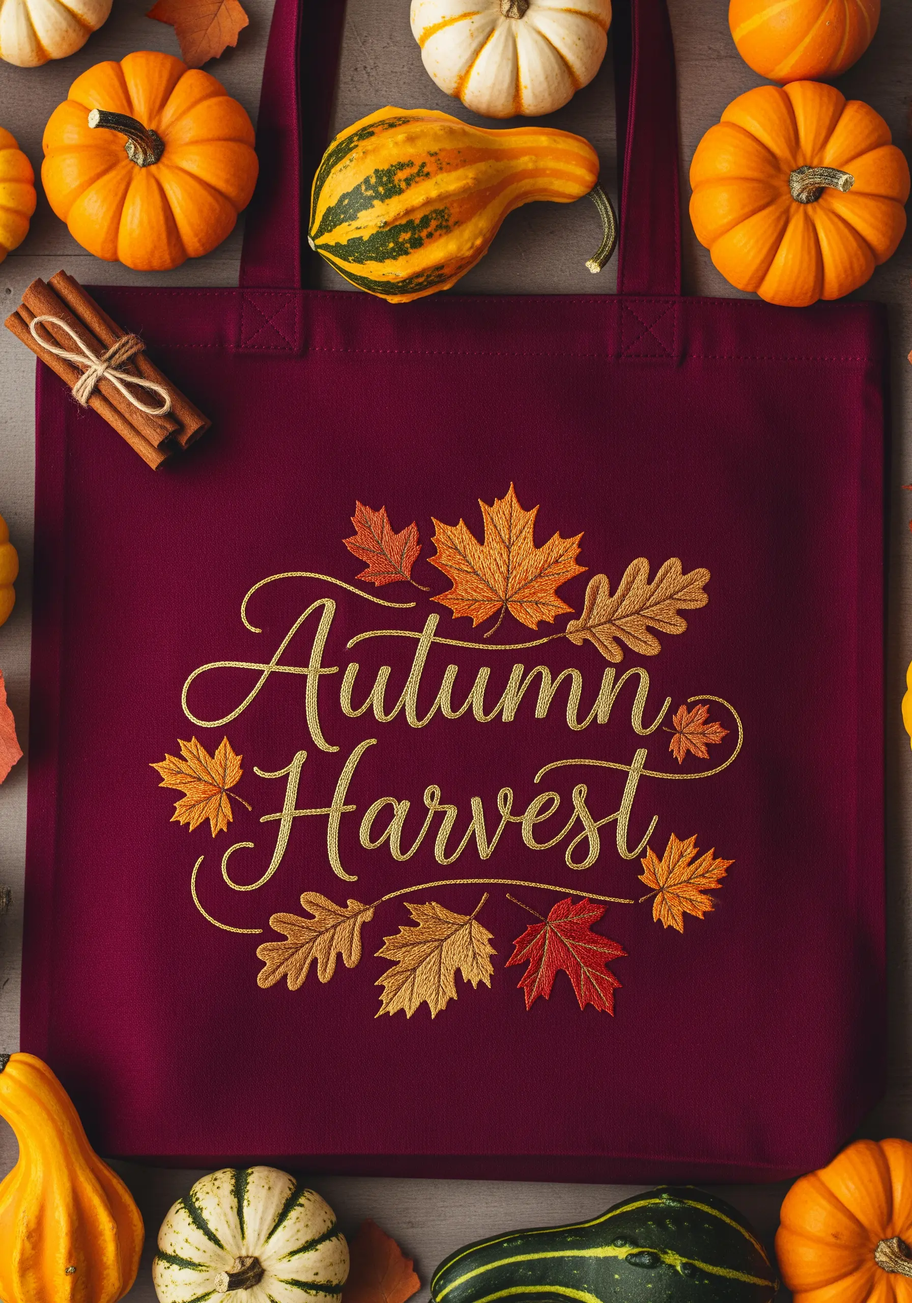
To create a rich, autumnal feel, choose a color palette of warm golds, oranges, and deep reds.
For the leaves, use the fishbone stitch. This creates a central vein and allows you to angle your stitches outwards, mimicking the natural structure of a leaf.
You can even use two different colored threads on your needle at once (a technique called tweeding) to create subtle, variegated color within a single leaf.
This adds depth and a cozy, painterly quality to your seasonal design.
23. Create Ombré Lettering for a Painterly Effect
Achieve a beautiful gradient in your lettering by strategically switching thread colors.
Divide your word into sections and use a long-and-short stitch to seamlessly blend from one shade to the next—for example, from a light pink to a deep magenta.
For the dahlia, use the same principle, working from the light outer petals to the darker center to create realistic depth.
This organic thread art technique gives your embroidery a soft, watercolor-like appearance that is truly stunning.
24. Use Negative Space to Define Shapes
You don’t always need to fill an entire shape with thread. Use negative space to create detail, as seen in this vegetable basket.
Instead of stitching a solid basket, use straight stitches to create a simple grid pattern.
The canvas of the tote bag shows through, creating the illusion of a woven texture without the density of a fully stitched object.
This keeps the design feeling light and modern, and it’s much faster to stitch.
25. Achieve a Flawless Satin Stitch Fill
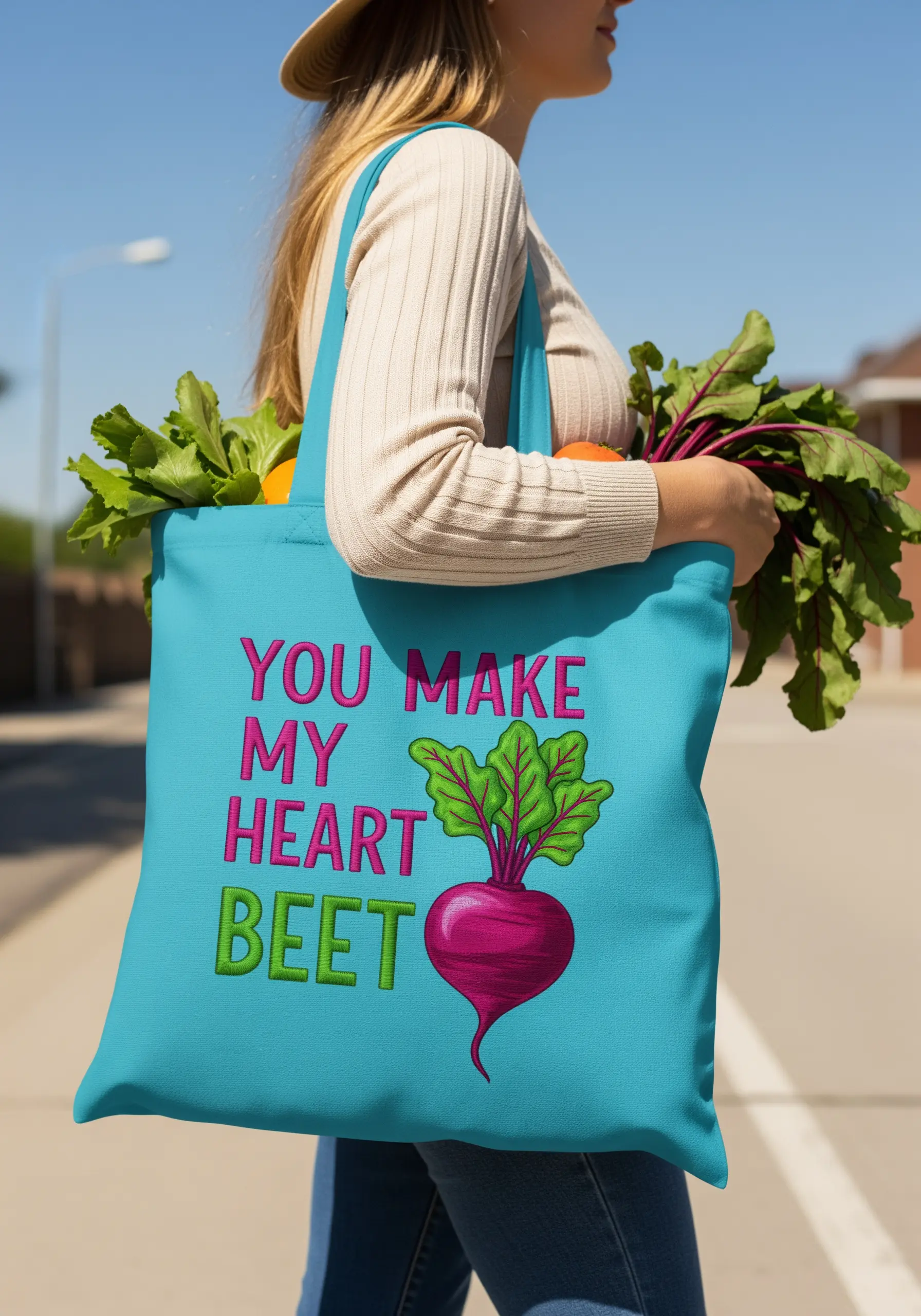
For large, solid areas of color like this beet, a smooth satin stitch is essential.
The secret is to keep your thread tension perfect—not too tight, or the fabric will pucker, and not too loose, or the stitches will sag.
Always use a stabilizer on the back of your fabric to prevent distortion.
Lay each stitch directly next to the previous one, ensuring they are all parallel. This creates a beautifully smooth, seamless surface with a gentle sheen.
26. Capture Retro Fonts with Smooth Curves
To successfully stitch a rounded, retro-style font, your stitches must follow the curves of the letters.
Instead of using straight horizontal or vertical satin stitches, angle them to follow the shape of each curve. This is sometimes called a slanted satin stitch.
Outlining the letters with a split stitch first will give you a clean edge to stitch against, ensuring those groovy ’70s letterforms are smooth and legible.
This attention to stitch direction is what gives the final piece its polished, professional look.
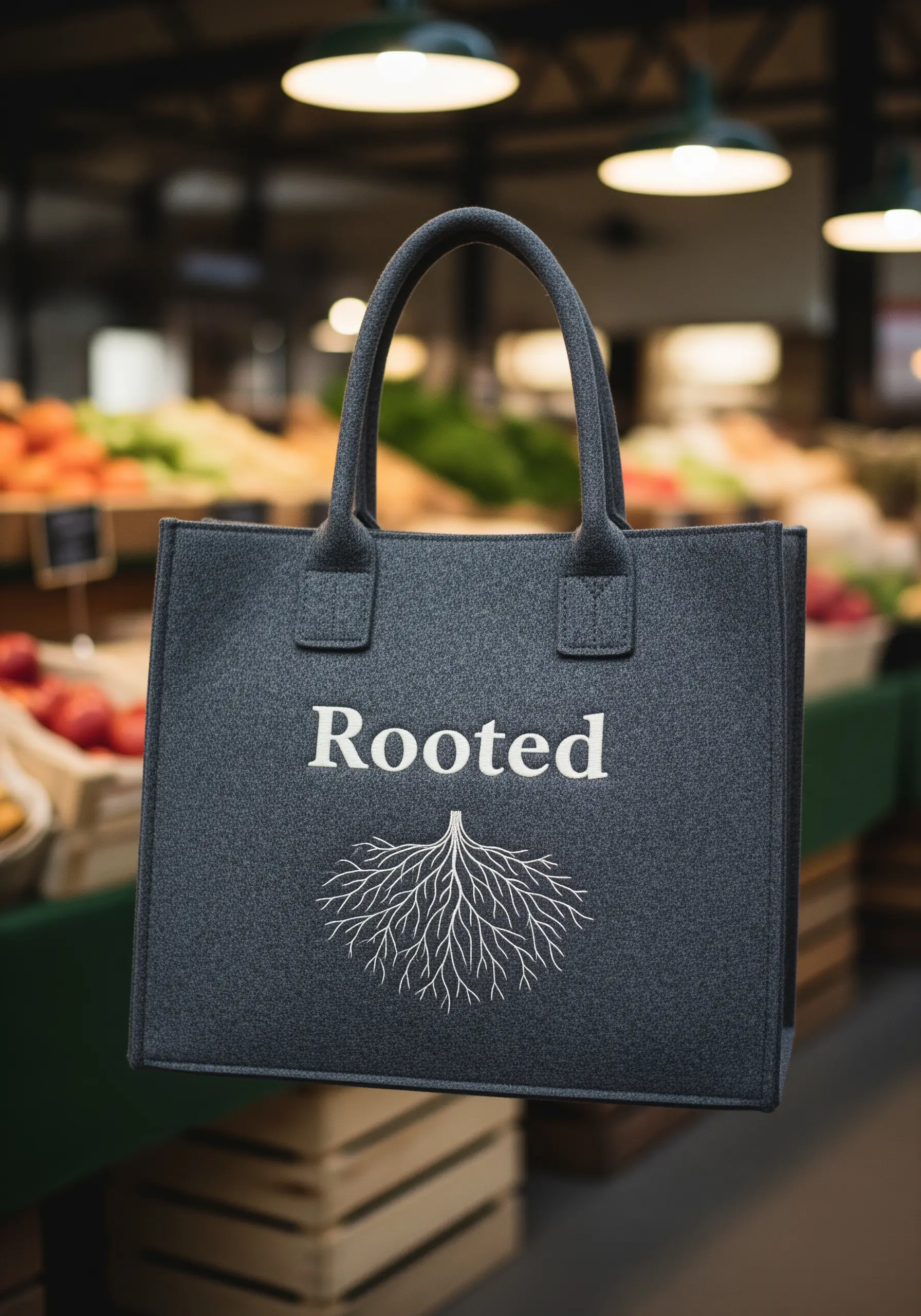
27. Adapt Your Stitches for Unique Materials
Stitching on thick, non-woven fabric like felt requires a different approach than cotton canvas.
Use a sharper, thicker needle (like a chenille needle) to pierce the material without resistance.
For the delicate, branching roots, use a simple backstitch with only one or two strands of floss. The felt’s natural texture will grip the thread, so you don’t need a stabilizer.
The contrast between the fine, delicate stitches and the thick, sturdy felt creates a beautiful and unexpected textural pairing.
28. Plan Your Palette for Rainbow Lettering
Creating a seamless rainbow effect requires thoughtful color planning.
Lay out your floss colors in the order you want them to appear before you start stitching.
For a smooth transition, allow the color of one letter to be informed by the one before it, following the sequence of a real rainbow (ROYGBIV).
Use a dense satin stitch to ensure each color is vibrant and solid, giving the whole design a cheerful, cohesive look.
29. Master Bold Textures on Burlap
The loose, open weave of burlap is perfect for bold, textural techniques.
Instead of standard floss, use a thick black yarn or even fine rope for the letters.
Couch it onto the burlap surface by laying the yarn in the shape of the letters and tacking it down with a matching black thread.
This method creates extremely durable, highly tactile lettering that complements the rustic nature of the burlap perfectly.
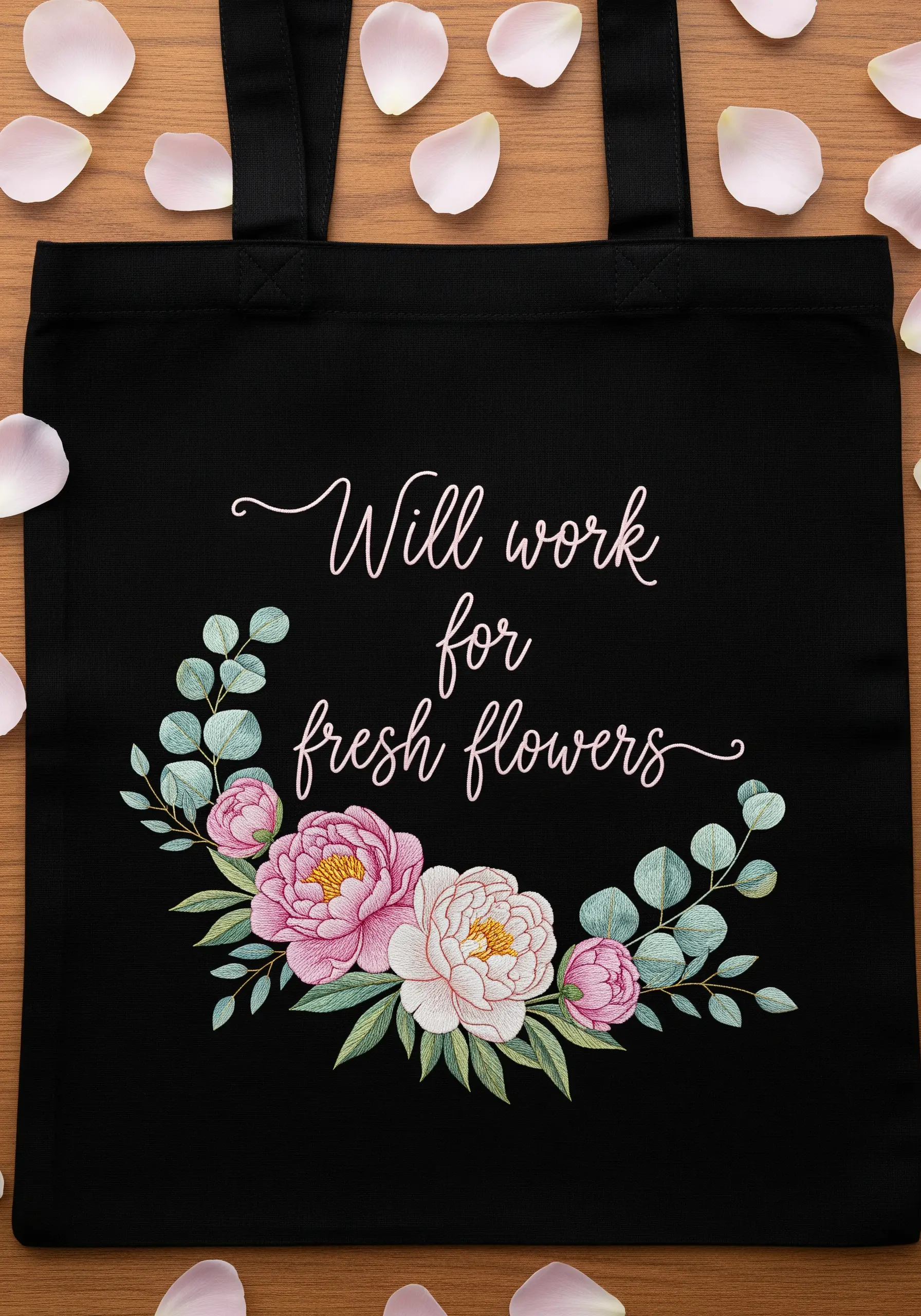
30. Frame Your Lettering with a Delicate Wreath
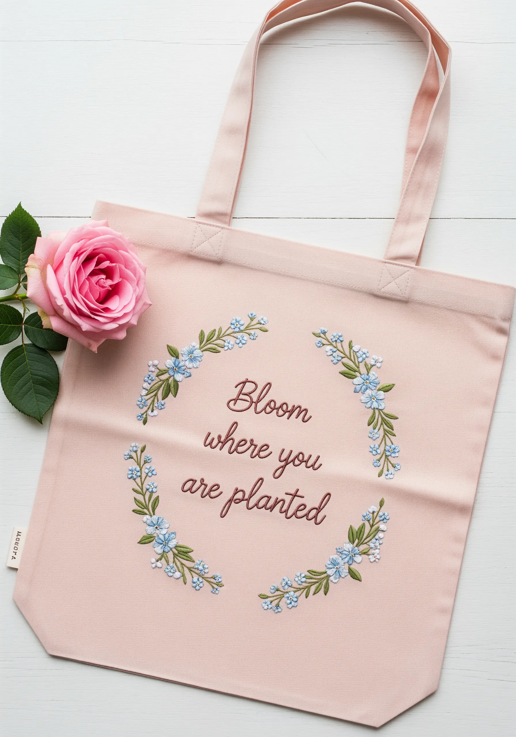
A floral wreath is a timeless way to elevate a simple quote. The key is to keep the elements in balance.
Stitch the text first to establish the center of your design. Then, build the wreath around it.
Use light, airy stitches for the botanicals—lazy daisy stitches for petals, stem stitch for vines, and French knots for accents.
This ensures the wreath feels like a delicate frame rather than a heavy border, allowing the quote to remain the focal point.
31. Create Crisp Edges with Fabric Appliqué
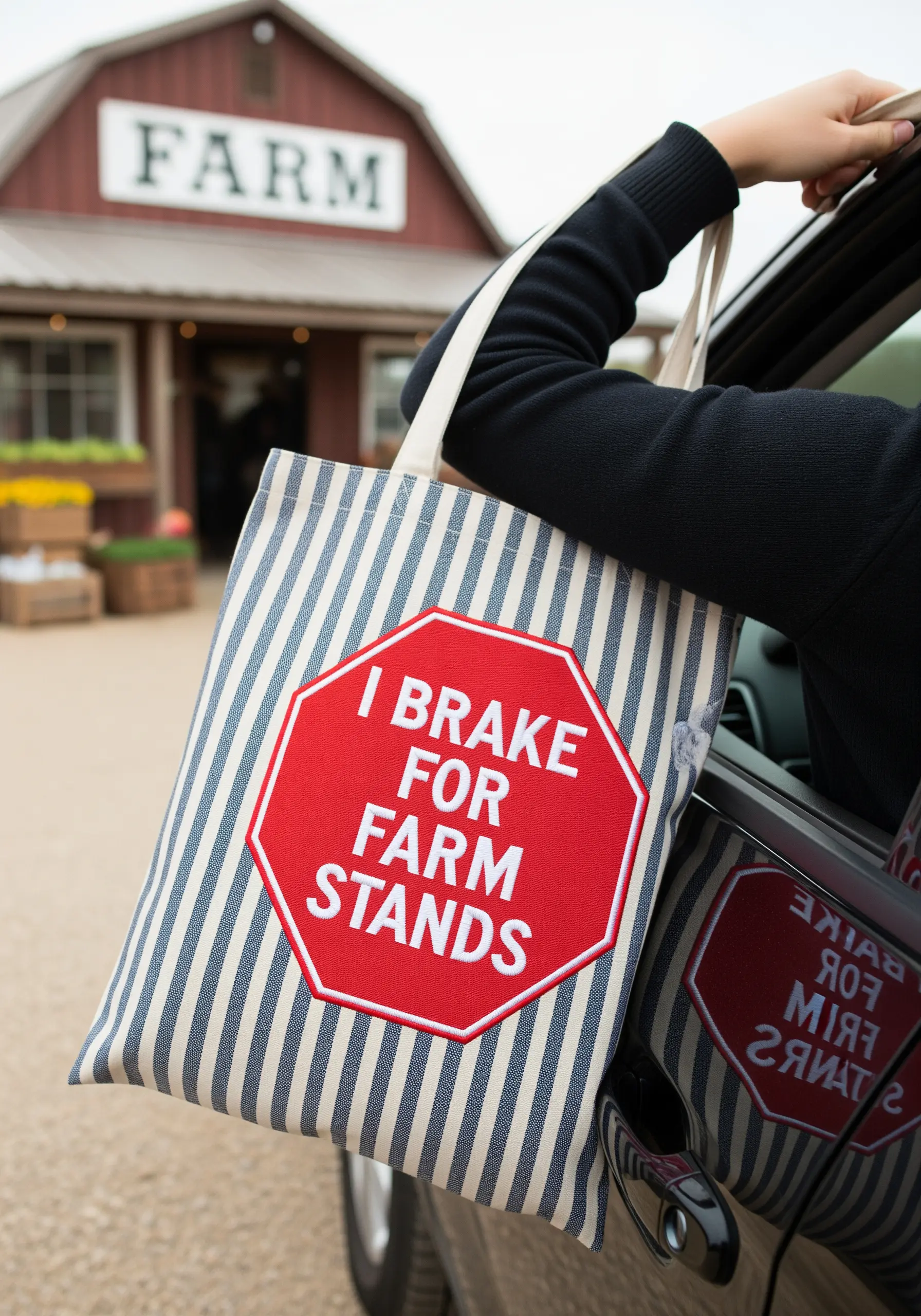
For an ultra-clean, graphic look like a stop sign, combine fabric appliqué with embroidery.
Cut the main shape (the red octagon) from a piece of felt or non-fraying cotton. Lightly secure it to the tote with fabric glue or fusible web.
Then, stitch a tight, dense satin stitch or blanket stitch around the entire perimeter to secure the shape and create a perfectly crisp border.
Finally, stitch your lettering directly onto the appliquéd fabric for a layered, professional look.
32. Sculpt Fluffy Clouds with French Knots
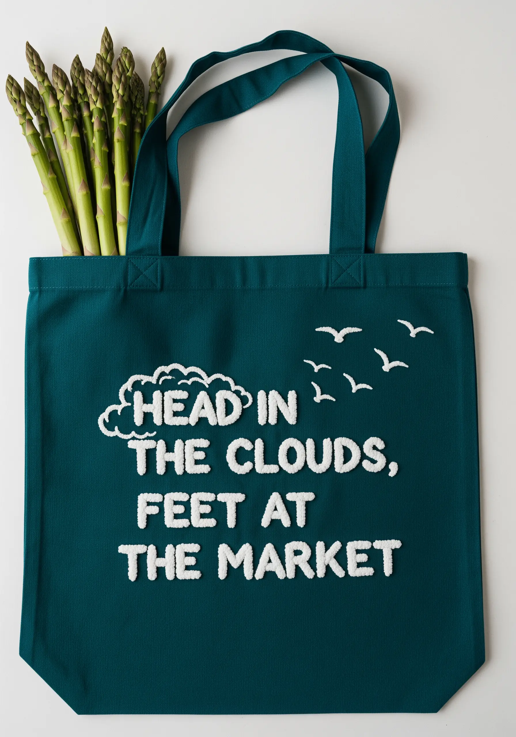
To give your letters a soft, cloud-like texture, fill them entirely with French knots.
Use a lighter weight thread (like three strands) and pack the knots tightly together, ensuring no fabric shows through.
For a more varied texture, slightly alter the size of your knots by changing how many times you wrap the thread around the needle (once for small knots, twice for larger ones).
This technique creates a wonderfully tactile and visually striking effect that begs to be touched.
33. Combine Lettering Styles for Visual Interest
Pairing a flowing script with a more structured print font creates a dynamic and engaging design.
To ensure harmony, stitch both fonts with a similar thread weight—for example, use three strands of floss for both the script and the print letters.
Use a whipped backstitch for the smooth script and a simple backstitch for the clean print font.
This contrast in style, unified by color and thread weight, adds personality and charm to your quote.
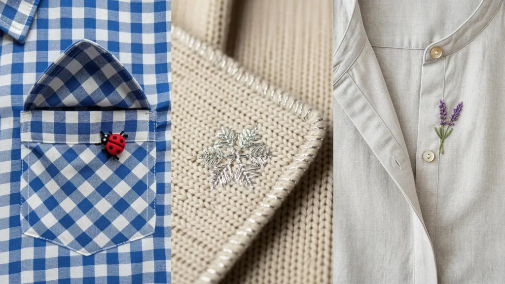
34. Add Meaningful Detail to Existing Garments
Embroidering on a pre-made pocket is a quick way to customize a bag.
To avoid stitching the pocket closed, slide a piece of thick cardstock or a small embroidery hoop inside the pocket before you begin.
Use simple, recognizable icons and clean backstitch lettering that can be stitched quickly and legibly.
This approach turns a functional element like a pocket into a canvas for a meaningful message, adding a layer of purpose to your tote bag embroidery.
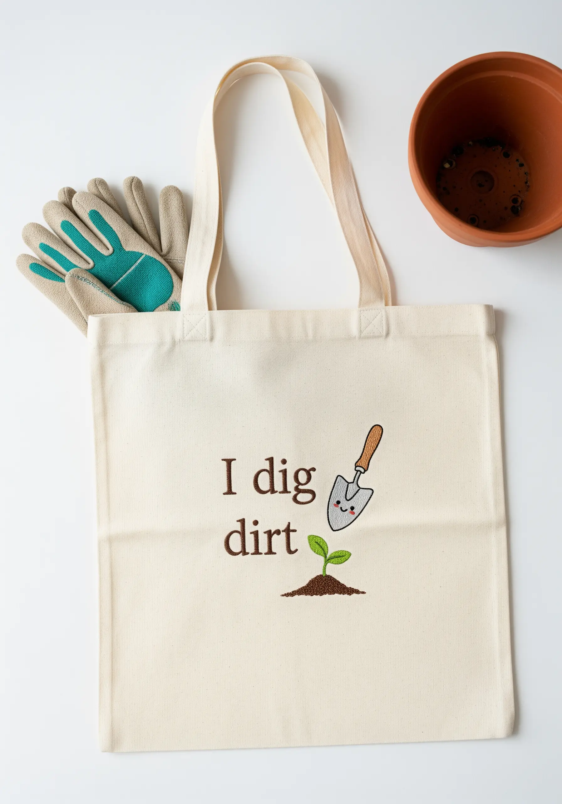
35. Stitch Expressive Characters with Simple Stitches
You don’t need complex stitches to create a character with personality.
Use two small, tight satin stitches or French knots for the eyes. A simple, curved backstitch is all you need for a cheerful smile.
The placement of these features is what brings the character to life. Stitch the eyes slightly closer together and place the mouth high up to create a sweet, friendly expression.
This proves that even the simplest stitches can create a huge impact when used thoughtfully.