A simple tote bag is more than just a carrier for your essentials—it’s a blank canvas waiting for your voice. Embroidering a quote you connect with transforms it into a personal statement, a quiet reminder of your strength, or a burst of joy you carry with you throughout the day.
But making that statement feel polished and intentional comes down to the details. It’s about choosing the right stitch to give your letters character, selecting a color palette that enhances the mood of the words, and understanding how a simple motif can amplify your message.
Here, you’ll discover how to move beyond basic stitches to create lettering with texture, depth, and personality. These are not just quotes; they are small acts of self-expression, stitched with purpose and ready to empower your every step.
1. Frame a Powerful Serif with a Delicate Wreath
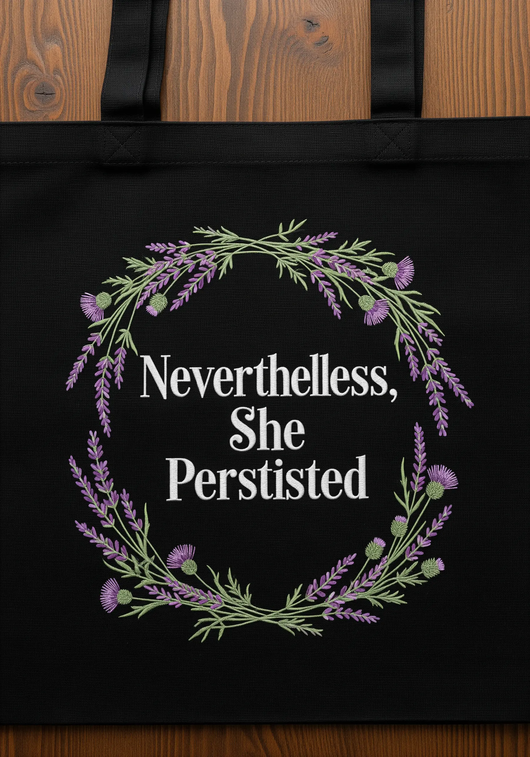
Create a striking contrast by pairing a strong, classic serif font with a soft, botanical frame.
Use a single strand of floss for the delicate lavender stems and thistle leaves to ensure the details remain crisp and not bulky.
For the lettering, switch to a three-strand satin stitch to give the words weight and presence against the dark fabric, making them the undeniable focal point.
This balance of strength and softness visually reinforces the message, creating an elegant and meaningful composition for your inspirational quote embroidery.
2. Elevate Script with a Climbing Vine
Transform simple script lettering by integrating a botanical element that grows with the words.
Use a whipped backstitch for the letters to create a smooth, raised, and rope-like texture that stands out on the canvas tote.
For the vine, stitch the stem first, then add individual leaves using a fishbone stitch to give them a natural, veined appearance.
A few scattered lazy daisy stitches with French knot centers create charming, simple flowers that add a touch of whimsy without overwhelming the quote.
This technique turns your tote bag into a piece of wearable botanical art.
3. Achieve 3D Bubble Letters with Padded Satin Stitch
Give your words a playful, three-dimensional pop by using a padded satin stitch technique.
First, outline your letters with a split stitch, then fill the interior with a layer of seed stitches or straight stitches—this creates the “padding.”
Next, cover this padding with smooth, vertical satin stitches using a high-sheen rayon or silk thread to maximize the light reflection and enhance the rounded effect.
The subtle gradient within each letter is achieved by switching thread colors halfway through, creating a soft, cartoon-like highlight that feels joyful and optimistic.
4. Paint with Thread on Dark Canvas
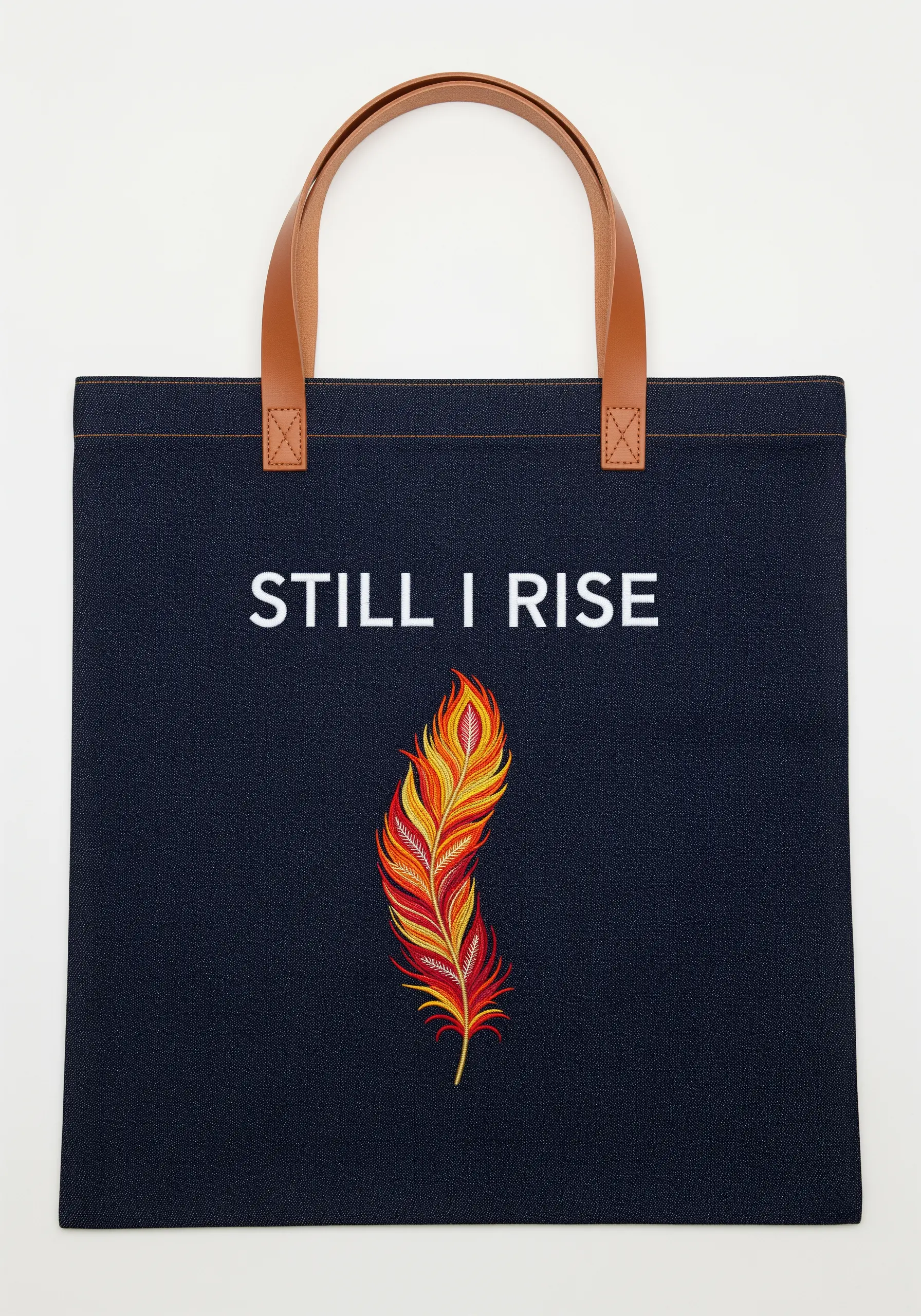
Make a bold statement on dark fabric by using thread painting to create a single, vibrant motif.
On a heavy material like denim or dark canvas, your colors will appear richer and more saturated.
Use a long and short stitch to blend the fiery reds, oranges, and yellows of the feather, creating a seamless gradient that looks almost painted on.
To ensure your outlines are sharp against the dark background, define the feather’s edges with a precise split stitch before you begin filling it in. This gives your feather embroidery a clean, professional finish.
5. Build a Sunburst with Layered Textures
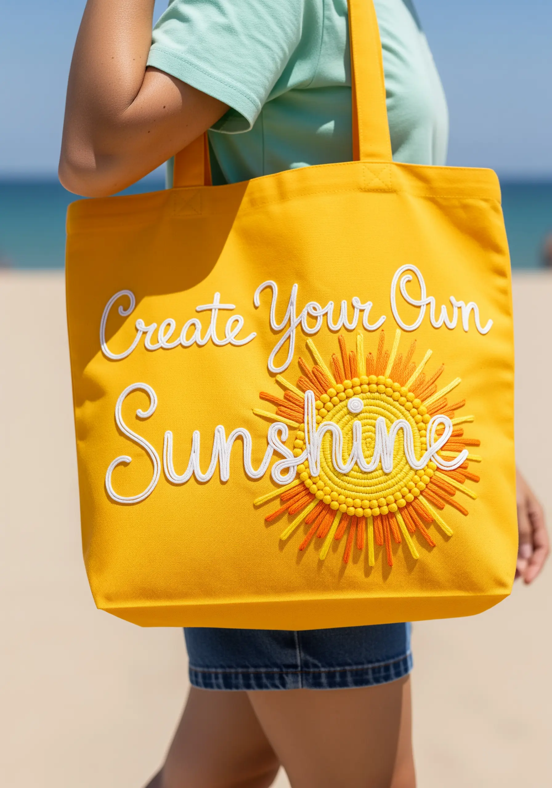
Capture the feeling of sunshine by building a motif with layers of textural stitches.
Create a dense, tactile center for the sun using hundreds of tightly packed French knots in varying shades of yellow and orange. This technique provides immediate dimension.
For the sun’s rays, use a combination of long straight stitches and satin stitch, varying the length and color to create a dynamic, radiating effect.
To make the white script lettering stand out, use a whipped backstitch or a thick stem stitch, ensuring it sits cleanly on top of the vibrant background.
6. Stitch Abstract Energy on Textured Fabric
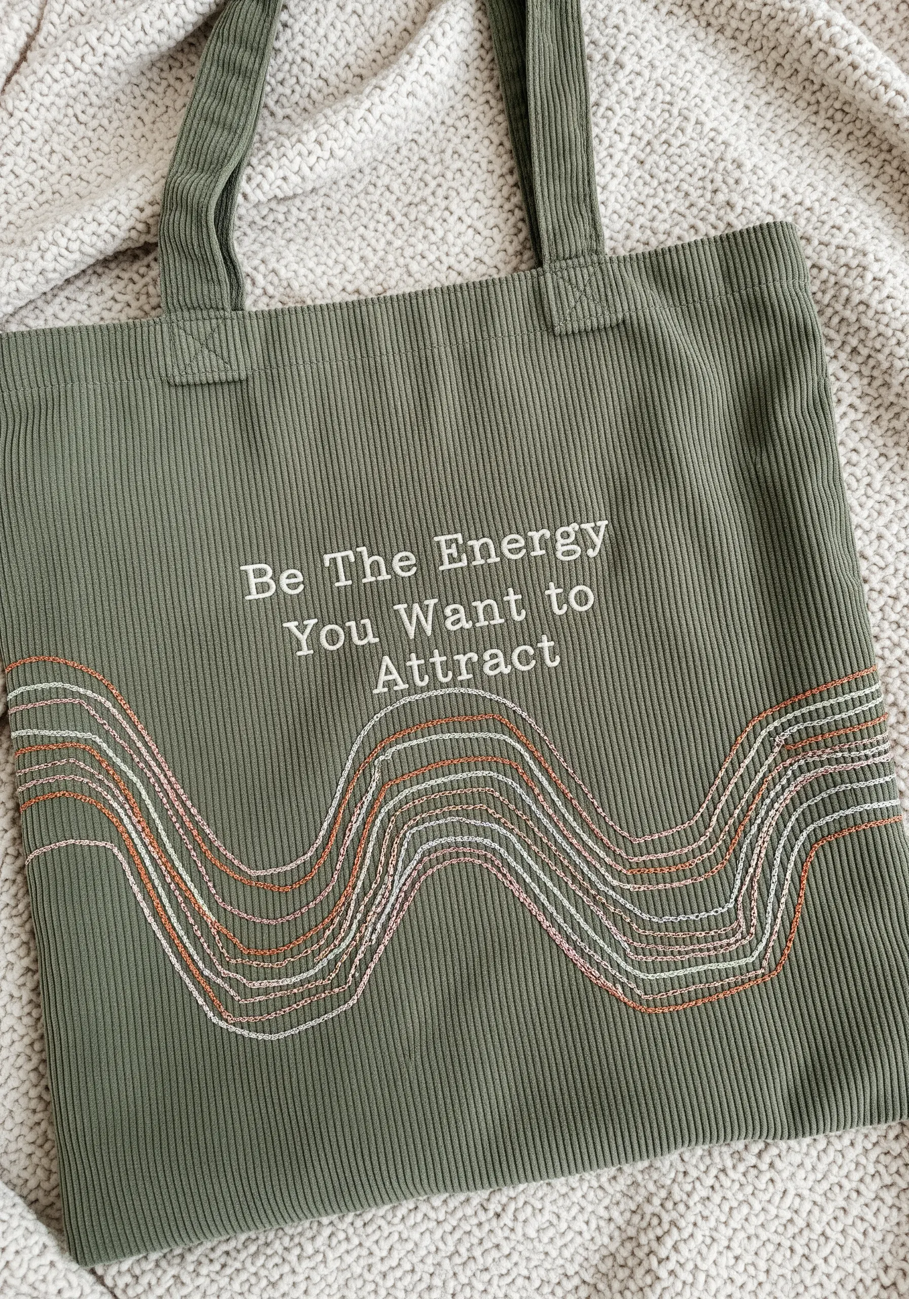
When stitching on a textured fabric like corduroy, lean into simplicity and let the material do some of the work.
A simple, fine-tipped font stitched in a contrasting color will appear elegant and clean against the fabric’s ridges.
Create the flowing, energetic waves with a simple running stitch, but use multiple strands of thread in different colors—including a metallic one for a subtle glint of light.
This method of creating abstract thread embroidery adds movement and visual interest without fighting the natural texture of the tote bag.
7. Embrace Asymmetry for Quiet Confidence
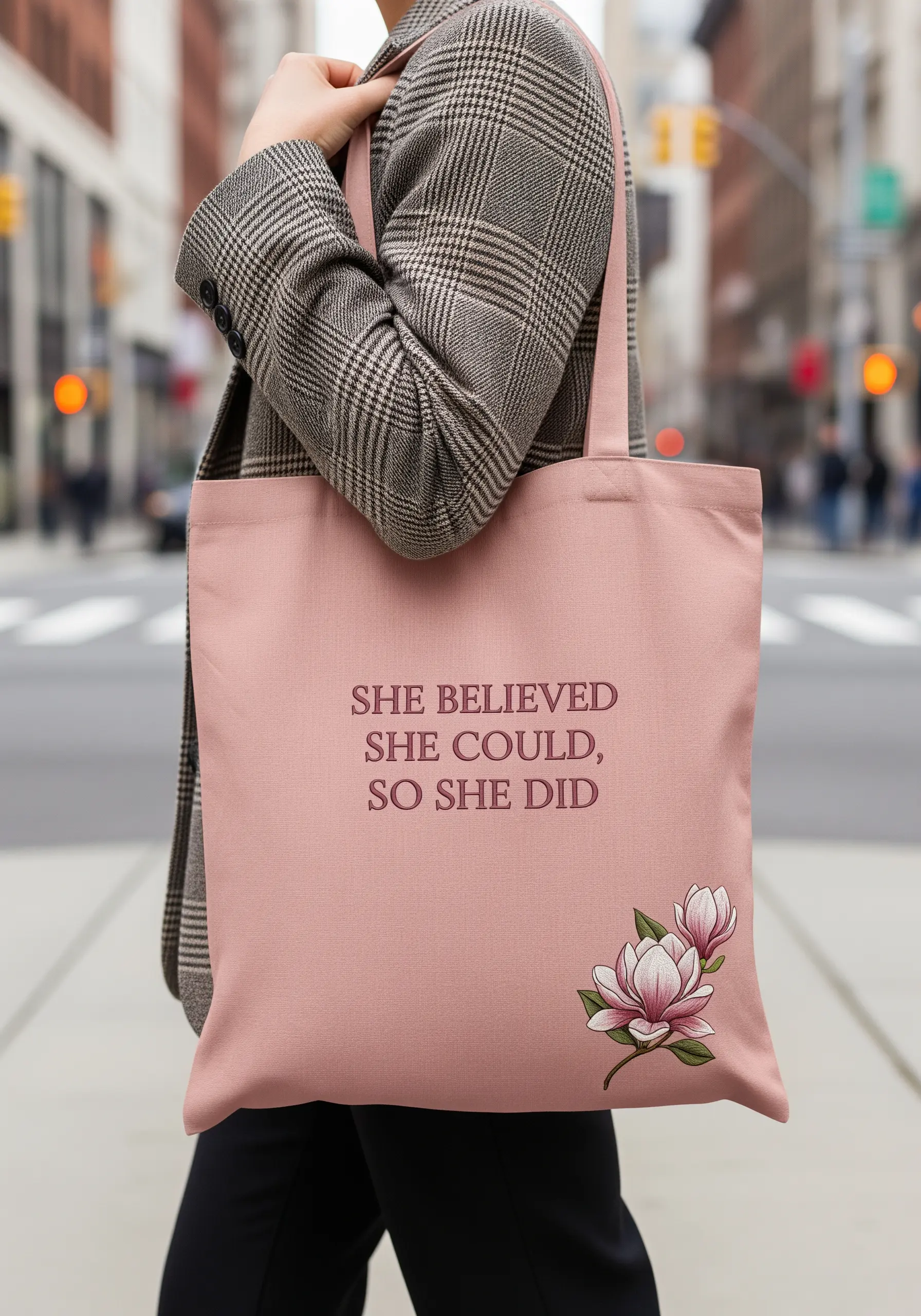
An off-center composition can feel more modern and sophisticated than a perfectly centered design.
Place your quote in the upper portion of the bag and balance it with a small, detailed botanical element in the opposite lower corner.
Use a clean, classic serif font for the lettering, stitched with a simple backstitch for ultimate readability. This ensures the message is clear and direct.
For the magnolia, use long and short stitch to create soft, realistic color blending on the petals, making it a subtle floral motif that adds a touch of grace.
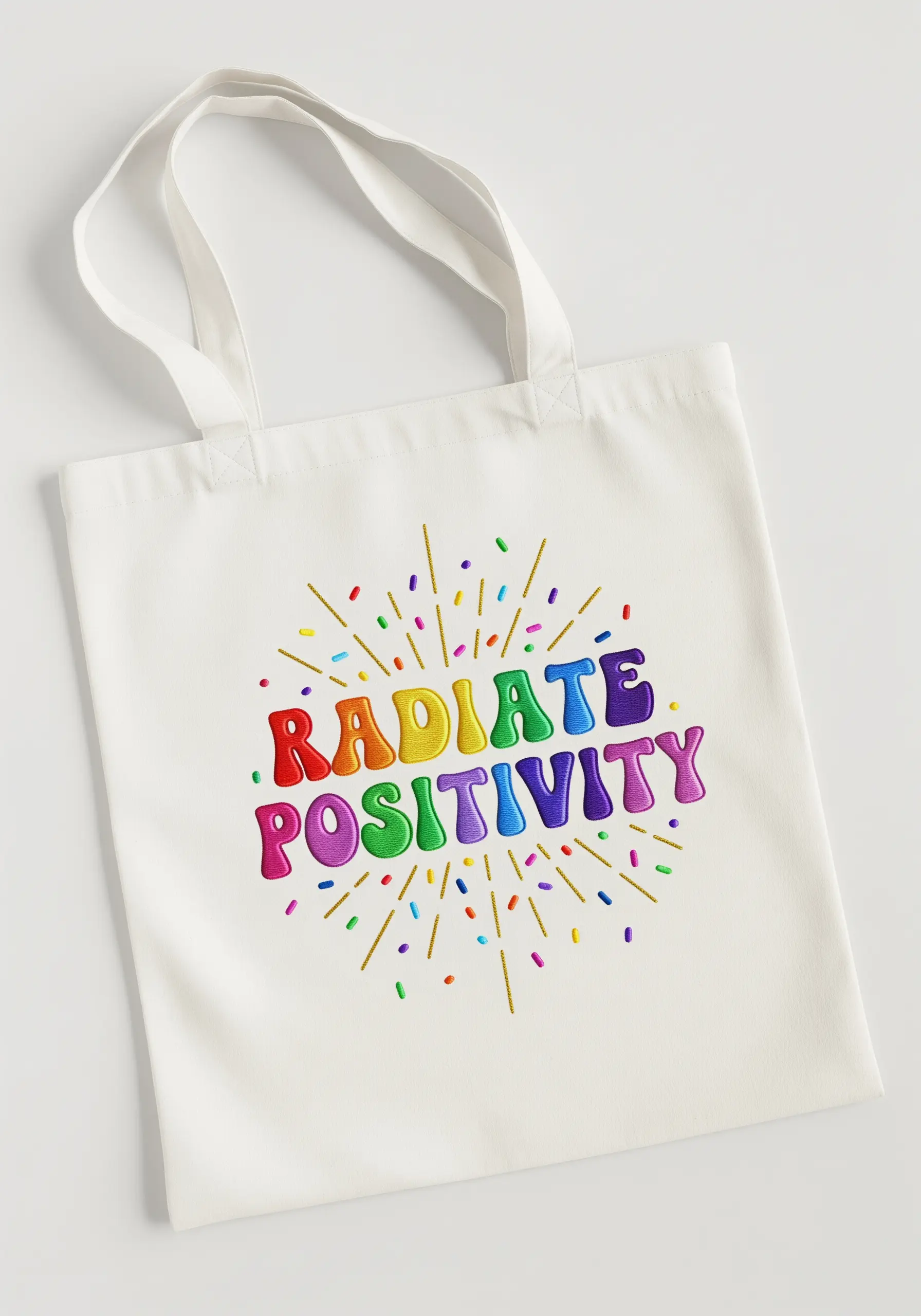
8. Master Controlled Chaos with Layered Stitches
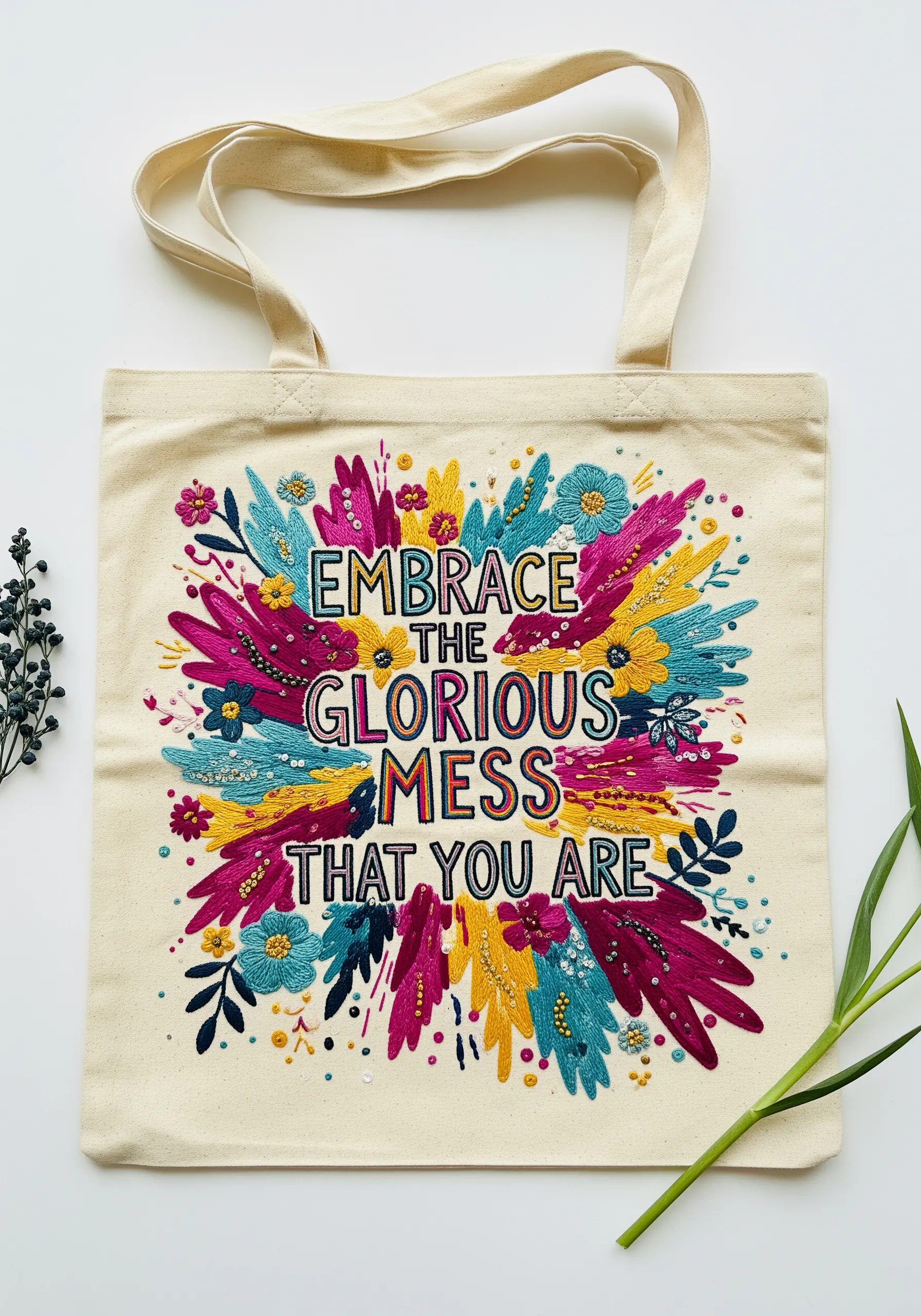
Capture the energy of a “glorious mess” by layering stitches, colors, and textures in a dynamic burst.
Start by creating a base of long, directional satin stitches in bold colors, radiating from the center like sunbeams.
Next, layer smaller, more textural elements on top: French knots, lazy daisy flowers, and tiny seed stitches add confetti-like detail and depth.
By stitching the lettering last using a bold, white backstitch, you ensure the words sit clearly on top of the colorful explosion, creating a cohesive and alive design.
9. Use Metallics and Seed Stitches on Velvet
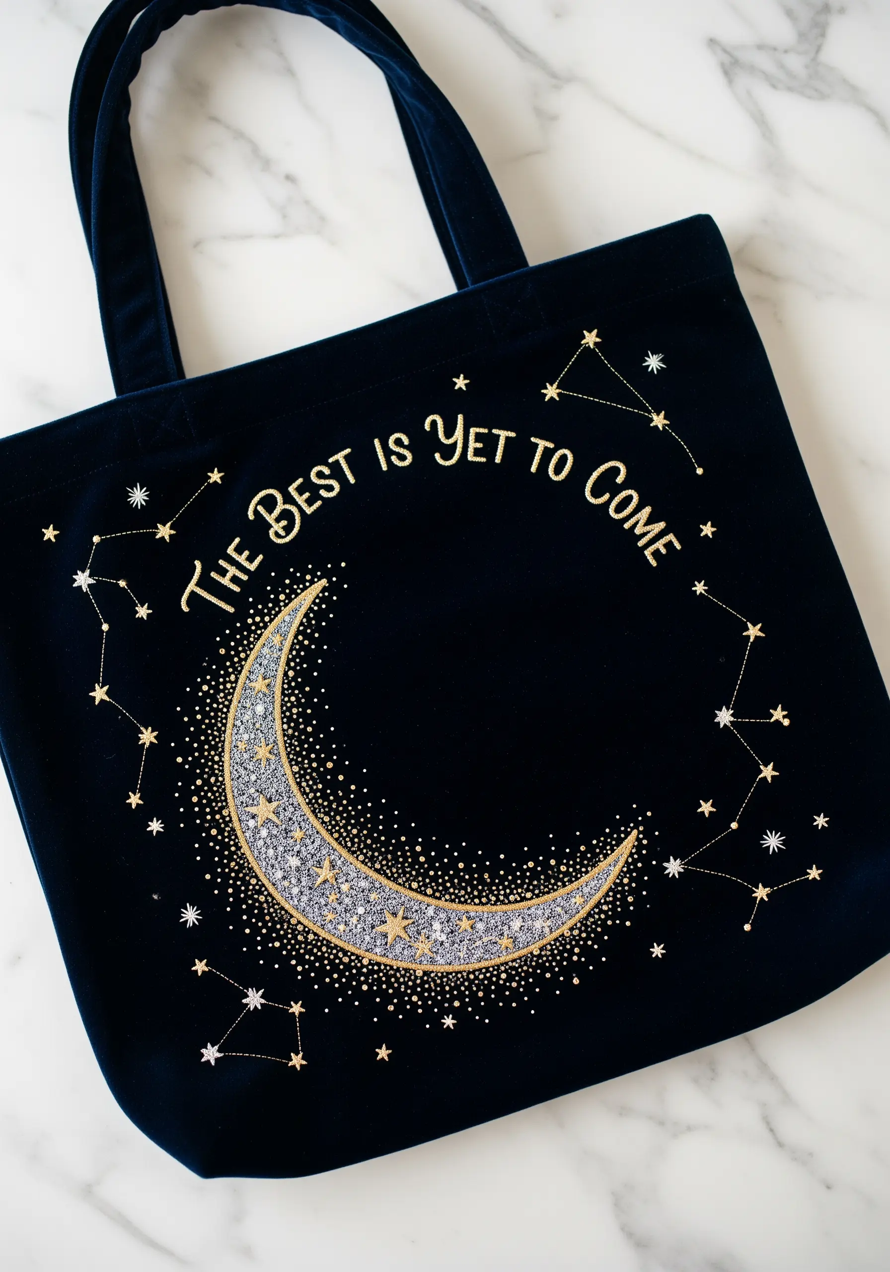
Stitching on a plush fabric like velvet requires techniques that prevent the stitches from sinking into the pile.
Always use a water-soluble or tear-away stabilizer on top of the velvet to create a smooth surface for your needle.
Use metallic thread for the constellations and lettering; its stiffness and shine help it sit prominently on the fabric’s surface.
Fill the moon with thousands of tiny seed stitches and French knots in silver, white, and gold. This dense texture creates a sparkling, cratered effect that contrasts beautifully with the smooth velvet, perfect for celestial embroidery.
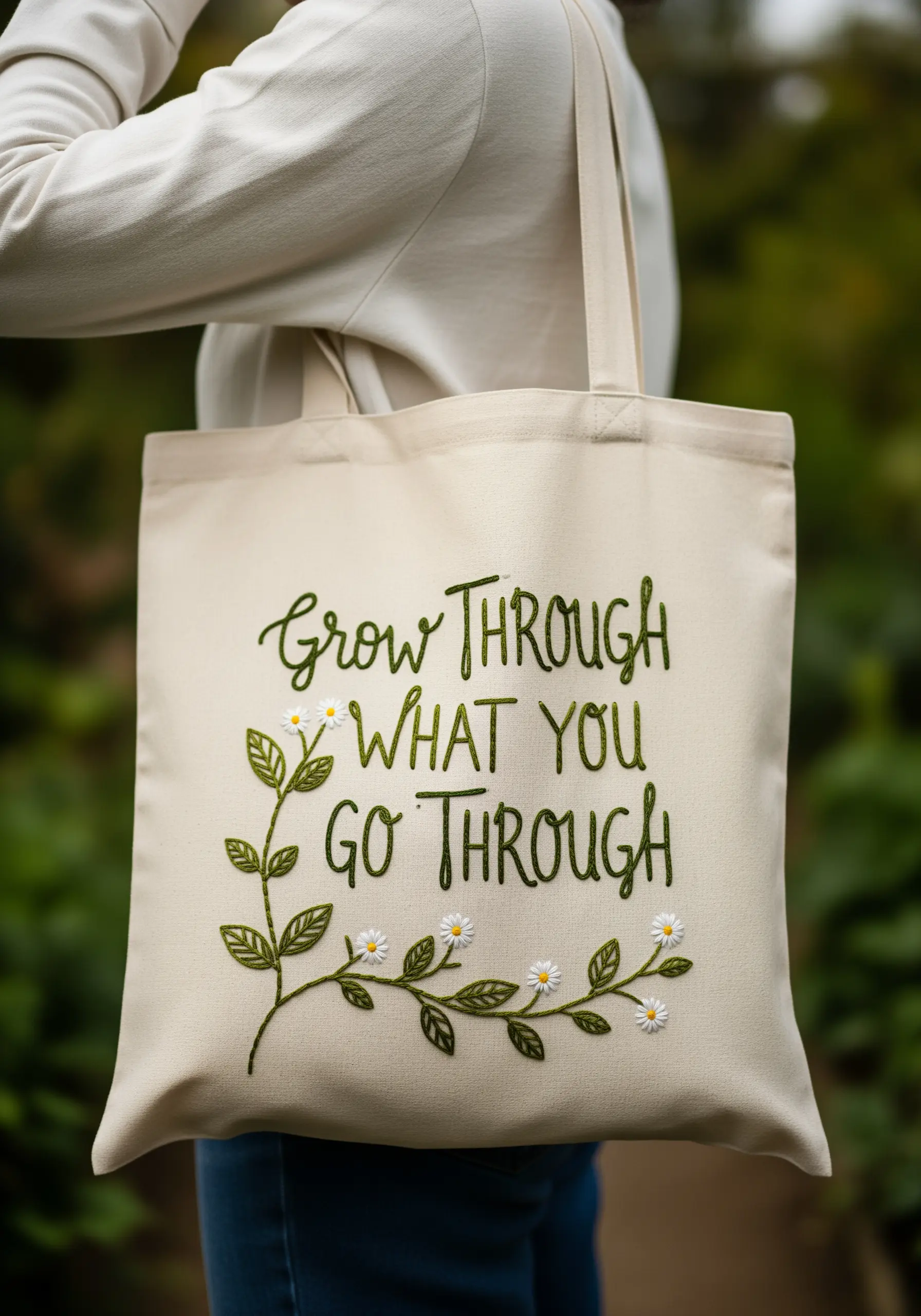
10. Fill Your Lettering with Tiny Florals
Instead of a standard satin stitch, fill your letters with a delicate meadow of tiny botanical motifs.
First, trace and outline your letters with a simple backstitch in a dark, defining color. This creates the container for your floral fill.
Inside the letters, use a variety of simple stitches: lazy daisies for petals, French knots for flower centers, and tiny straight stitches for leaves and stems.
This technique turns typography into a miniature garden, adding a layer of charming detail and personality that a solid fill could never achieve. It’s a perfect way to add tiny floral embroidery to any project.
11. Add Rugged Texture to Waxed Canvas
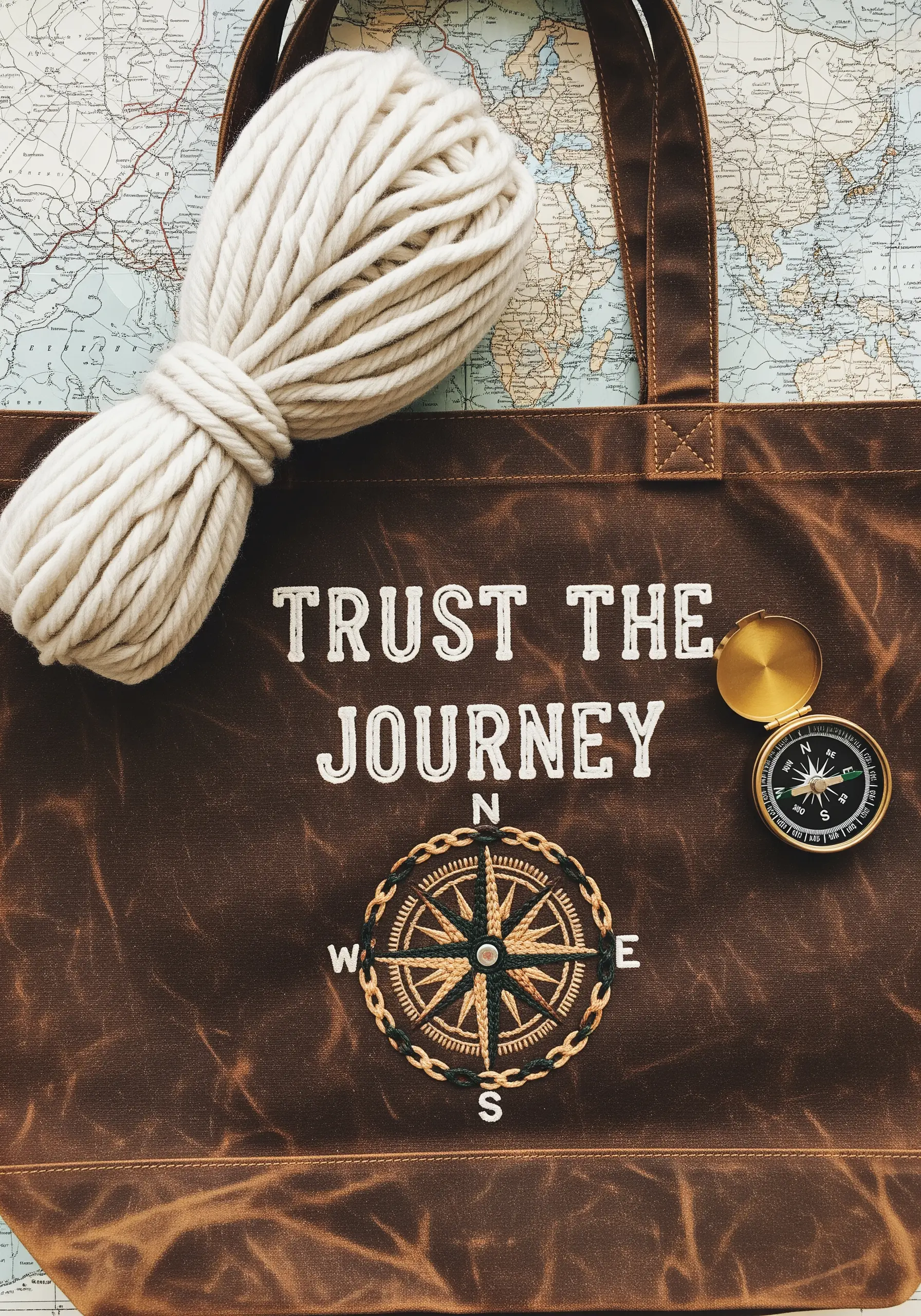
Complement the rugged aesthetic of waxed canvas by choosing stitches that add dimension and a handmade feel.
Use a chunky, off-white thread and a whipped backstitch for the lettering. This creates a raised, rope-like effect that stands out against the dark, moody fabric.
For the compass, introduce couching: lay down thicker yarn or multiple strands of floss for the outer ring and stitch over it with a thinner thread to tack it down.
This mix of techniques adds a tactile quality, creating earthy texture that feels adventurous and authentic.
12. Create Art Deco Glamour with Satin Stitch
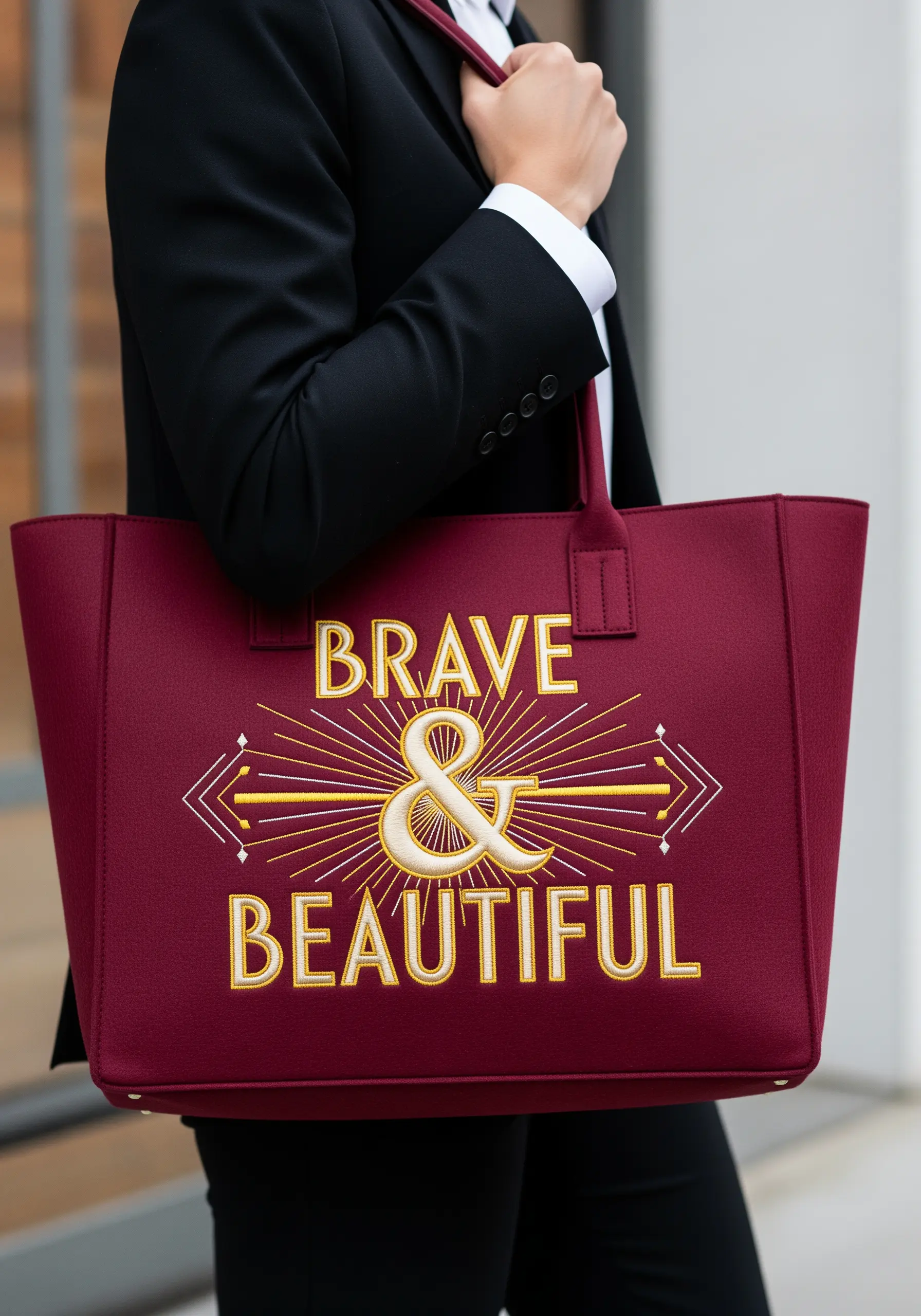
Evoke an Art Deco feel by combining bold, clean typography with metallic, symmetrical linework.
Use a smooth satin stitch to fill the letters, ensuring your stitches are parallel and consistent to create a silky, light-catching surface.
Choose a high-contrast palette like cream and gold on a deep burgundy. The contrast makes the design feel luxurious and intentional.
Frame your words with sharp, geometric rays stitched with a simple backstitch in metallic thread. This symmetry and clean-lined geometry are hallmarks of the elegant Art Deco style.
13. Make a Statement with High-Contrast Graphics

Achieve a bold, modern, and graphic look by pairing a neon thread with a neutral, dark background.
The key to this style is flawless execution. Use a dense satin stitch to fill the block letters, ensuring there are no gaps and the edges are perfectly clean.
Outline the letters first with a split stitch in the same color. This creates a slightly raised edge that makes it much easier to keep your satin stitches neat and contained.
This minimalist, two-color approach makes your message feel direct, confident, and unapologetic, perfect for minimal typography.
14. Capture Movement with Delicate Line Work
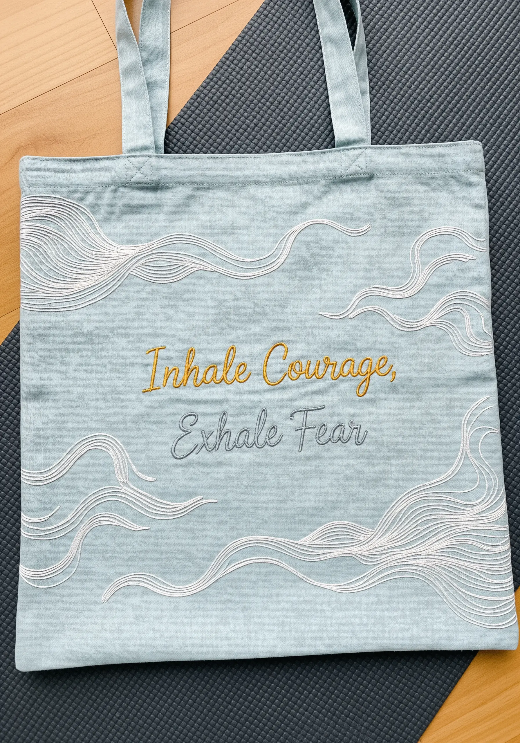
Suggest the feeling of breath and air by using fine, flowing lines instead of solid shapes.
Create the cloud-like swirls using a simple backstitch or stem stitch. To create depth and variation, use a different number of floss strands for each line—some with three strands, others with just one.
This subtle shift in thread weight makes the composition feel more organic and less flat.
By stitching the wispy lines in white on a soft blue fabric, you evoke a sense of calm and serenity, turning the tote into a visual reminder to breathe. These are perfect for abstract thread swirls.
15. Stitch a Flame Gradient for Fiery Impact
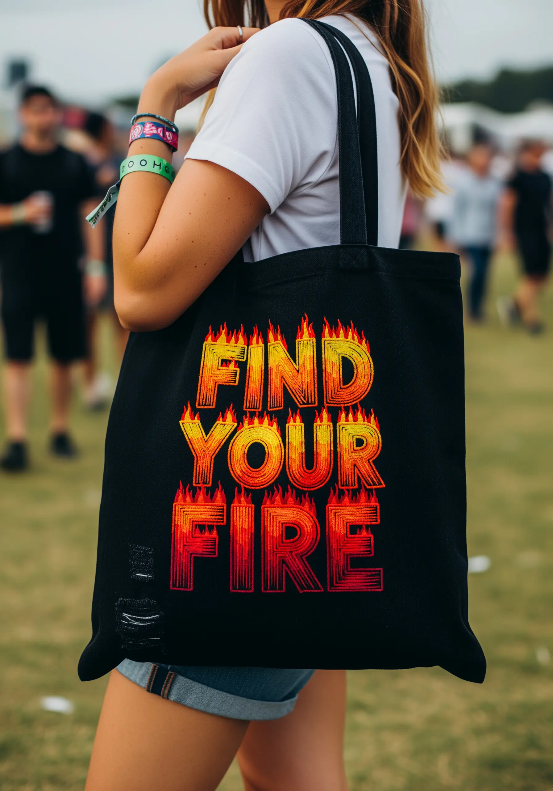
Create the illusion of fire by carefully blending thread colors from yellow to red.
Fill the letters using long and short stitch, starting with the lightest color (yellow) at the top and gradually blending into orange, then deep red at the bottom.
To make the gradient seamless, ensure the stitches from one color section overlap slightly with the stitches from the next.
The thin, radiating lines stitched on top add a flickering effect, making the letters feel dynamic and alive with energy. Use a single strand for these lines to keep them sharp.
16. Add Dimension with Sequins and Crystals
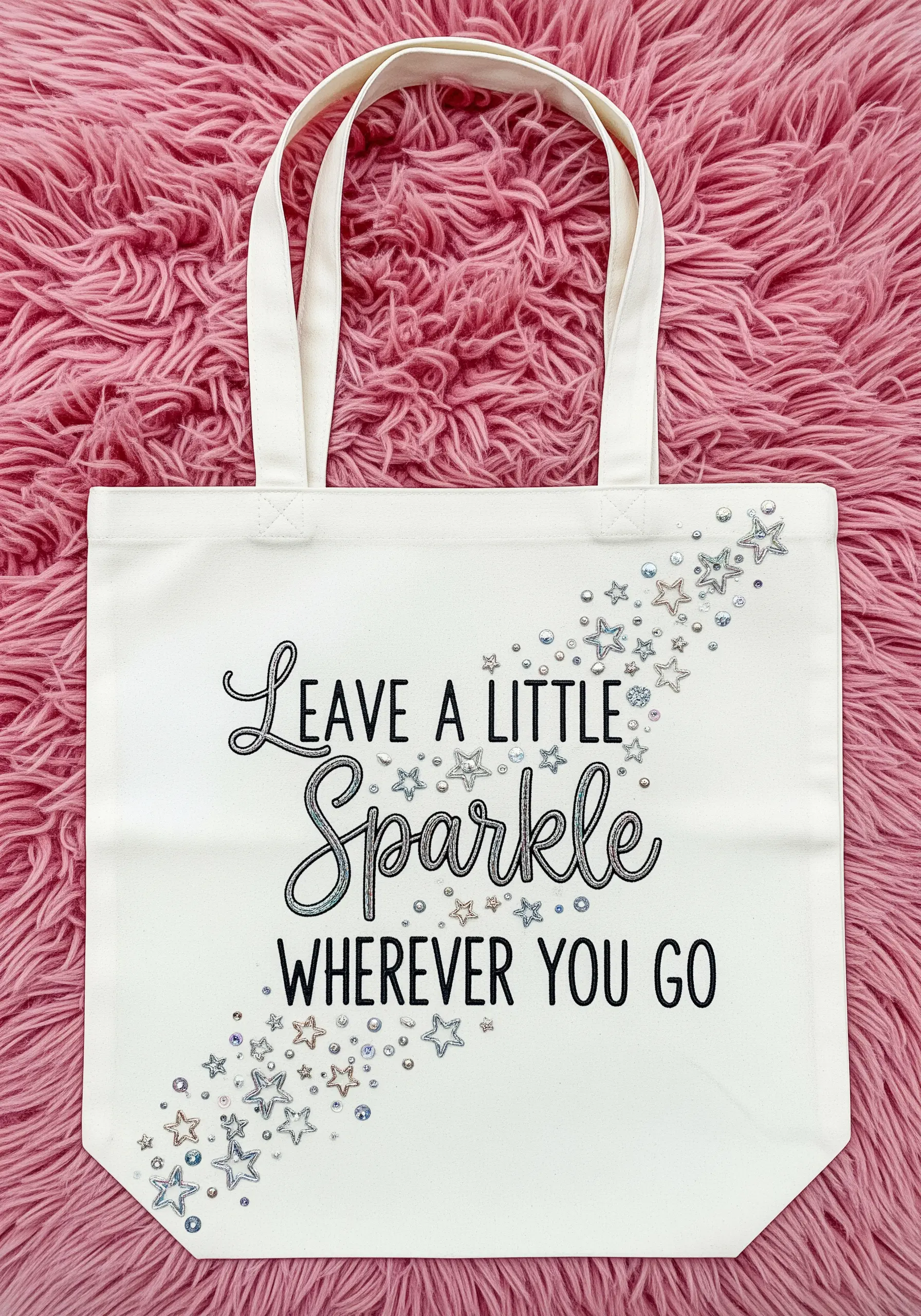
Elevate a simple script quote by incorporating beads and crystals for a touch of glamour.
First, stitch your lettering using a clean backstitch or stem stitch. This provides the design’s foundation.
Then, embellish the surrounding area with a scatter of sequins, beads, and flat-backed crystals, concentrating them near the text and fading them out.
Secure each element with a tiny matching seed bead or two small, discreet tacking stitches. This ensures they are durable enough for a well-used tote bag.
17. Contrast Appliqué with Delicate Linework
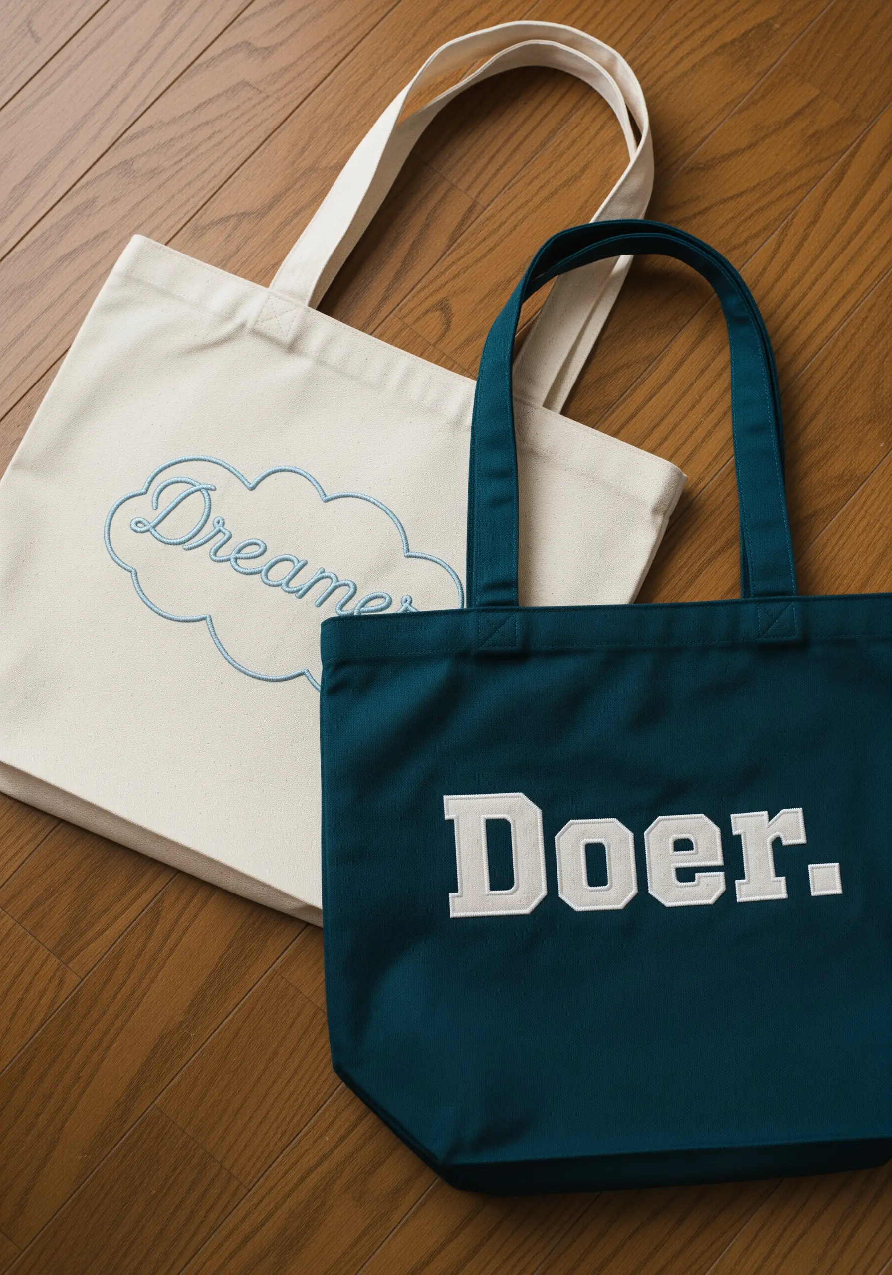
Tell a story of two complementary ideas by pairing two distinct embroidery techniques.
For the bold, assertive word “Doer,” use fabric appliqué. Cut the letters from felt or a non-fraying cotton, iron them on with fusible web, and secure the edges with a neat satin stitch border.
For the gentle, whimsical word “Dreamer,” use a delicate stem stitch with a lighter-weight thread. Outlining it with a cloud shape reinforces the airy, imaginative feeling.
This contrast in texture and weight creates a powerful visual narrative about the balance between action and imagination.
18. Use Color Blocking for a Modern Edge
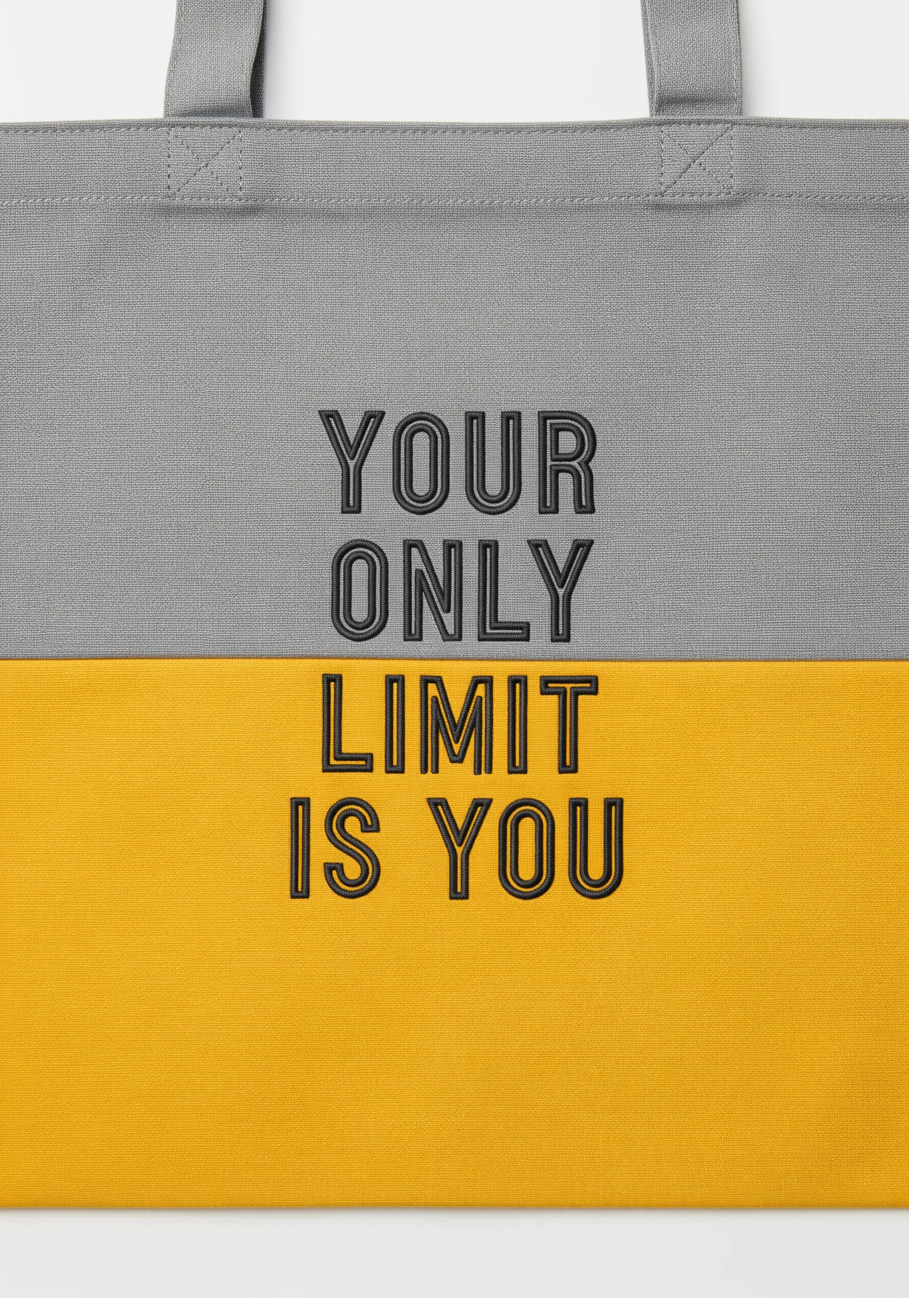
Create a sharp, contemporary look by combining color-blocked fabric with clean, minimalist embroidery.
This design’s power comes from the striking horizontal line dividing the two colors. The embroidery bridges this divide, unifying the composition.
Stitch the quote using a tone-on-tone approach on the top half—a dark grey thread on a lighter grey fabric. This creates a subtle, sophisticated effect.
When the stitching crosses onto the yellow fabric, the high contrast makes the words pop, drawing the eye and emphasizing the message. This is a masterclass in elegant, tone-on-tone embroidery with a graphic twist.