

The colors you choose are more than just decoration; they are the voice of your embroidery. They set the mood, create depth, and turn a simple stitched line into an emotional statement. But moving beyond pre-made kits or predictable combinations can feel intimidating. How do you build a palette that feels both personal and polished?
Think of your thread as paint and your fabric as the canvas. The relationship between them is where the magic happens. A dark fabric can make jewel tones sing, while a simple two-tone palette can unify an entire collection of different motifs. It’s not about using more colors, but about using the right ones with intention.
In these examples, you’ll discover how to use color to create atmosphere, guide the eye, and integrate your art seamlessly into your home. Let’s move past guessing and start choosing colors with the confidence of an artist. Your walls are ready for a transformation.
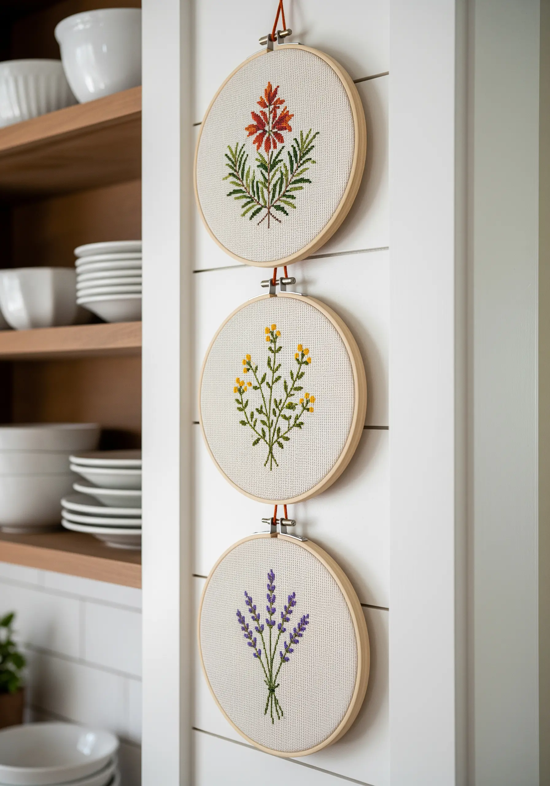
1. Master Monochromatic Gradients for Natural Depth
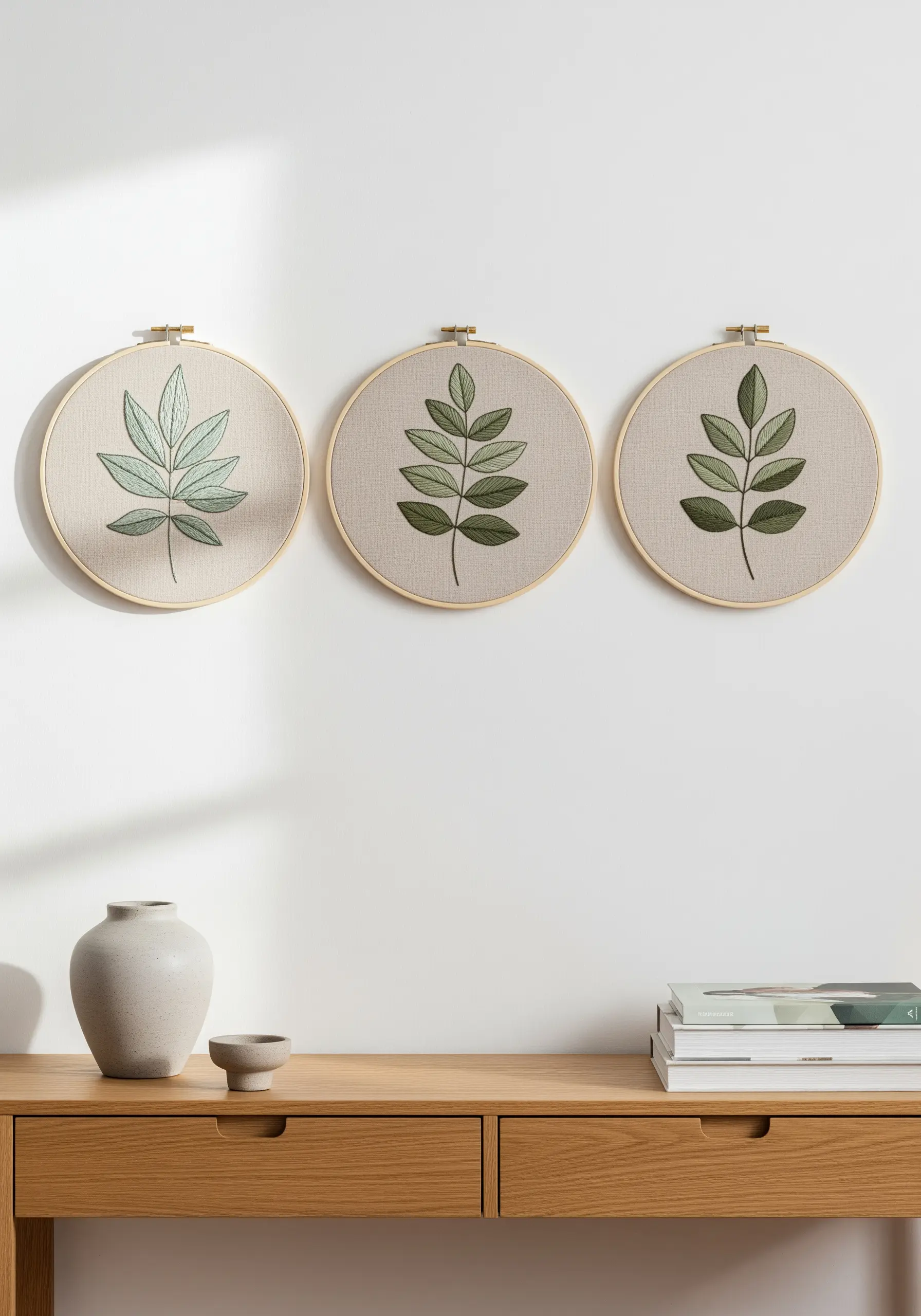
Focus on a single color family, like green, but vary the light, medium, and dark shades across multiple hoops to create a cohesive, yet dynamic, display.
For each botanical, use a lighter shade for the fill (satin stitch) and a darker one for the central vein and outline (stem stitch or backstitch).
This subtle contrast mimics how light hits foliage, adding realism without complexity.
The neutral oatmeal-colored fabric acts as a quiet, earthy backdrop, allowing the greens to stand out with serene elegance, perfect for showcasing delicate leaf stitch techniques.
2. Use Black Fabric to Amplify Jewel Tones
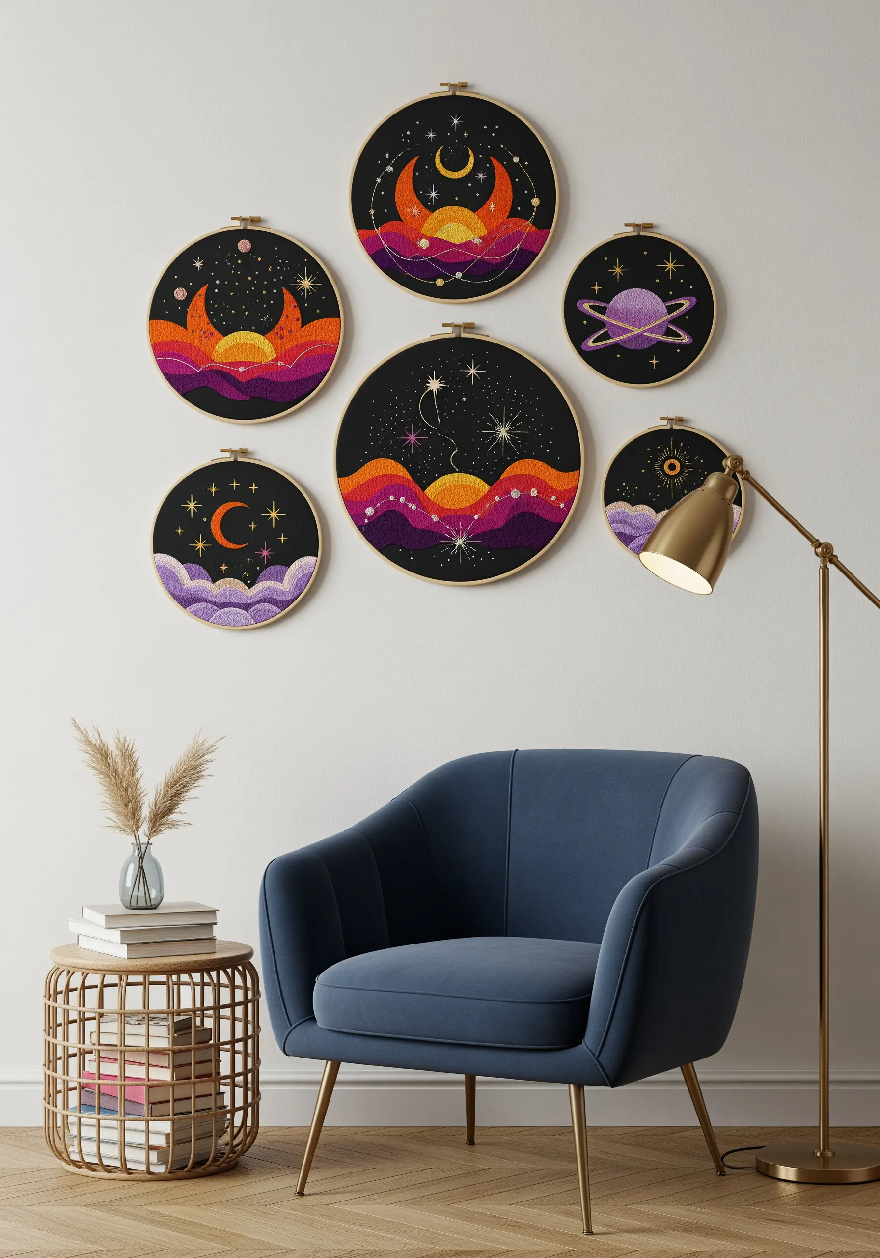
A black or dark navy fabric isn’t just a background; it’s a tool for making your colors vibrate with energy.
Palettes of magenta, deep orange, and gold pop with celestial power against the dark canvas, turning simple stitches into glowing statements.
Use satin stitch for solid color-blocked areas to maximize light reflection and color intensity.
For stars, a simple French knot or star stitch in a metallic or bright white thread creates a sharp, brilliant contrast that feels truly magical.
3. Unify a Collection with a Strict Triadic Palette
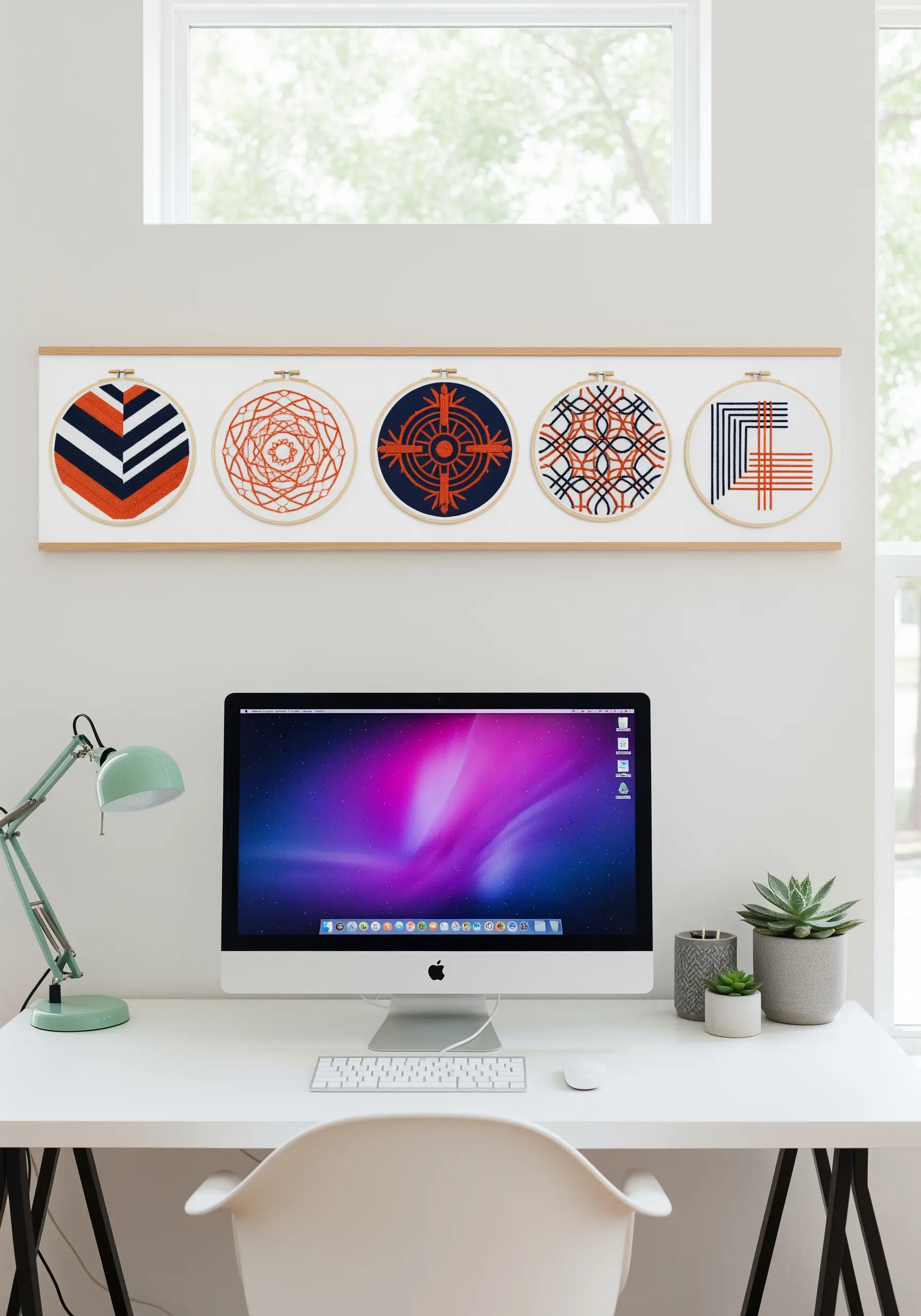
Choose three high-contrast colors—like navy, burnt orange, and cream—and use them exclusively across a series of hoops.
This disciplined approach forces you to explore composition and pattern rather than relying on a dozen shades, resulting in a bold, graphic statement.
It works especially well for geometric stitch patterns, where clarity and precision are key.
The final arrangement feels like a single, unified piece of art, not just a collection of individual hoops.
4. Build a Landscape with an Analogous Earth-Tone Palette
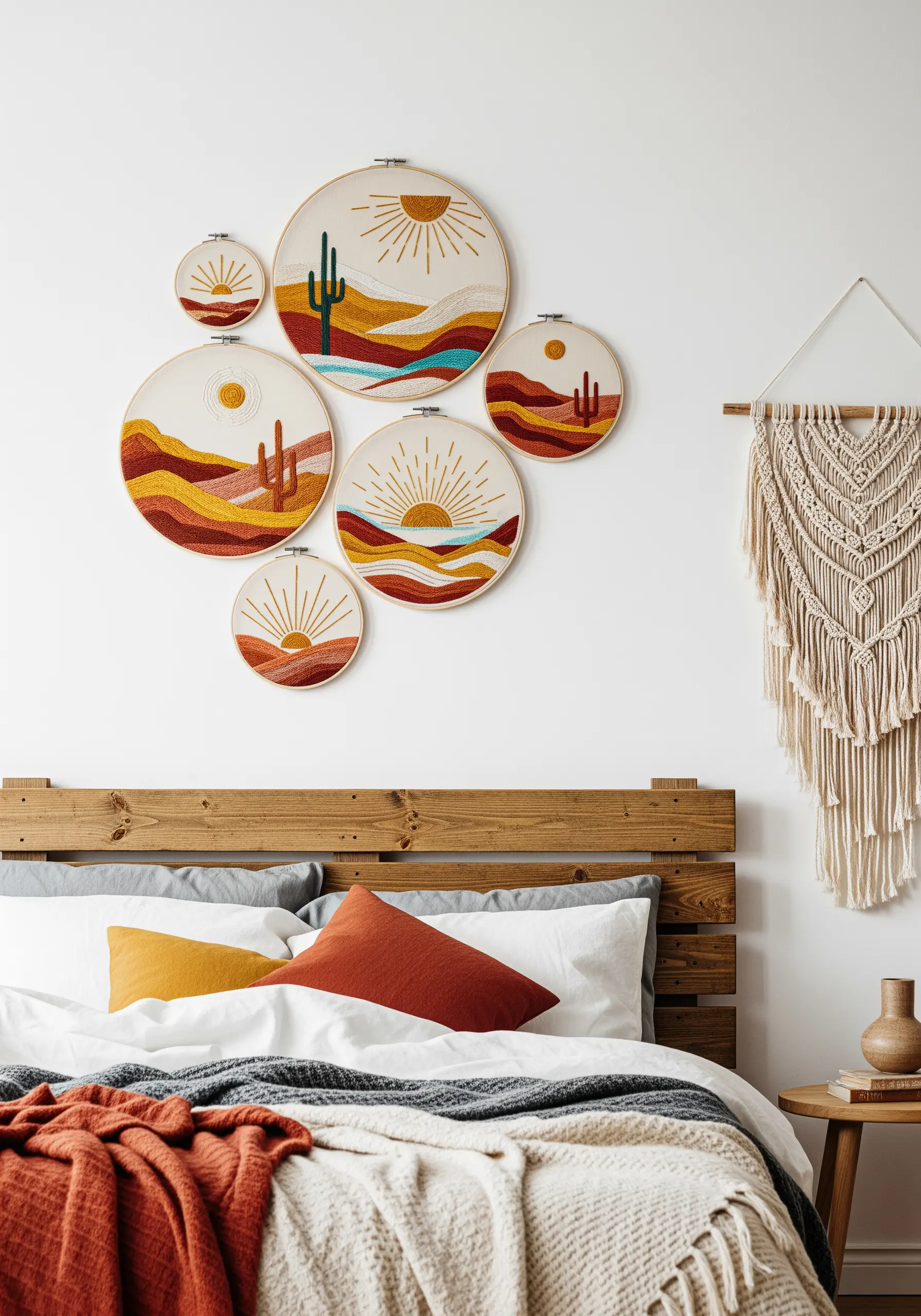
Select colors that sit next to each other on the color wheel—like reds, oranges, and yellows—to create a naturally harmonious landscape.
Layer these tones using long-and-short stitch to mimic the soft gradients of a desert sunset or rolling hills.
A single touch of a complementary color, like teal green for a cactus, provides a striking focal point without disrupting the overall warmth.
This technique results in earth-tone embroidery projects that feel effortlessly chic and grounded.
5. Balance a Saturated Palette with Symmetrical Design
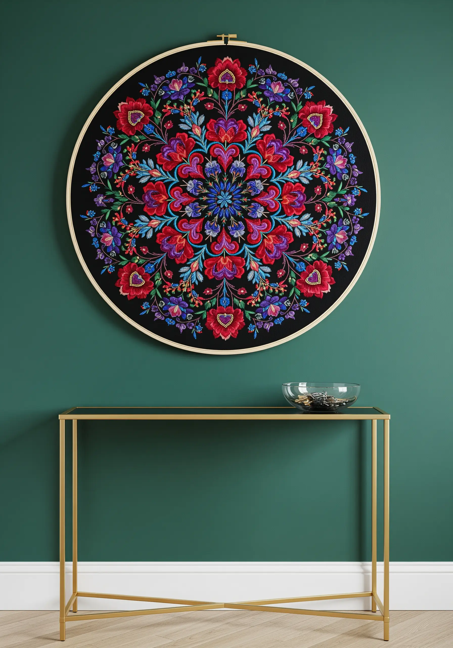
When using a full spectrum of intense, saturated colors, a symmetrical pattern like a mandala provides essential structure and prevents visual chaos.
The repetition of motifs in bold reds, blues, and purples creates a rhythm that guides the eye calmly through the complex design.
Place your brightest, most vibrant colors at the center or key anchor points to draw focus and create a clear visual hierarchy.
A black background ensures each hue remains distinct and powerful, allowing the intricate details to shine.
6. Create Cohesion with a Muted Duotone Palette
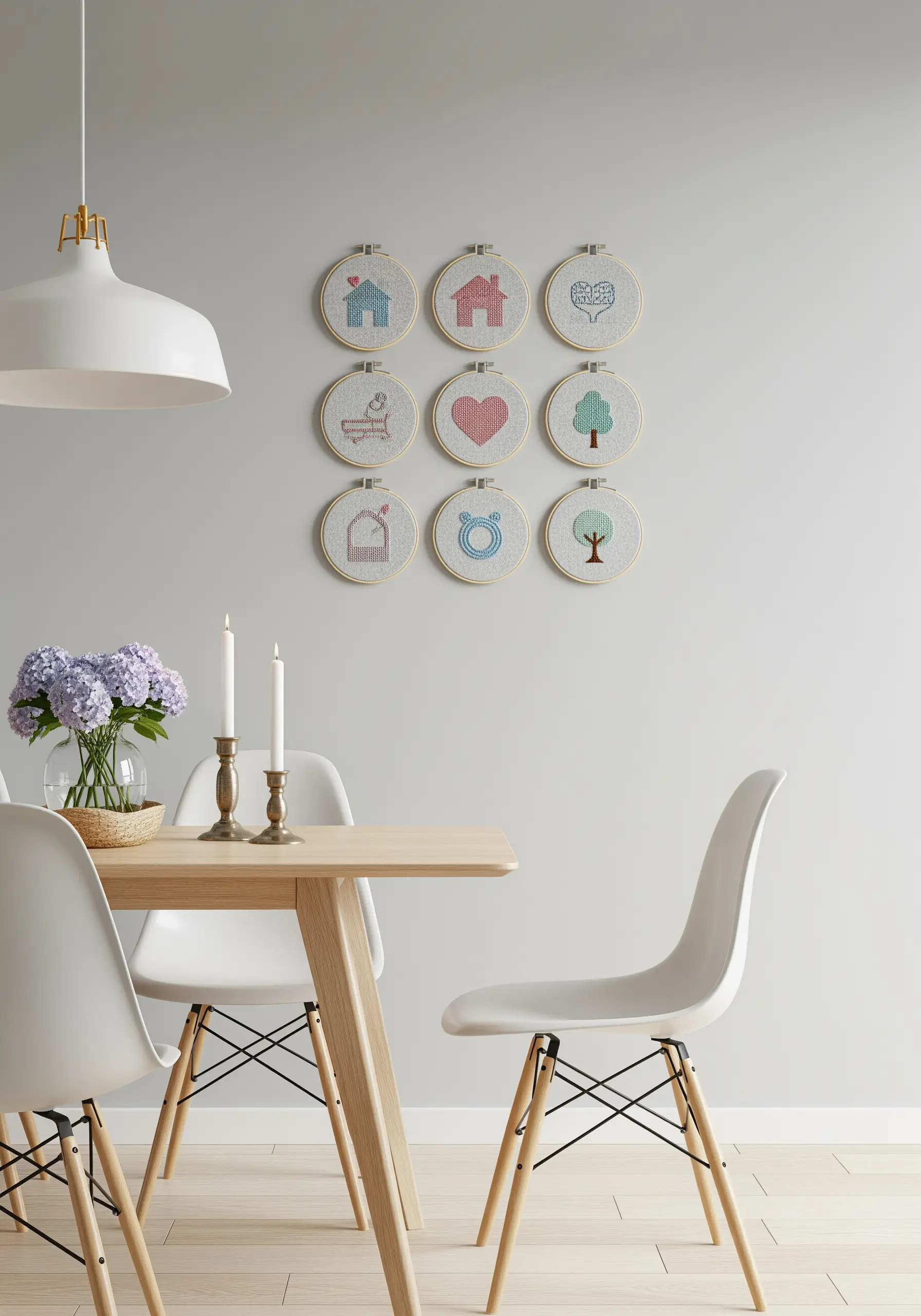
For a gallery wall of small motifs, limit your palette to just two soft, complementary colors, like dusty rose and pale teal.
By using only these two shades across nine different icons, you create an instant, calming collection that feels intentional and curated.
This minimalist approach allows the simple line work of each design to shine without distraction.
It’s a perfect strategy for creating a narrative series of tiny embroidery patterns that look designer-made.
7. Energize a Space with a Triad of Neon Brights
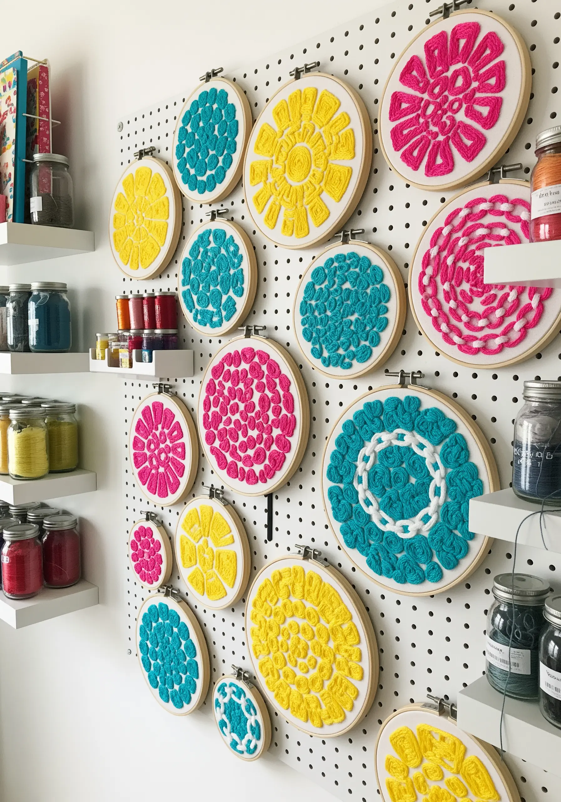
Choose three unapologetically bold colors like hot pink, electric cyan, and lemon yellow for an instant mood lift and a dose of pure joy.
To maximize their impact, use chunky yarn or multiple strands of floss to create high-texture stitches like French knots and chain stitch loops.
This adds a tactile, three-dimensional quality that makes the vibrant colors feel even more playful and energetic.
These color-pop embroidery art ideas are perfect for reviving a neutral wall.
8. Soothe with a Split-Complementary Coastal Palette
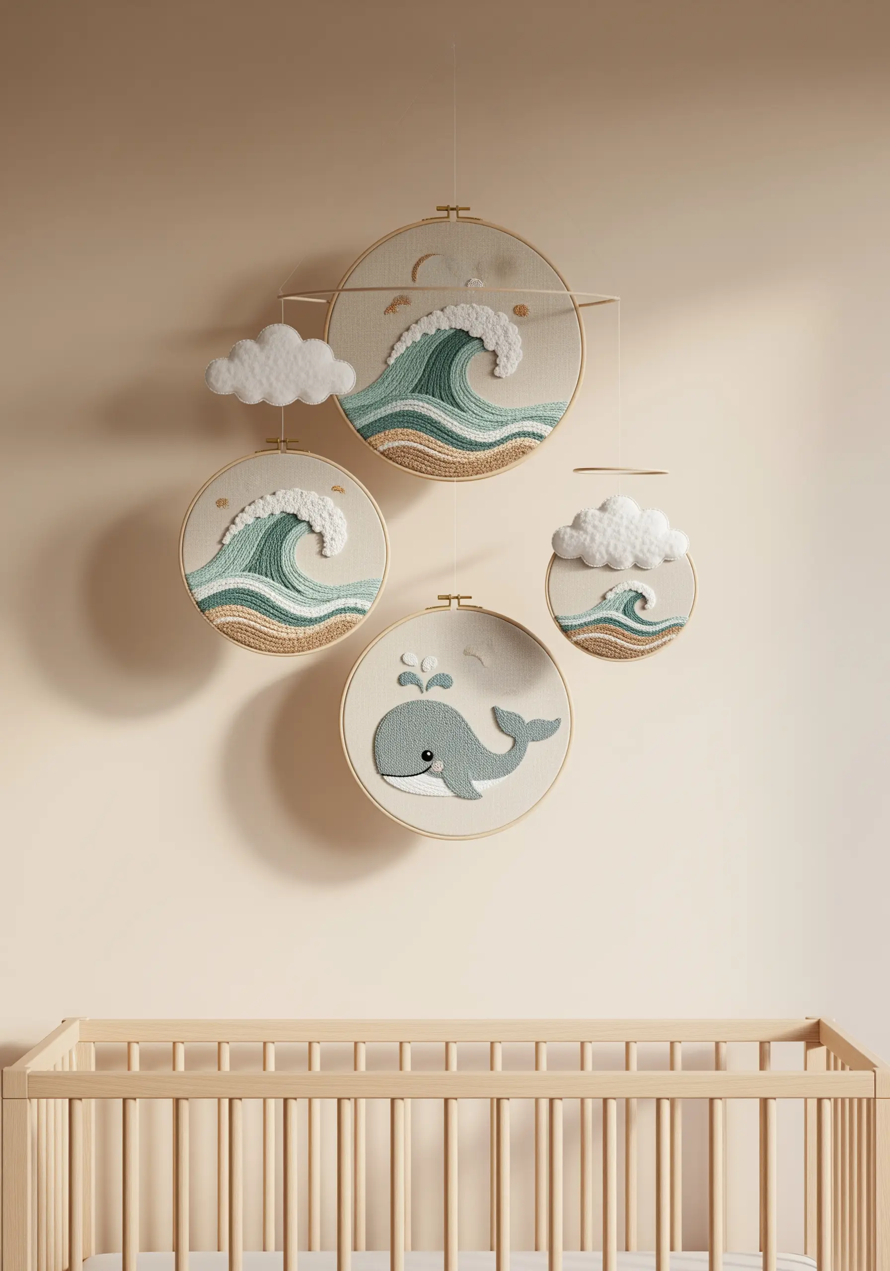
To create a calming yet visually interesting palette for a nursery or bedroom, try a split-complementary color scheme.
Start with a base color like sandy beige. Instead of its direct complement (blue), use the two colors on either side of it—seafoam green and dusty blue.
This creates a gentle, sophisticated harmony that feels serene and is perfect for cloud-soft embroidery hoops for nursery walls.
The subtle tension between the colors adds interest without sacrificing tranquility.
9. Isolate Botanical Palettes for a Refined Trio
Instead of mixing all your floral colors in one hoop, dedicate each piece in a series to its own specific plant palette.
One hoop for the warm reds and oranges, another for the buttery yellows, and a third for the cool purples of lavender.
This method allows each botanical to have its own identity while the consistent style and green foliage tie the collection together.
It results in a clean, curated display that feels like a page from a botanist’s journal.
10. Echo Your Interior with a Mirrored Palette
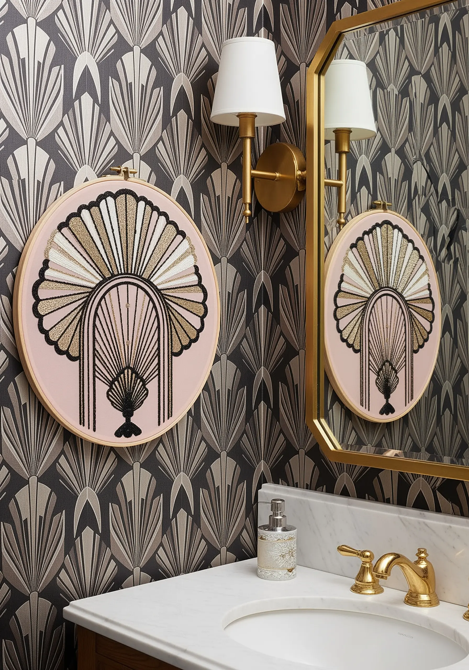
To make your hoop art feel truly integrated, pull colors directly from your room’s decor for a bespoke, custom look.
Here, the gold, black, and cream threads perfectly mirror the brass fixtures, dark wallpaper, and white sconces.
This intentional color harmony elevates the embroidery from a craft project to a piece of interior design.
Using luxury metallic thread adds a touch of glamour that echoes the room’s high-end finishes.
11. Create Atmospheric Depth with a Moody, Jewel-Toned Palette
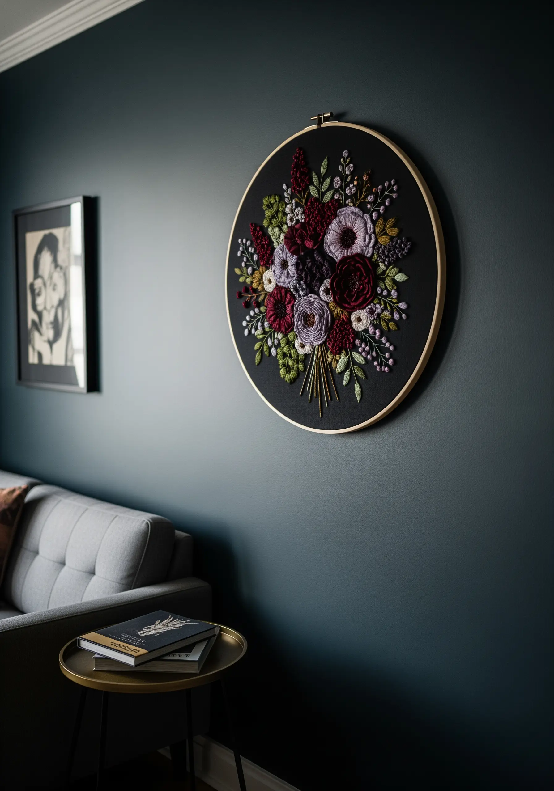
Against a dark wall, a palette of deep jewel tones—burgundy, plum, dusty mauve, and olive green—creates a rich, dramatic, and immersive effect.
Use highly textural stitches like woven wheel roses and French knots to catch the light, adding dimension and preventing the dark colors from flattening against the background.
A single pop of a lighter color, like pale lilac or cream, can act as a highlight to draw the eye and add a point of contrast.
This strategy is perfect for creating dramatic dark thread embroidery designs with an emotional quality.
12. Use a Transparent Fabric for a Stained-Glass Effect
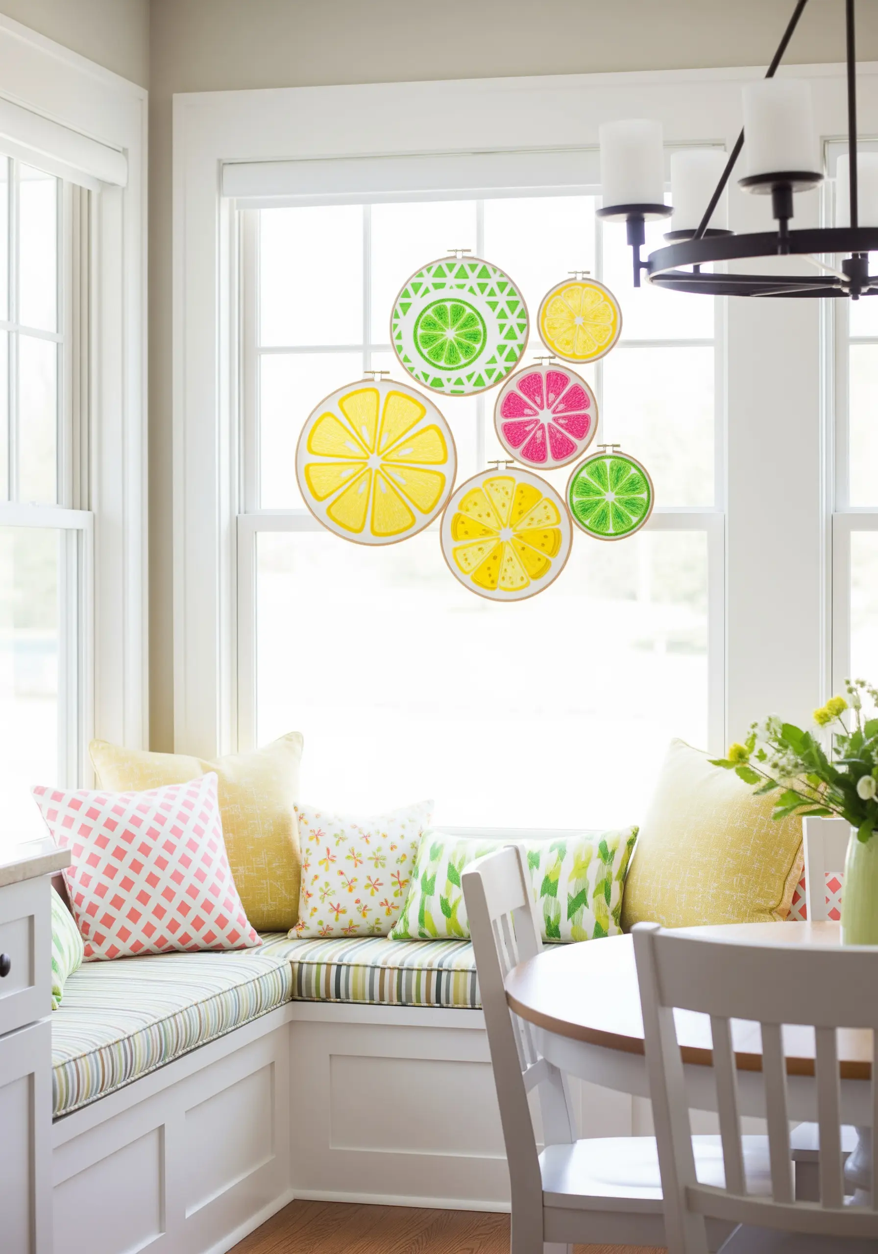
Instead of opaque cotton or linen, stitch your design on a sheer fabric like organza or tulle.
When you hang the finished hoops in a window, the light will shine through the fabric, making your thread colors glow like stained glass.
A palette of vibrant citrus yellows, pinks, and limes is perfect for this technique, creating a cheerful, luminous display that changes throughout the day.
This method is ideal for nature-themed embroidery projects that you want to feel light and airy.
13. Tell a Story with a Gradual Color Transition
Create a single, flowing design that spans multiple hoops, using color to show progression and movement.
Start with a deep navy in the first hoop and gradually introduce lighter shades of blue until you reach a pale, airy tone in the last one.
This technique transforms a simple collection of hoops into a dynamic, narrative installation that guides the viewer’s eye along the wall.
The continuous thread connecting them literally illustrates the flow, turning the hoops into frames of a single, abstract story.
14. Capture a Vibe with a Vintage-Inspired Palette
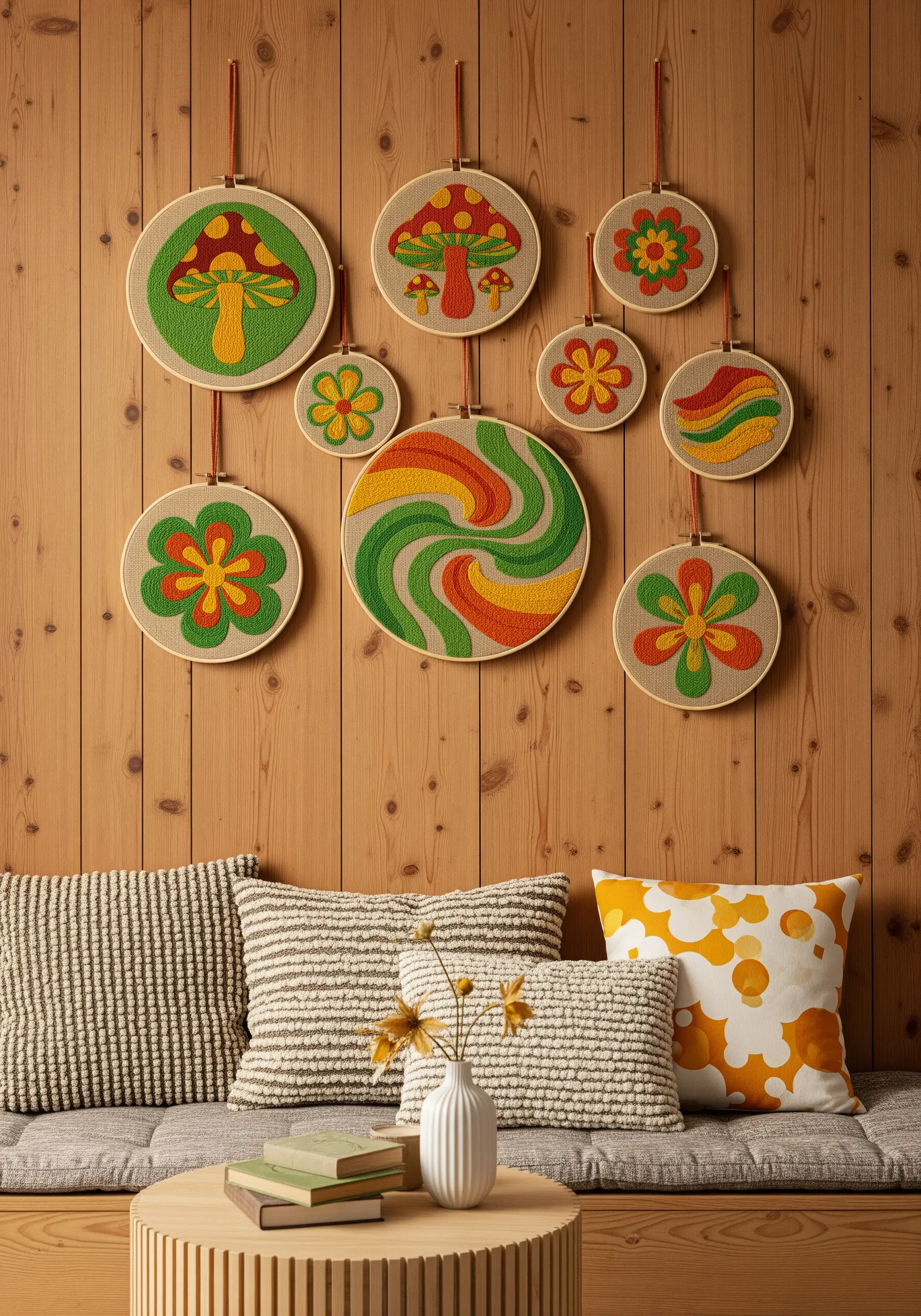
Evoke a specific era by borrowing its signature color palette, instantly creating a nostalgic and cohesive atmosphere.
For a ’70s feel, combine avocado green, harvest gold, burnt orange, and earthy brown against a natural linen background.
These colors immediately create a warm, retro mood that pairs perfectly with stylized motifs like mushrooms and flowers.
The key is to keep the tones slightly muted, as if authentically faded by time, a great technique for retro-70s style pillow designs too.
15. Create Atmospheric Perspective with Muted Tones
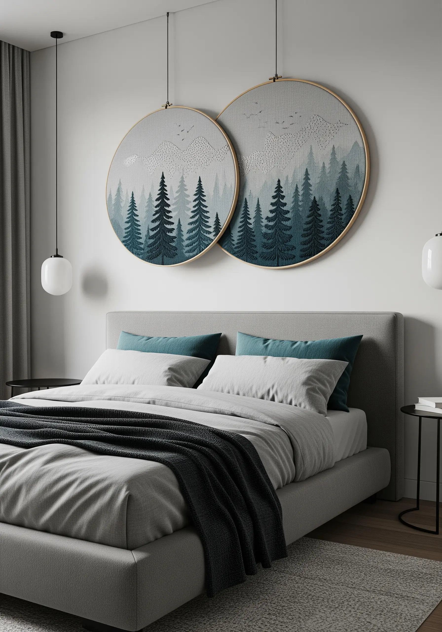
To give your embroidered landscape a powerful sense of depth, use color to create atmospheric perspective.
Stitch the trees and elements in the foreground with saturated, dark teals and greens for clarity and focus.
For the mountains and trees in the distance, switch to muted, lighter grays and dusty blues.
This technique mimics how colors appear less vibrant the farther away they are, giving your 2D mountain landscape thread painting a surprisingly realistic 3D feel.
16. Maximize Impact with a High-Contrast Tropical Palette
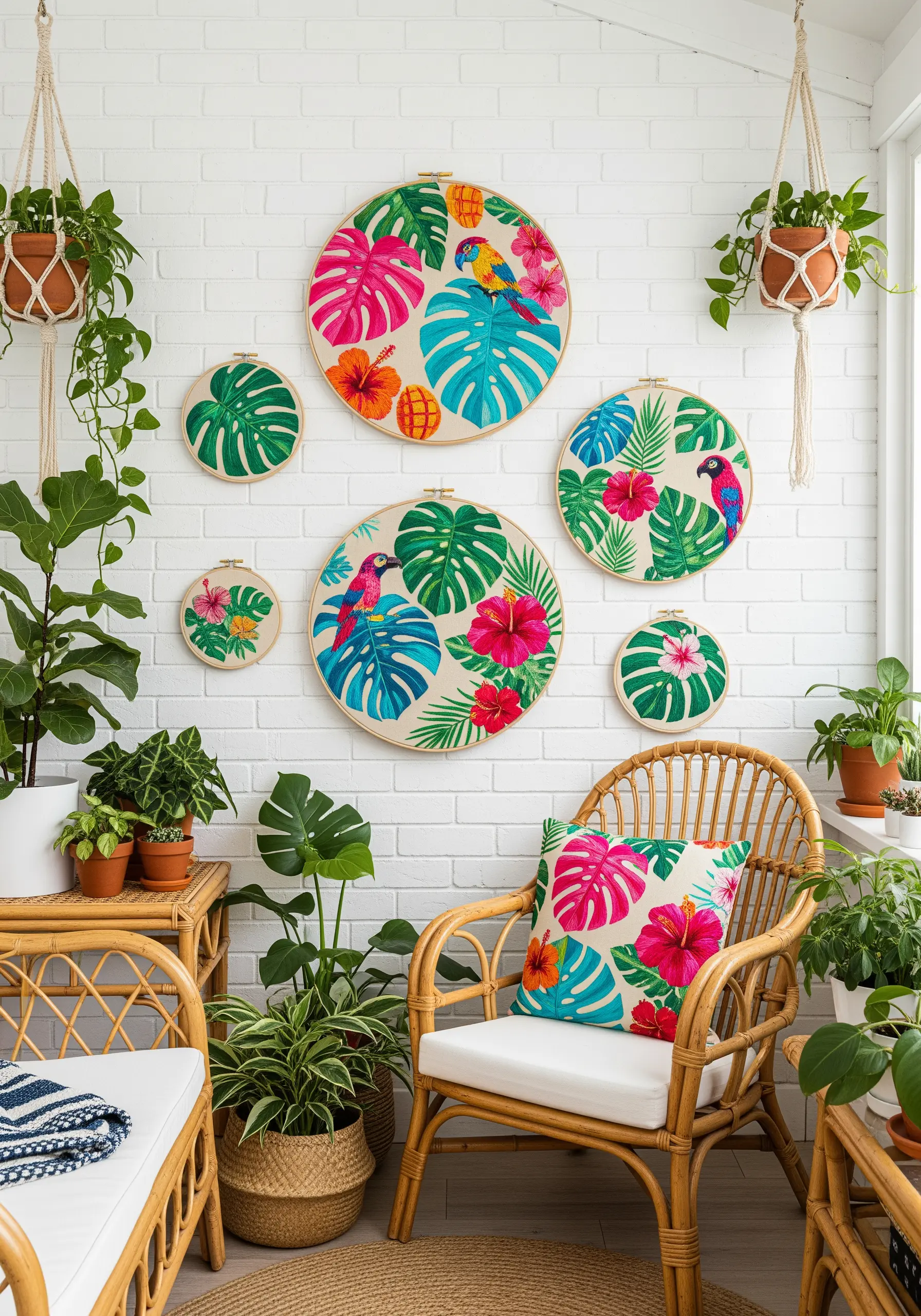
For a vibrant, energetic feel that bursts with life, pair intense complementary and near-complementary colors.
Hot pink hibiscus flowers pop against lush monstera leaves stitched in shades of deep green, while a bright blue parrot adds another layer of cool contrast.
This high-energy palette works best on a neutral background like white or natural linen, which allows the tropical tones to feel bold and exciting without being overwhelming.
17. Evoke Quiet Luxury with a Metallic Monotone
For an understated yet incredibly elegant piece, use only a single metallic thread on a dark, rich fabric like navy blue or black velvet.
The play of light on the gold or silver thread creates all the texture and dimension you need, without any color variation.
Use a combination of dense satin stitch for solid areas and delicate seed stitches for a shimmering texture.
This minimalist approach demonstrates how neutral color embroidery patterns can make a big impact through material choice alone.
18. Embrace the Power of a Purely Graphic Palette

Remove color completely from the equation and focus entirely on the strength of line and the elegance of negative space.
Using only black thread on a white or off-white fabric creates a bold, graphic look that feels modern, confident, and artistic.
Vary your line weight by using different numbers of strands—a single strand for delicate details and three or four for strong, impactful outlines.
This technique turns simple backstitches into powerful museum-style wall hoops.
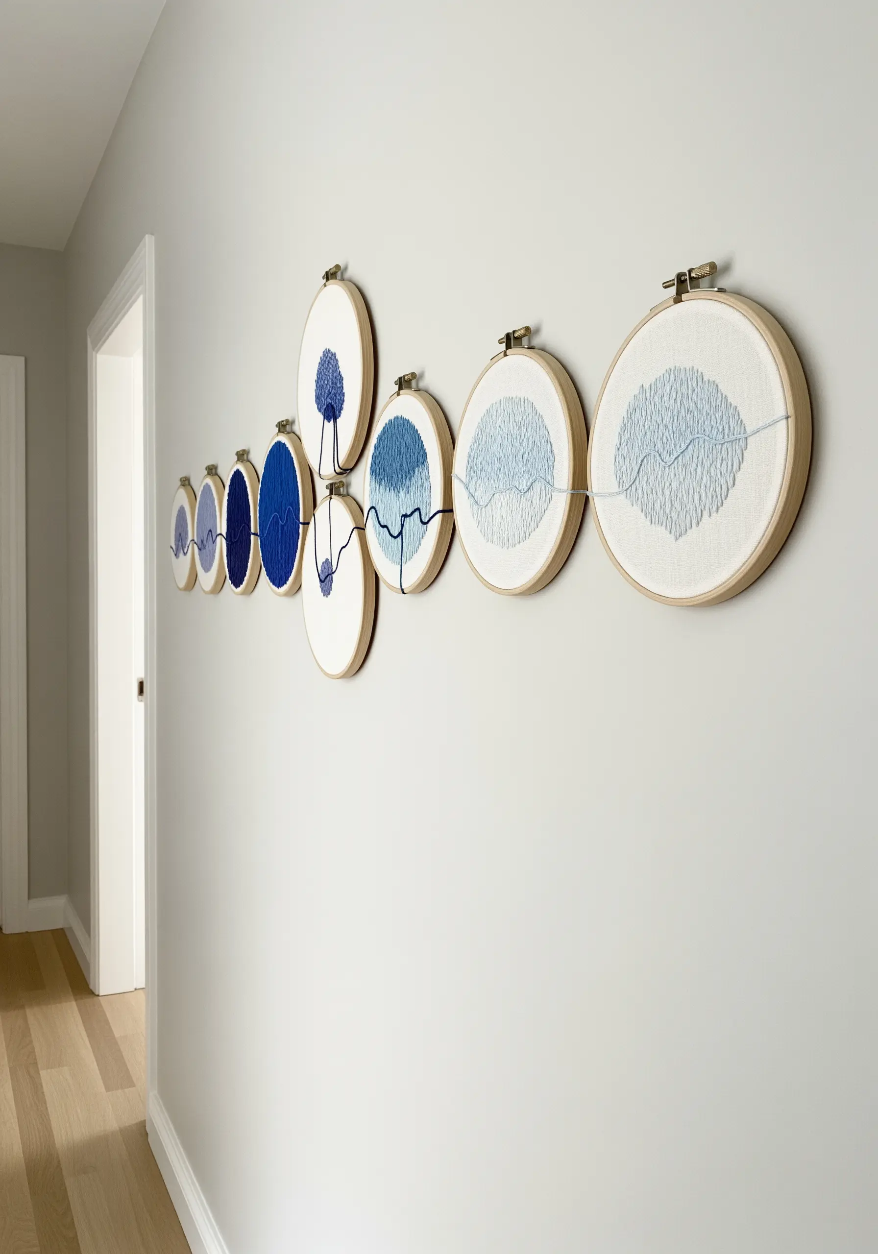
19. Build Intensity with a Focused Analogous Blue Palette
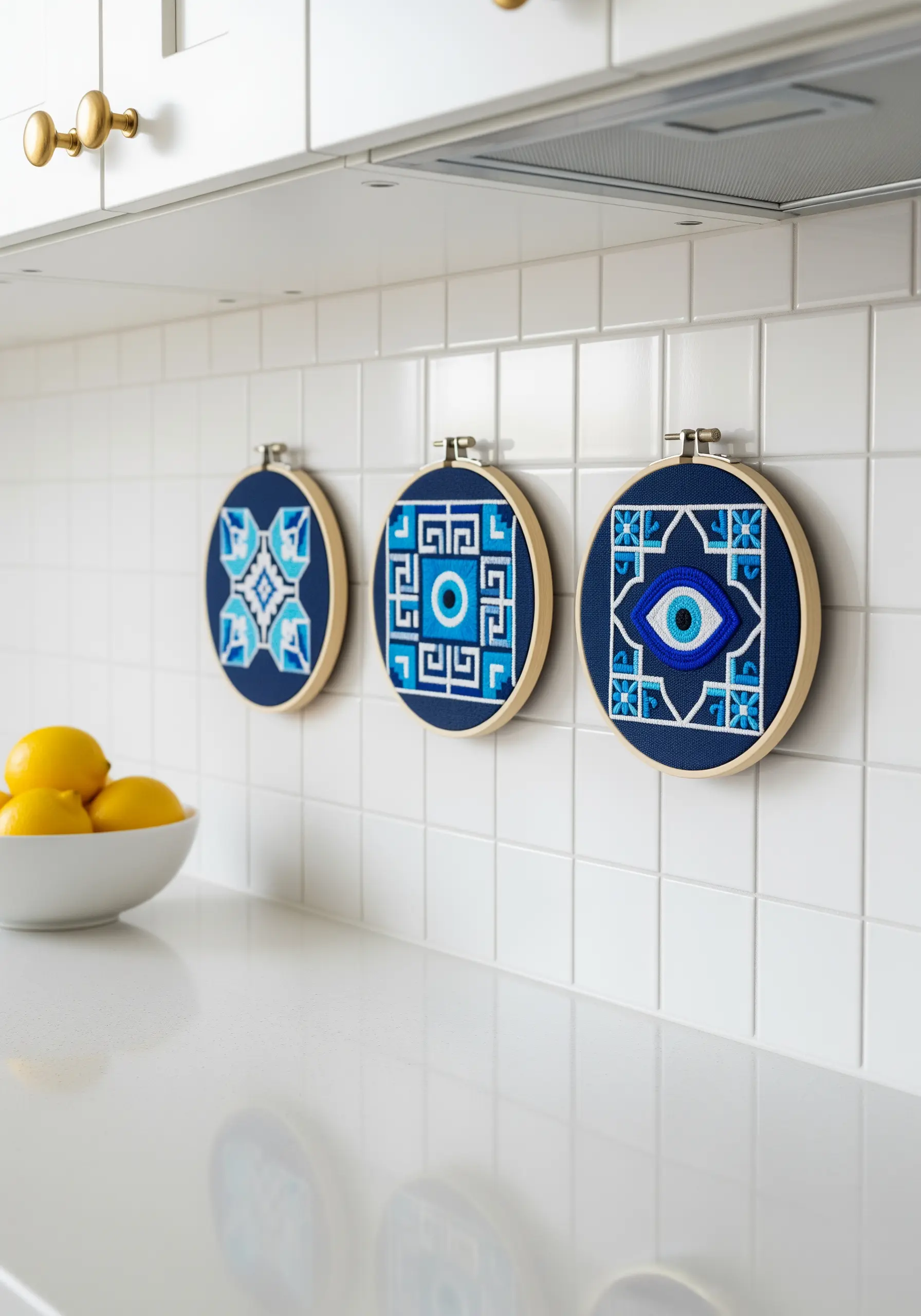
Create a powerful, thematic collection by exploring the full range of a single color family.
For these protective talismans, use shades from deep navy to bright turquoise to crisp white, all within the blue spectrum.
By staying within one color family, you create a design that feels both cohesive and visually intense.
The repetition of the motif across multiple hoops strengthens the impact, turning simple stitches into a stylish statement piece.
20. Translate Traditional Quilt Palettes into Thread
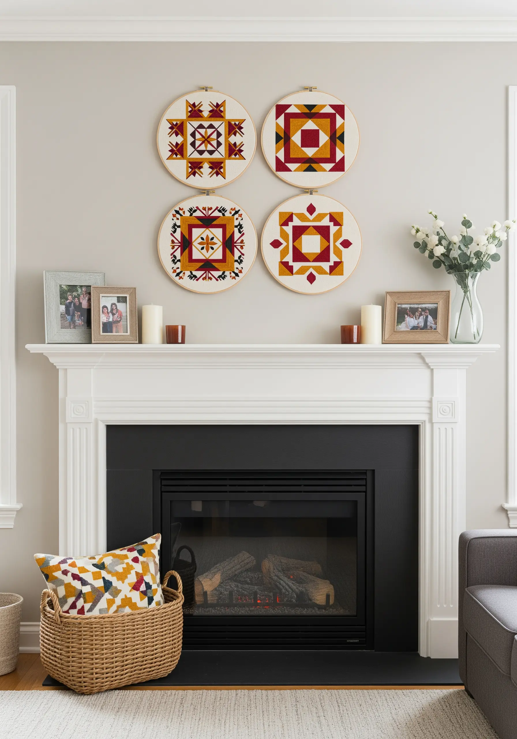
Find timeless color inspiration by borrowing harmonies from other textile arts, such as traditional quilting.
Classic quilt patterns often use a balanced palette of a primary color (red), a warm secondary (yellow-orange), and a dark neutral (deep brown or black) against a cream background.
This combination brings a sense of heritage, comfort, and warmth to your embroidery, making it a perfect accent for a cozy space.
21. Create a Night Sky with Cool Tones and Metallic Accents
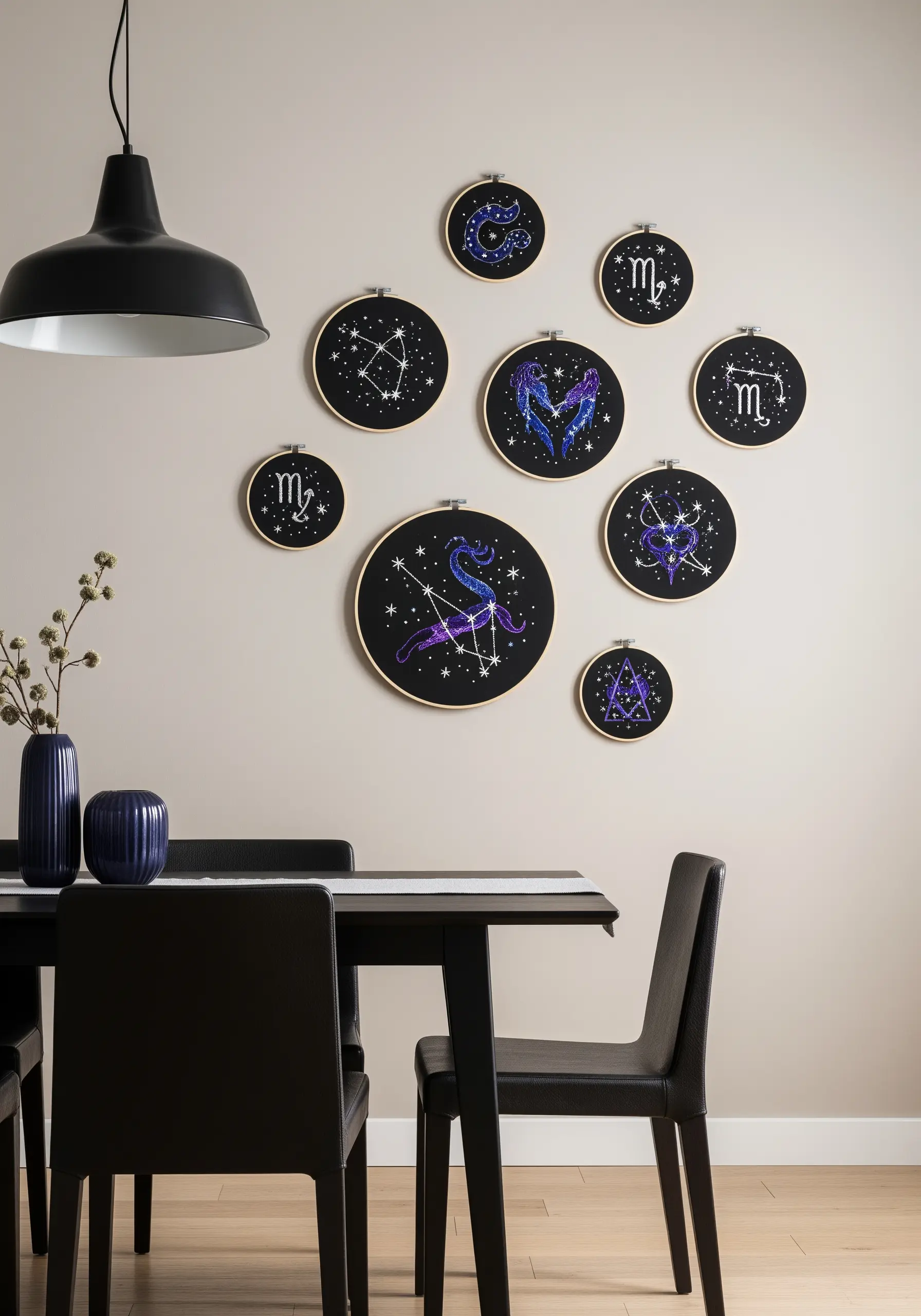
To stitch a convincing night sky, build your palette around cool blues and purples on a black or navy fabric.
Blend these shades using long and short stitch or seed stitch to create a soft, ethereal nebula effect.
Then, introduce a single, high-contrast metallic thread—like silver or pale gold—for the stars and sharp constellation lines.
This strategic flash of light against the deep, cool background creates a magical, shimmering effect that truly captures the cosmos.
22. Choose a Meditative Palette for a Calming Space
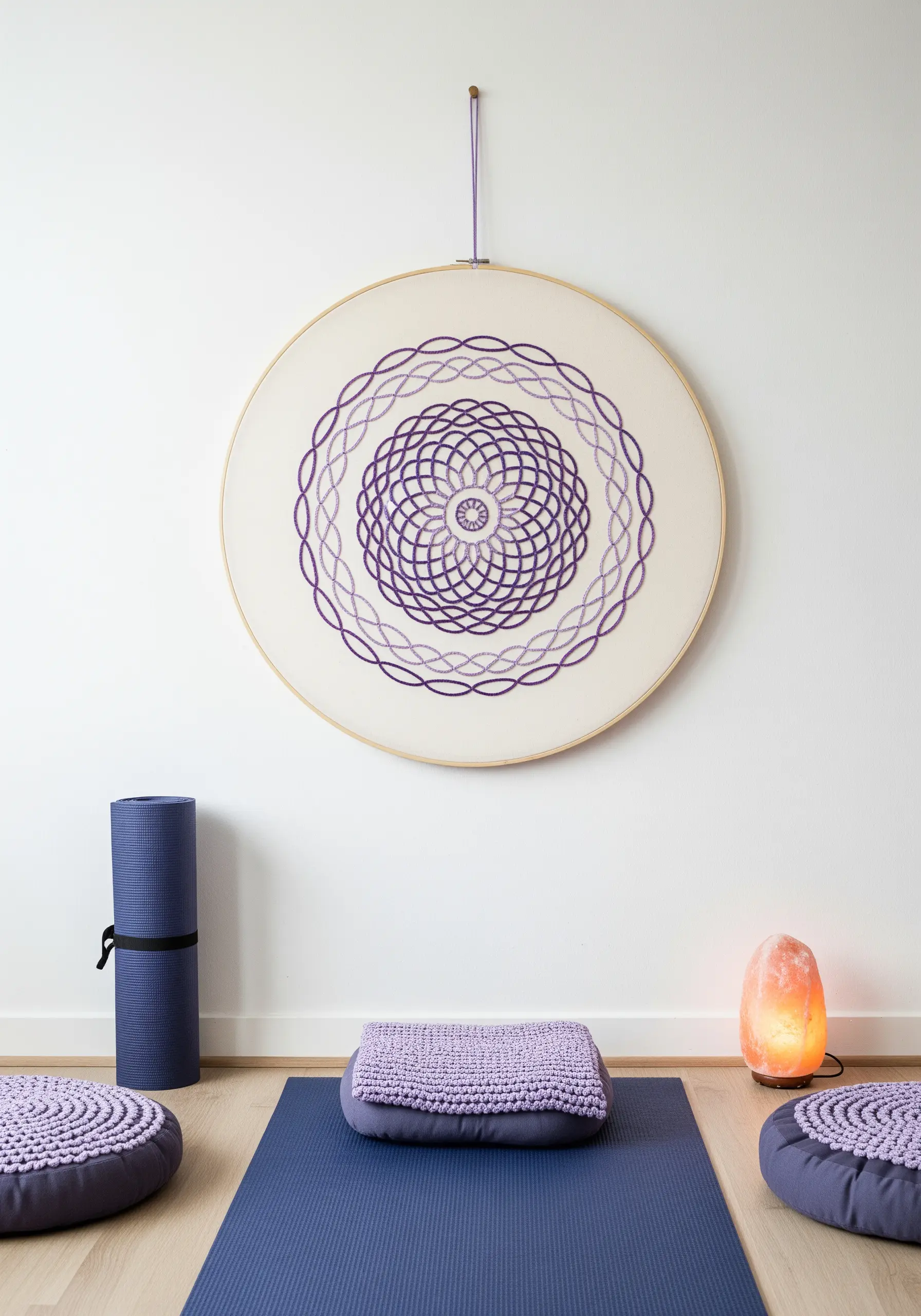
In a space designed for relaxation, like a yoga corner, a serene color palette is essential for fostering tranquility.
An ombré progression of a single calming color, such as lavender, creates a gentle visual rhythm that is soothing to the eye.
Pair this palette with simple, repetitive stitches like backstitch or chain stitch to enhance the meditative quality of the design and the stitching process itself.
This is a core principle behind minimal embroidery wall designs made for meditation rooms.
23. Match Your Palette to Your Room’s Dominant Tones

Create an immersive, professionally designed feel by selecting thread colors that echo the main materials and colors in your room.
If you have a leather sofa and terracotta pots, build your embroidery palette around warm browns, dusty pinks, and muted sage greens.
This creates a cohesive, earthy aesthetic where your art feels like a natural and intentional extension of the space itself.
It’s a simple way to ensure your earth-inspired embroidery designs feel perfectly at home.
24. Use a Playful Pastel Palette for Functional Spaces
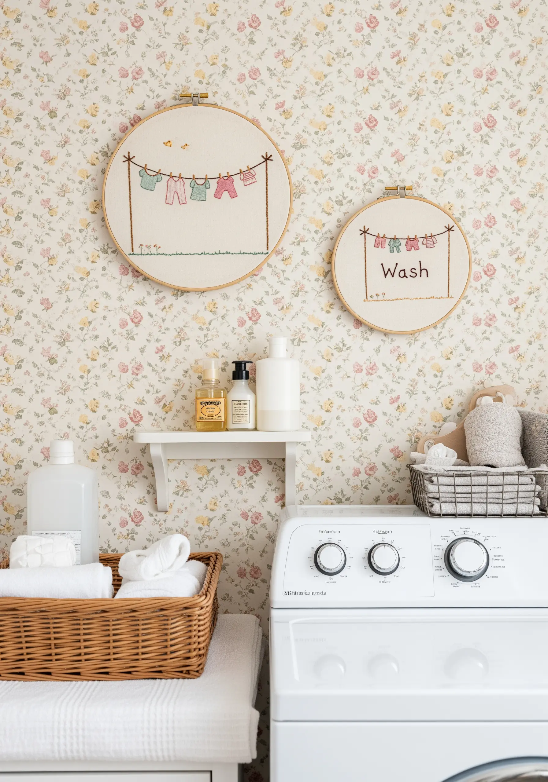
Brighten up a utilitarian space like a laundry room or kitchen with a sweet, simple, and clean color palette.
Soft pastels—mint, pink, baby blue, and lemon—feel fresh, cheerful, and lighthearted.
Keep the designs minimal and the stitches simple (like backstitch outlines and a few French knots) to maintain a light and airy feel.
It’s a small touch that can bring a lot of joy to a mundane space and is perfect for cute and colorful embroidery projects.
25. Convey Mood with an Abstract, Expressive Palette
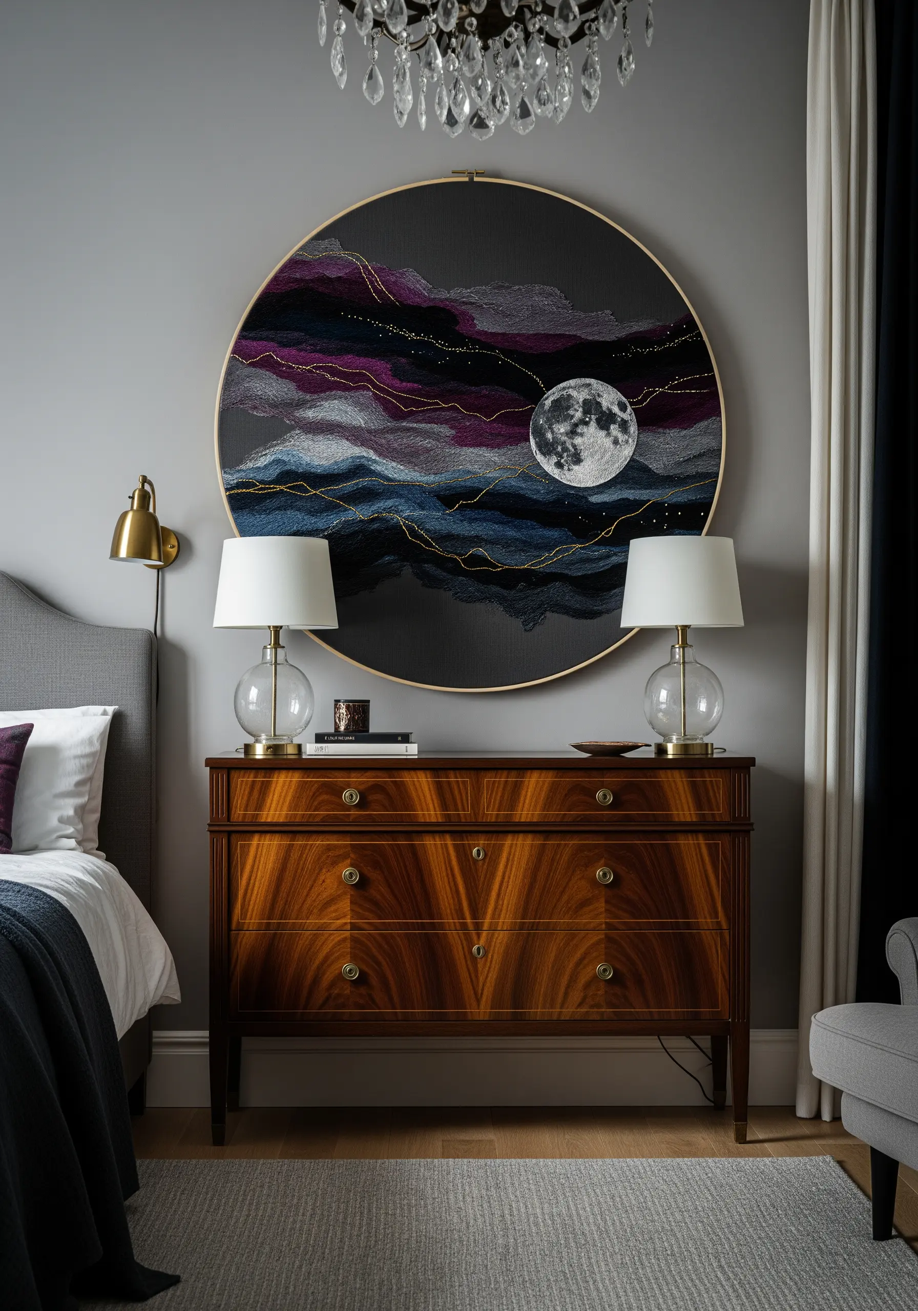
Use color to convey an emotion or a feeling rather than a literal interpretation of a scene.
Create a moody, dreamlike landscape with swirling clouds of grey, charcoal, and deep magenta, accented by a fine, shimmering line of gold metallic thread.
The dense texture of thousands of tiny seed stitches for the moon adds a point of realism within the expressive, abstract scene.
This technique turns your hoop into a piece of abstract thread painting that tells an emotional story.
26. Curate a Spa-Like Palette with Washed-Out Tones
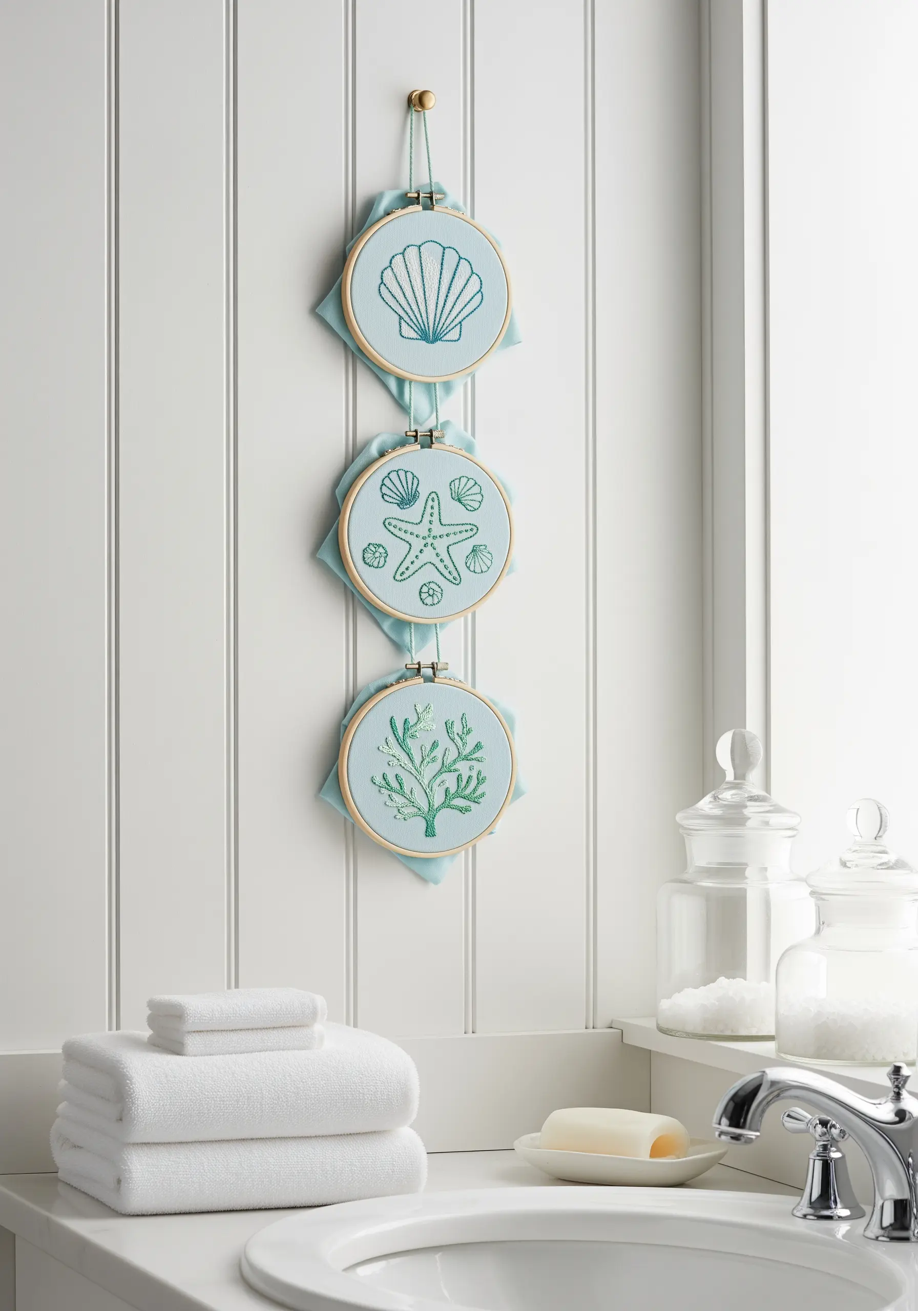
To create a tranquil, spa-like feel in a bathroom or bedroom, choose a palette of soft, water-inspired colors.
Seafoam green, pale aqua, and sandy beige on a light blue or off-white fabric feel instantly calming and clean.
This aesthetic is more about subtlety than high contrast; keeping the values of your chosen colors close together creates a gentle, cohesive look.
It’s a perfect strategy for tiny bathroom embroidery art projects that promote relaxation.
27. Color-Block with Texture for a Bold Typographic Display
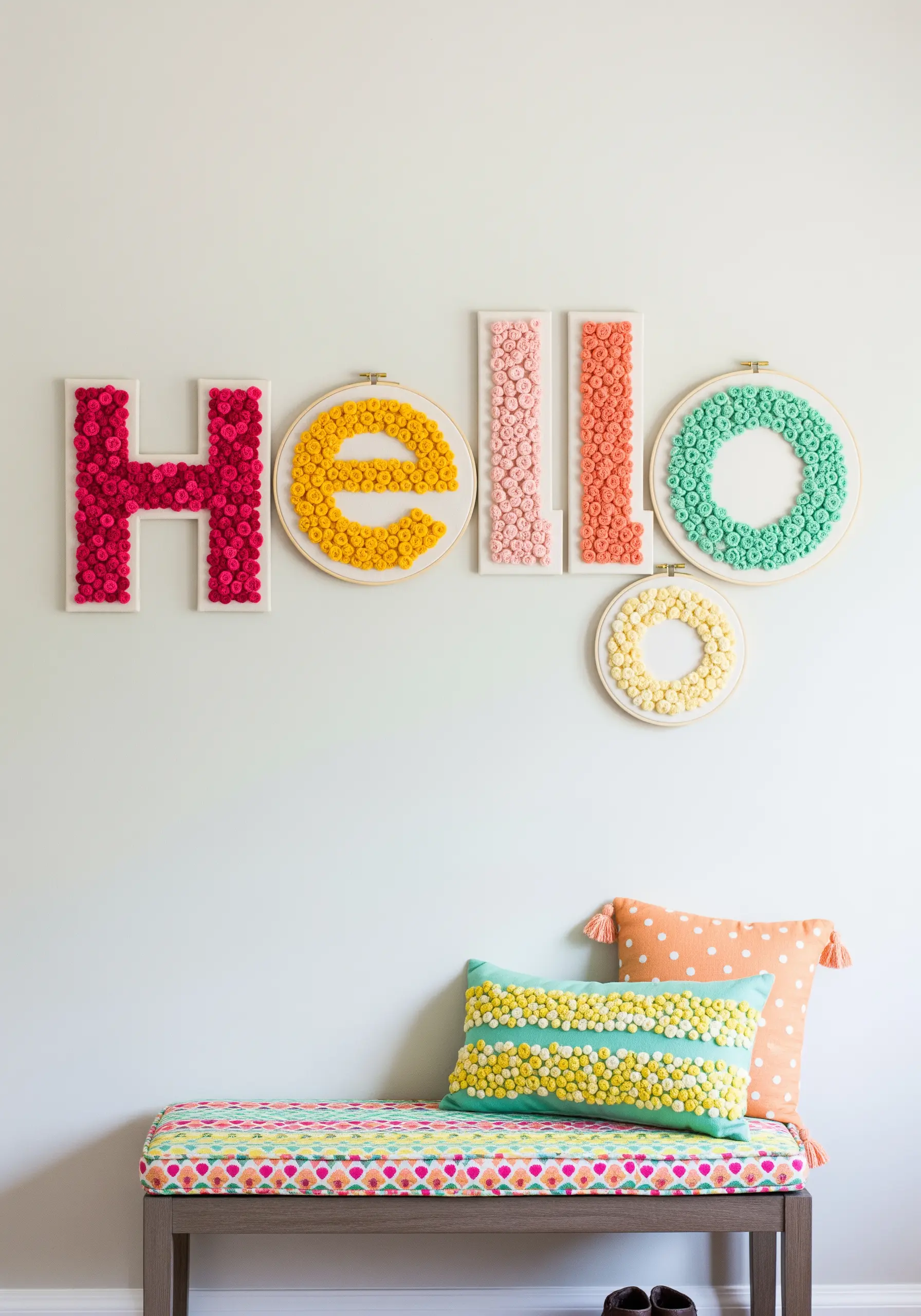
When creating typographic art, assign one vibrant, distinct color to each letter for maximum graphic impact and readability.
Use a highly textured stitch, like dense French knots or woven wheels, to fill the letterforms completely.
The combination of block color (hot pink, yellow, coral, mint) and deep texture makes the letters feel sculptural and playful.
This is a fantastic way to turn simple thread-based typography ideas into joyful statement pieces.
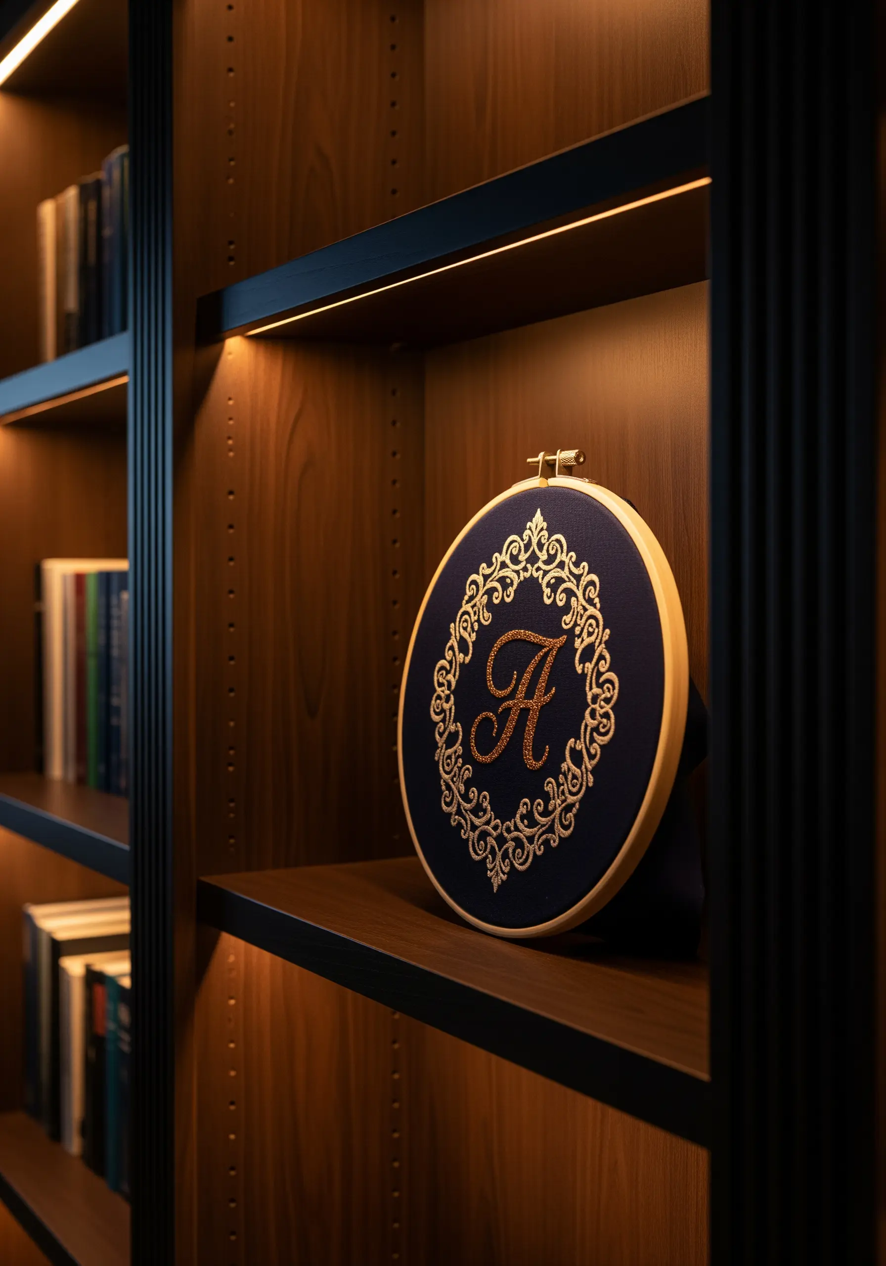
28. Use a Scholarly Palette for a Refined, Classic Look
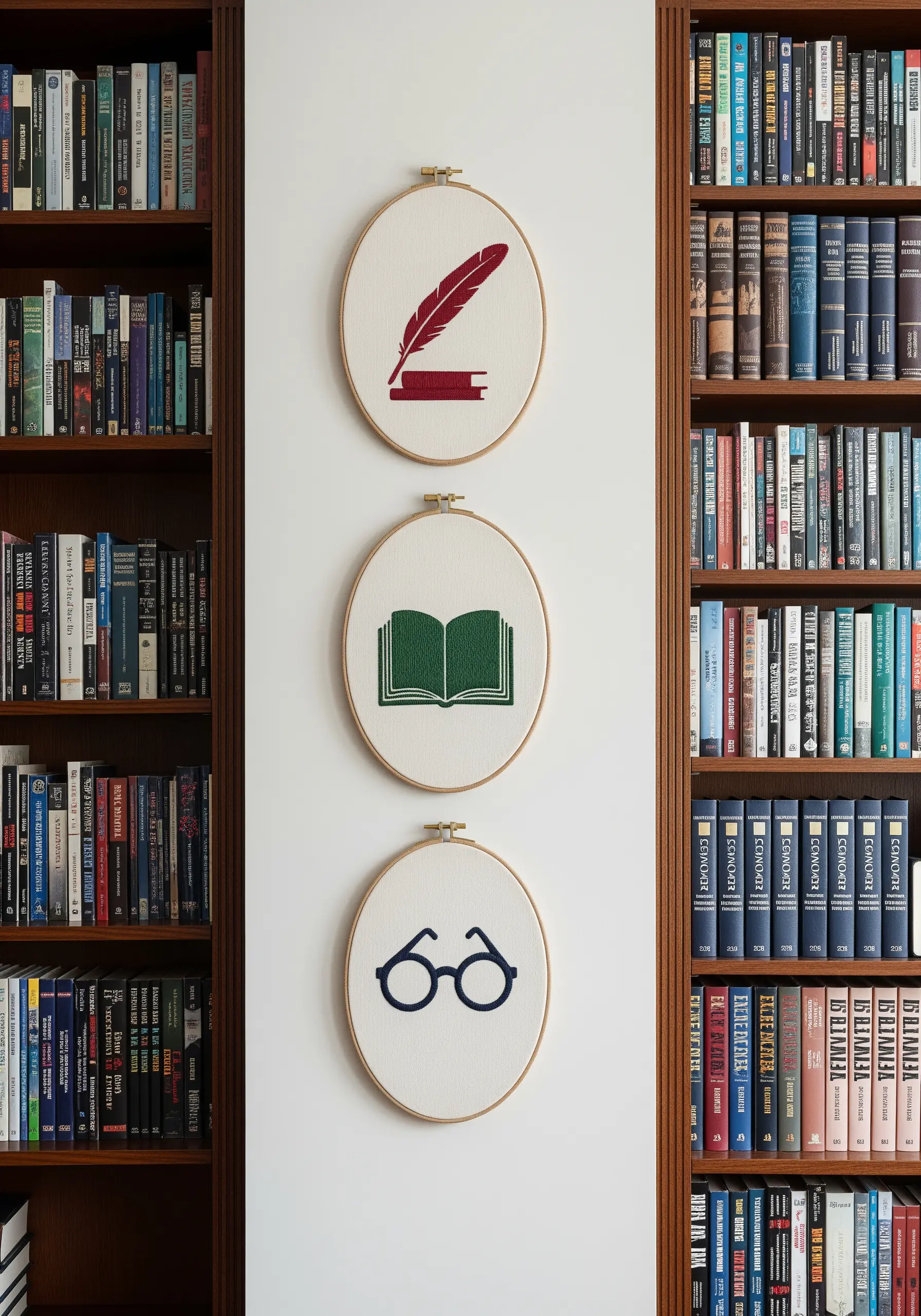
Evoke the feeling of a classic library or study with a sophisticated and timeless color palette.
Rich, dark jewel tones like deep burgundy, forest green, and navy blue feel traditional, intellectual, and calming.
Use them for simple, symbolic motifs on a cream or off-white linen background for a clean, high-contrast look.
This classic combination feels both established and modern, perfect for creating cozy embroidery bookmarks and wall art.
29. Create a Meadow Effect with a Diverse Floral Palette
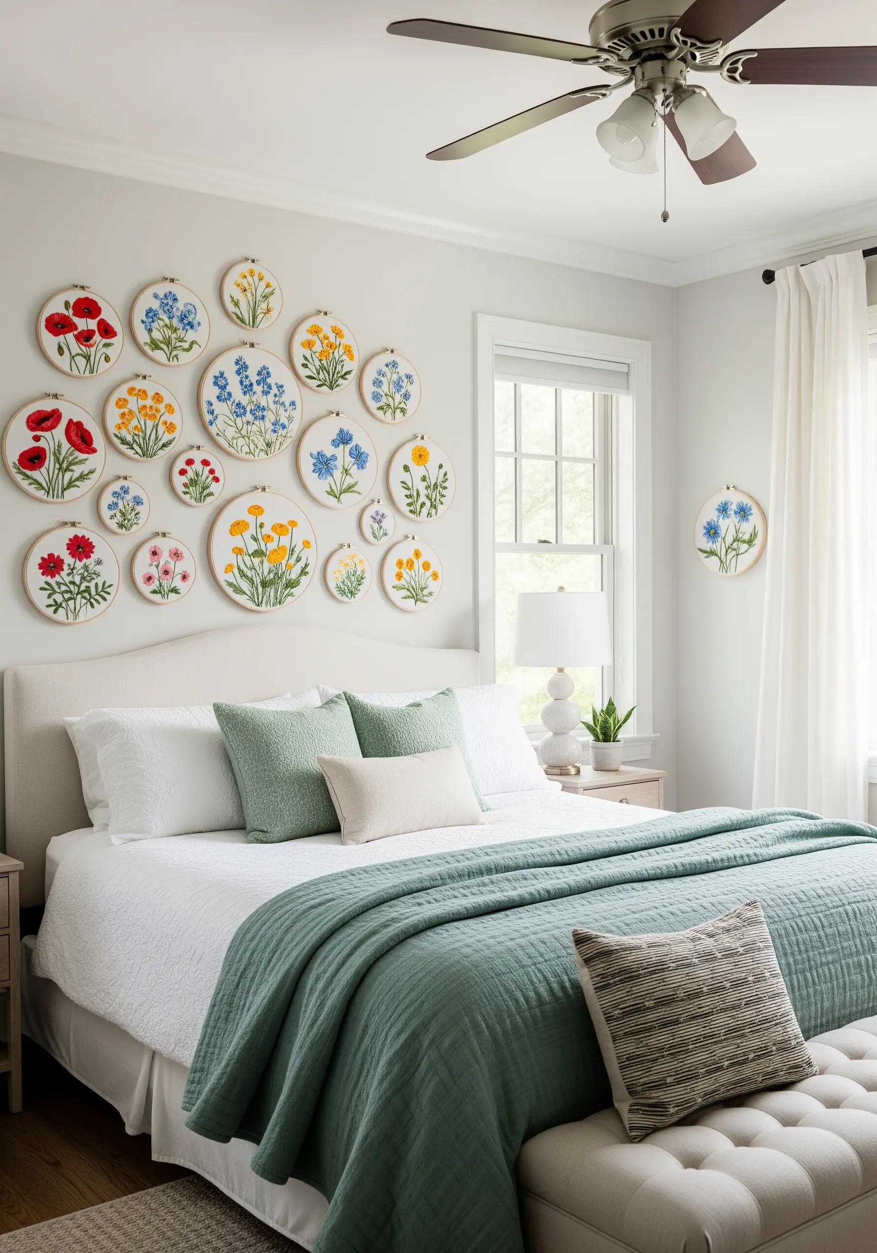
To mimic the natural, abundant look of a wildflower meadow, use a wide but curated palette of primary and secondary colors.
Combine poppy red, cornflower blue, and marigold yellow, but ground them all with consistent shades of green for the foliage.
Arrange hoops of varying sizes in an organic, clustered formation to create a vibrant, sprawling display that feels alive.
The key is the repetition of the green tones, which unifies the entire collection of diverse wildflower thread palettes.
30. Complement an Industrial Space with a Grayscale Palette
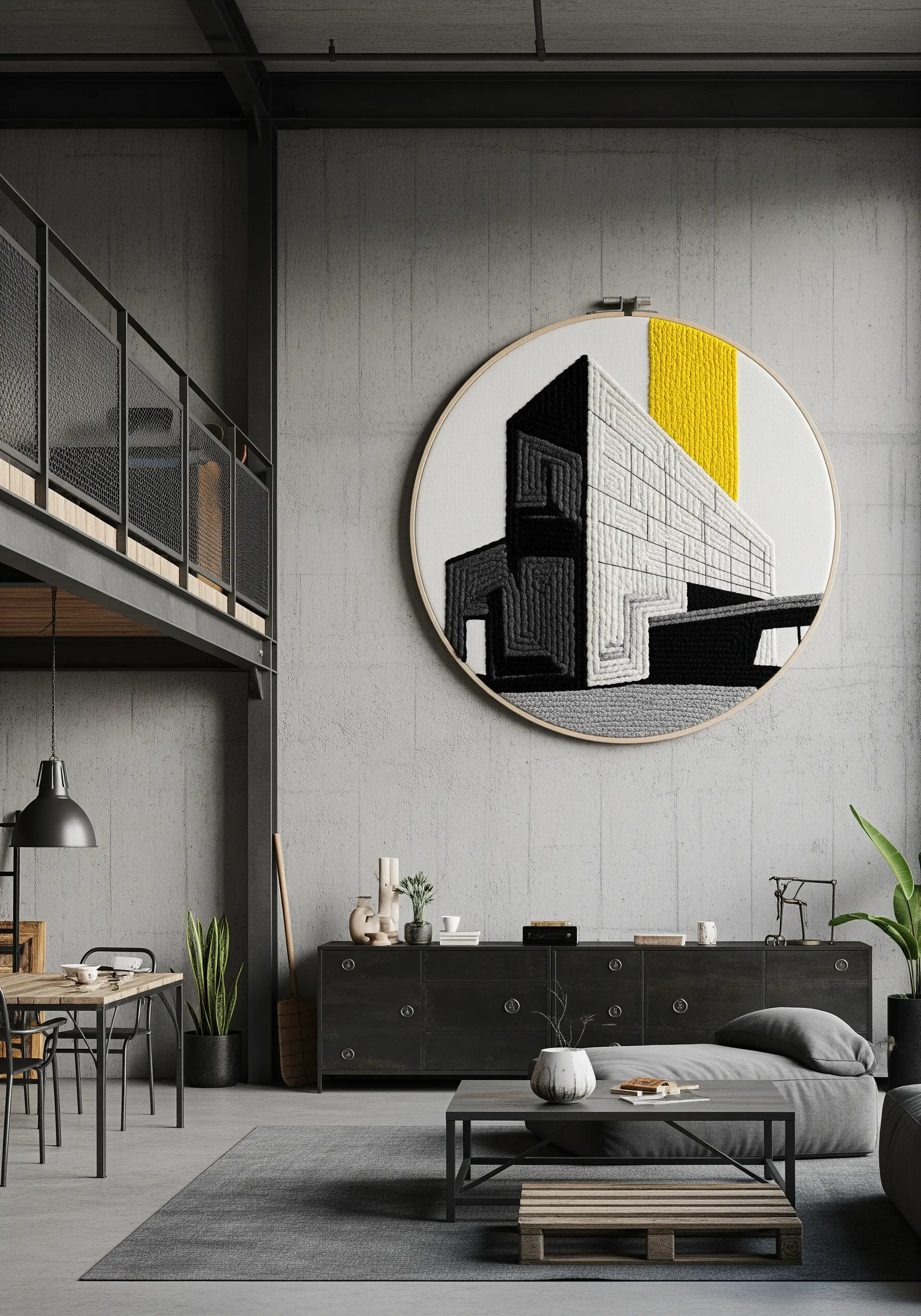
In a space dominated by concrete, metal, and glass, a stark grayscale palette feels intentional, modern, and chic.
Use shades from black to pale gray to create your design, focusing on line, shape, and texture rather than color.
Introduce a single, small block of a bold primary color, like yellow, as a deliberate and confident accent.
This strategic splash of color provides a focal point and keeps the monochrome embroidery from feeling flat or cold.


